Juniper Apstra Demo: Heat Map for Data Center Traffic & Resource Utilization Monitoring & Management
Apstra can help you easily identify the top talkers in your network. Here’s how.
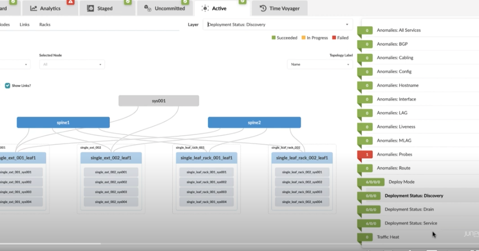
In Apstra, how do you visualize where bandwidth is being consumed? This demo shows you how to view heatmaps of network traffic and load so that you can tune the network for optimal performance.
This unique ability to collect traffic statistics and contextualize traffic flows to provide a comprehensive view for network operators is just one of Apstra’s amazing features. Check it out now.
You’ll learn
How Apstra generates a heat map, what it looks like, and how to read it using the legend
How Apstra uses color codes to indicate where traffic is coming from
The various views that Apstra can provide to help you decode the heat map and monitor resources
Who is this for?
Transcript
0:00 foreign
0:05 [Music]
0:08 how do you visualize where our current
0:11 bandwidth is being consumed what are the
0:13 top Talkers in the actual top we have a
0:16 number of different layers which we can
0:18 use to view different types of anomalies
0:20 and right at the bottom here we have one
0:22 called traffic heat and I see what
0:24 abstra is doing here is we have a probe
0:27 which is analyzing the switches and
0:28 collecting data
0:30 and that kind of data is used to
0:32 generate this heat map
0:34 now we have a legend
0:36 as we can see it at the right top corner
0:39 and that Legend states that if a given
0:41 interface or a switch representing all
0:43 of the abstra managed interfaces is
0:45 generating x amount of traffic it's
0:47 going to be color coded accordingly
0:50 and in our setup most of these switches
0:52 generating 21 to 40 or 41 to 60 percent
0:57 we have one which is 81 to 100
0:59 utilization
1:02 and the higher utilization interfaces we
1:05 provide this red warning symbol
1:07 to show that there's at least one link
1:09 connected to the switch
1:11 which is generating greater than 81
1:13 traffic and here you can see a nice
1:16 little summary which says well
1:18 collectively all of the interfaces
1:20 connected to this switch are generating
1:22 x amount of traffic or transmitting or
1:24 receiving x amount of traffic now
1:26 another view that we can provide is by
1:28 selecting a server and let's just select
1:30 this random one here
1:32 we can now use this Headroom view to
1:34 view two different points of the fabric
1:37 and if I choose the next one
1:40 what I've done is I've selected two
1:43 points in the fabric and the first point
1:45 was this generic IP system which just
1:47 happened to be a server I said I went to
1:49 see all of the paths between one server
1:51 and another and here's the other generic
1:54 IP system which I selected and just
1:56 opted to be a server as well now if I
1:59 Mouse over the link it's a 10 gig link
2:01 and the 6.51 gigs free is a concurrent
2:05 3.49 gigabits per second at both
2:07 transmit and receive
2:11 we can see things like you know are they
2:13 Giants are they runs or how many pockets
2:15 we got with frame check sequence errors
2:17 this Headroom probe is really used to
2:19 give you a quick view so you've got
2:21 operations that are saying I've got a
2:23 problem in this application the operator
2:26 of abstra can use this view to look at
2:28 all of the piles between each of those
2:29 servers
2:31 and have a quick view of the Headroom
2:33 and check to see if there are any errors
2:36 you can see it dynamically changing over
2:39 time for this real-time View
2:42 and also we have a Time series view as
2:44 well
2:45 so we can start to look at the data that
2:47 we've collected over time
2:49 and that can be aggregated by one hour
2:51 two minutes five minutes accordingly
2:54 [Music]