Executive Summary—Wireless
Use the Executive Summary - Wireless dashboard to get an overview of your wireless network components and the latest performance trends.
You can view the number of connected devices, traffic throughput, application usage, and service-level expectation (SLE) metric trends. With the information, you can perform a comprehensive analysis of your wireless network to optimize the usage of your network resources.
Features and Benefits
-
Generates insights about organization-wide client trends, traffic trends, and SLE trends. With these insights, you can spot the network areas that experience problems.
-
Provides reports on SLE metrics at the site and organization levels. With SLE details, you can understand the experiences of clients utilizing your network.
-
Provides data on the amount and types of traffic passing through the network.
-
Reports on the clients attached to the network along with client traffic utilization.
-
Gives visibility to the devices and applications that use the network's bandwidth.
Before You Begin
- Become familiar with the options available on your dashboard. See Figure 3.
-
See Juniper Mist Wireless Configuration Guide for wireless configuration details.
-
You need a license for using the Juniper Mist Premium Analytics dashboard. For more information, see Mist Premium Analytics Trial License.
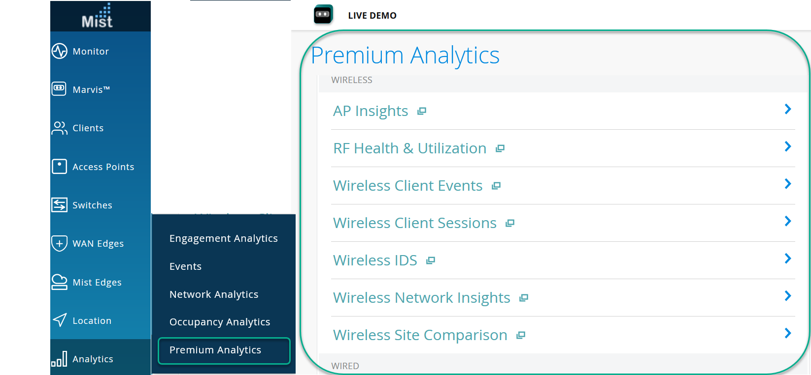
Access Executive Summary - Wireless Dashboard
To access the Wireless Network Insights dashboard:
-
On
the Premium Analytics page, click Executive Summary - Wireless
.
Figure 1: Access Premium Analytics
 The Executive Summary - Wireless dashboard appears.
Executive Summary - Wireless Tiles
At the top of the dashboard, you can get a summary of your site's wireless network. The dashboard displays the number of assigned APs, number connected devices, and the volume of traffic flow.

The Wireless Network Insights dashboard includes various tiles that provide graphical representations of analytics at a granular level. On the tiles, you can see the number of connected clients and information about applications, sites, traffic, and SLE metrics.
- Trend of Client Count and Traffic
- Service Level Expectations
- Site Statistics
- Top Applications and Device Types
Trend of Client Count and Traffic
The tile shows the traffic trend and the number of connected clients over a period of time.
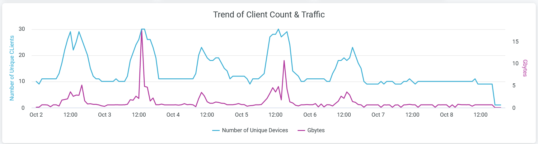
The chart shows two lines—one that represents the number of unique client devices and another that represents traffic volume. You can hide one of these two graphs by clicking the name in the legend below the chart.
Place the cursor on the line graphs, which represent the number of client devices and volume of traffic, to see the actual numbers at any given time.
Click the chart to open the report in a new window with additional details. You can view details such as names of client devices, WLAN SSID, AP name, and traffic usage per device. You can download the table by using the Download option.
Service Level Expectations
The tile shows the SLE at organization-level and at site-level.
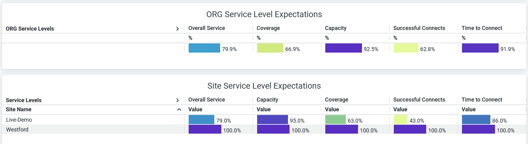
The tile displays the performance of each of the following SLE metrics as a percentage that represents the success rate of the metric:
-
Overall Service—Number of connections that experience the specified SLE goals.
-
Coverage—Percentage of user minutes for which a client’s received signal strength indicator (RSSI), as measured by the access point (AP), matches the SLE goal.
-
Capacity—Percentage of user minutes for which a client experiences a good coverage. The capacity depends on factors such as interference, number of attached clients, and usage by attached clients.
-
Successful Connects—Percentage of successful connections (initial, roaming, and ongoing).
-
Time to Connect—Percentage of successful connections established with the Internet within the specified threshold time.
Site Statistics
The Site Statistics tile displays the list of sites according to the number of client connections and traffic volume.
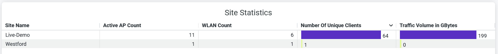
You can see the name of each site and the number of unique client devices connected to each site. You can view for each site:
- Active AP count
- WLAN count
- Number of unique client devices connected
- Traffic usage
Top Applications and Device Types
The tile shows the Top Device Types and Top Applicationspie charts.
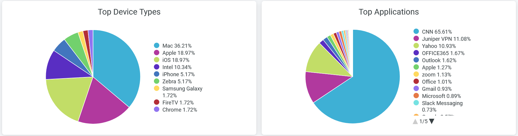
Top Device Types
The Top Device Types pie chart shows the client devices in the network classified according to the operating systems.
Click a wedge, which represents an operating system, of the pie chart to view additional information about the devices that use that operating system.
You can also see in the legend next to the chart the percentage of devices using each operating system.
To hide information about an operating system and see information only about the remaining operating systems, click the operating system name in the legend.
Top Applications
The Top Applications pie chart displays the bandwidth usage by all the applications or websites in a site. Hover over the chart to see the volume of traffic that application or website receives and transmits.
Click a wedge, which represents an application, of the pie chart to view additional information about the devices that use that application.
Additionally, you can see in the legend below the chart the percentage of traffic that an application receives and transmits. To hide data for an application or website and see data for only the remaining ones, click the application name in the legend.