Wireless Site Comparison
Compare site performance to proactively troubleshoot connectivity and performance issues on your wireless network.
On the Wireless Site Comparison dashboard, you can see service-level expectation (SLE) metrics and traffic performance of different sites in separate graphs. You can compare and monitor sites in terms of SLE, connections, bandwidth usage, performance, and application usage. You can use the information to proactively troubleshoot connectivity and performance issues in the wireless network of your organization.
Features and Benefits
-
Track the performance of your network, systems, and applications, and identify the sites that are providing unsatisfactory user experience.
-
Monitor wireless network traffic, identify peak wireless data usage, and detect health and utilization patterns. With these capabilities, you get a comprehensive view of your organization's network and thereby efficiently manage your network.
-
Get visibility on devices and applications using network's bandwidth.
-
Track wireless traffic activity, and in turn identify and troubleshoot network incidents faster or even prevent these incidents from happening.
Before you Begin
- Familiarize with the options available on your dashboard. See Figure 3.
-
Refer to Juniper Mist Wireless Configuration Guide for wireless configuration details.
-
You need a license for using the Juniper Mist Premium Analytics dashboard. See Mist Premium Analytics Trial License.
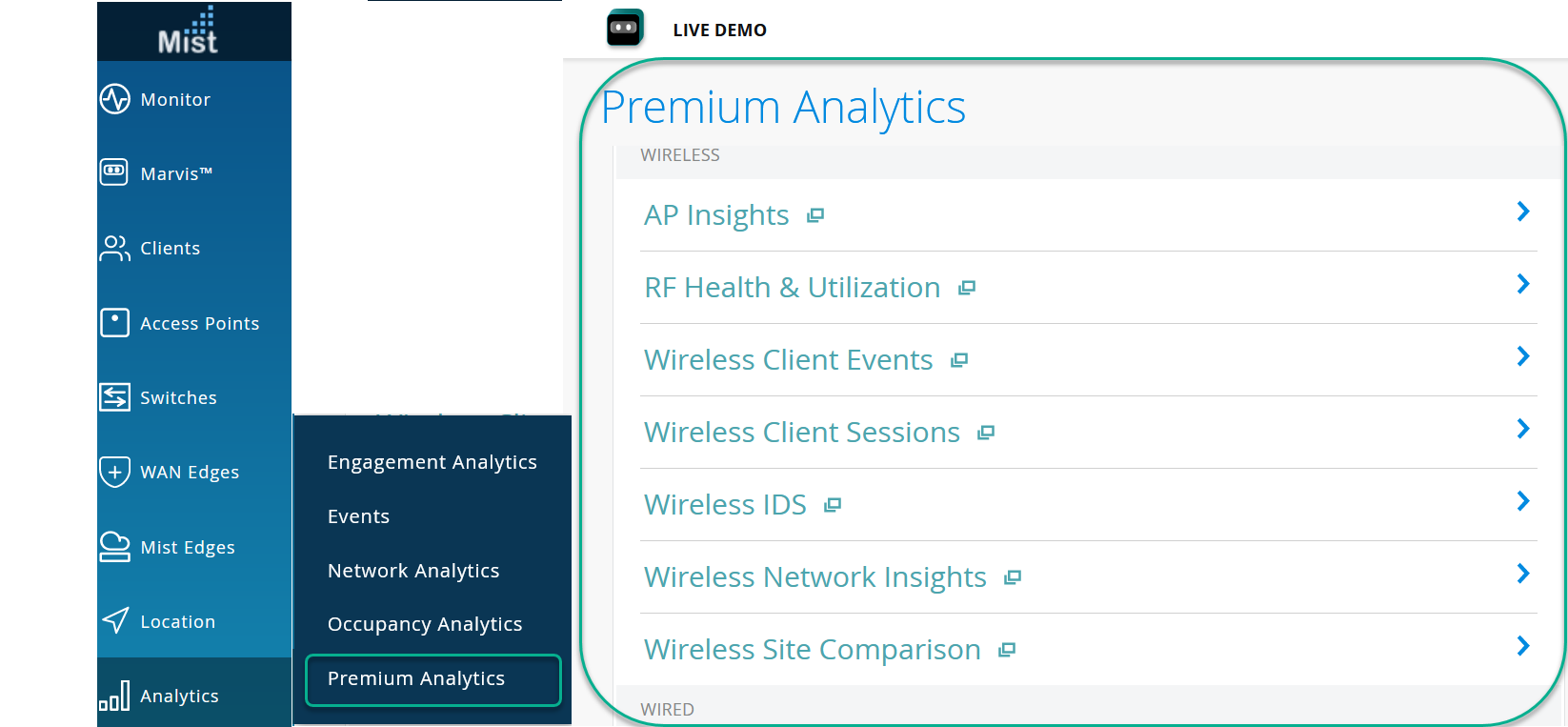
Access Wireless Site Comparison Dashboard
-
In the left menu of the Juniper Mist portal, click Analytics
> Premium Analytics.
Figure 1: Access Premium Analytics
Wireless Site Comparison Tiles
The Wireless Site Comparison dashboard includes various tiles that provide analytics data in graphical formats. With these tiles, you can compare and contrast different types of metrics to determine site performance or the percentage of SLE that your network achieves.
Site SLE Summary
Figure 2 shows the site SLE summary tile.
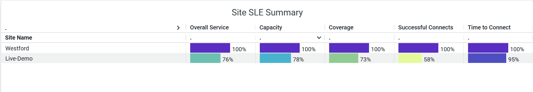
The Site SLE Summary tile displays the percentage of time that the SLE metrics meet the specified SLE goal within a specific time range. The Juniper Mist portal displays each SLE metric as a percentage that represents the success rate of the metric.
Juniper Mist provides the following SLE metrics:
- Overall Service—Identifies the number of connections that experience the specified SLE goals. In Figure 2, we see that 100 percent of the connections in the Westford site and 76 percent of the connections in Live-Demo meet the specified SLE goals.
- Time to Connect—Identifies the number of connections that connect to the Internet within the specified time threshold. In the above sample, 100 percent of the connections in the Westford site and 95 percent of the connections in the Live-Demo site connect to the Internet within the specified time.
- Successful Connects—Shows the percentage of successful connections (initial, roaming, and ongoing). In the above sample, 100 percent of the connections in the Westford site and 58 percent of the connections in the Live-Demo site are able to connect successfully.
- Coverage—Identifies the number of user minutes that a client’s received signal strength indicator (RSSI), as measured by the access point, are within the configured threshold. In the above sample, 100 percent of the client devices in the Westford site and 73 percent of the client devices in the Live-Demo site experience the expected level of network coverage.
- Capacity—Tracks the user minutes that a client experiences low capacity because of interference, number of attached clients, and usage by the attached clients. In the above sample, 100 percent of the clients in the Westford site and 76 percent of the clients in the Live-Demo site experience the expected level of coverage.
Site Performance Comparison
Figure 3 shows the site performance comparison tile.
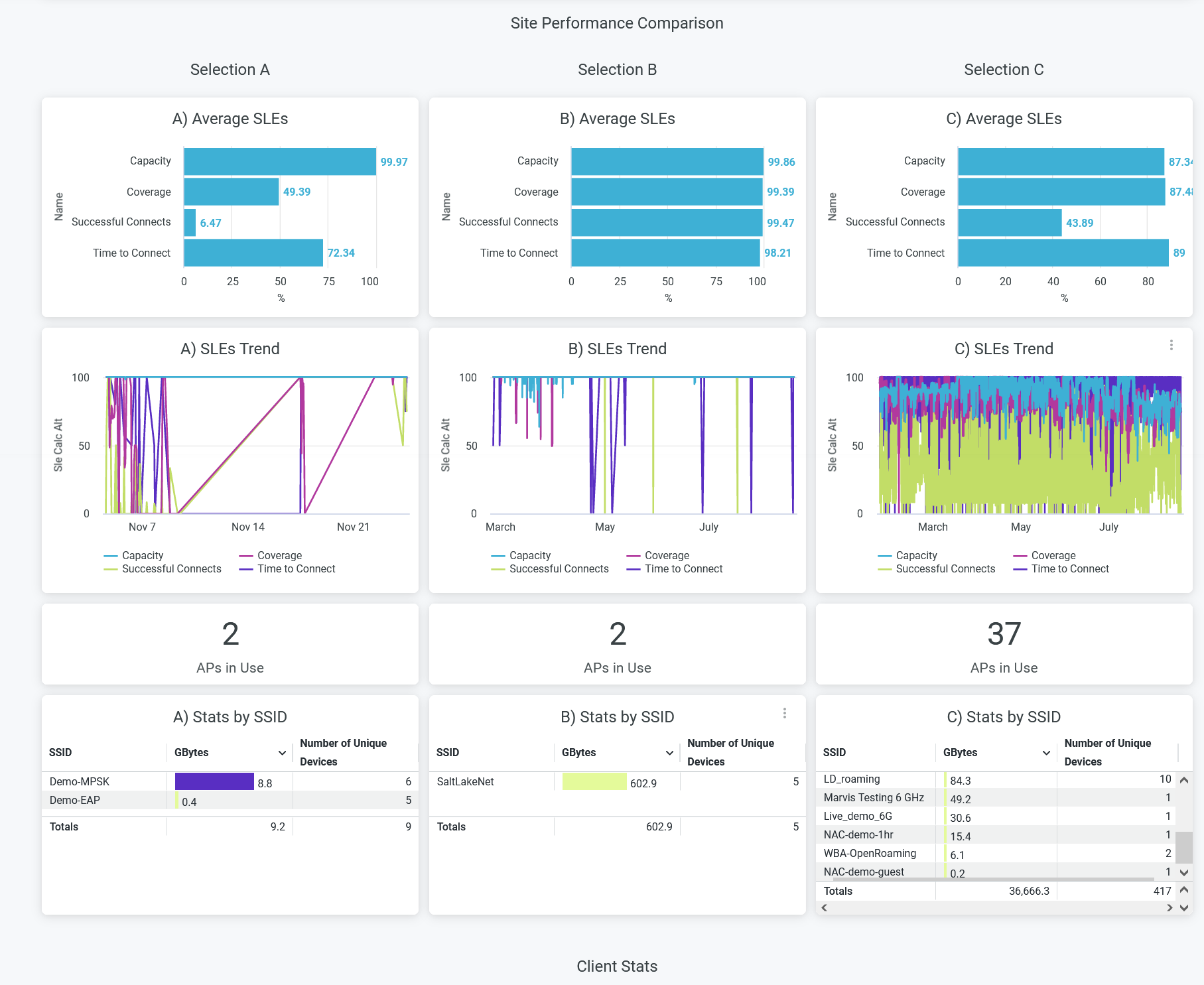
The Site Performance Comparison tile compares and displays site performance measures in terms of the following parameters:
- Average SLE—Compares performance of sites in terms of SLE parameters such as capacity, coverage, time to connect, and successful connects details. This tile displays a bar graph in which you see the success percentage of each SLE parameter.
- SLEs Trend—Displays a graphical representation of the SLE trends for the selected sites for capacity, coverage, time to connect, and successful connects.
- APs in Use—Displays the number of access points (APs) currently in use for each site.
- Stats by SSID—Displays data usage and the number of unique devices connected to each site. Click the service set identifiers (SSIDs) to get the details of the connected devices and data consumption.
Client Stats
Figure 4 shows the client stats analytics data.
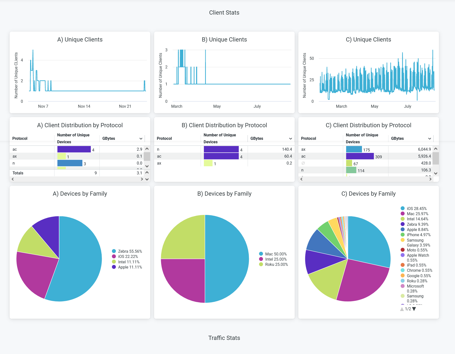
The Client Stats dashboard shows client connection trends and client distribution grouped by device type, operating system (OS), and 802.11 protocols. The details include:
- Unique clients—Number of unique client devices connected over a specified time period. Hover over the chart to see the number of devices and their reporting time.
- Client Distribution by Protocol—Clients grouped by the IEEE 802.11 standards.
- Devices by Family—Type of connected devices grouped by client operating systems.
Traffic Stats
Figure 5 shows traffic statistics data.
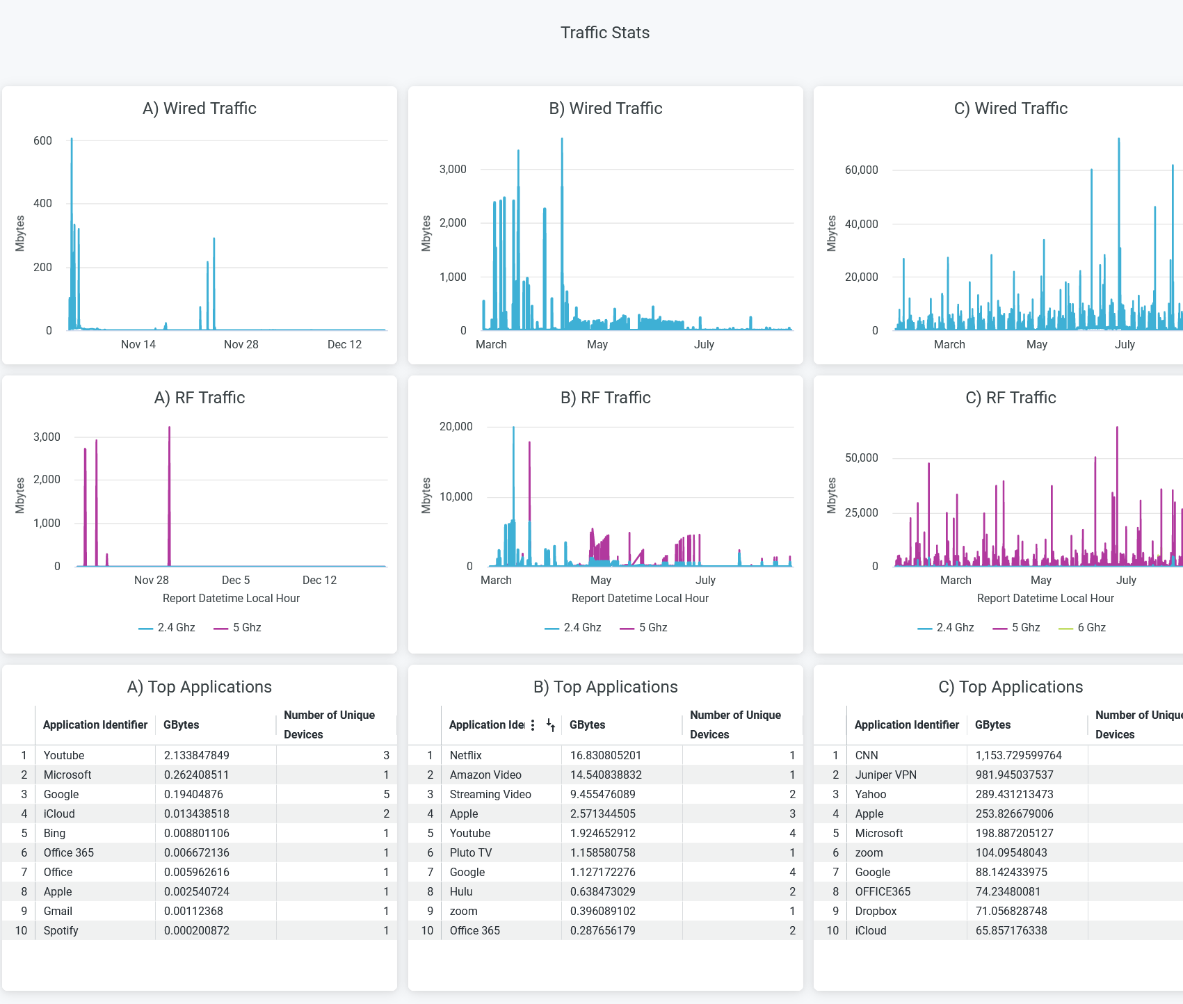
The Traffic Stats tile provides trend reports for applications, traffic, and clients. The tile provides reports on:
- Wired traffic—Wired network traffic in the site for the selected period.
- RF traffic—RF-based traffic in the site for the selected period. The details include usage by 2.4-GHz, 5-GHz, and 6-GHz bands.
- Applications—Bandwidth utilization of each application in a site and the number of unique devices using those applications.
RF Health and Utilization
Figure 6 shows RF health and utilization analytics data.
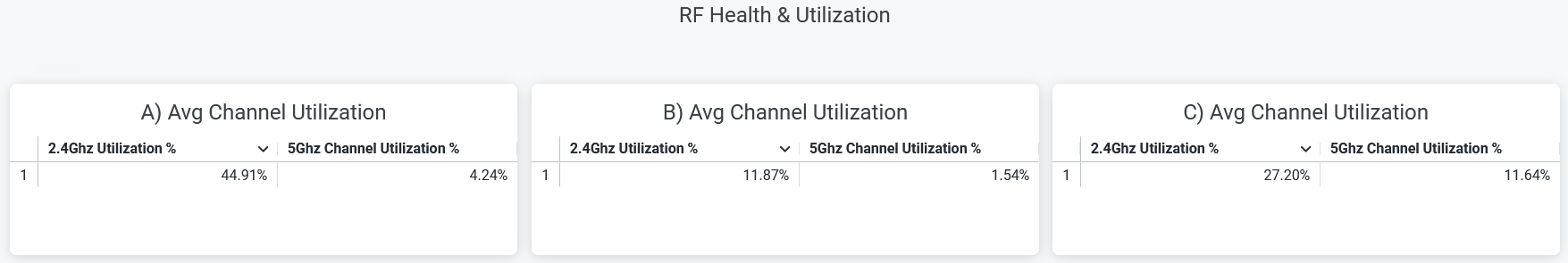
On this tile, you can see the average channel utilization trends in the 2.4-GHz and 5-GHz radio channels grouped by sites. In the sample shown above, site A uses 44.9 percent of the 2.4-GHz channel and 4.24 percent of the 5-GHz channel.