Application SLEs
Use the Application service-level expectations (SLE) dashboard to assess the service levels for user-impacting factors such as signal strength, RF channel capacity, client CPU utilization, and more.
Overview
Monitoring network performance is crucial for any organization as a healthy network is key to the performance of applications. Monitoring the network performance requires you to assess multiple network aspects using reliable performance indicators. However, efficient assessment and reporting of network performance at an organization level continues to be a challenge.
With the Marvis Large Experience Model (LEM), Juniper Mist can accurately predict end-user application experience for real-time communication tools such as Microsoft Teams and Zoom. If you have integrated Zoom and Teams, then LEM utilizes the user minutes from the Zoom and Teams sessions to calculate the experience correlation.
Juniper Mist provides a cloud-to-cloud integration with Zoom and Microsoft Teams to analyze, correlate, and classify collaboration user experience based on correlation of network parameters both at the site level and organization level. Using this information, Juniper Mist provides an assessment of the quality of user experience on your network. Zoom and Microsoft Teams applications are sensitive to any network changes and play a key role in determining the user experience. A measure of how well these application user minutes are performing acts as a third-party report card for your network. The absence of any Zoom and Teams issues on a network indicates that all other user applications are probably performing well.
If you have not enabled Zoom and Teams integration, then LEM utilizes all user minutes for all clients connected on the network to predict the user experience.
Juniper Mist identifies various factors contributing to a bad user experience and provides a site-level or organization-level experience correlation of the bad user minutes experienced by all users. The Application Experience dashboard provides a Shapley feature ranking that helps determine the contribution of network parameters towards a negative user experience.
Finding the Application Experience Correlation View
To find the Application Experience Correlation view, select Monitor>Service Levels from the left menu of the Juniper Mist portal, and then select the Application button.
Your subscriptions determine which SLE buttons appear. The Application button is available when you have a Marvis for Wireless subscription.
If you have enabled Zoom and Teams integration, you'll see the page listed with the Zoom and Teams options.
If you have not enabled Zoom and Teams integration, you'll see the page without the Zoom and Teams options.
For information about integrating Zoom or Teams with Mist, see Zoom Integration Overview and Microsoft Teams Integration Overview.
Application Experience Correlation with Marvis LEM
Juniper Mist collects information such as latency, packet loss, and jitter experienced by every user during a Teams or Zoom session. It correlates this information against the network parameters to identify the root cause for a bad user experience. Juniper Mist then aggregates this individual user information to provide insights into the quality of Teams or Zoom application user experiences at a site or an organization level.
- Experience Correlation
- Site-Level Application Experience Correlation
- Organization-Level Application Experience Correlation
Experience Correlation
Experience correlation provides visibility into the performance of collaboration applications such as Teams and Zoom at a site or an organization level. With detailed insights into the factors impacting the application quality, the correlation data helps network administrators to quickly identify issues causing bad user experiences across a site or an entire organization.
Use the feature ranking graph to identify which features contributed the most to an issue, Also view the insights for the impacted clients and the APs that they're connected to. If clients experience degraded call quality, use the experience correlation at the site level to easily identify which APs are involved.
As Juniper Mist provides the correlation based on the latency, loss, and jitter data it fetches from the third-party applications (Zoom and Teams), fewer bad user minutes also serve as a third-party validation of your network.
The feature ranking (Shapley) helps you to troubleshoot audio or video sessions by ranking the impact of each network feature on the sessions. You can read more about the Shapley feature ranking in Troubleshoot Zoom Sessions Using Shapley Feature Ranking.
To understand how you can integrate the Teams and Zoom applications with Juniper Mist, see:
Site-Level Application Experience Correlation
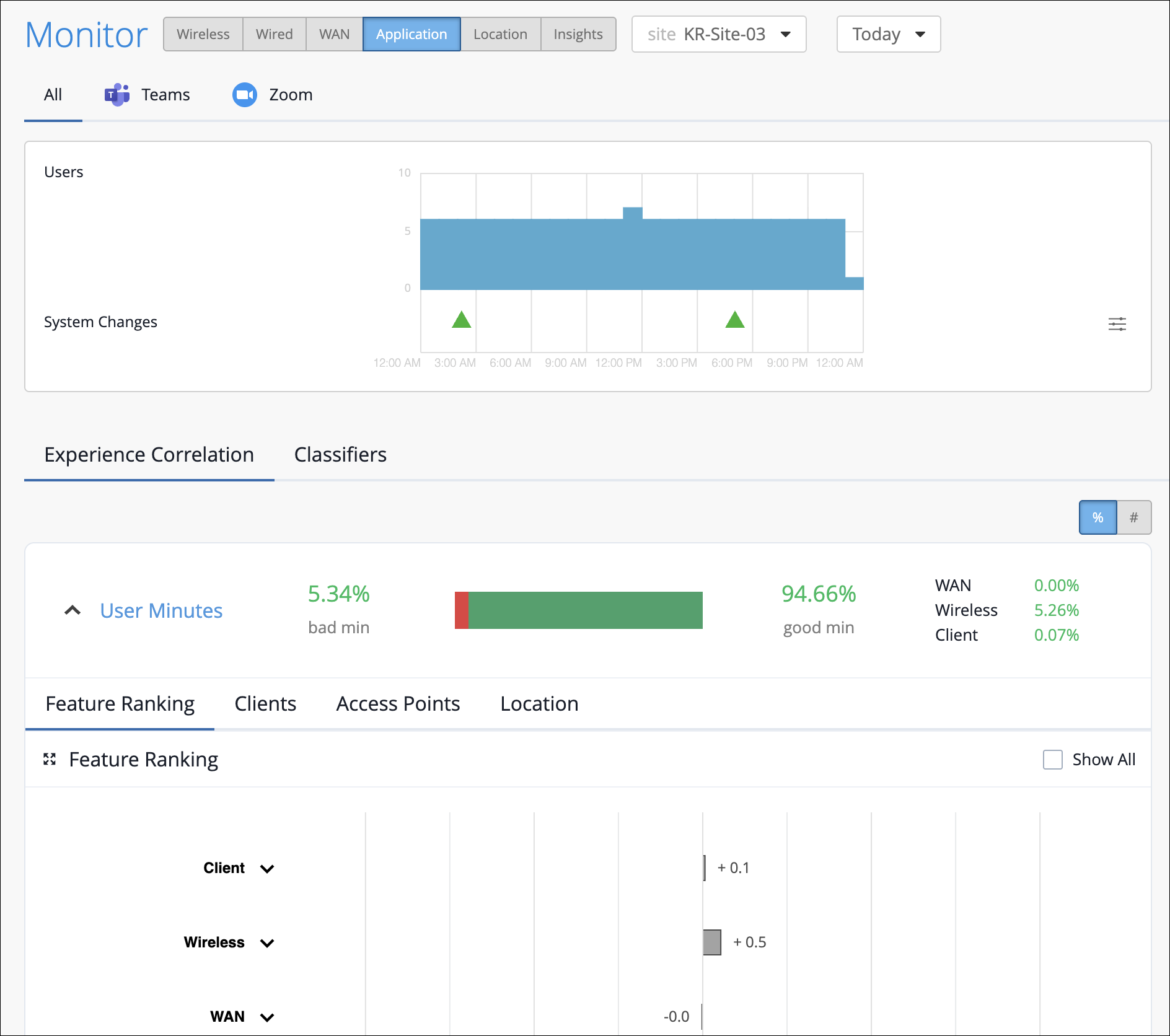
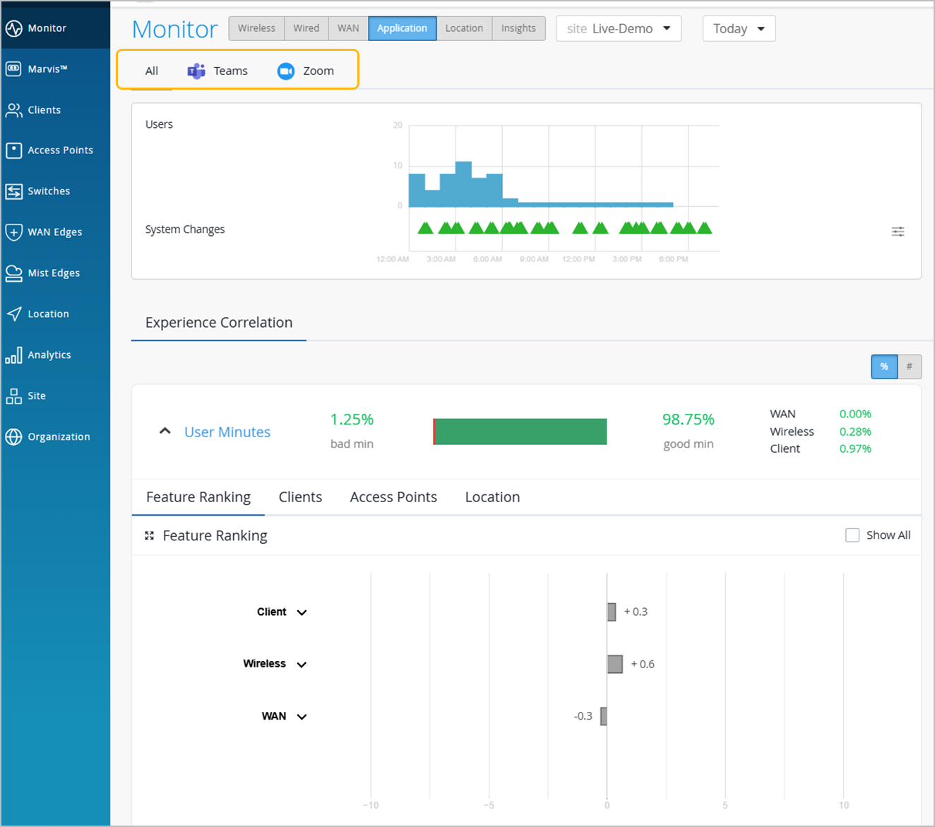
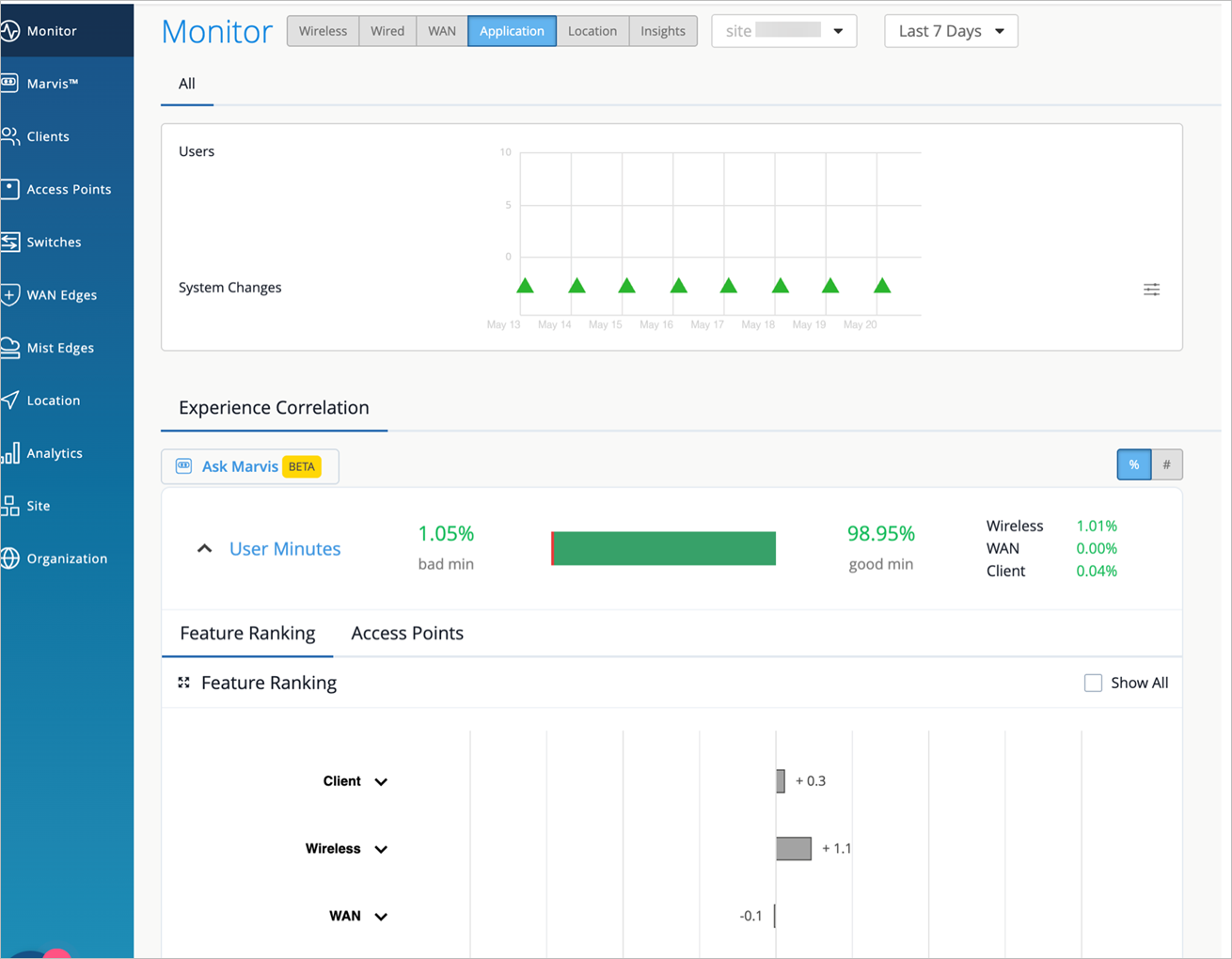
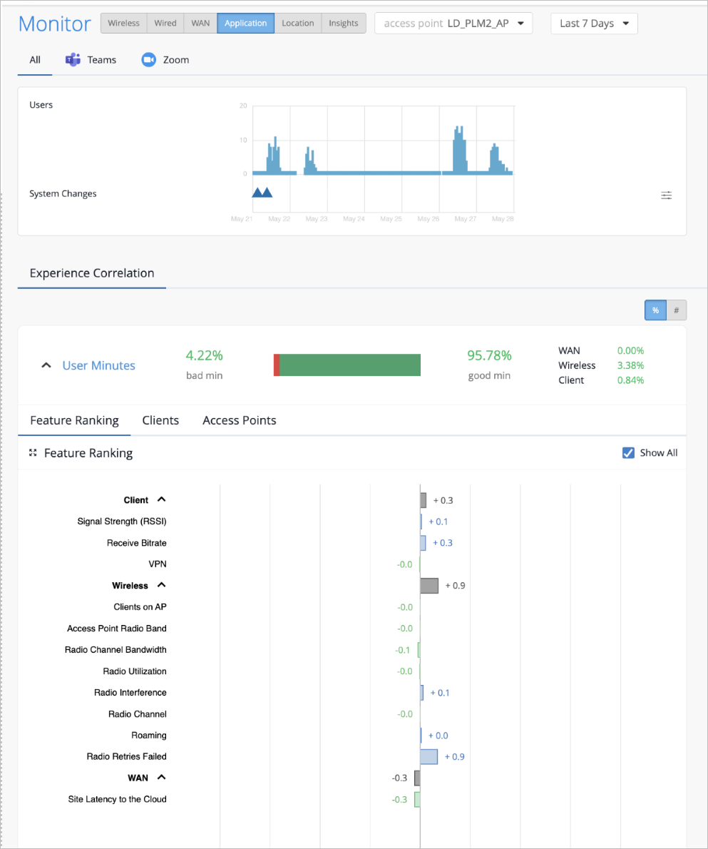
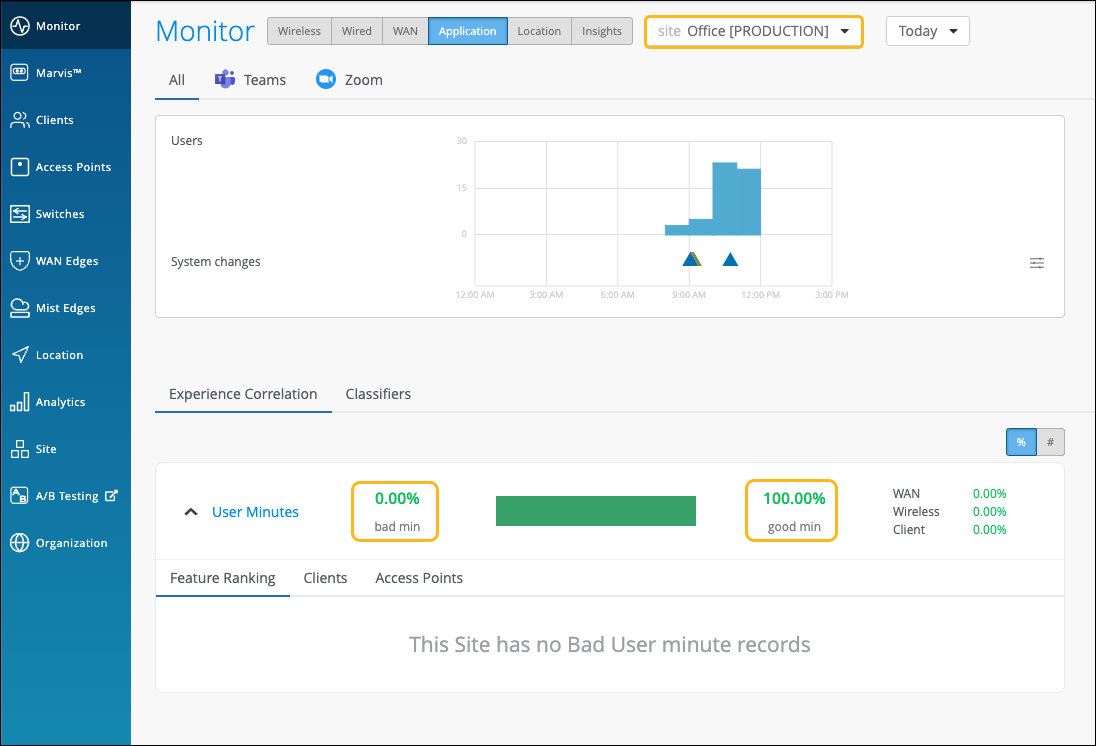
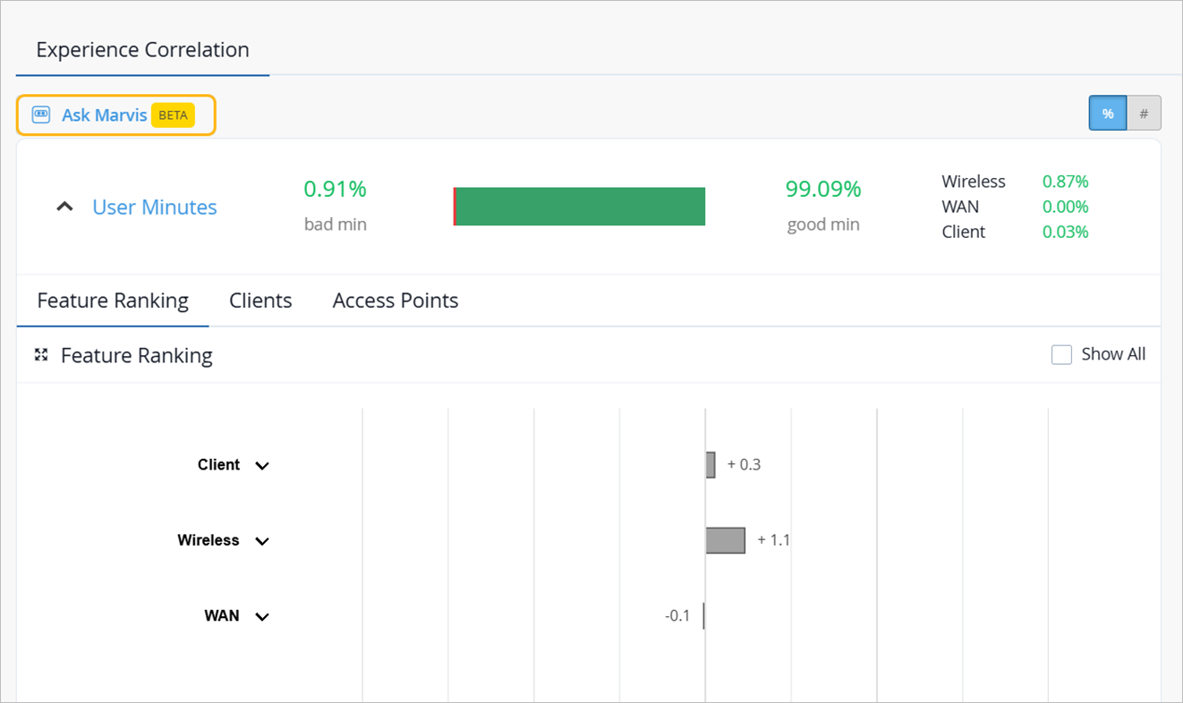
The Experience Correlation section provides an aggregate of the total good and bad user minutes experienced by all users in a site for a specific duration. It also provides granularity by providing a breakup of the bad user minutes based on the factors that contributed to it—WAN, wireless, or client.
To view the site-level application correlation, select the site and the duration. Here’s an example. You can see the good and bad user minutes listed for the site. You can also see the distribution of the bad user minutes across the WAN, Wireless, and Client categories, with WAN contributing the most.
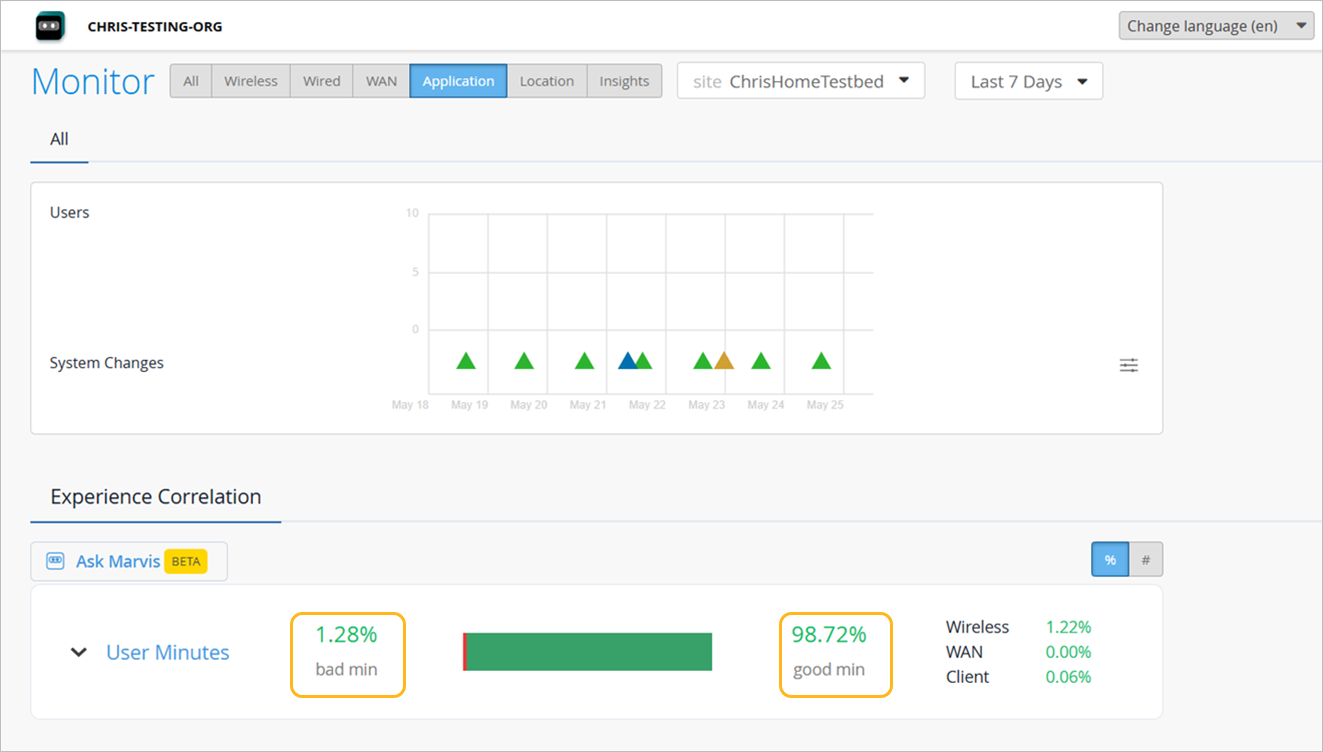
You can click ^ to further expand User Minutes to view the following information:
-
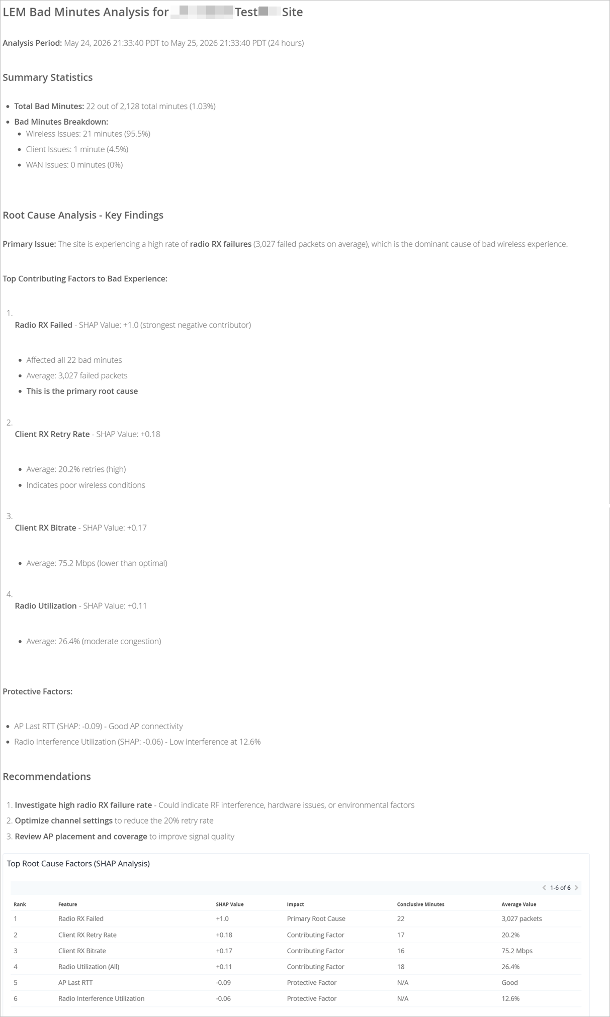
Feature ranking—Provides a Shapley feature ranking graph computed based on the latency, packet loss, and jitter for every user minute. The X axis indicates the contribution score and the Y-axis lists the main features under the Wireless, WAN, and client categories. You can expand each category to display the main features or use the Show All check box to expand all the categories. As shown in the following example, you can expand the Client, Wireless, and WAN categories to drill down to the network feature that is contributing the most to the issue.
Each contributing feature for bad user minutes is ranked in terms of the additional latency that it adds to the call. The increase in latency for each contributing feature is measured against the site average latency.
Additionally, the graph also shows the conclusive minutes, which represent the number of minutes during which a specific feature was identified as one of the causes for a poor user experience. While the Shapley ranking indicates how strongly a feature contributed to the user experience at a given minute, it does not indicate how often the feature was the main cause for the issue. Each network feature in the SHAP feature ranking graph shows the number of minutes during which that feature was clearly identified as a contributor to poor user experience. This makes it significantly easier to identify the issues that require immediate attention.
In the following example, you’ll notice that WAN is contributing the most to the issue.
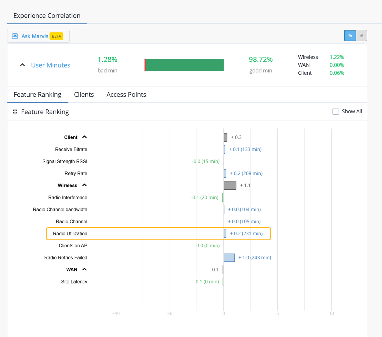
The graph provides the contribution score of a feature relative to the other features. It also shows the aggregate contribution score for a feature category (wireless, client, and WAN).
When you expand the categories, you see that the site latency is the major contributing factor to the increased call latency. Based on this information, you can look at the site WAN uplink metrics to confirm the issue and take necessary action.
-
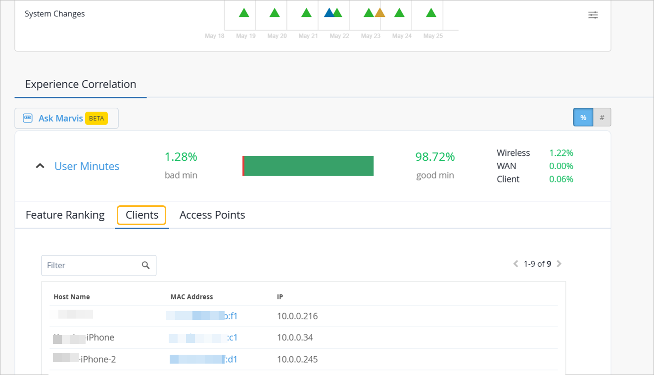
Clients—The Clients tab displays the users that experienced bad user minutes and lists the number of bad call occurrences. Click the MAC address to go into the individual client insights page to view the meeting details, Shapley feature ranking, and pre and post connection metrics for the client. If you look through the list of affected clients for a specific duration (for example, last 24 hours, yesterday, 7 days), you can identify clients that faced a bad user experience consistently. You can also obtain information by entering ‘list bad zoom calls for last 7 days’ or ‘list bad Teams calls for last 7 days’ in the Marvis conversational assistant. You can also view the details for a site or a specific user—for example, ‘list bad zoom calls for host-abc for last 7 days’.
-
Access Points—Shows the APs that the users were connected to when issues occurred. You can click the MAC address of an individual AP to view the insights.
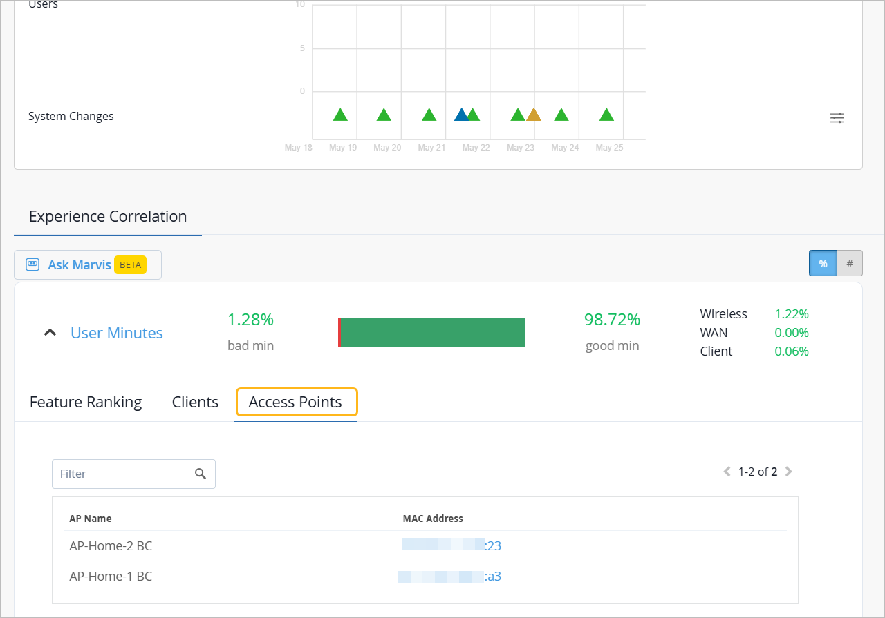
You can also select the individual AP from the drop-down list on the top. Juniper Mist will list the feature ranking specific to the selected AP and its connected clients that experienced the issue.
In the following example, the users connected to the selected AP did not experience any bad user minutes.
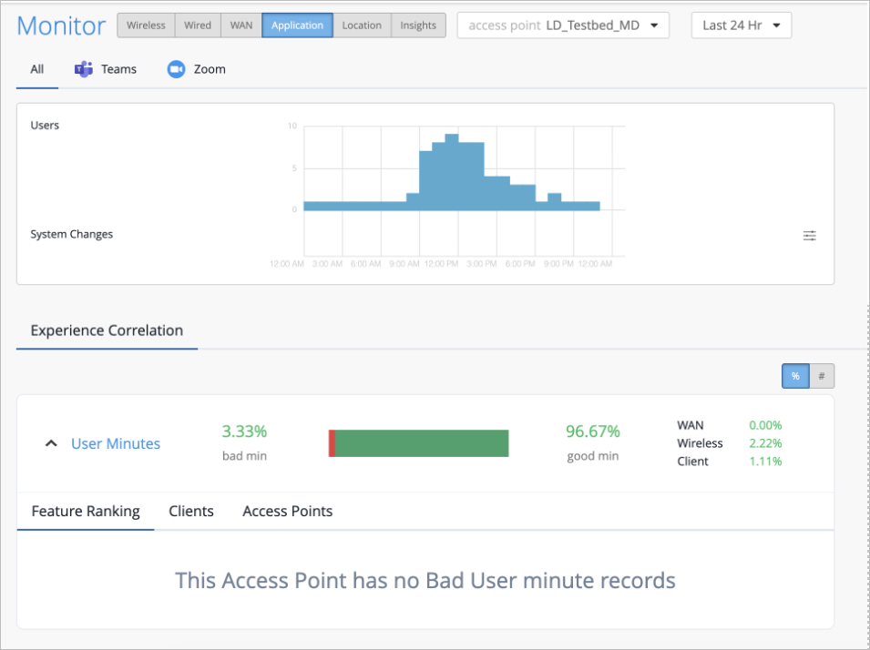
If all users connected to an AP do not experience any bad user minutes, then you'll see the page like the following example.
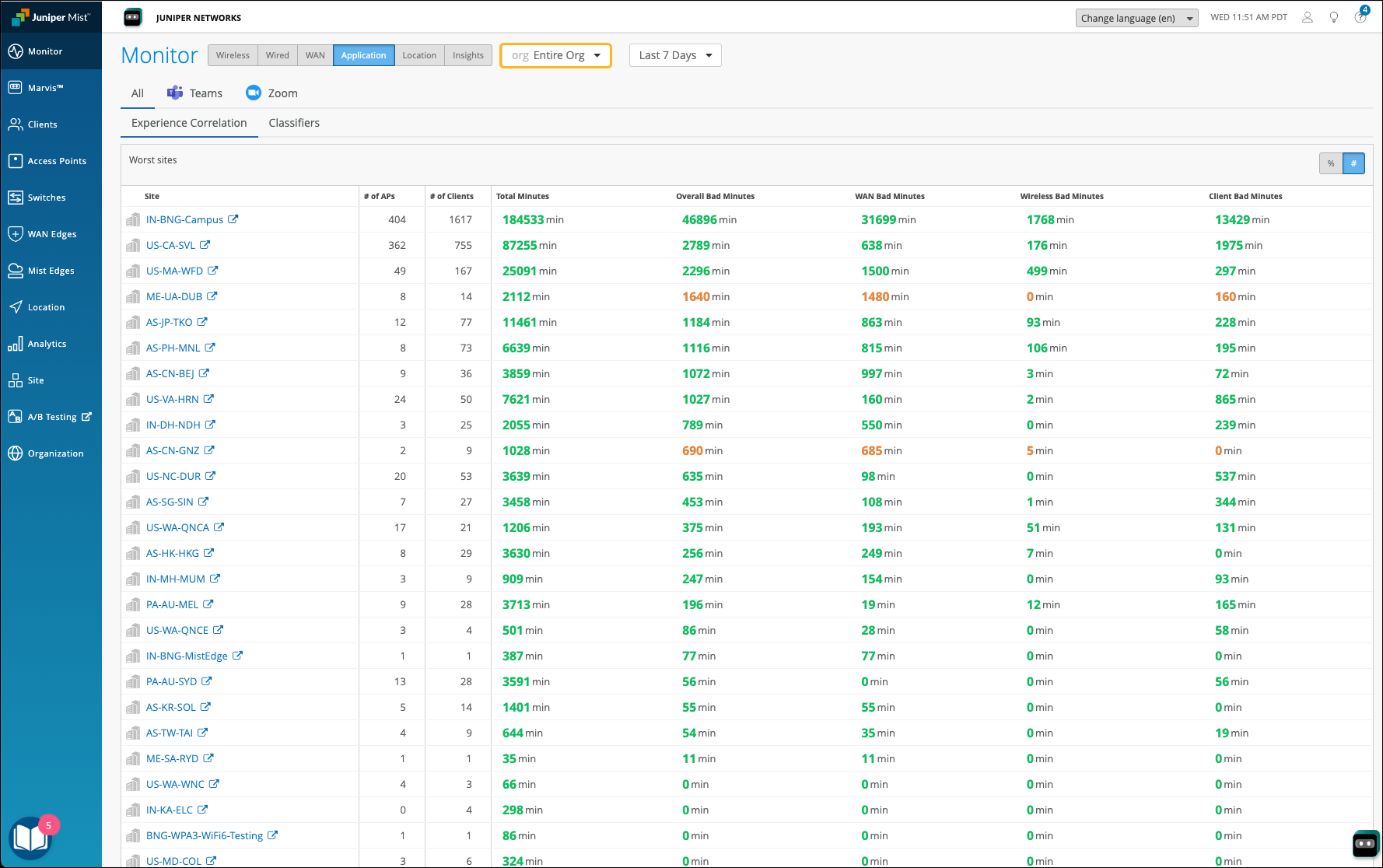
Organization-Level Application Experience Correlation
Juniper Mist also provides an aggregated view of all affected sites at an organization level. Note that this view is available only if you have integrated Zoom and Teams. Using this data, you can identify sites where users are facing issues consistently for a specific duration. You can also determine the dominant feature for the bad experience along with the total number of clients and APs involved.
In the Application Experience Correlation page, select the organization and time duration for which you want to view the data.
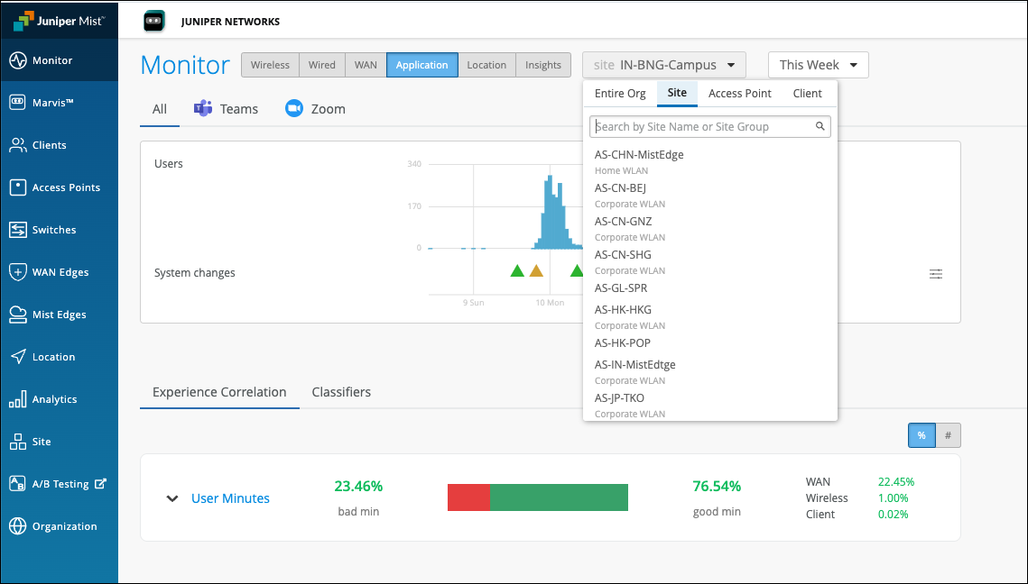
You’ll see a list of all sites that experienced bad user minutes. You can click a site to view the details.
In the following example, you see the sites with bad user experience and the total bad minutes for the WAN, Wireless, and Client categories. At an organization level, this type of data helps the networking teams to enhance and optimize the network, WAN links and any increased client CPU or memory utilization that could be causing the problem.
Zoom and Teams applications are sensitive to any network changes. Viewing application performance at an organization level is essential for assessing and improving the user experience.
Troubleshoot Using Ask Marvis
The Application SLE page has an Ask Marvis option that provides visibility into the bad user minutes, clearly identifying the underlying root causes, along with the contribution of each feature.
This option enables you to evaluate site-level performance and determine whether issues are related to wireless, WAN, or client-related factors. With these insights, you can take targeted corrective actions and monitor whether the total bad user minutes for the site decrease.