Troubleshoot Zoom Sessions Using Shapley Feature Ranking
Get started using the Shapley feature rankings on the Client Insights page.
You can use Shapley feature ranking to troubleshoot Zoom sessions. Shapley feature ranking is a technique that determines the average marginal contribution of each feature to the user experience. It takes into account all possible permutations of features to generate a Shapley value that indicates a feature’s contribution.
Juniper Mist™ uses the Shapley feature ranking technique to rank the impact of each feature on Zoom calls. Here, features indicate network characteristics such as received signal strength indicator (RSSI), latency, jitter, and so on. The Shapley feature ranking is computed for every minute of user experience during Zoom sessions. This ranking helps you to quickly identify the WAN, wireless, and client issues that impact Zoom calls.
You can see information about Shapley feature ranking from the Client Insights page, which lists details of all the meetings that a user joined over a certain period of time. See View Client Insights for information about how you can access and view the Client Insights page. The Client Insights page provides:
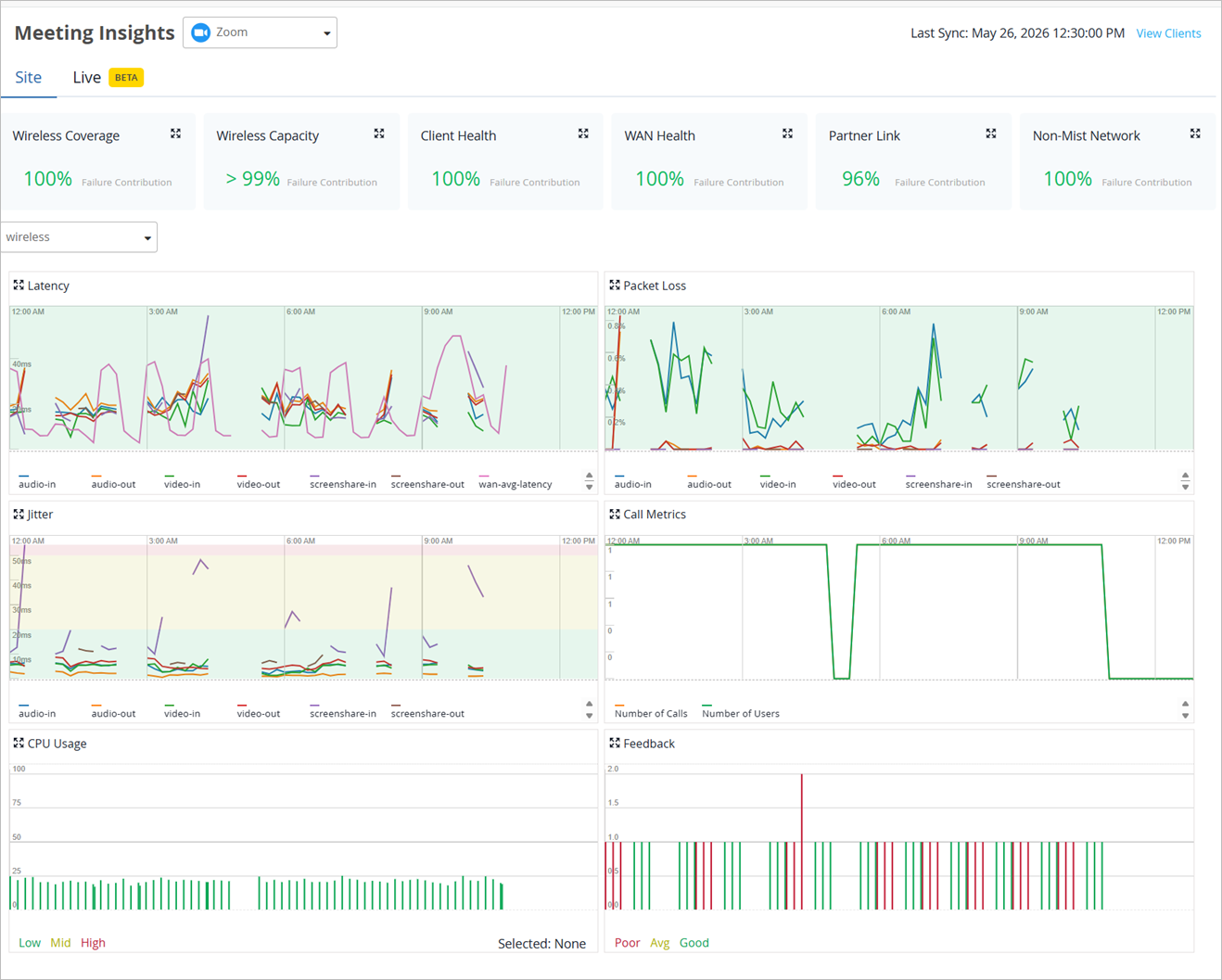
Meeting Insights—This section provides time series graphs depicting RSSI, latency, packet loss, and jitter. For more information, see Meeting Insights.
Meeting Details
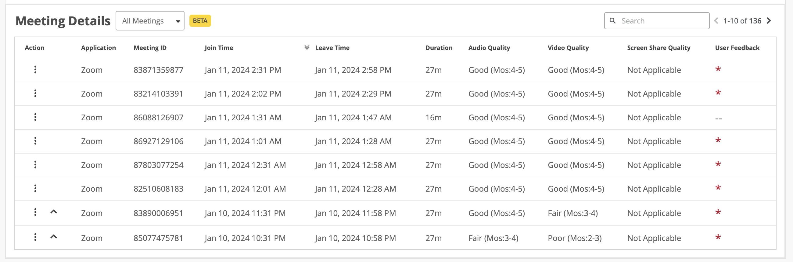
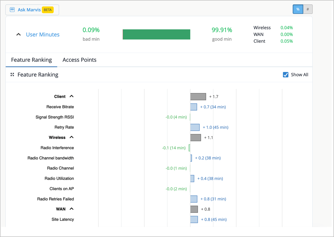
This section provides a Shapley feature ranking graph for each meeting which reports bad user experiences. In this example, the last two rows include the caret symbol (^), which indicates that the meeting has a Shapley feature ranking graph associated with it.
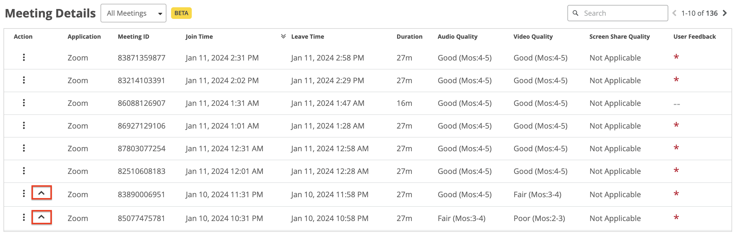
Click ^ to view the Shapley feature ranking graph.
Here is an example that shows feature ranking for bad user minutes. The X axis indicates the contribution score and the Y-axis lists the main features under the Wireless, WAN, and client categories.
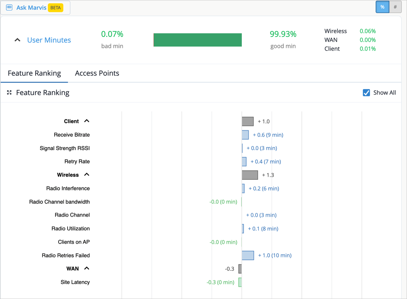
You can expand each category to display the main features or use the Show All checkbox to expand all the categories. The graph provides the contribution score of a feature in comparison to the other features. It also shows the aggregate contribution score for a feature category (wireless, client, and WAN). The feature ranking is computed based on the latency, packet loss, and jitter for every user minute.
This graphical representation enables you to quickly identify the network segment that needs attention.
If you observe several minutes of bad user experience in a Zoom meeting, you can select the date and time of that meeting to view the associated feature ranking computation. You select the date and time from the drop-down list above the graph.
In the example shown above you can see that the dominant feature category contributing to the issue is Wireless. In the expanded view of the graph, you can see that among the Wireless features, radio utilization is causing a major impact.
Here’s another example illustrating that the site latency feature under WAN has the most significant influence on user experience. Site latency can be caused by various factors such as network speed and server performance. You can look at the site WAN uplink metrics to confirm the issue and take necessary action.