Application SLEs
Use the application experience and service-level expectations (SLE) dashboard to assess the service levels for user-impacting factors such as signal strength, RF channel capacity, client CPU utilization, and more.
Overview
Monitoring network performance is crucial for any organization as a healthy network is key to the performance of applications. Monitoring the network performance requires you to assess multiple network aspects using reliable performance indicators. However, efficient assessment and reporting of network performance at an organization level continues to be a challenge.
Juniper Mist™ provides a cloud-to-cloud integration with Zoom and Microsoft Teams to analyze, correlate, and classify collaboration user experience based on correlation of network parameters both at the site level and organization level. Using this information, Juniper Mist provides an assessment of the quality of user experience on your network. Zoom and Microsoft Teams applications are sensitive to any network changes and play a key role in determining the user experience. A measure of how well these application user minutes are performing acts as a third-party report card for your network. The absence of any Zoom and Teams issues on a network indicates that all other user applications are probably performing well.
Juniper Mist identifies various factors contributing to a bad user experience and provides a site-level or organization-level experience correlation of the bad user minutes experienced by all users. The Application Experience dashboard provides a Shapley feature ranking that helps determine the contribution of network parameters towards a negative user experience.
In addition, service level metrics provide visibility into how the users are experiencing the network and help you to proactively address issues.
Finding the Application Experience Correlation and Classifiers View
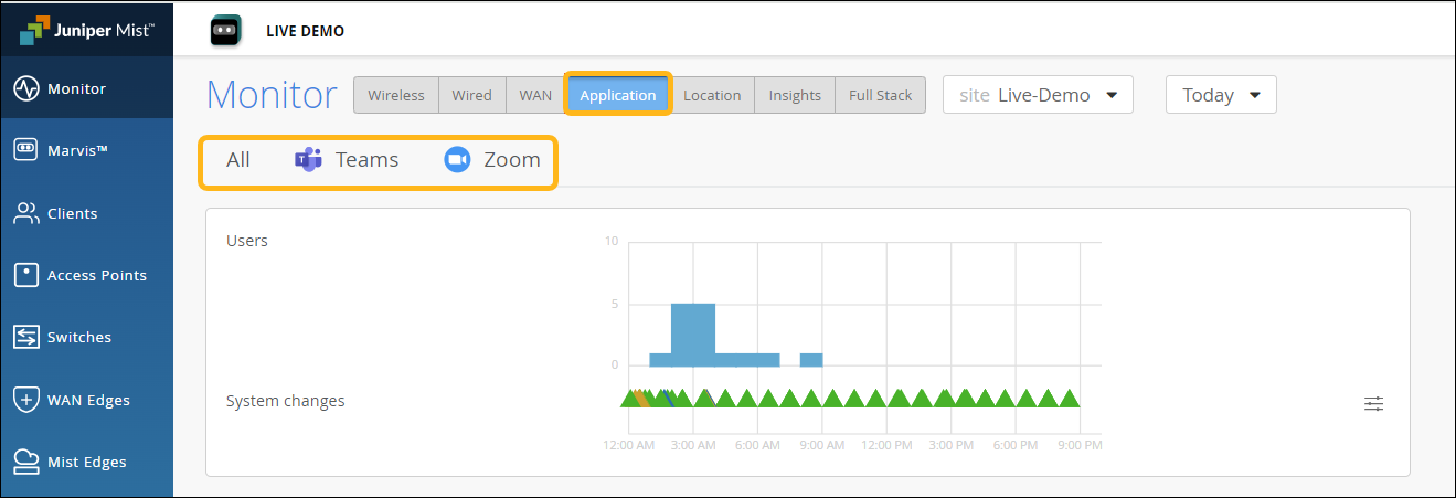
To find the Application Experience Correlation and Classifiers view, select Monitor > Service Levels from the left menu of the Juniper Mist portal, and then select the Application button.
Your subscriptions determine which SLE buttons appear. The Application button is available when you have a Marvis for Wireless subscription. In addition, you'll also need to integrate your Zoom or Teams account with Juniper Mist. See Zoom Integration Overview and Microsoft Teams Integration Overview.
Application Experience Correlation
Juniper Mist collects information such as latency, packet loss, and jitter experienced by every user during a Teams or Zoom session. It correlates this information against the network parameters to identify the root cause for a bad user experience. Juniper Mist then aggregates this individual user information to provide insights into the quality of Teams or Zoom application user experiences at a site or an organization level.
- Experience Correlation
- Site-Level Application Experience Correlation
- Organization-Level Application Experience Correlation
Experience Correlation
Experience correlation provides visibility into the performance of Teams and Zoom applications at a site or an organization level. With detailed insights into the factors impacting the application quality, the correlation data helps network administrators to quickly identify issues causing bad user experiences across a site or an entire organization.
Use the feature ranking graph to identify which features contributed the most to an issue, Also view the insights for the impacted clients and the APs that they're connected to. If clients experience degraded Zoom or Teams call quality, use the experience correlation at the site level to easily identify which APs are involved.
As Juniper Mist provides the correlation based on the latency, loss, and jitter data it fetches from the third-party applications (Zoom and Teams), fewer bad user minutes also serve as a third-party validation of your network.
The feature ranking (Shapley) helps you to troubleshoot Zoom or Teams sessions by ranking the impact of each network feature on the sessions. You can read more about the Shapley feature ranking in Troubleshoot Zoom Sessions Using Shapley Feature Ranking.
To understand how you can integrate the Teams and Zoom applications with Juniper Mist, see:
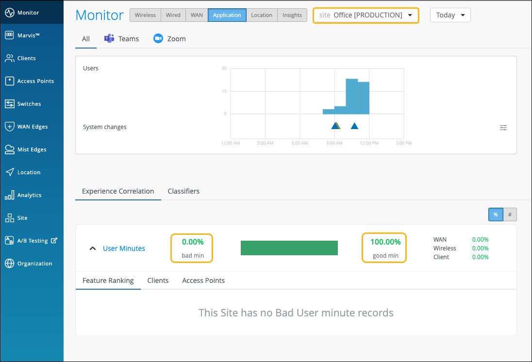
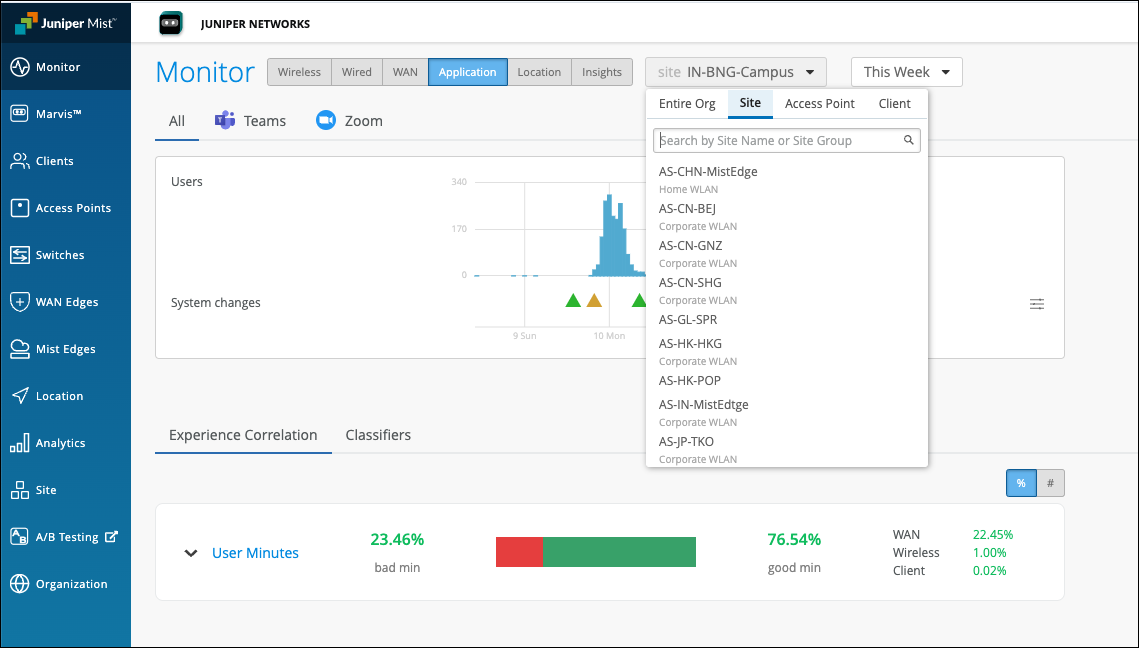
Site-Level Application Experience Correlation
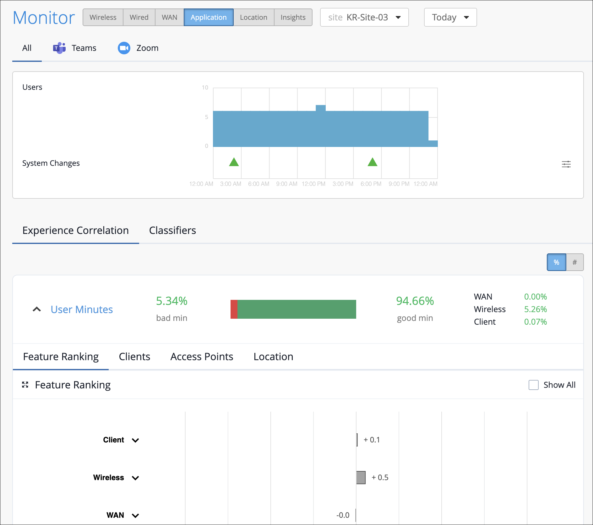
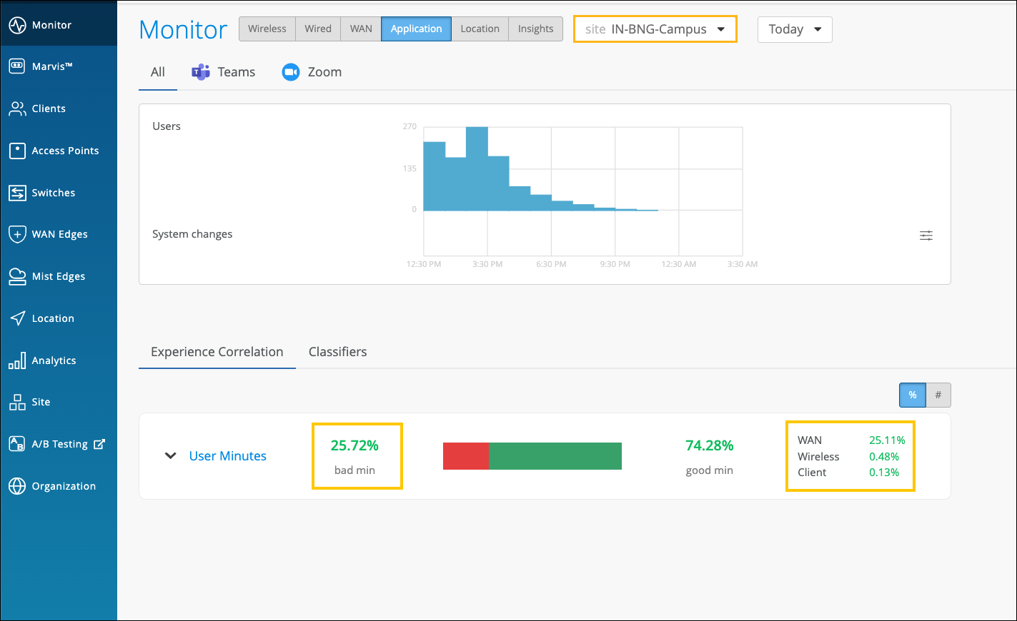
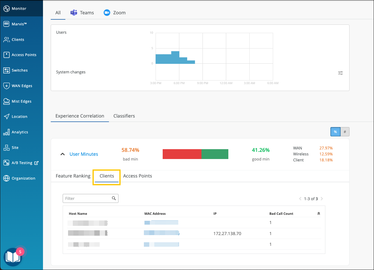
The Experience Correlation section provides an aggregate of the total good and bad user minutes experienced by all users in a site for a specific duration. It also provides granularity by providing a breakup of the bad user minutes based on the factors that contributed to it—WAN, wireless, or client.
To view the site-level application correlation, select the site and the duration. Here’s an example. You can see the good and bad user minutes listed for the site. You can also see the distribution of the bad user minutes across the WAN, Wireless, and Client categories, with WAN contributing the most.
You can further expand User Minutes to view the following information:
-
Feature ranking—Provides a Shapley feature ranking graph computed based on the latency, packet loss, and jitter for every user minute. As shown in the following example, you can expand the Client, Wireless, and WAN categories to drill down to the network feature that is contributing the most to the issue.
Each contributing feature for bad user minutes is ranked in terms of the additional latency that it adds to the Zoom or Teams call. The increase in latency for each contributing feature is measured against the site average latency.
In the following example, you’ll notice that WAN is contributing the most to the issue.
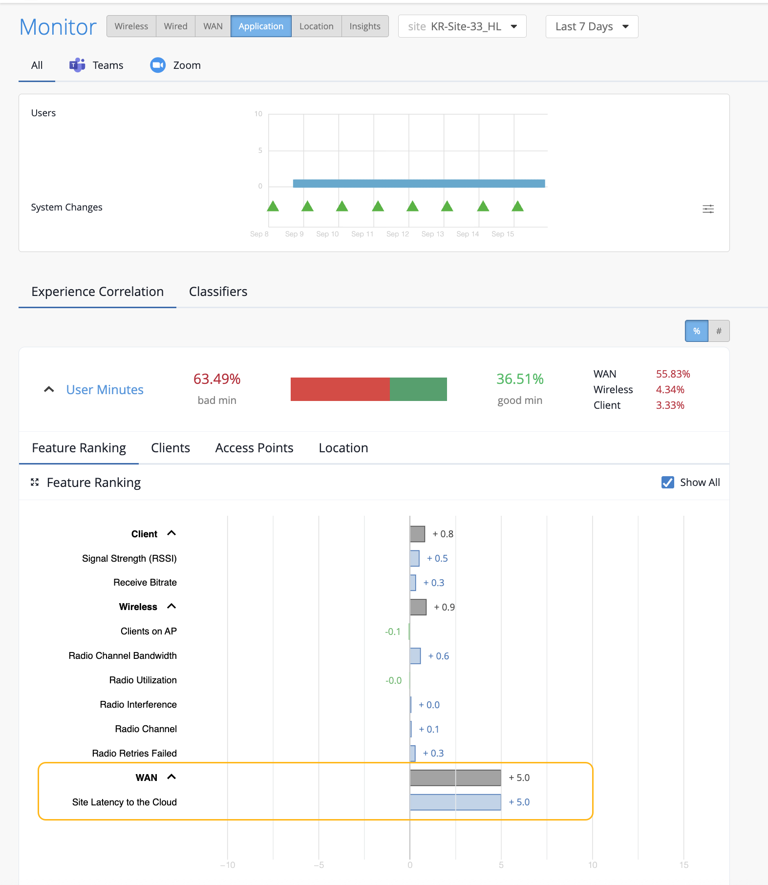
When you expand the categories, you see that the site latency is the major contributing factor to the increased call latency. Based on this information, you can look at the site WAN uplink metrics to confirm the issue and take necessary action.
-
Clients—The Clients tab displays the users that experienced bad user minutes and lists the number of bad call occurrences. Click the MAC address to go into the individual client insights page to view the meeting details, Shapley feature ranking, and pre and post connection metrics for the client. If you look through the list of affected clients for a specific duration (for example, last 24 hours, yesterday, 7 days), you can identify clients that faced a bad user experience consistently. You can also obtain information by entering ‘list bad zoom calls for last 7 days’ or ‘list bad Teams calls for last 7 days’ in the Marvis conversational assistant. You can also view the details for a site or a specific user—for example, ‘list bad zoom calls for host-abc for last 7 days’.
-
Access Points—Shows the APs that the users were connected to when issues occurred. You can click the MAC address of an individual AP to view the insights.
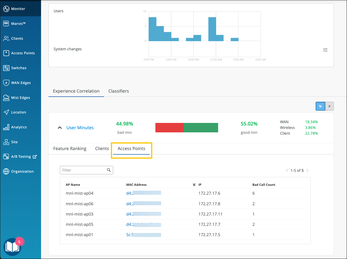
You can also select the individual AP from the drop-down list on the top. Juniper Mist will list the feature ranking specific to the selected AP and its connected clients that experienced the issue.
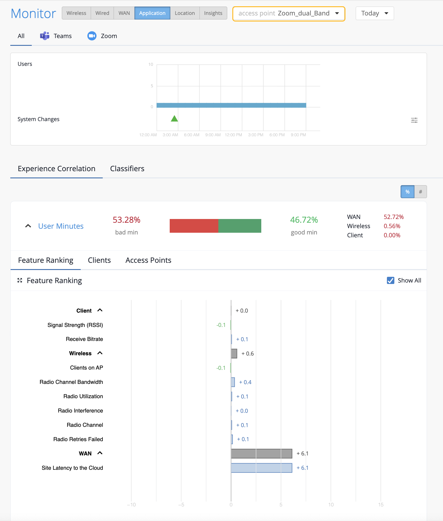
In the following example, the users connected to the selected AP did not experience any bad user minutes.
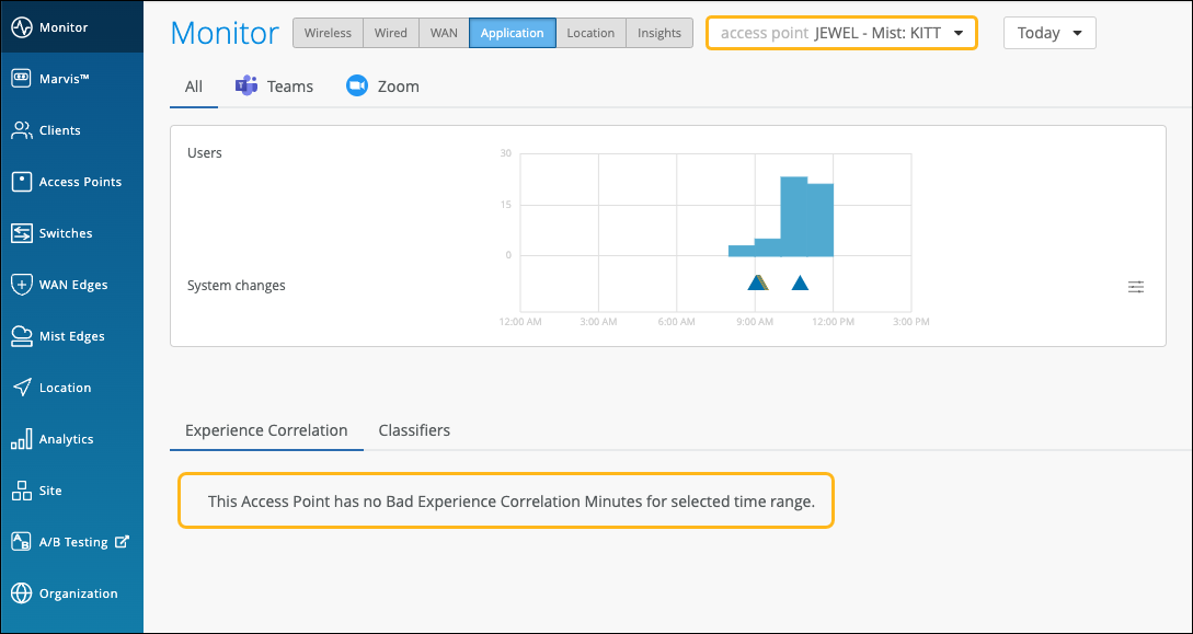
If all users connected to an AP do not experience any bad user minutes, then you'll see the page like the following example.
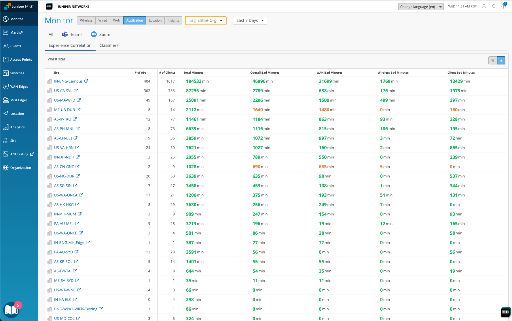
Organization-Level Application Experience Correlation
Juniper Mist also provides an aggregated view of all affected sites at an organization level. Using this data, you can identify sites where users are facing issues consistently for a specific duration. You can also determine the dominant feature for the bad experience along with the total number of clients and APs involved.
In the Application Experience Correlation page, select the organization and time duration for which you want to view the data.
You’ll see a list of all sites that experienced bad user minutes. You can click a site to view the details.
In the following example, you see the sites with bad user experience and the total bad minutes for the WAN, Wireless, and Client categories. At an organization level, this type of data helps the networking teams to enhance and optimize the network, WAN links and any increased client CPU or memory utilization that could be causing the problem.
Zoom and Teams applications are sensitive to any network changes. Viewing application performance at an organization level is essential for assessing and improving the user experience.
Application SLE Blocks
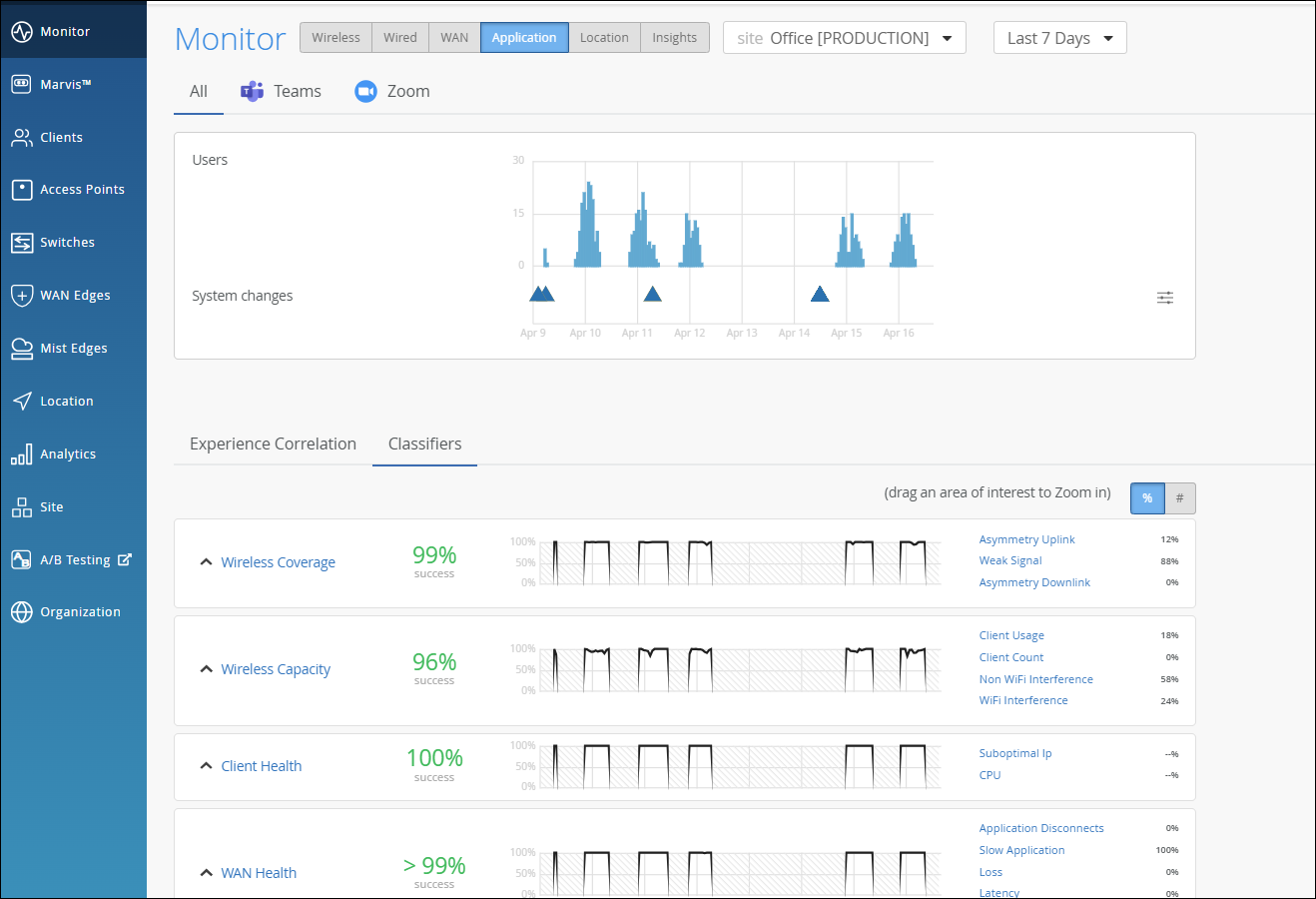
As shown in the following example, each SLE block provides valuable information.
-
At the left, you see that this SLE has a 94 percent success rate. If you select the Value filter button, you'll see a number instead.
-
At the center, the timeline shows variations across the time period. You can hover your mouse pointer over any point to see the exact time and SLE outcome.
-
At the right, the classifiers show the percentage of the issues that were attributed to each root cause. In this example, 46 percent of issues were attributed to non-Wi-Fi interference. The remaining issues were due to Wi-Fi Interference and Client Usage.
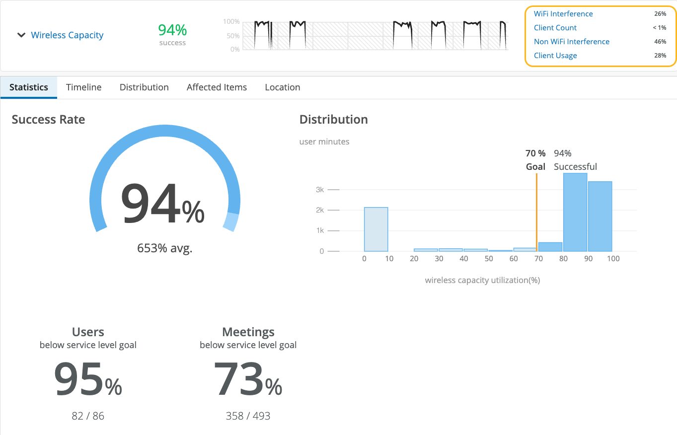
-
By clicking the down arrow next to the SLE name, you can see additional information, such as the timeline, distribution, affected items, and the client locations on your floorplan.
See the following table for more information about the application SLEs and classifiers.
| SLEs | SLE Descriptions | Classifiers | Classifier Descriptions |
|---|---|---|---|
| Wireless Coverage (for Applications) |
Juniper Mist tracks active clients' Received Signal Strength Indicator (RSSI), as measured by the access point for the duration of the Zoom or Teams call. A low RSSI impacts the quality of the audio or video during a Zoom or Teams call. You can use this SLE to determine if you have sufficient access points. |
Weak Signal |
Unknown causes of weak signal |
| Asymmetry Downlink |
Weak signal due to asymmetric transmission strength from the AP to the client |
||
| Asymmetry Uplink |
Weak signal due to asymmetric transmission strength from the client to the AP Asymmetry can occur for various reasons, such as clients being too far from the AP. |
||
| Wireless Capacity (for Applications) |
Juniper Mist monitors the percentage of the total RF channel capacity that is available to clients for the duration of the Zoom or Teams call. When the capacity threshold for a Zoom or Teams user minute is less than MOS 3.0, Juniper Mist sorts the issues into classifiers. |
Non-Wi-Fi interference |
Low capacity due to interference from non-Wi-Fi sources |
| Wi-Fi interference |
Low capacity due to wireless interference |
||
| Client Count | Low capacity due to a high number of clients | ||
| Client Health (for Applications) |
Juniper Mist monitors the CPU utilization and routing paths to identify issues affecting application performance. |
Suboptimal IP | Latency and call quality issues due to a suboptimal network path, as might happen when the client is directed to a geographically distant server |
| CPU | Low resource availability due to high CPU utilization | ||
| WAN Health (for Applications) | Juniper Mist monitors the network performance of the Zoom or Teams application to determine if there is any performance degradation. This SLE can help you understand the end users’ experiences when accessing the applications. | Application Disconnects | Disconnects due to network issues, ISP-related issues, or device-specific issues |
| Loss | Issues due to packet loss | ||
| Slow Application | Issues involving slow responses to application requests | ||
| Latency | Lag interrupting video and audio streams | ||
| Jitter | Inconsistent packet transmit times | ||
| Partner Link | Juniper Mist assesses performance from network co-participants that can contribute to issues. | Co Participant |
|