Understanding the Device-Level Sustainability Dashboard
Use the Device-Level Sustainability Dashboard to gain visibility into how much power a network device in your Data Center Director-managed data center consumes, how efficiently it operates under different traffic conditions, and where energy optimization is possible without impacting device performance. The sustainability analytics are organized into four tabs: Overview, Power Supply, Thermal Profile, and Recommendation.
About the Overview Tab
The Overview tab provides a high-level summary of a device's energy usage, efficiency, port activity, and potential energy savings.
Use this tab to quickly assess device's key energy metrics, analyze power-throughput behavior, identify ports contributing to idle power consumption, and evaluate the potential energy savings achievable by applying the recommended actions.
-
View Key Energy Metrics for a Device
The summary cards display the key energy metrics for the device.
Use these cards to monitor how much power the device consumes, how that translates into energy cost and greenhouse gas (GHG) emissions, and how usage trends vary over time.
Figure 1: Device-level Summary Cards
Table 1: Energy Metrics Description Metric Description Unit Notes Power Usage Real-time power draw of the device Kilowatts (kW)
The timestamp indicates when the data was last updated. Energy Consumption Energy consumed by the device during the selected time range Kilowatt-hour (kWh)
The system aggregates power usage for a rolling one hour interval to calculate energy consumption
GHG Emission Estimated greenhouse gas emission generated by the device during the selected time range gCO₂e (grams of CO₂ equivalent)
Calculated based on the carbon intensity you configure at the organization or site level. If not configured, a default value is used to calculate the emission. See, Configure Sustainability Settings for the Organization or Configure Sustainability Settings for a Site.
Cost Estimated cost of energy consumed by the device during the selected time range Region‑specific currency If cost per unit is not configured at the organization or site level, this field appears blank. See, Configure Sustainability Settings for the Organization or Configure Sustainability Settings for a Site.
Note:-
The values displayed for Energy Consumption, GHG Emissions, and Cost represent aggregated values for the selected time range. The timestamp indicates the selected time range. By default, the data is displayed for the last 30 days.
-
The units displayed for Power Usage, Energy Consumption, and GHG Emissions are dynamically scaled based on the magnitude of the value.
Trend graphs for Energy Consumption, GHG Emission, and Cost are available for the device.
Click any of these three summary cards to view their historical trend for the selected time range in the right pane. The x-axis represents the selected time range and y-axis represents the selected metric's values. Hover over any point on the graph to see the exact metric value for that timestamp.
Figure 2 shows the power cost trend for the last 30 days. Hover over the trend line to see the cost for a specific timestamp in a popover.
Figure 2: Cost Trend Graph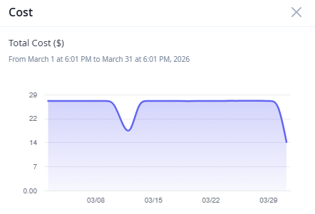
-
-
View Potential Energy Savings For the Device
The Potential Energy Savings widget provides a high-level summary of the projected energy savings, reduction in emission, and cost savings that a device can achieve if all the available optimization recommendations are applied.
Figure 3: Potential Energy Savings Widget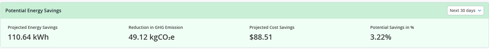
The projections are displayed based on the selected time range. The available time ranges are Today, Tomorrow, Next 7 Days, and Next 30 Days. By default, the widget displays projections for Next 30 Days.
For field descriptions, see Table 2.
Table 2: Potential Energy Savings Widget Energy Metric Description Data Availability Projected Energy Savings Estimated reduction in energy consumption that the device can achieve by applying the available energy optimization recommendations. The projection is displayed for the selected time range. Reduction in GHG Emission Estimated reduction in greenhouse gas emissions the device can achieve by applying the available energy optimization recommendations. The value is calculated based on the projected energy savings and carbon intensity configured at the organization or site level.
Note:If the carbon intensity is not configured at the organization or site level, a default value is used to calculate the reduction in GHG emissions.
See, Configure Sustainability Settings for the Organization or Configure Sustainability Settings for a Site.
The projection is displayed for the selected time range. Projected Cost Savings Estimated cost savings that the device can achieve by applying the available energy optimization recommendations. The value is calculated based on the projected energy savings and the average power cost configured at the organization or site level.
Note: If the Projected Cost Savings appears blank, verify that the Average Power Cost is configured at the organization or site level.See, Configure Sustainability Settings for the Organization or Configure Sustainability Settings for a Site.
The projection is displayed for the selected time range. Potential Savings in % Percentage of energy savings the device could have achieved in the last 24 hours by applying all the available energy optimization recommendations.
The value is calculated by comparing the potential energy savings over the last 24 hours with the total energy consumed during the same period.
The projection is displayed for the last 24 hours. Navigate to the Recommendation tab to review the available energy optimization suggestions and the potential energy savings for each recommendation. See, About the Recommendation Tab.
-
Monitor a Device's Power vs Throughput Patterns
The Power vs Throughput line graph visualizes the historical correlation between a device's power usage and its throughput over a selected time range.
Use this graph to analyze how efficiently the device converts traffic load into power usage, identify idle power consumption, analyze historical patterns, such as, peak vs off-peak behavior, and identify opportunities for energy optimization.
Figure 4: Power vs Throughput Graph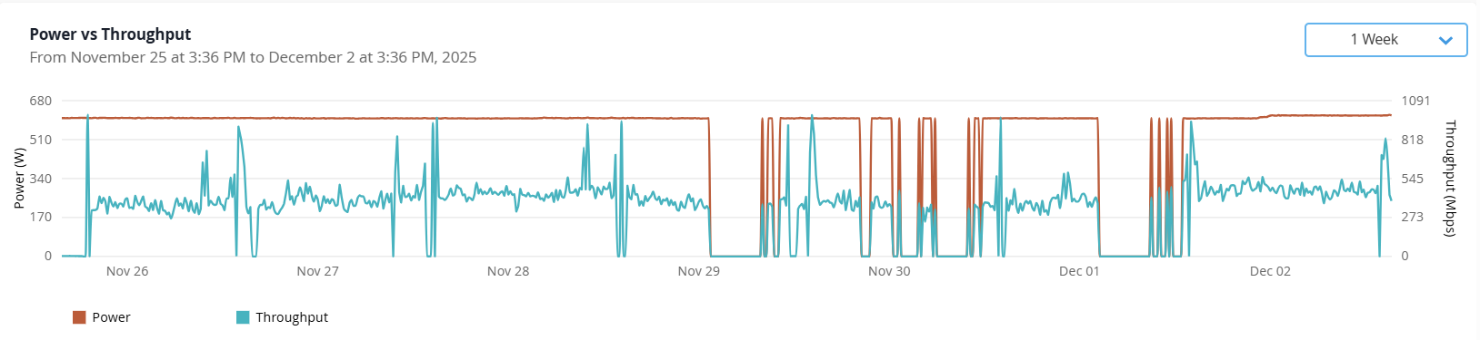
Table 3: Graph Description Axis Metric Description Color Unit Left y-axis Power Shows the aggregated power usage of the device over the selected time range. Note:Click the Power legend to view only the power trend line on the graph. Double click the metric to clear the filter.
Brown Watts (W) Right y-axis Throughput Shows the aggregated traffic handled by the device over the selected time range. Traffic may vary significantly based on network activity.
Note: Click the Throughput legend to view only the throughput trend line on the graph. Double click the metric to clear the filter.Blue bps x-axis Time Range (Today, Yesterday, Last 7 Days, Last 30 Days, Custom)
Displays the selected time range. By default, it is set to Last 30 Days.
— Hours or Days Note:-
The metric legends available below the graph acts as filters. Click a metric to view only its trend line on the graph. Double click the metric to clear the filter.
By default, the trend lines for both metrics are displayed on the graph.
-
Hover over any point on the lines to view the exact power and throughput values for that timestamp.
Under normal operating conditions, power draw increases when throughput increases and reduces during low-traffic periods. However, most network devices have a relatively flat power curve due to always-on components such as forwarding planes, PSUs, transceivers, and cooling systems, as shown in Figure 5.
Figure 5: Sample Power vs Throughput Graph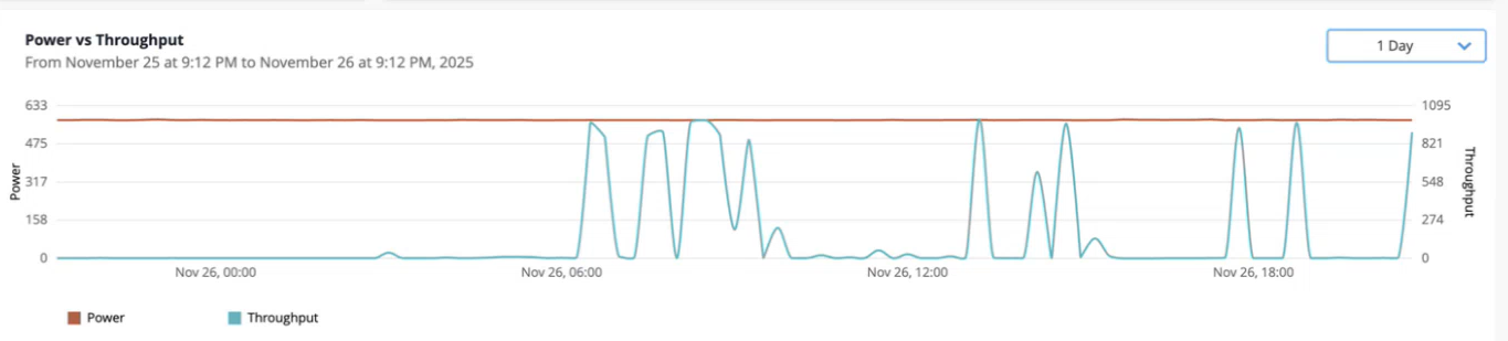
For example, in a stock exchange network, throughput spikes during trading hours and drops afterward. However, power usage remains almost constant. You can use the historical trends to schedule port shutdown during off-peak hours to reduce unnecessary power consumption.
Use the graph to:
-
Compare the device's power to traffic proportionality across time ranges
-
Identify idle power draw during low-traffic periods and plan optimization efforts
-
Compare device-level energy patterns across multiple devices
-
-
Monitor a Device's Per Port Peak and Off-Peak Traffic Patterns
The Per Port Peak / Off-Peak Traffic Monitoring heatmap shows the hourly traffic pattern for each port on the device for a rolling 24 hour window.
Note:The traffic is categorized based on the port utilization thresholds configured at the organization or site level. For more information, see Configure Port Threshold for the Organization, Configure Port Threshold for a Site.
Use this visualization to easily identify unused or lightly used ports that contribute to idle power consumption.
For devices that support multiple line cards, you can view hourly traffic pattern per line card.
Note: Currently, we support line card level traffic pattern visualization for the following platforms: PTX10016, PTX 10008, PTX10004, PTX10001-36MR.Select the Forecast checkbox to display hourly predicted traffic patterns for the next 24 hours.
Figure 6 shows the heatmap with the Forecast option enabled. The heatmap is split into two sections: current traffic pattern on the left and the forecasted traffic pattern on the right.
Figure 6: Per Port-Peak/ Off-Peak Traffic Heatmap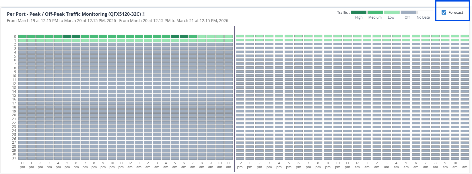
Forecasts are generated based on several days of historical port traffic data. Use the forecast to identify ports that show stable patterns of low utilization windows and schedule temporary port shutdowns.
Heatmap Components
-
Each row corresponds to a port on the device. The count varies by device model.
-
On modular devices with multiple line cards, ports are grouped by line card.
-
Each cell represents an hourly time slot for a rolling 24 hour window.
-
Hover over a tile to view the port number and traffic for that hour.
-
The timestamp above the heatmap shows the exact 24 hour time window for which the data is displayed.
When forecasting is enabled, timestamps are shown for both the current traffic and forecasted traffic.
-
Traffic intensity on each port is represented using gradients of green. See Table 4
Note:Traffic on the heatmap is categorized based on the port traffic thresholds you configure at the organization or site level.
For more information, see Configure Port Threshold for the Organization, Configure Port Threshold for a Site.
Table 4: Traffic Intensity Based on Configured Port Traffic Threshold Color Traffic Level Description Dark Green High Port is handling heavy traffic. Mild Green Medium Port is handling moderate traffic. Light Green Low Port is handling light traffic. Grey Off Port is unused. White No data No data available for the port. Use the heatmap to:
-
Identify unused ports (grey), which are candidates for shutdown recommendations. See, Optimize Energy Consumption by Shutting Down Unused Ports.
-
Identify unused line cards (grey), which are candidates for shutdown recommendations. See, Optimize Energy Consumption by Shutting Down Unused Line Cards.
-
Use forecasted traffic patterns to spot recurring low‑utilization windows and determine when specific ports can be shut down temporarily without impacting network traffic. See, Optimize Low Traffic Ports Based on Historical Traffic Patterns.
-
Identify ports with consistently low traffic (light green) that reduces device's energy efficiency and schedule port shutdown.
-
Map per-port trends to power-throughput behavior over time
For example, if a port remains light green or gray across multiple hours, and the device's power usage does not drop during those periods, the port is contributing to idle power draw.
-
About the Power Supply Tab
The Power Supply tab provides insights into the health, status, and efficiency of the power modules installed on the device. These modules are typically hot-swappable and often deployed in redundant configurations (N+1) to ensure power availability.
Network devices usually support multiple power modules to maintain uptime even if one module fails. Each module may connect to one or more input power sources, such as AC mains or DC battery. The number of module slots can vary depending on the device model and usually can be replaced without powering off the device.
Use the tab to monitor power module performance and redundancy, diagnose input feed issues, and plan upgrades or maintenance based on module health.
- View the Power Capacity of a Device
The Power Usage widget uses a progress bar to display the device’s maximum power capacity and its current power usage.
Figure 7: Power Usage Bar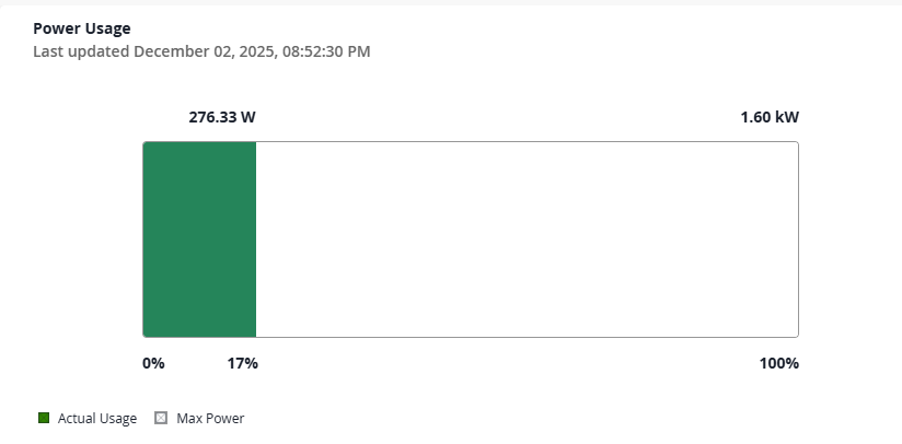
-
The full bar indicates the maximum power capacity of the device.
-
Green segment represents the actual power usage of the device in Watts.
-
White segment represents the remaining capacity in Watts.
-
The percentage below the bar indicates how much of the maximum capacity is utilized by the device.
-
The timestamp indicates when the data was last updated.
Use this view to understand the device's overall power capacity and current utilization by the device.
-
- View Power Supply Module Availability
The Power Supply Modules widget uses a donut chart to summarize the status of the power modules in the device.
For status definition, see Table 5.
Table 5: Power Module Status Color Status Definition Recommended Action Green Online Power module is installed and supplying power. No action required; verify redundancy Grey Offline Power module is installed but not supplying power. Check input feed, cabling, or module health Use this chart to get a quick overview of power module availability and redundancy in the device.
In Figure 8, the entire ring is green, meaning 100% of modules are online.
If there were grey segments in the ring, it would indicate some modules are offline and may require troubleshooting.
Figure 8: Power Supply Module Chart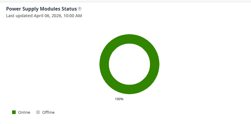
-
View Details on the Power Supply Modules
The Power Supply Modules table provides detailed information on the individual power modules installed on the device.
The timestamp indicates when the data was last updated.
Use this table to assess module health, prevent power outages, and monitor module efficiency to optimize energy usage.
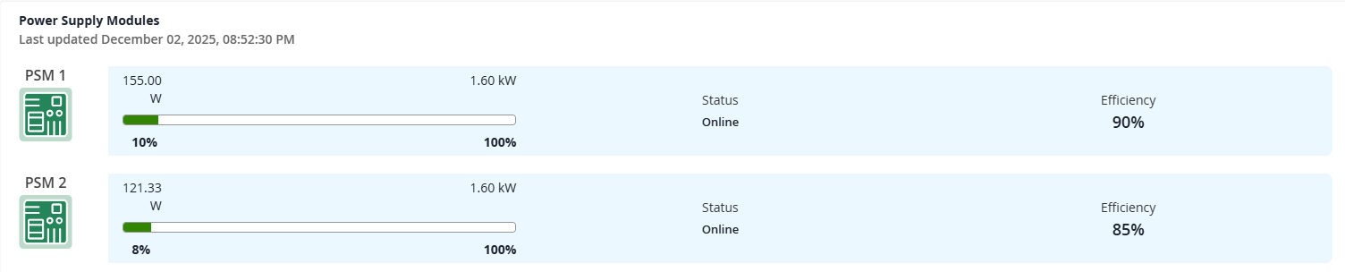
For field description, see Table 6
Table 6: Power Module Table Field Description Name Name of the power module, along with an icon representing the module. Color coding is used to indicate the health of each module.
-
Green—Indicates the module is healthy.
-
Red—Indicates the module is faulty.
Power Load Bar Visual indicator that shows the current power output of each module relative to its maximum capacity. The usage is measured in kilowatts (kW) and percentage, showing how much of the module’s capacity is being utilized.
Color Scale
- Green—Actual power being used by the module.
- White—Remaining unused capacity.
- Gray—Indicates the full bar but no active load. This is displayed for offline modules.
Status Indicates the status of the power module, whether the module is online or offline. See Table 5. Efficiency Shows the power conversion efficiency of each module, expressed in percentage. Higher values indicate more efficient module performance.
-
Use this table to ensure the device is not nearing power capacity thresholds, detect underperforming or degraded power modules, and plan for redundancy or upgrades.
For example, if a switch consumes 22 kW out of a total of 120 kW of power, it is operating at approximately 18% utilization. If the chassis provides two module slots but only one module is online, the device has no redundancy, and a single module failure would cause a complete outage. The dashboard helps you identify such risks and plan accordingly.
About the Thermal Profile Tab
The Thermal Profile tab displays information on the temperature, cooling performance, and sensor behavior of the device and how they contribute to energy usage.
Use this tab to monitor thermal performance, prevent overheating, and optimize fan and power usage of your device.
- View a Device's Average Temperature and Average Fan Speed
Use the Device Avg Temperature and Avg Fan Speed time-series graph to monitor trends in a device's temperature and cooling behavior.
Figure 9: Device Avg Temperature and Avg Fan Speed Graph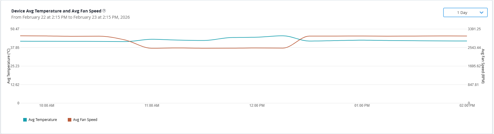
Table 7: Field Description Axis Metric Description Color Unit Left y-axis Average Temperature Shows the average temperature of the device over the selected time range. Note:Click the Avg Temperature legend to view only the temperature trend line on the graph. Double click the metric to clear the filter.
Blue °C (Celsius) Right y-axis Average Fan Speed Shows the average fan speed over the selected time range. Note:Click the Avg Fan Speed legend to view only the fan speed trend line on the graph. Double click the metric to clear the filter.
Brown RPM x-axis Time Range (Today, Yesterday, Last 7 Days, Last 30 Days, Custom)
Represents the selected time range. By default, it is set to Last 30 Days.
— Hours / Days Note:Hover over any point on the lines to view the exact temperature and fan speed values for that timestamp.
Under normal operating conditions, the fan speed remains proportional to the device temperature.
Use this graph to identify:
-
Periods where fan speed remains high while the temperature is low.
-
Instances where temperature spikes are not met with a corresponding fan speed increase. This signals potential overheating risks or an issue with the thermal control system.
-
Optimize fan speeds based on real-time needs to reduce the device's power draw and minimizes the heat load placed on the main data center cooling infrastructure.
-
- View Power Trend of a Device
The Power Trend line chart is a time-series graph that displays the power consumption of the device over a selected time period.
Figure 10: Power Trend Chart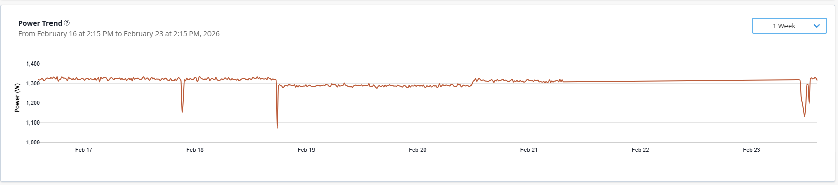
The y-axis represents the power draw in Watts (W) and x-axis represents the selected time period (Today, Yesterday, Last 7 Days, Last 30 Days, or Custom).
Tip:Analyze the chart alongside the Device Avg Temperature and Avg Fan Speed chart to understand the relationship between power draw and thermal load of the device. Under normal operating conditions, the device's fans must respond with proportional increase in fan speed to prevent overheating and ensure thermal stability.
If the thermal profile is stable but the power curve is consistently high, it suggests inefficient power to traffic proportionality and as a result increase the heat load.
- Monitor the Top Sensors on the Device by Temperature Deviation
The Top Sensors by Temperature Deviation widget provides a tabular view of the top five component sensors of the device that require immediate attention.
Table lists sensors with their current temperature and temperature deviation from baseline. You can also sort the table based on device temperature.
Figure 11: Top Sensors by Temperature Deviation Table
Use this table to identify sensors that have the highest fluctuation or variation from a stable or baseline temperature.
For field description, see Table 8.
High deviation suggests potential hotspots and thermal issues, which could be caused by sudden spikes of workload or a failing fan. High deviation places significant stress on the component over time and impacts device performance.
If components are frequently overheated and show high deviation, it means that the device's cooling system (fans) or the facility's cooling (airflow) are failing to maintain stable operating conditions.
You can also correlate the sensor with the Power Trend Chart. A high-deviation sensor indicates that the power draw is likely spiking rapidly and frequently, generating inconsistent heat.
Table 8: Sensors Table Field Description Field Description Sensor Name Identifies the specific sensor being measured. This allows you to identify the source of the heat. Temperature Deviation The variation between the device’s measured temperature and the optimal temperature range.
The icons help you quickly identify whether the device is running normal, warmer, or hotter than expected baseline.
-
Green—Indicates the device temperature is within expected range. No action required.
-
Yellow—The device is running slightly above its normal temperature but not yet critical.
-
Red—Temperature is significantly above normal and may impact device performance.
Temperature The current aggregate temperature recorded by the sensor. Click on the arrowhead next to the header to sort the table in ascending or descending order.
-
- View Fan Status of a Device
The Fan Status widget shows the operational status of all fan trays in the device. The widget displays individual fans within each tray, their speed (RPM), and health indicators to help monitor thermal performance.
Use this widget to monitor the cooling performance of the fans. Failed fans reduce cooling efficiency of the device.
Figure 12: Fan Status View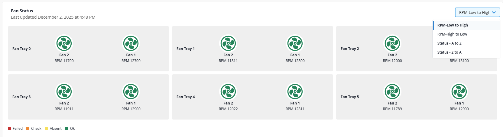
You can sort the view by RPM or fan status to quickly identify the fans that are drawing the most power or those that have shut down completely due to low heat load.
Each tray is represented as a separate tile and inside each tray, individual fans are listed.
Revolutions Per Minute (RPM) indicates the rotational speed of each fan.
Color-coding is used to convey the health of each fan component. See, Table 9.
Table 9: Fan Health Indicator Color Status Operational Status Green Ok Fan is healthy and operating normally. Yellow Absent Fan is not present in the tray. Amber Check An error has been detected in the fan and may require inspection. Red Failed The fan has failed or disconnected and requires immediate attention to prevent device from overheating. Use the insights provided in this section to take action, whether it's replacing a component or adjusting the device's fan control policies. Thermal optimization can also help reduce cooling costs.
About the Recommendation Tab
The Recommendation tab provides a wide range of device-level energy optimization suggestions and their potential energy savings, based on telemetry collected from the device. Currently, you can get recommendations at the line card, PFE, and port levels.
Each recommendation is designed to streamline decision‑making and give you the operational context you need to optimize energy usage.
The recommendation service executes once per day at around 3 AM UTC. Each execution uses historical port traffic telemetry and the configuration data available at the time of execution. The Recommendation tab displays the most recently generated results for the device.
The service generates recommendations based on collected operational data. If adequate data is not yet available, the corresponding recommendations may not appear.
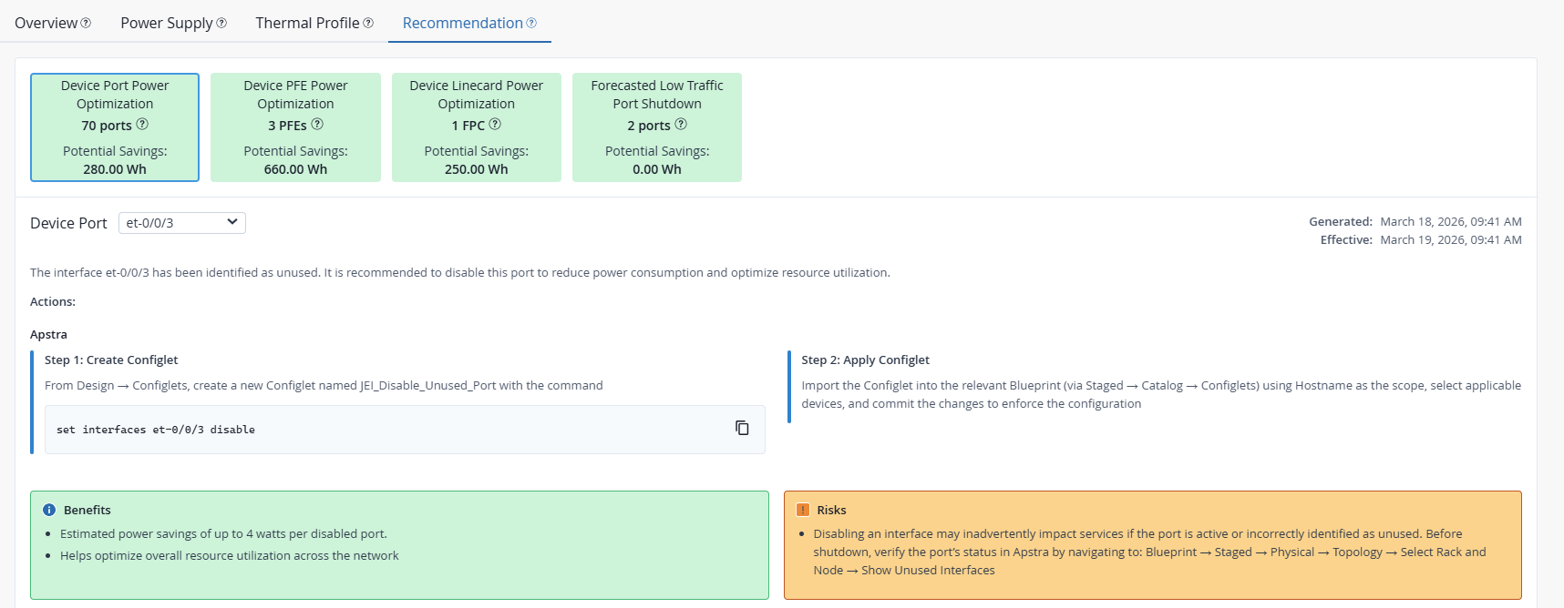
At the top of the page, you’ll see a set of recommendation cards, each representing a different category of energy optimization recommendation available for the device. Each card highlights the recommendation type, the component it applies to, and the potential energy savings you can achieve by applying this recommendation.
Click a card to open the detailed view panel for that recommendation type.
Each recommendation is presented in a structured format for easy evaluation. Use this information to assess and identify the most effective energy optimization actions for your network device.
The Recommendation tab appears empty, if no safe or meaningful recommendations or power saving actions were identified based on the latest device telemetry.
For field description, see Table 10.
| Header | Description |
|---|---|
| Recommendation Card |
Highlights the recommendation type, the count of device components that qualify for the recommendation, and the potential energy savings achievable if the recommendation is applied. |
| Device Component |
Device component identified for power optimization. Use the drop-down to select a component and view its specific recommendation. |
| Description |
A summary of the observations that resulted in this recommendation. |
| Actions |
Provides step-by-step guidance and relevant configlet-based actions required to apply the recommended changes on the device. Note:
You must use the configlets in Apstra Data Center Director to apply configuration changes to the device. For more information on configlets, see Configlets in the Apstra Data Center Director User Guide. |
| Benefits |
Displays quantified advantages achievable by applying the action, such as estimated power savings, cost reduction, and reduced GHG emissions. |
| Risks | Highlight caveats such as potential dependencies, safety checks, and guardrails to consider before applying the suggested changes. |
| Timestamp |
Indicates when the recommendation was generated and how long it is valid. Note: Recommendations are refreshed daily
based on the latest device telemetry.
|
Currently supported recommendations: