Occupancy Analytics
View visitor numbers, locations, and dwell times across your site.
You can use the Occupancy Analytics dashboard to identify the overcrowded areas in your sites and leverage this information to manage site occupancy with capacity limits for different zones in your site.
Features
-
- Provides comprehensive insights into visitor behavior, including visitor journeys and trends. You can use the insights to analyze user behavior and improve customer engagement and optimize workspace.
- Long-term historical time series analysis of network, application, and visitor behavior can enhance business decision-making. You can understand peak usage times, identify common issues, or spot opportunities for improvement.
Before You Begin
-
Refer to the Juniper Mist Location Services Guide for information about how to set up your sites and floor plans for location services.
-
Refer to Set the Engagement Dwell Limits and Schedule for a Site to learn how to enable the engagement analytics options for a site.
-
Refer to Mist Premium Analytics Trial License to know about license requirements for Juniper Mist™ Premium Analytics.
- Become familiar with the options available on the Juniper Mist Premium Analytics dashboards. See Figure 3.
Occupancy Analytics Dashboard
Occupancy Analytics Reports
The Occupancy Analytics dashboard includes various tiles that provide graphical representations of analytics at a granular level.
On the top of the dashboard, you can view a summary of the visitor data.
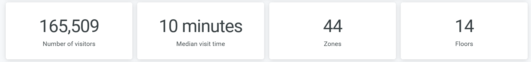
The dashboard displays the total number of visitors, number of visitor minutes, and number of zones and floors.
Occupancy Trend
The tile displays the number of unique devices trend for the selected time period. You can select days and a month by using the filter options on the top of the tile.
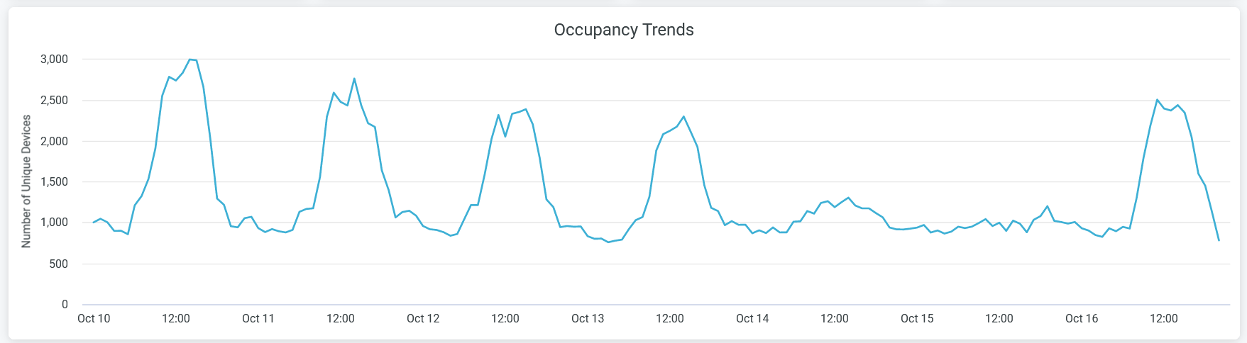
When you hover over the chart, you see a pop-up message with the actual number of unique devices at the given time.
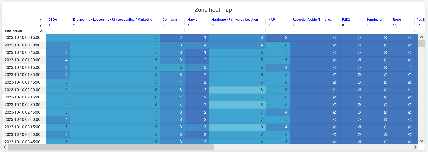
Zone Heatmap
You can view a heatmap that shows the number of unique devices connected in each zone for every 15 minutes.
Zone Ranking
You can view the list of zones in a site arranged according to the count of unique connected devices.
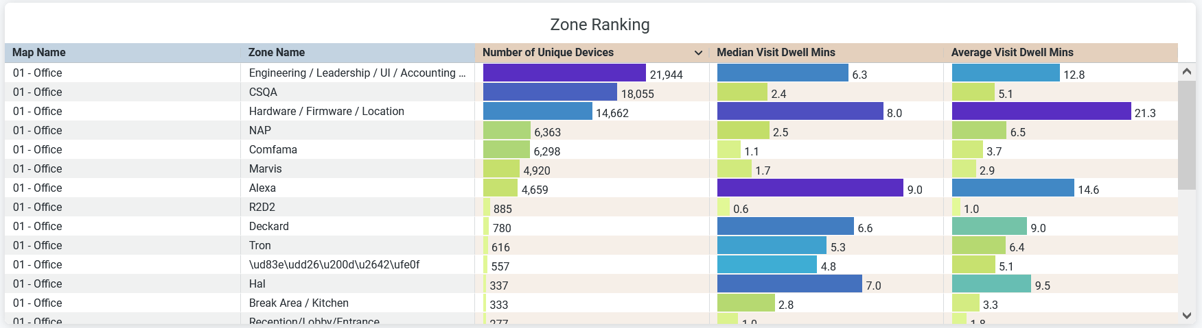
- Map Name—Name of the floor plan within which the zone is located.
- Zone Name—Name of the zone.
- Number of Unique Devices—Number of devices connected to the zone.
- Median Visit Dwell Minutes—Median duration that visitors spend in the zone.
- Average Minutes—Average duration that visitors spend in the zone.
User/Site
You can view the list of devices in a site arranged according to the time spent by visitors.
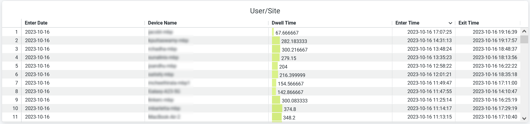
- Enter Date—Time of report generation.
- Enter Time—Time of a visitor's entry into the site.
- Exit Time—Time of a visitor's exit from the site.
- Device Name—Name of a client device.
- Dwell Time—Duration of a visitor's time in the site.