Occupancy Analytics - Users
Get a more precise understanding of occupancy by viewing analytics for unique users rather than unique wireless devices.
This dashboard is applicable in enterprise and educational environments where a single SSID, such as "Enterprise (802.1X)" or "eduroam," is deployed across the entire network. Since employees and students or staff members often connect multiple wireless devices to a single SSID with unique user names, this method eliminates duplicate counting and guarantees that each user is counted only once.
By analyzing wireless devices, BLE tags, and BLE application-enabled devices, Mist Premium Analytics generates insights about user visits, dwell time, and movement patterns across retail and enterprise floors and sites.
Occupancy analytics dashboard is designed specifically for enterprise and workspace environments. For the facility or workspace managers in an enterprises, these insights can help understand the space occupancy and workspace utilization of the various zones and floors. Using long-term occupancy data, you can gain insights into how spaces are utilized, identifying peak usage times and underutilized areas. This enables more efficient allocation of resources, such as heating, cooling, and lighting, reducing operational costs and enhancing sustainability efforts.
Features
- The dashboard provides comprehensive insights into visitor behavior, including zone occupancy trends, and utilization of SSIDs. You can use the insights to analyze user behavior, improve customer engagement, and optimize workspace utilization.
Before You Begin
-
See Juniper Mist Location Services Guide for information about how to set up your sites and floor plans for location services.
-
See Set the Engagement Dwell Limits and Schedule for a Site to learn how to enable engagement analytics options for a site.
-
Refer to Mist Premium Analytics Trial License to know about license requirements for Juniper Mist™ Premium Analytics.
- Become familiar with the options available on the Juniper Mist Premium Analytics dashboards. See Figure 3.
Access Occupancy Analytics Zone Dashboard
-
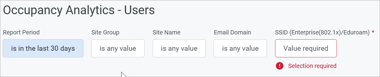
Use the filter options at the top of the dashboard to view specific
information.
Figure 1: Filter Options for Occupancy Analytics - Users Dashboard
-
Click Report Period and set the period for which you want to generate analytics. By default, the dashboard shows data for the last 7 days.
Filter by Site Group, Site Name, Zone Name, E-mail Domain, and SSID (Enterprise(802.1x)/Eduroam) (mandatory).
You must select an SSID with Enterprise (802.1x) security, or a eduroam SSID in case of higher education deployments.-
Select Reset filter from the dashboard actions on the top-right corner of the dashboard to reset the filters.
-
Occupancy Analytics Users Dashboard Tiles
The Occupancy Analytics Users dashboard includes various tiles that provide graphical representations of analytics at a granular level.
On the top of the dashboard, you can view a summary of the data that the tiles display.
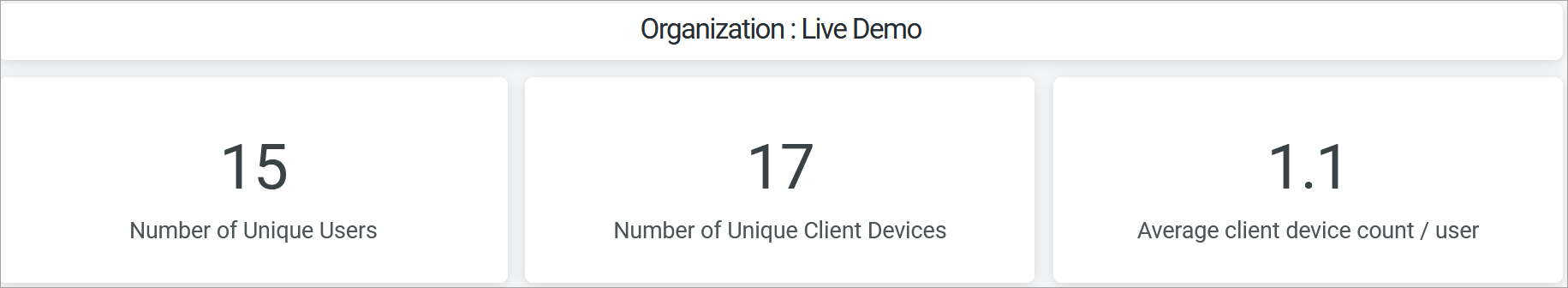
The dashboard displays the total number of unique visitors, number of unique client devices, and the average client devices per users.
- User Density Heatmap
- Site Occupancy Trends - Daily
- Top Domains
- Zone Occupancy Trends - Daily
- Zone Ranking
User Density Heatmap
The tile displays the trend in the number of unique client devices that connect to the selected SSID for the specified period.
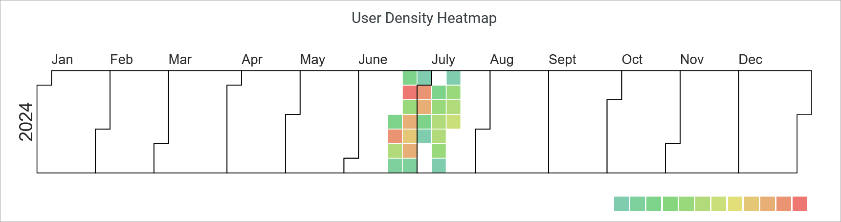
When you hover over the chart, a pop-up message displays the actual number of unique devices connected to the SSID on an exact date.
Use the legend on the bottom of the heatmap to get the number of clients represented by the color in the heatmap.
Site Occupancy Trends - Daily
The tile displays the number of unique users trend over a selected time period.
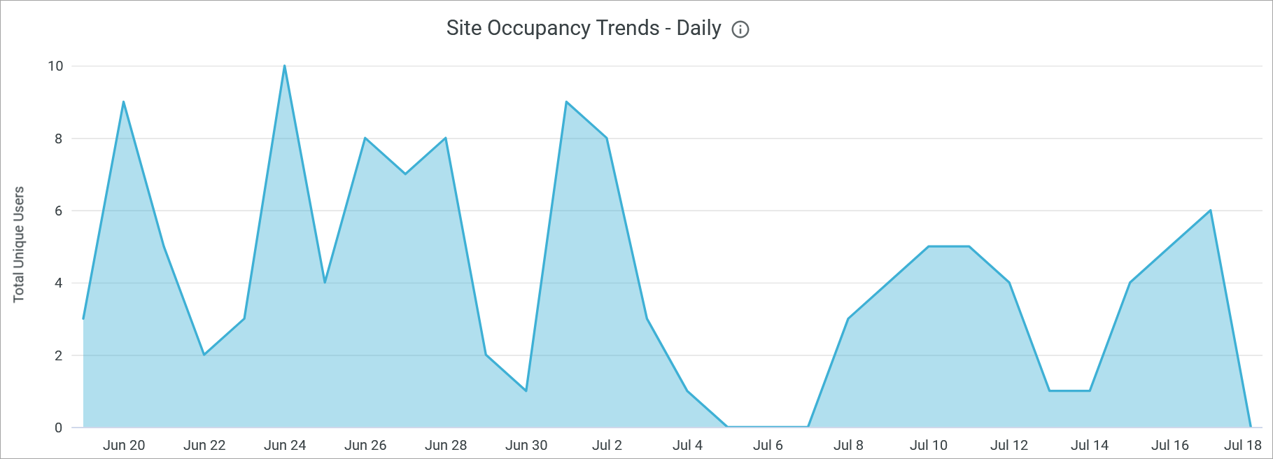
Hover over any portion of this chart to display the numbers of unique users associate with the SSID on that exact date.
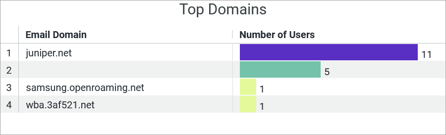
Top Domains
The tile shows the count of users associated with a specific email domain.
Zone Occupancy Trends - Daily
The Zone Occupancy Trends graph displays the number of unique users connected in different zones for a selected time period.
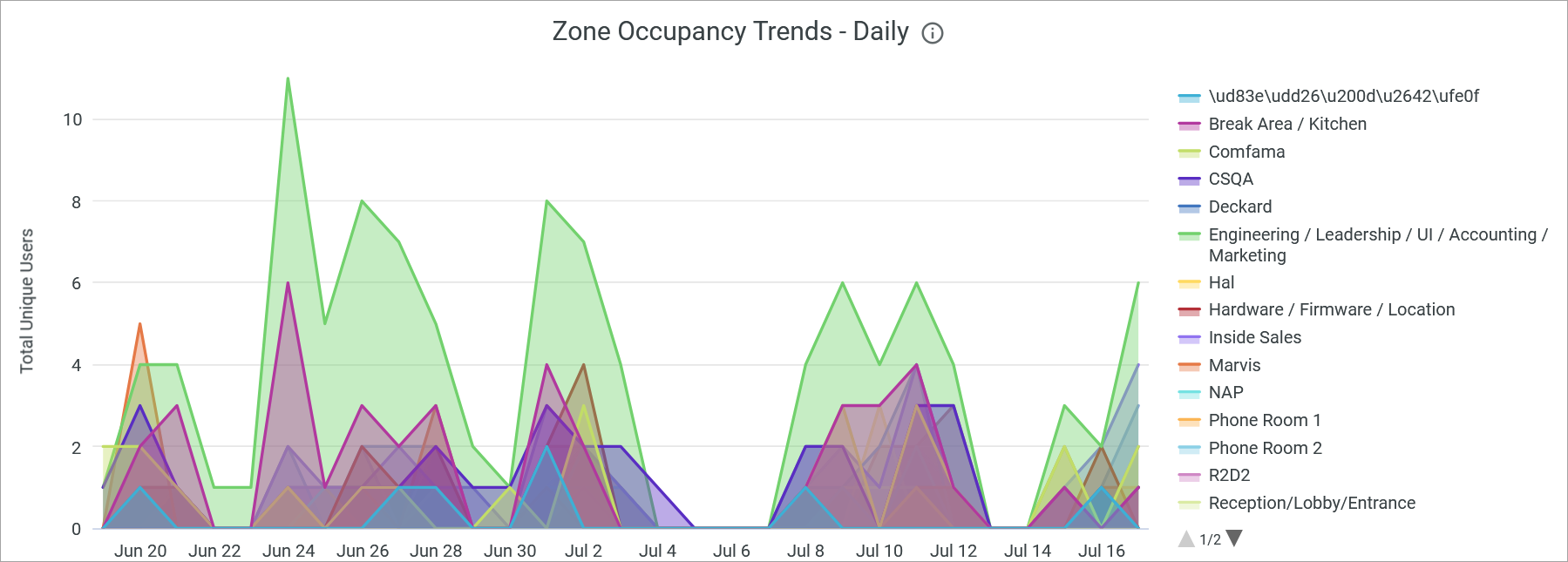
When you hover over the chart, a pop-up message displays the actual number of unique users connected to the zone on an exact date.
To hide a zone from the chart and show only the remaining zones, click the zone name in the legend next to the chart.
Zone Ranking
You can view the list of zones in a site arranged according to the daily average dwell time by connected devices.
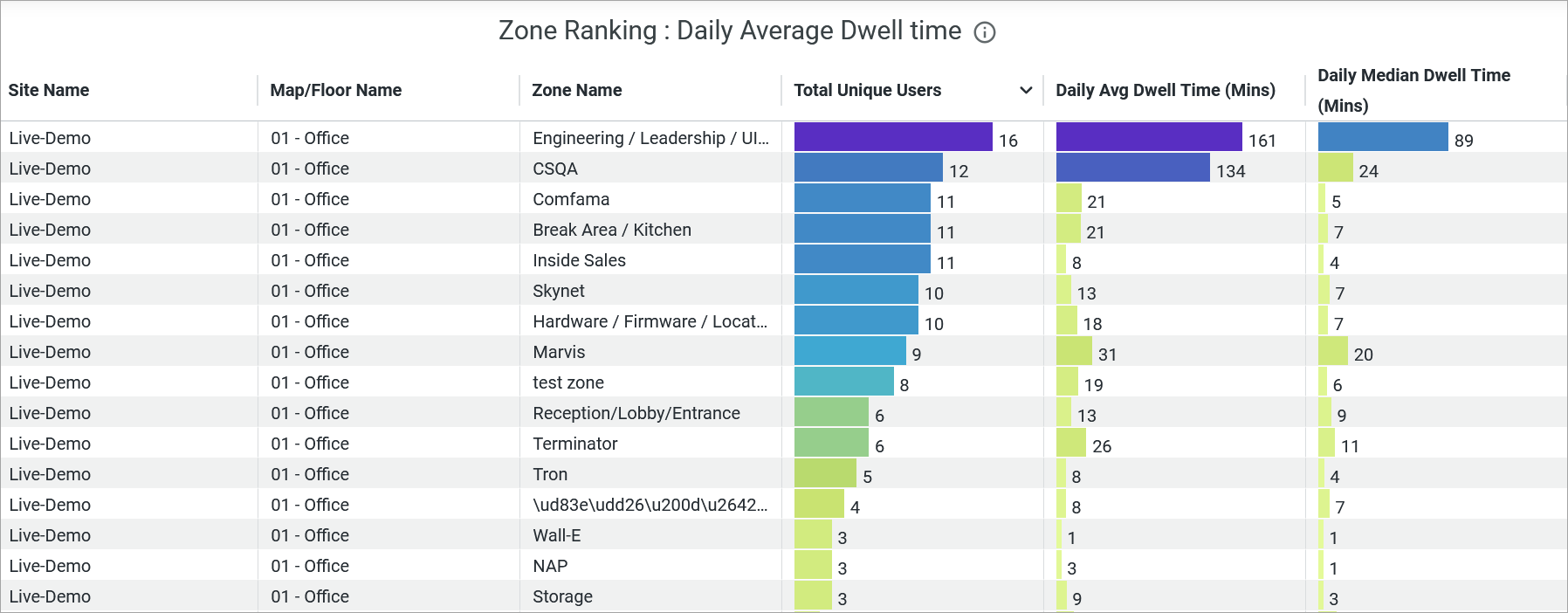
You see the following details about the zones:
- Site Name—Name of the site where a zone is located.
- Map Name—Name of the floor plan within which the zone is located.
- Zone Name—Name of the zone.
- Device Name—Name of the client or user device connected to zone.
- Daily Average Dwell Time (Min)—Average duration that users spend in the zone.
- Daily Median Dwell Time (Min)—Median duration that users spend in the zone.