Engagement Analytics
View real-time information about your visitors to understand user behavior and improve engagement.
By analyzing wireless devices, BLE tags, and BLE application-enabled devices, Mist Premium Analytics generates insights about user visits, dwell time, and movement patterns across retail and enterprise floors and sites.
Engagement Analytics dashboard is designed specifically for retail environments. The insights help retailers to drive more interactions with associates and customers, and plan cross-selling and omnichannel marketing and sales initiatives.
Features
- Provides comprehensive insights into visitor behavior, including visitor journeys and trends
- Displays zone occupancy in the form of heatmaps
- Identifies and displays new and repeat visitors
- Provides visitor and employee engagement time and engagement trends in terms of dwell time
Before You Begin
-
See the Juniper Mist Location Services Guide for information about how to set up your sites and floor plans for location services.
-
Refer to Set the Engagement Dwell Limits and Schedule for a Site to learn how to enable engagement analytics options for a site.
-
Refer to Mist Premium Analytics Trial License to know about license requirements for Juniper Mist™ Premium Analytics.
- Become familiar with the options available on the Juniper Mist Premium Analytics dashboards. See Figure 3.
Access Engagement Analytics Dashboard
Engagement Analytics Reports
The Engagement Analytics dashboard includes various tiles that provide graphical representations of analytics at a granular level.
On the top of the dashboard, you can view a summary of the visitor data as shown in Figure 1.

The dashboard displays the total number of visitors, number of loyalty visitors, and the average count of visitors and loyalty visitors per day.
- Monthly Visitor Trend
- Visitors Day of the Week
- Average Dwell - Day of Week
- Average Dwell
- Average Peak Times By Day Of Week
- Zone Ranking
- Zone Heatmap
- Most Frequent Moves Between Zones
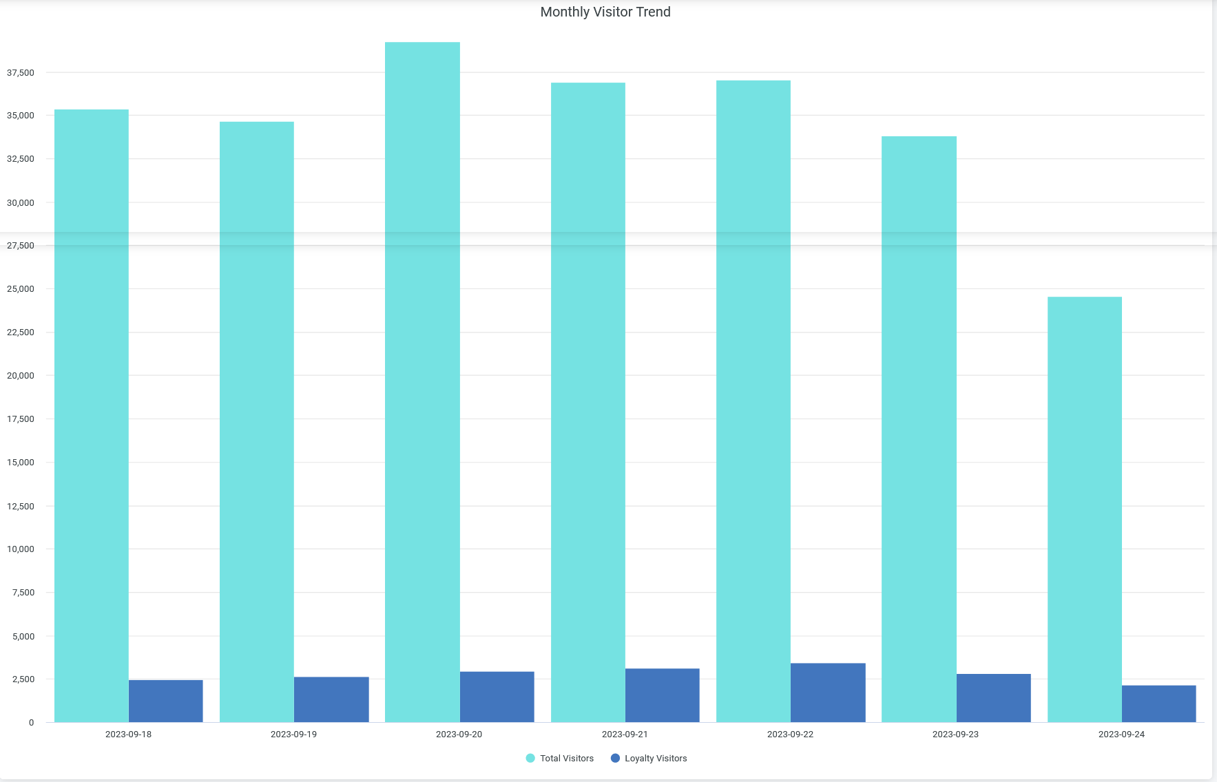
Monthly Visitor Trend
The tile displays the number of visitors in a bar chart for the selected time period. You can select days and a month by using the filter options on the top of the tile.

When you hover over a bar, you see a pop-up message with the actual number of visitors at the given time.
Visitors Day of the Week
You can view the average number of daily visitors during a specific week.

When you hover over a bar, you see a pop-up message with the actual number of visitors at the given time.
Average Dwell - Day of Week
You can view the average time that the visitors spend on each day of a specific week.

When you hover over a bar, you see a pop-up message with the actual average dwell time at the given time.
Average Dwell
You can view the average time that the visitors spend on each day in a selected time period.

When you hover over a chart, you see a pop-up message with the actual average dwell- time at the given time.
Average Peak Times By Day Of Week
You can view the number of unique devices connected at each hour in a day over a selected time period.

Click a line, which represents a day in the graph, to view the number of connections at a particular hour of the day. You can find out the busiest hour for a specific day from the graph.
To hide data for a day and see data for only the remaining days, click the day in the legend.
Zone Ranking
You can view the list of zones in a site arranged according to the count of unique connected devices.

You see the following details about the zones:
- Site Name—Name of the site where a zone is located.
- Map Name—Name of the floor plan within which the zone is located.
- Zone Name—Name of the zone.
- Number of Unique Devices—Number of devices connected to the zone.
- Median Visit Dwell Minutes—Median duration that visitors spend in the zone.
- Average Minutes—Average duration that visitors spend in the zone.
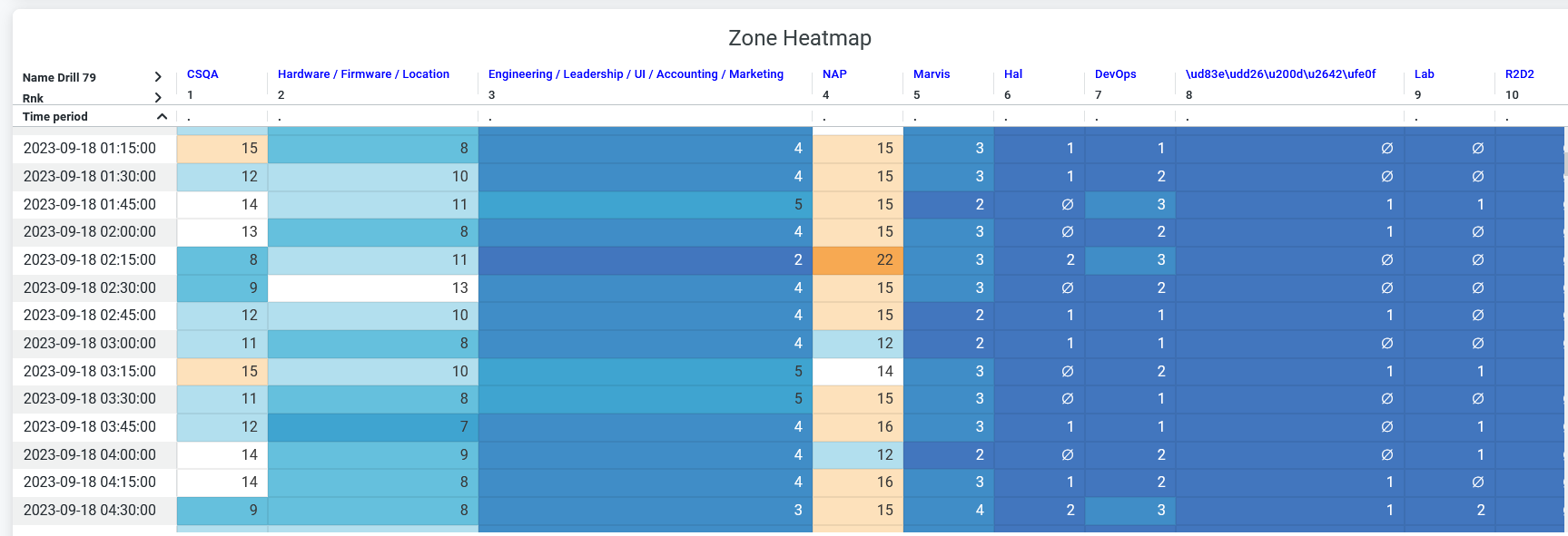
Zone Heatmap
You can view a heatmap that shows the number of unique devices connected in each zone for a regular interval.

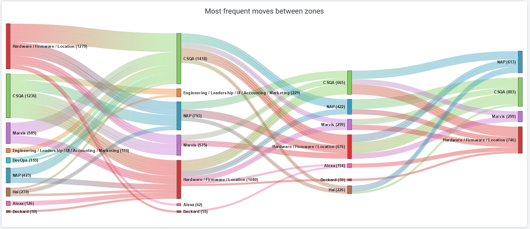
Most Frequent Moves Between Zones
You can view the movement of visitors or devices between the zones. With this information, you can determine the places with the highest and lowest flows of visitors and take steps to optimize logistics.

The colored bars represent zones and the lines connecting the bars represent visitor's movements.
Click any colored bar to get the details of movement from that zone to the other zone.
Click any line on the chart to get the path from the source zone to the destination zone.
Download the report as an HTML file or an Excel spreadsheet to see the details in a table.
