ON THIS PAGE
Organization Insights (BETA)
Investigate issues affecting sites, devices, clients, tunnels, alerts, events, firmware and more for your Mist organization.
Find the Org Insights
From the left menu of the Mist portal, navigate to Monitor > Service Levels, then click the Insights button at the top of the Monitor page. By default, the Site Insights page displays. Select the drop-down menu and select Entire Org.
In the top right corner of the page, you can toggle between the Overview and Trends tabs.
Overview Tab
Once you select Entire Org on the Insights dashboard, the Overview tab is displayed by default. Network Operation Center (NOC) users can use the Org Insights Overview dashboard to access a single-pane-of-glass that displays any potential issues affecting the network. Within the sections of the dashboard, the color indications gives you information about alerts from various categories.
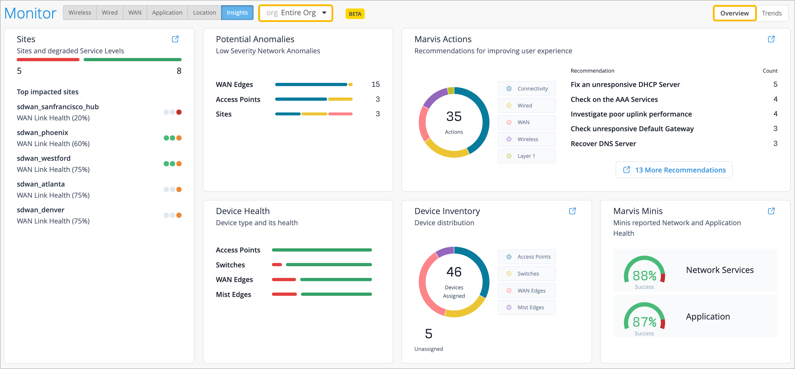
Sites
From the Sites section, you can view the top 10 worst sites in relation to degraded WAN, wired, and wireless health SLEs. Quickly glance to get a sense of the health status for the SLE. Red indicates SLE health is below 60%, and orange indicates SLE health is below 80%. Green indicates that SLE health is at 100%.
When you click on a site from the Sites widget, you are brought to the Site Insights page for that site. When you click on the color coding to the right, you are brought to the corresponding WAN, wired, or wireless SLE.
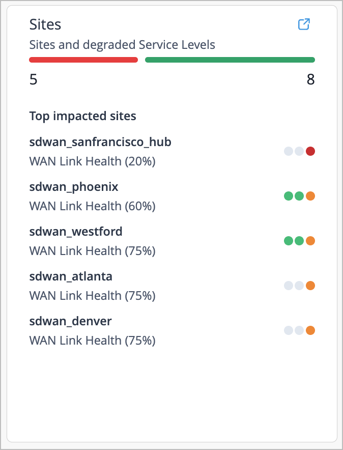
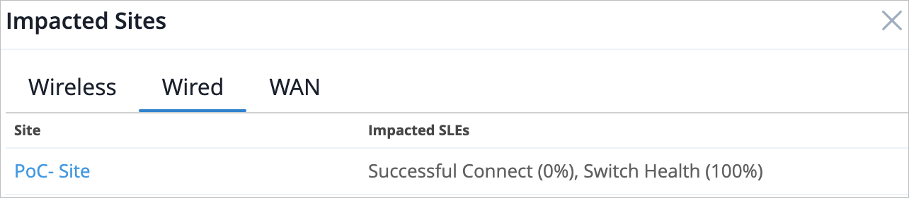
If you click on the red color from the line at the top of the section, a pop-up window displays sites and their impacted SLEs. The window is organized by category.
Potential Anomalies
In the Potential Anomalies section, gain visibility into the low-severity network anomalies for the organization. You can see alerts from various categories such as Sites, Servers, ISP, Application, Access Points, Mist Edges, WAN Edges, Switches, Routers, and Clients.
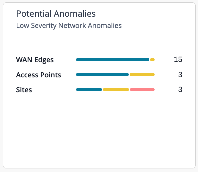
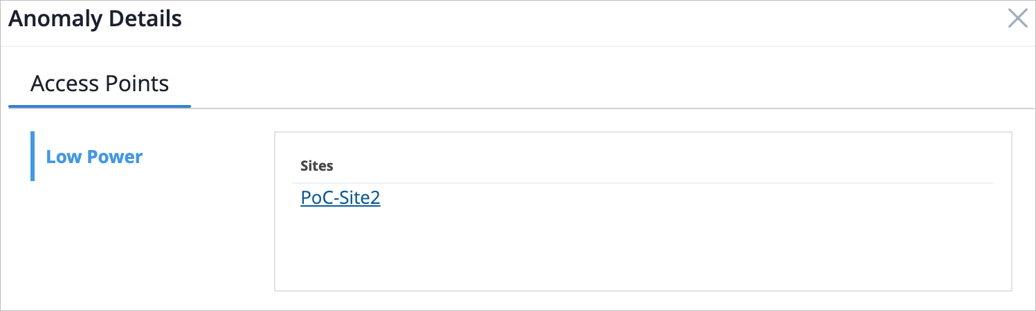
Click on the color line to display a pop-up window of anomaly details, organized by category. You can click on the anomaly name from the left of the window to see a list of the affected sites that are experiencing that particular network anomaly.
Device Health
View the overall health by device type for your organization in the Device Health section. You can hover over the color line to see how many devices of a particular type are online or offline for the entire organization.
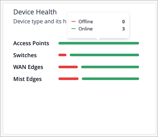
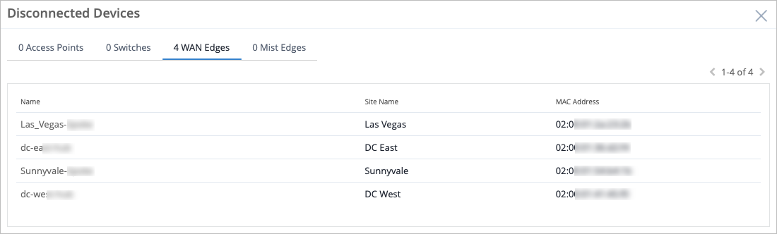
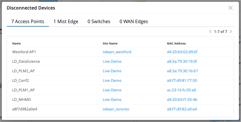
If you click on the red color next to the device type, a pop-up window that displays the disconnected devices appears. You can see information such as the device's name, the site it belongs to, and its MAC address.
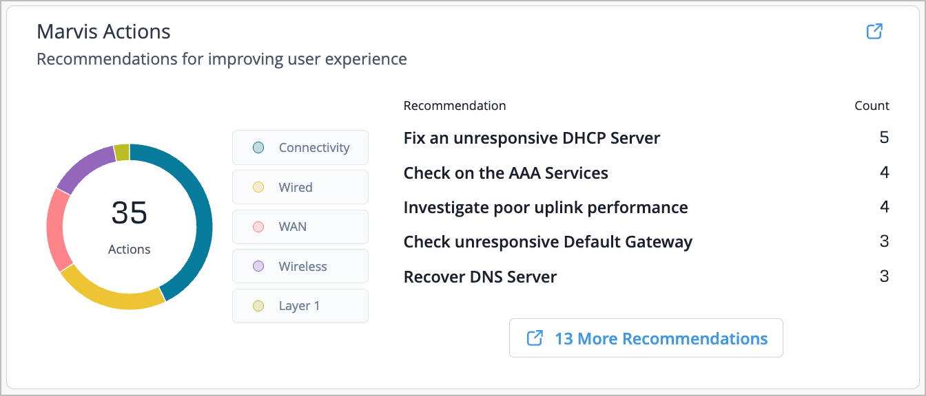
Marvis Actions
See the Marvis Actions recommendations for optimizing network performance and improving user experience. The categories that display are Layer 1, Wireless, WAN, Wired, and Connectivity. Hover your mouse to see how many Marvis Actions recommendations of a particular category there are for your organization.
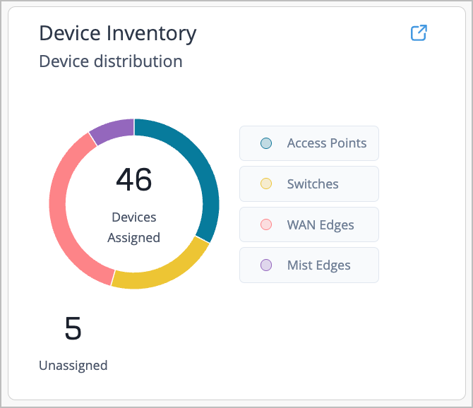
Device Inventory
Easily view device distribution and activities in the Device Inventory section. See WAN Edges, Access Points, Mist Edges, and Switches here. Quickly glance at the number of devices in your organization that are assigned, or how many devices require site assignment. Hover your mouse to see how many of a particular device are assigned to your organization.
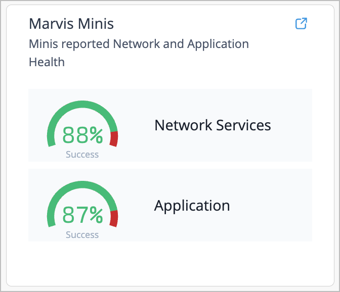
Marvis Minis
Learn the Marvis Minis reported information derived from the Marvis Minis Network and Application SLEs.
Marvis Minis runs periodic validations to assess network connectivity and application reachability to detect network or application issues, and you can see those at a glance in the Marvis Minis section of the Org Insights overview. For more information, see Marvis Minis SLE Dashboard (Beta), Network Services SLE (Marvis Minis), and Application Services SLE (Marvis Minis).
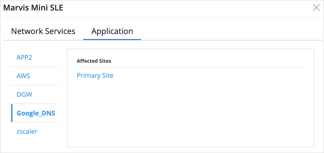
Click on the red color in the section to display a pop-up window of Marvis Minis reported information. The Network Services tab displays the affected sites that are experiencing network services issues.
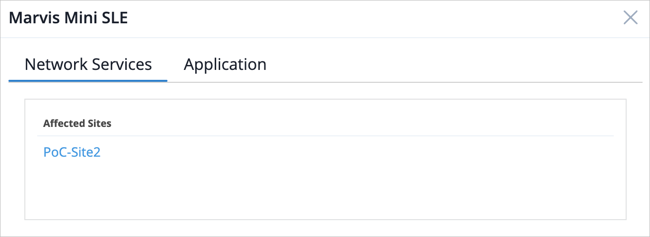
The Application tab lists affected applications. You can click on the application name from the left of the window to see a list of affected sites per application.
Trends Tab
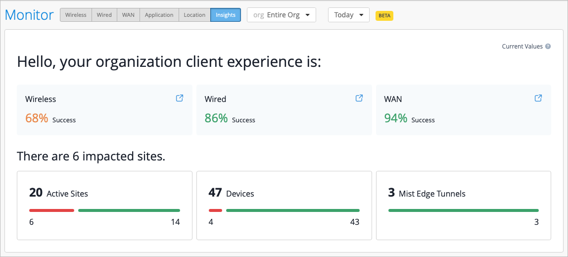
Select the Trends tab in the top-right corner of the Org Insights page to see network monitoring metrics. Quickly view the overall client experience for Wired, Wireless, and WAN, or scroll down the page to see more information and graphs.
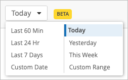
You can also select a time frame for which you want to view the data. To do so, select the drop-down menu at the top of the page and select the desired time frame.
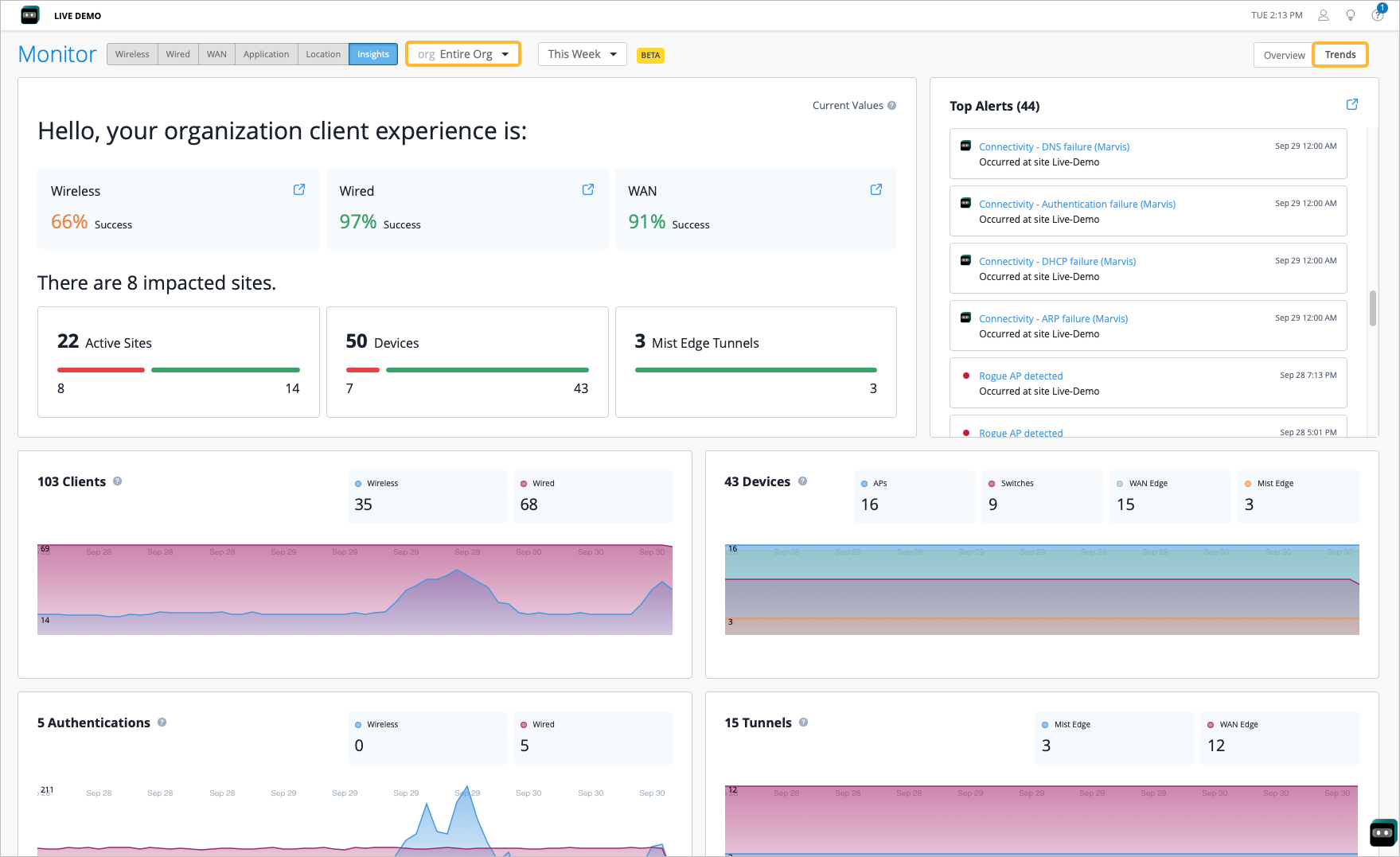
Organization Client Experience
-
Overall SLE Health—This displays the overall SLE health across Wireless, Wired, and WAN clients. The SLE health score is calculated by considering a subset of the most actionable SLEs within each. There is also a shortcut in each widget you can use to jump to those Insights pages.
-
Active Sites—The Active Sites count indicates the number of sites in service and lists the sites that have had client activity in the past 7 days. This count also tells you the number of sites in your org that had client activity in the past 7 days. The breakdown provides you with the number of sites with optimal (represented in green) or sub-optimal (in red) SLEs for the subset of SLEs in each domain. This is refreshed every minute.
Select the red portion of the bar to bring up the list of Impacted Sites with sub-optimal SLEs. This displays the impacted SLE and the success percentage.

-
Devices—The Devices count provides insight into the total number of active devices (active in the last 14 days) and a further breakdown of connected and disconnected devices at an organization level.
Click the red portion of the bar to open the list of disconnected devices per device category.
-
Mist Edge Tunnels—This count provides insight into the total number of tunnels configured for Mist Edges. If you click the red portion of the bar, the breakdown provides insight into the tunnels that are configured but currently disconnected.
-
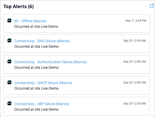
Top Alerts—This section displays the alerts with the highest impact, effectively reducing alert fatigue. The following alert types can be displayed in this list:
-
Marvis Action
-
AP Loop Detected event
-
WAN Edge/Switch DHCP Pool Exhausted
-
Critical Switch Port Up/Down
-
Critical WAN Edge Port Up/Down
-
EVPN Detected Duplicate MAC Address
-
Network Activity Overview
These graphs provide high-level insights into network activity. The data visualizations reflect system status and usage patterns over a selected time period. The graphs are updated via the API and WebSockets.
-
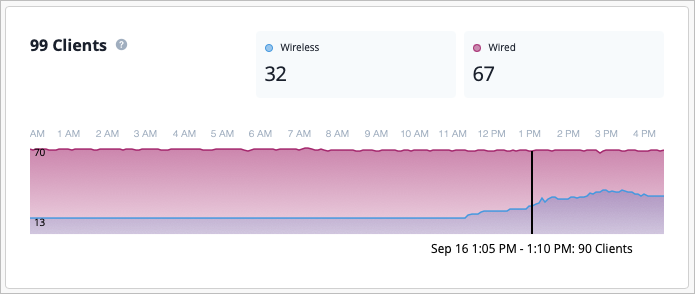
Clients—This graph reflects the most up to date number of clients per wired and wireless assurance. The numbers are updated every minute via WebSockets. The graph itself displays client connectivity for wireless and wired users and automatically refreshes every 10 minutes. It may take up to 5 minutes for the graph to indicate a major drop in trends.
-
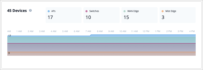
Devices—The most up to date number of cloud connected wired, wireless, and WAN devices are displayed. These numbers are updated every minute through WebSocket, and can take up to 5 minutes before indicating a major drop in trends. The graph itself shows device cloud connectivity for access points, switches, WAN Edges and Mist Edges. It automatically refreshes every 10 minutes.
-
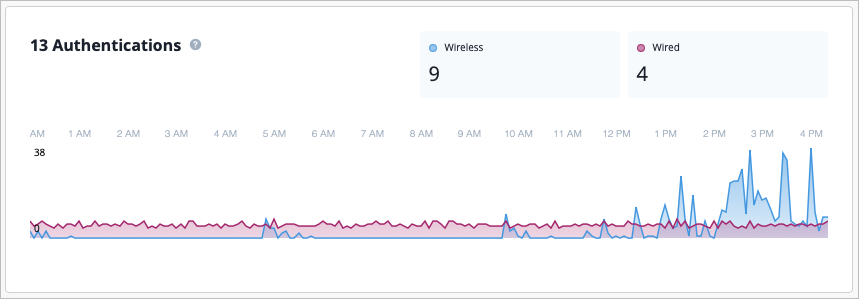
Authentications—The current rate of successful authentication events across wired and wireless clients are shown. These numbers are updated every minute through WebSockets. The graph itself shows trends of successful authentication events across wired and wireless clients per 5 minutes per hour based on the selected time. It automatically refreshes every 10 minutes.
-
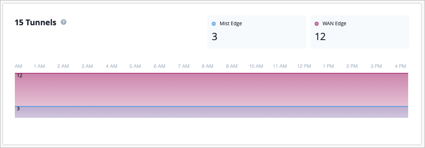
Tunnels—The current number of tunnels are shown for Mist Edges and WAN Edges. These numbers are updated every minute through WebSocket. In the graph, you can see the aggregated trend of active tunnels events across Mist Edges and WAN Edges per 5 minutes per hour based on the selected time. It automatically refreshes every 10 minutes.
-
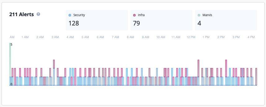
Alerts—This displays the total number of alerts for the selected time period, including the most up to date number of Security, Infrastructure, and Marvis alerts. In the graph, you can see what types of alerts occurred at a specific point in time.
-
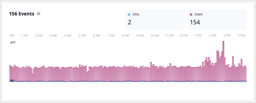
Events—This displays the total number of current infrastructure and client events for the selected time period. The graph is updated via API and the UI refreshes every 10 minutes.
Firmware Overview
The firmware section provides a detailed breakdown of device firmware deployments segmented by device type, firmware version, and hardware model. Network engineers and IT administrators can use the firmware section to monitor firmware consistency, identify upgrade opportunities, and ensure optimal performance across wireless infrastructure.
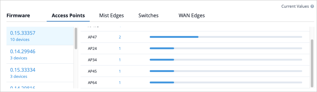
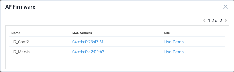
You can also click on the number in the Device Count column to see a pop-up window which includes device information such as device name, MAC address, and the Site that the device belongs to.