Insights Overview
Get familiar with the major features of the Insights page.
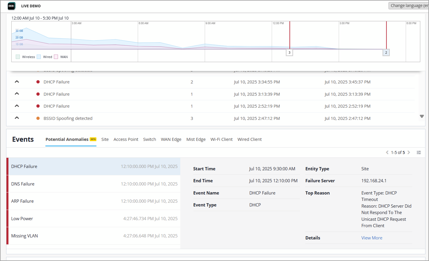
The Mist Insights page provides a quick overview into your clients' network experience for anywhere in the stack, be it the Wireless, Wired, or WAN network. From there, double-click whatever parameters or events that interest you to get statistical insights into the health of your network or to identify and troubleshoot issues.
To open the page, select Monitor > Service Levels from the left menu and then click the Insights button at the top of the Monitor page. (Click Classic View if you don't want the Full Stack design, or if you experience any numerical discrepancies in the data as presented.)
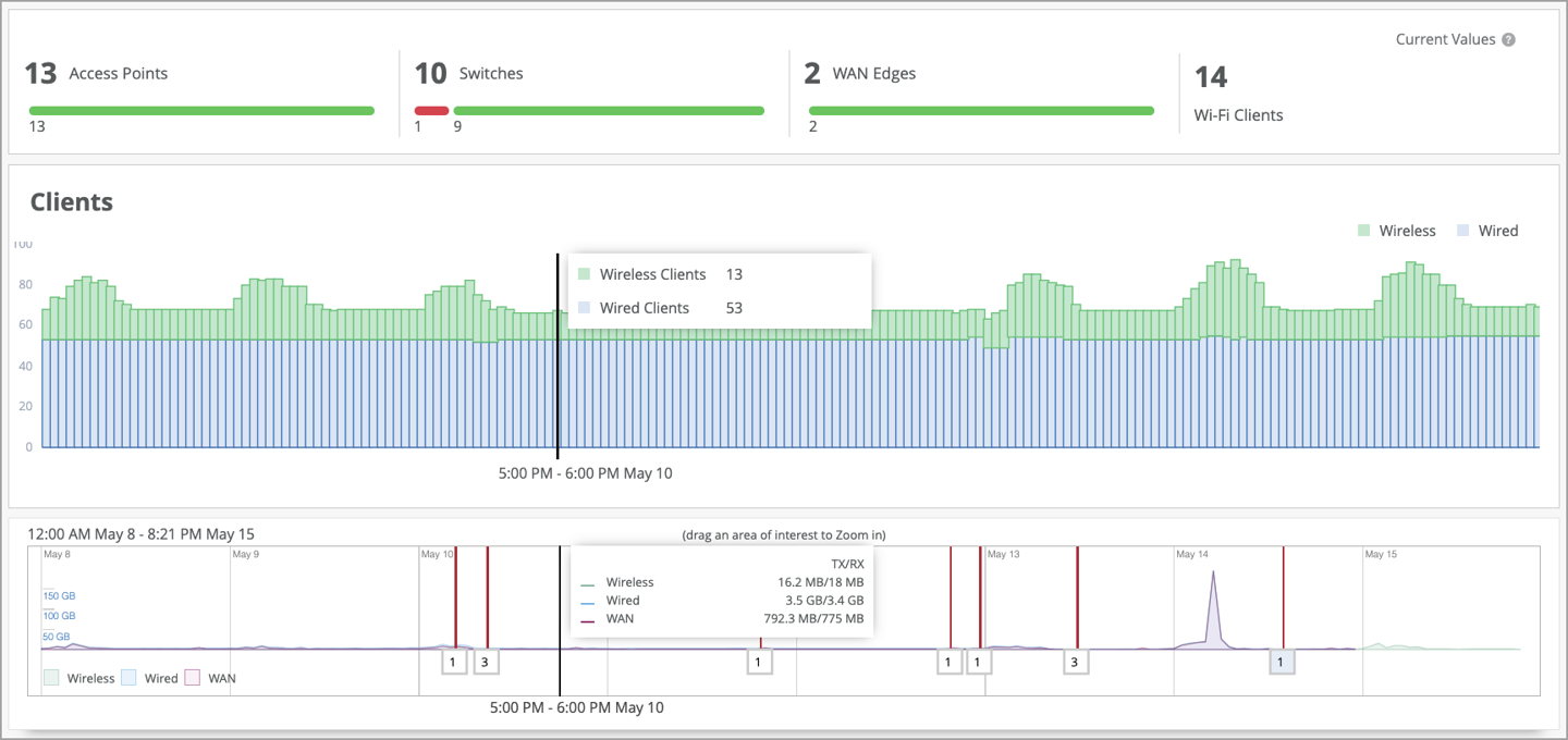
You can view data for a given site using the map view, by device using a floorplan, or by time using the timeline. For example, under AP Insights you can get details about network traffic, client session and connection trends, post client connection metrics, as well as traffic volume and type transiting all or selected APs.
The time-based analysis is especially useful. You can view Insights telemetry aggregated by the past 60 minutes, all the way up to the past seven days. Analysis includes overall connection status, client connection trends, and network traffic patterns. If you need an even longer time-view, Premium Analytics provides up to three years' data and analysis with a subscription (select Analytics > Premium Analytics from the Mist menu).
Insights Telemetry and Events
The Insights summary shows the connection status of devices such as access points (APs), switches, WAN edges, and Wi-Fi clients. It also includes event details for all devices and sites.
The Applications view shows the number of clients and the bytes sent and received on both WAN and Wireless networks.
Telemetry sources include the following:
-
Juniper wired switches
-
Edge devices supported by Juniper Mist WAN Assurance
-
Juniper Mist Edge device
-
Time to connect data from wireless clients
-
Coverage, roaming, and throughput data from access points
-
Throughput data for network applications.
-
Dwell time and other location data from Bluetooth Low Energy (BLE) tags
For information about the various sections of the page, see the other topics in this chapter.