Widget Chart Types
QRadar Pulse provides many types of charts for presenting your data in a way that is meaningful for your organization.
Bar Chart
Compare sets of data between groups; for example, log source ID and event rates. Show significant changes in data over time. Stack each series. Show or hide the legend, and position it horizontally or vertically on the chart. For more information, see Creating a bar chart in Widget Chart Types.
Big Number Chart
Display important metrics on the SOC wall that you want your team to monitor. Turn on trending to see how your organization is doing over time. For more information, see Creating a big number chart in Widget Chart Types.
Geographic Data Chart
See where events are occurring on a choropleth (shaded) map or on a scatter map. Set the color scheme for when land and water is displayed. Set the latitude, longitude, and scale for IP addresses. Display lines between source and destination IP markers.
Geographic charts are not supported on QRadar 7.3.0.
For more information, see in Creating a geographic chart Widget Chart Types.
Pie Chart
Use to represent numbers in percentages, or to visualize the parts of a relationship or a composition. Display in a doughnut shape. Display a pie slice value as a percentage or a number. Show or hide the legend, and position it horizontally or vertically on the chart. For more information, see Creating a pie chart in Widget Chart Types.
Scatter Chart
Use scatter charts to explore correlations between different measures. Scatter charts use data points to plot two measures anywhere along a scale, not only at regular tick marks. For more information, see Creating a scatter chart in Widget Chart Types.
Tabular Display Chart
Display all columns or only selected ones. Use when you have more than one set of values that have a direct relationship. For more information, see Creating a tabular chart in Widget Chart Types.
Time Series Chart
Use to show trending or comparisons. Turn on area charts to show data over time. Choose from multiple line shapes or line modes for each value.
If the data makes the chart look crammed, consider changing the default number of items (1000) to display. For example, if you set the time series to be an hour long with a default of 1000 results, the display might be illegible.
For more information, see Creating a time series chart in Widget Chart Types.
Creating a Bar Chart
Bar charts are useful for comparing similar attributes between objects over time, such as the number of events from different log sources over a selected time period.
Complete one of the following tasks: Creating dashboard items from an offense data source or Creating dashboard items from an AQL data source. Ensure that you have query results.
In the Views section of the widget, give the chart a name and select whether to show the title and the update status.
Select Bar Chart.
On the General tab, set the following properties:
Select a field for the category.
Set a value for the category.
Select the display colors. If you have only one series, choose whether to color each bar differently (Default) or all as one color (Monochrome). If you have more than one series, choose a color for each series.
For offense data sources only, click More options, select the axis label, and choose how to aggregate the values. The following table describes the available aggregation options:
Option
Description
No aggregation
For each unique category (x-axis), returns the sum of each value of the selected field.
First
For each unique category (x-axis), returns the first value of the selected field.
Average
For each unique category (x-axis), returns the average of the selected field.
Sum
For each unique category (x-axis), returns the sum of each value of the selected field.
Count
For each unique category (x-axis), returns a row count of the selected field.
Maximum
For each unique category (x-axis), returns the largest numeric value of the selected field.
Minimum
For each unique category (x-axis), returns the smallest numeric value of the selected field.
If you have a lot of information to convey, set Stack Series to On. Stacked charts are useful for comparing proportional contributions within a category. They plot the relative value that each data series contributes to the total.
Select the Orientation for the bars to display: vertical or horizontal. The default orientation is Vertical. Use the Horizontal orientation when you have long labels for the categories that might be cut off if you display as a vertical bar chart or if you don't have much data to display.
Set Show Legend to Yes and set the orientation.
On the Axes tab, set the Category Axis Type based on the data that is retrieved from the query. The following table describes the available axis types:
Type
Description
None
The chart attempts to automatically determine the type based on the data set.
Linear
Numeric axis mode. Displays a range of numbers. Each bar represents a unique numerical value for each selected field, and bars are spaced in a linear manner according to their values.
Category
Non-numeric axis mode. Each bar represents a unique category. Bars are spaced evenly in the chart display.
Log
Numeric axis mode. Bars display as unique numerical values, and are spaced in a logarithmic manner according to their values.
Set the Value Axis Type based on the data that is retrieved from the query. The following table describes the available axis types:
Type
Description
None
Displays a range of numbers, depending on the selected fields.
Linear
Displays a range of numbers.
Log
Displays a large range of values in a log-10 scale.
Set the Value Axis Range to On to make it easier to compare data in different charts.
Optional: On the Drilldown tab, choose drill down action for when a bar or segment is clicked in the bar chart. You can open a Pulse dashboard, a URL, or a specific page in the source application (QRadar or QRadar Analyst Workflow).
If you chose to open a Pulse dashboard, select the dashboard to open, optionally select dashboard parameter values, and choose whether to open it in the current window or in a new window.
If you set parameters, they are passed to the target dashboard based on the bar or segment that was clicked in the bar chart. For example, if you set an ID parameter, the bar or segment ID is passed as a parameter to the target dashboard. If you set a dashboard parameter value to Default, no parameter value is passed to the target dashboard; the existing session or default parameter value is used or the parameter field is blank in the target dashboard Parameters card.
Tip:If you drill down to a different Pulse dashboard in the same window, you can use the breadcrumb trail to return to previous dashboards in the drill path.
If you chose to open a URL, specify an absolute path to open an external URL or a relative path to open a QRadar page such as DNS lookup. The URL opens in a new browser window.
You can define any number of parameters anywhere in the URL. Enclose parameters in curly braces. The following table lists some typical QRadar URLs with parameters:
Description
URL
QRadar port scan
The data source must include source or destination IP address. The
{id_address}string defines an id_address URL parameter for a source or destination IP address column. Then, when you drill down on a table row, the port scan page opens to the source or destination IP address of the row./console/core/jsp/investigate.jsp?type=port _scan&host={ip_address}QRadar DNS lookupscan
The data source must include source or destination IP addresses. The
{ip_address}string defines an ip_address URL parameter for a source or destination IP address column. Then, when you drill down on a table row, the DNS lookup page opens to the source or destination IP address of the row./console/core/jsp/investigate.jsp?type= dns_lookup&host={ip_address}QRadar DNS lookup
The data source must include source or destination IP addresses. The
{ip_address}string defines an ip_address URL parameter for a source or destination IP address column. Then, when you drill down on a table row, the DNS lookup page opens to the source or destination IP address of the row./console/core/jsp/investigate.jsp?type= dns_lookup&host={ip_address}QRadar WHOIS lookup
The data source must include source or destination IP addresses. The
{ip_address}string defines an ip_address URL parameter for a source or destination IP address column. Then, when you drill down on a table row, the WHOIS lookup page opens to the source or destination IP address of the row./console/core/jsp/investigate.jsp?type= whois_lookup&host={ip_address}The data source must include offense IDs. The
{offense_id}string defines an offense_id URL parameter for an ID column. Then, when you drill down on a table row, the Offense Summary page opens to the offense ID of the row./console/do/sem/offensesummary?appName=Sem&pageId=OffenseSummary &summaryId={offense_id}If you chose to open a page in the source application, select the page to open and specify a data column for each URL parameter. (At this time, only the Offense Summary page is available and only an offense_id URL parameter is required.)
Depending on the source application, the page will open in either QRadar or QRadar Analyst Workflow.
Preview how the chart looks and then click Save.
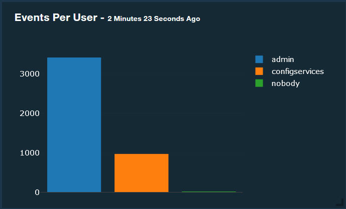
The following image shows the events per user.
Creating a Big Number Chart
Big number charts display important metrics on the SOC wall that you want your team to monitor. Turn on trending to see how your organization is doing over time.
Complete one of the following tasks: Creating dashboard items from an offense data source or Creating dashboard items from an AQL data source. Ensure that you have query results.
In the Views section of the widget, give the chart a name and select whether to show the title and the update status.
Select Big Number Chart.
On the General tab, set the value and font size.
For offense data sources only, choose how to aggregate the values. The following table describes the available aggregation options:
Option
Description
First
Returns the first value of the selected field in the data set.
Average
Returns the average of all numeric values for the selected field.
Sum
Returns the sum value for the selected field.
Count
Returns a row count of the selected field.
Maximum
Returns the maximum value for the selected field.
Minimum
Returns the minimum value for the selected field.
Turn on trending to compare the current and previous values.
On the chart, an arrow indicates whether the value increased, decreased, or stayed the same since the previous value.
For numeric data from AQL data sources, set Display 0 if no data is returned to On if you want to prevent a blank chart or a
No data was returnedmessage. This behavior matches the standard behavior for offense data sources.On the Thresholds tab, set thresholds to display conditional color formatting in the chart.
Click Add Threshold Indicator.
Select a threshold indicator, enter a threshold value, and then click Add Value to pick a color or enter an HTML color code in the color palette to make it easier to select the same colors on different charts. For example, if the value is higher than 50, set the background color to red and the data color to black. If you only set the background color, the data color and view name display a contrasting black or white, depending on the background color that you select.
Note:It is invalid to select a non-numerical column as a threshold. Run the query to get results and check your threshold settings to make sure that they work properly.
Preview how the chart looks and then click Save.
Tip:The labels for the chart come from the queries that are used. If they are unintelligible in the preview, edit the labels in the View section.
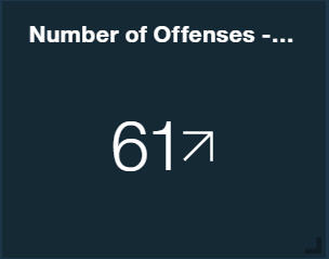
The following image shows that the number of offenses increased since the last count.
Creating a Geographic Chart
Geographic charts map their presentation onto a geographic map by using location information, where the data is displayed on the map according to the geographic location with which the data is associated.
Complete the following task: Creating dashboard items from an AQL data source. Ensure that you have query results.
In the Views section of the widget, give the chart a name and select whether to show the title and the update status.
Select Geographic Chart.
On the General tab, select the chart subtype.
Scatter Geo charts display points to indicate the IP source and destination of detected malicious activities. You can display lines between the source and destination points.
Choropleth charts are shaded in proportion to the amount of malicious activity detected in each geographic region.
Select the type of geographic data, metric data, location, and projection.
Set Show Legend to Yes and set the orientation.
On the Thresholds tab, set thresholds for the geographic chart. In scatter geo charts, thresholds can be indicated in various ways. In choropleth charts, thresholds are indicated by using a color scale.
Click Add Threshold Indicator.
Set thresholds to display any numerical field in the query, such as the magnitude of events. For Scatter Geo charts, select the threshold indicator (point color, point shape, point size, line color, or line width) and then select the column. For Choropleth charts, select color scale and then select the column.
Enter a value and click Add Value to pick a color or enter an HTML color code in the color palette to make it easier to select the same colors on different charts.
Note:It is invalid to select a non-numerical column as a threshold. Run the query to get results and check your threshold settings to make sure that they work properly.
On the Map tab, show borders and map grids, and set the color scheme for when land and water is displayed. If there is more than one geographic data source, you can also show the lines between data sets.
On the Viewport tab, set the latitude, longitude, and scale for IP addresses.
Preview how the chart looks and then click Save.
Tip:The labels for the chart come from the queries that are used. If they are unintelligible in the preview, edit the labels in the View section.
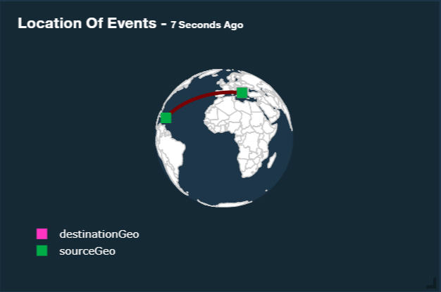
The following image shows a line between the two markers of a source IP and a destination IP.
Creating a Pie Chart
Use a pie chart to represent numbers in percentages, or to visualize the parts of a relationship or a composition.
Complete one of the following tasks: Creating dashboard items from an offense data source or Creating dashboard items from an AQL data source. Ensure that you have query results.
In the Views section of the widget, give the chart a name and whether to show the title and the update status.
Select Pie Chart.
On the General tab, select a label and value.
For offense data sources only, click More options, and select an aggregation type for the value. The following list describes the available aggregation options:
Option
Description
No aggregation
If the field is numerical, returns the sum of each unique label.
First
For each unique label, returns the first value of the selected field.
Average
For each unique label, returns the average of the selected field.
Sum
For each unique label, returns the sum of each value of the selected field.
Count
For each unique label, returns a row count of the selected field.
Maximum
For each unique label, returns the largest numeric value of the selected field.
Minimum
For each unique label, returns the smallest numeric value of the selected field.
Set Doughnut Chart to On to give the chart an open center.
Set Show Legend to Yes and set the orientation.
On the Format tab, select a text format and hover format for the labels.
On the Drilldown tab, choose a drill down action for when a slice is clicked in the pie chart. You can open a Pulse dashboard, a URL, or a specific page in the source application (QRadar or QRadar Analyst Workflow).
If you chose to open a Pulse dashboard, select the dashboard to open, optionally select dashboard parameter values, and choose whether to open it in the current window or in a new window.
If you set parameters, they are passed to the target dashboard based on the slice that was clicked in the pie chart. For example, if you set an ID parameter, the bar or segment ID is passed as a parameter to the target dashboard. If you set a dashboard parameter value to Default, no parameter value is passed to the target dashboard; the existing session or default parameter value is used or the parameter field is blank in the target dashboard Parameters card
If you chose to open a URL, specify an absolute path to open an external URL or a relative path to open a QRadar page such as DNS lookup. The URL opens in a new browser window.
You can define any number of parameters anywhere in the URL. Enclose parameters in braces. The following table lists some typical QRadar URLs with parameters:
Description
URL
QRadar port scan
The data source must include source or destination IP addresses. The {ip_address} string defines an ip_address URL parameter for a source or destination IP address column. Then, when you drill down on a table row, the port scan page opens to the source or destination IP address of the row.
/console/core/jsp/investigate.jsp?type
=port_scan&host={ip_address}
QRadar DNS lookup
The data source must include source or destination IP addresses. The
{ip_address}string defines an ip_address URL parameter for a source or destination IP address column. Then, when you drill down on a table row, the DNS lookup page opens to the source or destination IP address of the row./console/core/jsp/investigate.jsp?type= dns_lookuphost={ip_address}QRadar WHOIS lookup
The data source must include source or destination IP addresses. The
{ip_address}string defines an ip_address URL parameter for a source or destination IP address column. Then, when you drill down on a table row, the DNS lookup page opens to the source or destination IP address of the row./console/core/jsp/investigate.jsp?type=whois _lookup&host={ip_address}QRadar WHOIS lookup
The data source must include source or destination IP addresses. The
{ip_address}string defines an ip_address URL parameter for a source or destination IP address column. Then, when you drill down on a table row, the WHOIS lookup page opens to the source or destination IP address of the row./console/core/jsp/investigate.jsp?type= whois_lookup&host={ip_address}QRadar Offense Summary page
The data source must include offense IDs. The
{offense_id}string defines an ip_address URL parameter for an ID column. Then, when you drill down on a table row, the Offense Summary page opens to the offense ID of the row./console/do/sem/offensesummary?appName= Sem&pageId =OffenseSummary&summaryId={offense_id}If you chose to open a page in the source application, select the page to open and specify a data column for each URL parameter. (At this time, only the Offense Summary page is available and only an offense_id URL parameter is required.)
Depending on the source application, the page will open in either QRadar or QRadar Analyst Workflow.
Preview how the chart looks and then click Save.
Tip:The labels for the chart come from the queries that are used. If they are unintelligible in the preview, edit the labels in the View section.
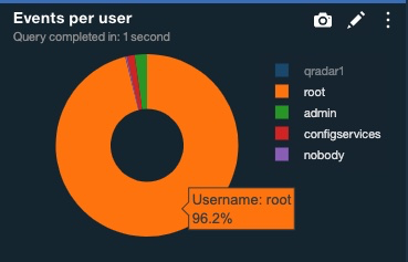
The following image shows the events per user. Hover text was configured so that the column name and percentage of the slice is displayed.
Creating a Scatter Chart
Use scatter charts to explore correlations between different measures. Scatter charts use data points to plot two measures anywhere along a scale.
Complete one of the following tasks: Creating dashboard items from an offense data source or Creating dashboard items from an AQL data source. Ensure that you have query results.
In the Views section of the widget, give the chart a name and select whether to show the title and the update status.
Select Scatter Chart
On the General tab, set the following properties:
Select a field for the x-axis.
Select Dynamic Series to subdivide the x-axis field by another field. By using a dynamic series, you can compare subdivisions within the x-axis field.
Note:To prevent performance degradation, QRadar Pulse renders the first 20 data series that it detects, and ignores subsequent series. You can limit the size of the data by using the AQL WHERE clause to LIMIT and ORDER your data sets for use in a dynamic series.
Select a field for the y-axis and specify the axis label, line mode, and symbol shape and size for data points in the scatter chart.
Set Show Legend to Yes and set the orientation.
On the Axes tab, set the Y Axis Type based on the data that is retrieved from the query. The following table describes the available axis types:
Type
Description
None
The chart attempts to automatically determine the type based on the data set.
Linear
Numeric axis mode. Displays a range of numbers. Each bar represents a unique numerical value for each selected field, and bars are spaced in a linear manner according to their values.
Log
Numeric axis mode. Bars display as unique numerical values, and are spaced in a logarithmic manner according to their values.
Set the Value Axis Range to Yes and enter Minimum and Maximum values to make it easier to compare data in different charts.
On the Thresholds tab, set thresholds for the scatter chart. Thresholds can be indicated in various ways in the chart.
Click Add Threshold Indicator.
Set thresholds to display any numerical field in the query, such as the magnitude of events. Select the threshold indicator (point color, point shape, point size) and then select the column.
Enter a value and click Add Value to pick a color or enter an HTML color code in the color palette to make it easier to select the same colors on different charts.
It is invalid to select a non-numerical column as a threshold. Run the query to get results and check your threshold settings to make sure that they work properly.
Preview how the chart looks and then click Save.
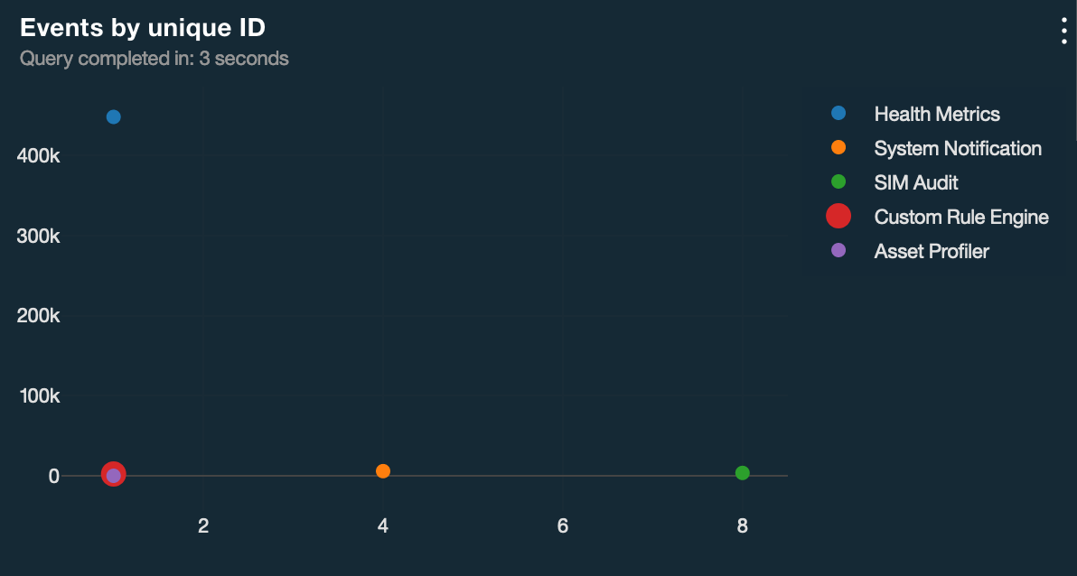
The following image shows a scatter chart to display events by unique ID:
Creating a Tabular Chart
Use a tabular chart when you have more than one set of values that have a direct relationship.
Complete one of the following tasks: Creating dashboard items from an offense data source or Creating dashboard items from an AQL data source. Ensure that you have query results.
In the Views section of the widget, give the chart a name and select whether to show the title and the update status.
Select Tabular Display
On the General tab, set the following properties:
Select all columns or specify which columns to display.
If you selected specific columns, click More options for each column and give the column a name to display. You can also specify the column alignment for the specific column, or use the alignment that is inherited from the default column settings.
Select the default alignment for all of the columns in the table.
Select a table size and the maximum number of items to display.
On the Thresholds tab, set thresholds to display conditional color formatting in the chart.
Click Add Threshold Indicator.
Set thresholds to display any numerical field in the query, such as the magnitude of events. Select the threshold indicator (color, shape, or both) and then select the column.
If you selected color, enter a value and then click Add Value to pick a color or enter an HTML color code in the color palette to make it easier to select the same colors on different charts.
If you selected shape, enter a value and then click Add Value to pick a shape.
If you select color and shape threshold indicators, color is applied to the shape instead of the left border of the table. For example, a caution state can be displayed as a yellow triangle. You can use the same threshold values for color and shape.
Run the query to get results and check your threshold settings to make sure that they work properly. It is invalid to select a non-numerical column as a threshold.
On the Drilldown tab, choose an action for when a row is clicked in the tabular chart. You can open a Pulse dashboard, a URL, or a specific page in the source application (QRadar or QRadar Analyst Workflow).
If you chose to open a Pulse dashboard, select the dashboard to open, optionally select dashboard parameter values, and choose whether to open it in the current window or in a new window. If you set parameters, they are passed to the target dashboard based on the row that was clicked in the tabular chart. For example, if you set an ID parameter, the bar or segment ID is passed as a parameter to the target dashboard. If you set a dashboard parameter value to Default, no parameter value is passed to the target dashboard; the existing session or default parameter value is used or the parameter field is blank in the target dashboard Parameters card.
Tip:If you drill down to a different Pulse dashboard in the same window, you can use the breadcrumb trail to return to previous dashboards in the drill path.
If you chose to open a URL, specify an absolute path to open an external URL or a relative path to open a QRadar page such as DNS lookup. The URL opens in a new browser window.
You can define any number of parameters anywhere in the URL. Enclose parameters in braces. The following table lists some typical QRadar URLs with parameters:
Description
URL
QRadar port scan
The data source must include source or destination IP addresses. The {ip_address} string defines an ip_address URL parameter for a source or destination IP address column. Then, when you drill down on a table row, the port scan page opens to the source or destination IP address of the row.
/console/core/jsp/investigate.jsp?type=port_
scan&host={ip_address}
QRadar DNS lookup
The data source must include source or destination IP addresses. The
{ip_address}string defines an ip_address URL parameter for a source or destination IP address column. Then, when you drill down on a table row, the DNS lookup page opens to the source or destination IP address of the row./console/core/jsp/investigate.jsp?type =dns_lookup&host={ip_address}QRadar WHOIS lookup
The data source must include source or destination IP addresses. The
{ip_address}string defines an ip_address URL parameter for a source or destination IP address column. Then, when you drill down on a table row, the WHOIS lookup page opens to the source or destination IP address of the row./console/core/jsp/investigate.jsp?type =whois_lookup&host={ip_address}QRadar Offense Summary page
The data source must include offense IDs. The {offense_id} string defines an offense_id URL parameter for an ID column. Then, when you drill down on a table row, the Offense Summary page opens to the offense ID of the row.
/console/do/sem/offensesummary?appName=Sem&page
Id=Offense
Summary&summaryId={offense_id}
If you chose to open a Pulse dashboard, select the dashboard to open, optionally select dashboard parameter values, and choose whether to open it in the current window or in a new window.
If you set parameters, they are passed to the target dashboard based on the row that was clicked in the tabular chart. For example, if you set an ID parameter, the row ID is passed as a parameter to the target dashboard. If you set a dashboard parameter value to Default, no parameter value is passed to the target dashboard; the existing session or default parameter value is used or the parameter field is blank in the target dashboard Parameters card.
Tip:If you drill down to a different Pulse dashboard in the same window, you can use the breadcrumb trail to return to previous dashboards in the drill path.
Preview how the chart looks and then click Save.
Tip:The labels for the chart come from the queries that are used. If they are unintelligible in the preview, edit the labels in the View section.
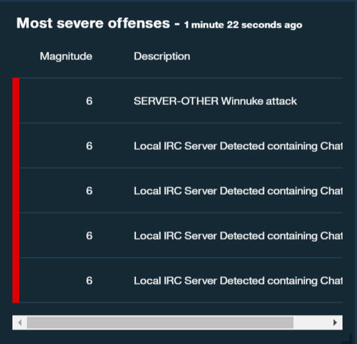
The following image shows a tabular chart to display the magnitude and description of the most severe offenses.
Creating a Time Series Chart
Time series charts illustrate data points at successive intervals of time. You use a time series chart to show trending or comparisons.
Complete the following task: Creating dashboard items from an AQL data source. Ensure that you have query results.
In the Views section of the widget, give the chart a name and select whether to show the title and the update status.
Select Time Series Chart.
On the General tab, set the following properties:
Select the time for the x-axis to display.
Select the dynamic series option to split the time series by a specific data point. This option helps make the data more visually consumable, and makes it easier to create a time series chart. For more information, see Time Series Charts in QRadar Pulse and Tracking the top five most active devices in the last ten minutes.
Select a field for the y-axis and a color for the display. Optionally, click Add Series to plot more than one series.
Tip:For best results in time series area charts that are not stacked, order the y-axis fields from smallest to largest on the General tab. Ordering the fields prevents larger values from overlapping smaller values.
Optional: Set Area Chart to On to fill the area below the plotted line with color.
If you use an area chart with more than one y-axis series, set Stacked Area Chart to On to sum and stack the series on top of each other.
Set Show Legend to Yes and set the orientation.
On the Legend tab, set Show Legend to On and set the orientation.
On the Axes tab, set the Y Axis Type based on the data that is retrieved from the query. The following table describes the available axis types:
Type
Description
None
The chart attempts to automatically determine the type based on the data set.
Linear
Numeric axis mode. Displays a range of numbers. Bars display as unique numerical values for each selected field, and are spaced in a linear manner according to their values.
Log
Numeric axis mode. Bars display as unique numerical values, and are spaced in a logarithmic manner according to their values.
Turn on value axis range to set a minimum and maximum for the value axis, and then click Save.
On the Thresholds tab, set threshold lines so that you can quickly recognize when values exceed predefined benchmarks, such as low, medium, high, and critical.
Enter a name for the line and a value, and then click Add Value.
Pick a color or enter an HTML color code in the color palette. You can use the same color code in multiple charts, which helps make threshold displays consistent in meaning across all of your charts.
For example, Critical has a value of 10 and is burgundy in color. The name Critical appears when you hover over the line in the chart.
Preview how the chart looks and then click Save.
Tip:The labels for the chart come from the queries that are used. If they are unintelligible in the preview, edit the labels in the View section.
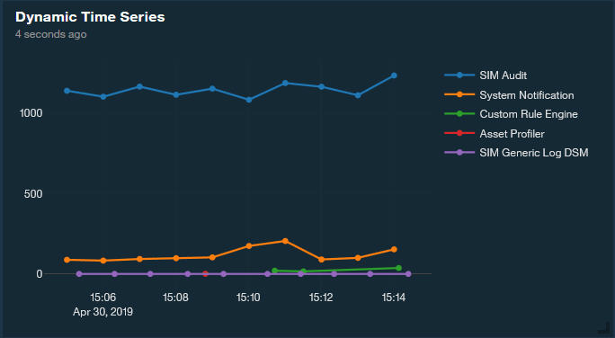
The following image shows the top 10 most active devices in the last ten minutes.