Displaying Dashboards
Open a dashboard into a separate window; for example, on a SOC wall. Select a specific dashboard to be the default dashboard every time you log in. Pin dashboards or widgets to individual windows.
Rearrange the layout of the widgets and the Parameters card as you like. Resize widgets to emphasize certain ones.
View the widget. Depending on the chart view you use, several options for viewing the chart are available from the More options menu or as individual icons:
Refresh the chart content immediately to see changes, instead of waiting for the next scheduled refresh time.
Toggle the chart settings to see all the available views of the data.
Open the dashboard data in the corresponding Log Activity or Network Activity tabs to see more details.
Note:If a widget contains parameters with no values, the menu options for Log Activity and Network Activity aren't displayed.
Zoom or pan the chart to focus your view on specific areas.
Reset the chart axes after you zoom or pan the chart.
Scale the size of the chart display in an expanded window, and easily restore the default. Toggle the scale on and off. The scale floats over the bottom of the window while you adjust the scale, and disappears when you move away from the scale.
Open a widget or dashboard to display in a new window on a SOC monitor.
Pin or unpin a widget or dashboard after you open it in a separate window. Restore all of your pinned windows after they are closed.
Note:If a pinned widget or a dashboard contains parameters, the pinned window saves the parameter values at the point in time that the window was pinned.
If you change the parameter values in the original dashboard or widget, and then close and reopen the pinned window, the parameters in the pinned window aren't affected.
If you edit the original dashboard or widget to add or delete parameters, and then close and reopen or refresh the pinned window, the parameters in the window are affected. Refresh your window to display the changes.
If you move the Parameters card of a widget to a different position in an expanded window, and then close and reopen the window, the card returns to the original position.
You can edit the parameters of the pinned window by using the Parameters card in the window. In SOCs where pinned windows can stay open on separate monitors for a long duration, it can be useful.
To change your workspace color scheme or remove the default QRadar branding that appears when you open any dashboard or widget in a new window, follow these steps:
From any dashboard, click More options > User Preferences.
Under Theme Options, choose a theme to control the background color and chart colors.
Set IBM Branding to Disabled
Click Close.
Remove widgets from a dashboard when the widgets no longer apply or delete dashboards when they no longer apply.
Note:Removing a widget from a dashboard does not delete it from the app. Deleting a dashboard doesn't delete the widgets from the app.
Changing the View Of Dashboard Item Data
You can change widget views or add widgets with different views in your dashboards so that you can see data from other perspectives.
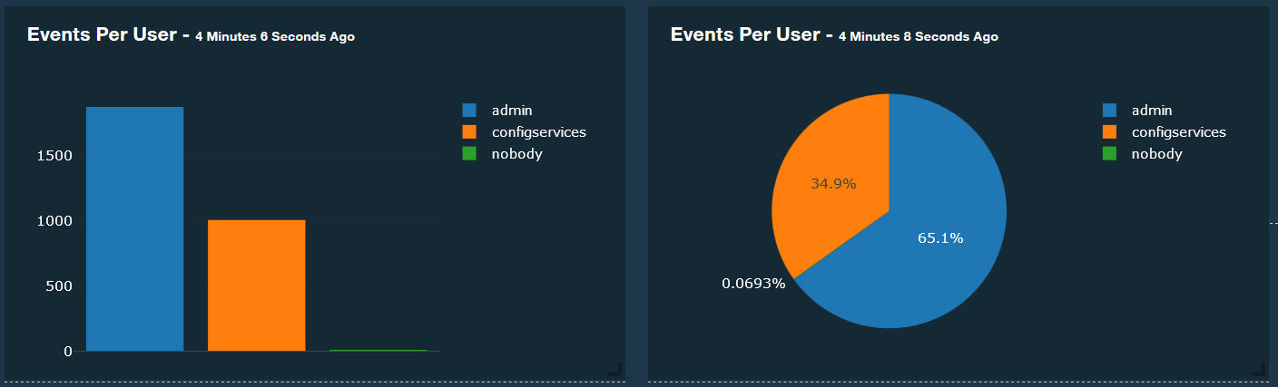
In this scenario, you want to add a pie chart view of the Events per user chart to the Miscellaneous metrics dashboard. By default, the dashboard displays the bar chart view.
To change the view of a dashboard chart, click More options > Settings to flip the card, and select the view to display.
To add another view of the dashboard chart, complete the following steps:
From the Miscellaneous metrics dashboard, click Configure Dashboard , and scroll down the list to find the item names of the chart view you want to add to the dashboard.
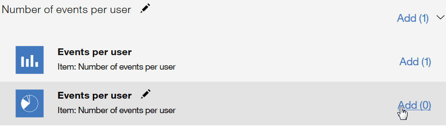
Click Add for each view you want to add to the dashboard, and click Done.
Both chart views are available on the dashboard.
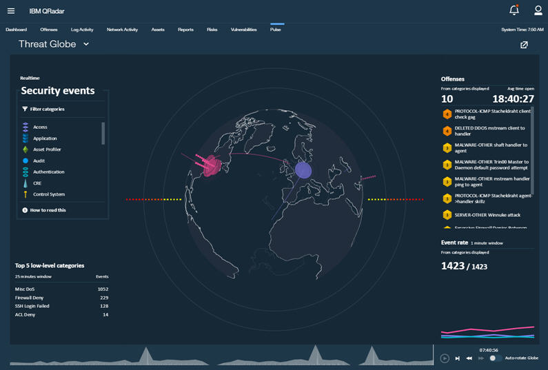
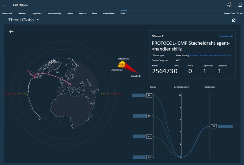
Visualizing Security Incidents on the Threat Globe Dashboard
The 3D threat globe dashboard displays where incidents are occurring. Threat researchers can use the visualization to see whether the same attacks are happening everywhere across the globe or just at specific customer sites.
The threat globe gathers initial data to populate the 3D globe, so it might take a few minutes to complete the visualization.
QRadar Pulse 2.1.6 on QRadar 7.3.1 or later uses the QRadar MaxMind database. QRadar Pulse uses the following order of precedence to find the geographical locations:
Looks at the network hierarchy (in QRadar 7.3.1 or later. If you're using 7.3.0, QRadar Pulse starts its process at step 2.)
Checks in the MaxMind database QRadar Pulse.
Checks in the MaxMind database in QRadar 7.3.1 or later.
Checks the QRadar Pulse configuration screen to verify that the latitude and longitude are properly set.
Select the event categories that you want to see on the globe. Click Filter Categories to display the list of offense categories. By default, all categories are selected.
To add or remove a category from the top list, select it.
To set the new categories, click Done.
Rotate the globe to focus on a country or continent. Events are plotted on the 3D globe according to their location in a country. Turn off the auto-rotate function and then zoom in to focus on a country. Click and drag the globe to change the angle. Use the following legend to understand what you see on the globe:
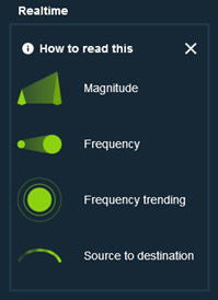
Magnitude: Specifies how bad the offense is. The height of the visual spike on the globe indicates the severity of the offense.
The magnitude rating of an offense is calculated based on relevance, severity, and credibility.
Relevance determines the impact of the offense on your network. For example, if a port is open, the relevance is high.
Credibility indicates the integrity of the offense as determined by the credibility rating that is configured in the log source. Credibility increases as multiple sources report the same event.
Severity indicates the level of threat that a source poses in relation to how prepared the destination is for the attack.
Frequency: The size of the circles on the globe indicates the frequency of new events that are coming in to the threat globe.
Frequency trending: If the concentric circles continue to expand outwards, the frequency of offenses is increasing.
Source to destination: The path arcs from the source IP to the destination IP.
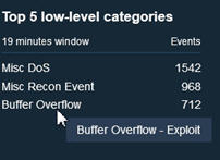
Hover over a security event category. Unrelated low-level categories are filtered from the top five low-level categories and the event rate chart.
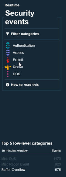
Hover over the top five low-level categories to see which high-level security event category they belong to.
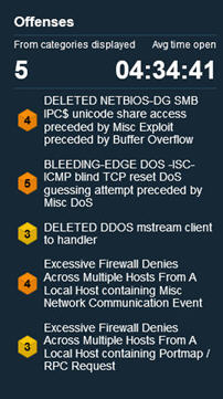
The Offenses section initially displays the top 10 offenses with recent activity that are currently open, sorted by severity, credibility, and relevance. As the app runs, the list is supplemented with new offenses from recent events. Click an offense to investigate it further.
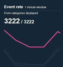
The timeline graph at the bottom of the page shows the last 15 minutes (default) of real-time activity. Pause the timeline and then rewind it to replay the events as they came into the threat globe. Hover over the timeline to see the date and time. The event rate is a running list of the events as they come in. When you pause the timeline, the event rate also pauses.
Note:You can customize the length of time of the real-time activity on the Configuration page.
By default, there is a 10-minute (600 seconds) delay from when QRadar collects an offense to when it is displayed in the threat globe.
The threat globe's filtering is not based on whether an offense is active or inactive. Instead, it shows open offenses with events that fall within an approximate 15-minute time frame after a real-time delay of around 10 minutes.
The Event rate chart displays the rate at which security events are collected by QRadar before they're visualized in the threat globe. In the screen capture, the number on the right reflects the total events that came in during 1 minute. The number on the left reflects the number for the event categories that are selected in the Security events section. Hover over the lines to display the high-level category. Events that are filtered from the Security Event categories appear as gray lines.
Event Categories That Are Visualized in the Threat Globe Dashboard
Event categories are used to group incoming events for visualizing by the Threat Globe. Events that occur on your network are aggregated into high-level and low-level categories. Each high-level category contains low-level categories and an associated severity level and ID number.
Security event category |
Description |
|---|---|
Access |
Authentication and access controls that are used for monitoring network events. |
Application |
Events that are related to application activity, such as email or FTP activity. |
Asset profiler |
Events that are related to asset profiles. Asset profiles provide information about each known asset in your network, including what services are running on each asset. |
Audit |
Events that are related to audit activity, such as email or FTP activity. |
Authentication |
Events that are related to authentication, sessions, and access controls that monitor users on the network. |
CRE |
Events that are generated from a custom offense, flow, or event rule. |
Control System |
Events that are related to your hardware system. |
DoS |
Events that are related to denial-of-service (DoS) attacks against services or hosts. |
Exploit |
Events where communication or access exploits occurred. |
Flow |
A single transmission of data that passes over a link during a conversation. |
Policy |
Events that are related to administration of network policy and the monitoring network resources for policy violations. |
Potential Exploit |
Events that are related to potential application exploits and buffer overflow attempts. |
Recon |
Events that are related to scanning and other techniques that are used to identify network resources. |
Risk |
Events that are related to QRadar Risk Manager. |
Risk Manager Audit |
Events that are related to QRadar Risk Manager audit events. |
SIM Audit |
Events that are related to user interaction with the QRadar Console and administrative features. |
Sense |
Events that are related to sense user behavior analytics. |
Suspicious Activity |
Events that are related to viruses, Trojan horse programs, back door attacks, and other forms of hostile software. |
System |
Events that are related to system changes, software installation, or status messages. |
Time Series |
A graphical representation of network connections over time. |
Unknown |
Events that are not parsed and therefore cannot be categorized. |
User Defined |
Events that are related to user-defined objects. |
VIS Host Discovery |
When the VIS component discovers and stores new hosts, ports, or vulnerabilities that are detected on the network, the VIS component generates events. These events are sent to the Event Collector to be correlated with other security events. |
Investigating the Details Of an Offense from the Threat Globe Dashboard
Conduct a more comprehensive investigation by studying the details of a particular offense.
From the main global view, click an offense to open the Offense Details page. The visualization display expands to show you the selected offense and where it is occurring on the 3D globe.
Click View full details to get detailed information in a separate browser tab.
Click the Pulse tab (or click the left arrow) to return to the original screen with refreshed content.
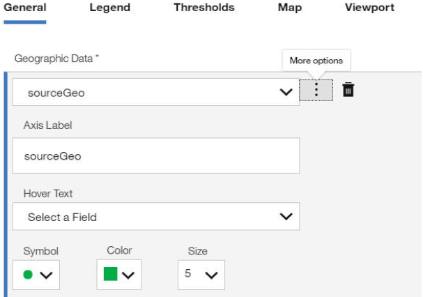
Visualizing the Average Magnitude of an Event on a Geographic Chart
In this example, you set the source and destination IP addresses, edit the colors that display on the scatter geo chart, and set the chart to auto rotate in the dashboard.
To ensure that the map renders properly in QRadar Pulse, your browser must be connected to the Internet.
Click Configure dashboard.
The Configure dashboard screen displays a library of available widgets, with details about each widget.
Click Create new widget.
On the New Dashboard Item page, enter Magnitude of events as the name and provide a description.
Select AQL as the data source, set the Refresh Time to every 5 minutes, and enter the following AQL query in the AQL Statement field:
SELECT sourceip as 'Source IP',
destinationip as 'Destination IP',
AVG(magnitude) as 'Average Magnitude',
count(*) as 'Number of Events',
GEO::LOOKUP(destinationip, 'geo_json') as destinationGeo,
GEO::LOOKUP(sourceip, 'geo_json') as 'sourceGeo'
from events
group by 'Source IP'
Set the Results Limit to 1000, and click Run Query.
Configure the chart display. In the Views section of the page, enter Magnitude of events as the View Name and select Geographic Chart as the chart type.
On the General tab, select sourceGeo in the Geographic Data field, and click the More options icon.
Leave the Axis Label as sourceGeo.
Select sourceGeo as the Hover Text.
Pick a
roundsymbol,greencolor, and size5for the data point.Click the More options icon to minimize the selected row.
Click Add Series, select destinationGeo, and repeat step 7. In step 7 (c), change the values to a
diamondsymbol,pinkcolor, and size8for the data point.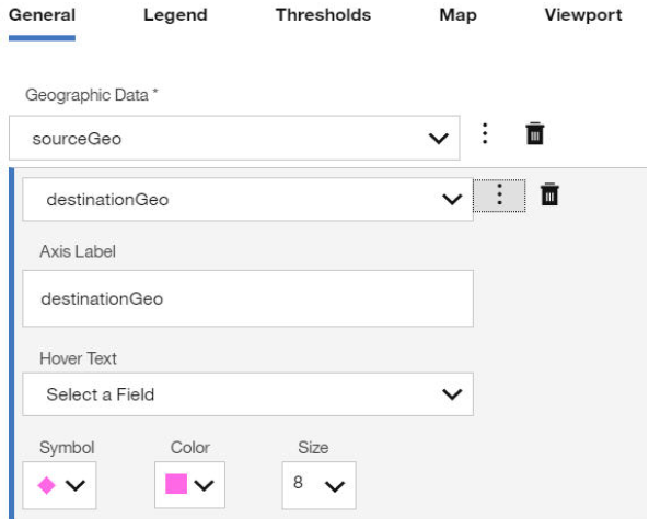
Select Globe (Orthographic) for the Projection.
Set Show Legend to Yes, and pick the Vertical legend orientation.
On the Thresholds tab, click Add Threshold Indicator. You can apply thresholds only if the AQL query contains numeric columns, such as Average Magnitude, Number of Events and count(*).
Select a threshold indicator, and click the More options icon.
Select a column, add a threshold value, and then click Add Threshold.
Change the option or use the default options. Add as many threshold values as you need.
Optional: For the Point Color threshold, select a color scale mode to display on the dashboard item.
Optional: Pick a scale mode to display for the Point Color threshold. The color scale mode displays under the legend on the dashboard item.
On the Map tab, enable all of the options except for Display Grid.
Pick colors for the lines, land, water, borders of the map. Choose whether to display the map grid or not.
On the Viewport tab, configure the latitude, longitude, and scale for how the map displays in the dashboard item. When you're happy with the preview display, click Set latitude, longitude, and scale as seen in the preview.
Click Save.
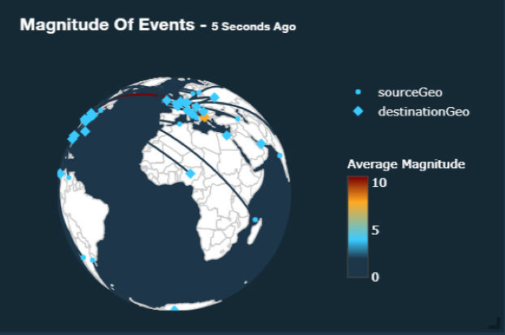
Optional: Click the Settings icon on the dashboard item, and toggle the Autorotate Globe switch.