Time Series Charts in QRadar Pulse
At first glance, creating a time series chart from relational data in QRadar Pulse can be challenging. The amount of data that is returned by an AQL query can be unwieldy, but with some background knowledge and careful planning, you can produce relevant and meaningful time series charts.
After you read about time series charts, create a dynamic time series chart by following the procedure in Tracking the top five most active devices in the last ten minutes. In QRadar Pulse 2.1.4 or later, the time series chart has a dynamic series option that is useful when you don't know which devices you want to track, or find it difficult to make time series charts work properly. It automatically detects series and displays them as separate lines on the time series chart.
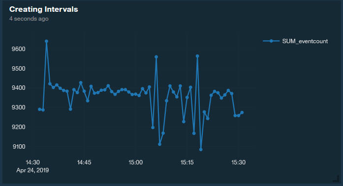
Ordering a metric by starttime does yield a time series, like the following AQL query, but the amount of returned data can be unwieldy to work with and understand.
select starttime as 'Start Time', SUM(eventcount)
as 'Event Count (Sum)' from events where eventcount <> NULL GROUP
BY starttime order by starttime LAST 60 minutes
The amount of returned data can result in a noisy chart that doesn't provide much information. The event start times might not occur at regular intervals, which can create gaps in the data set.
Creating Intervals in a Time Series Query
The first step is to decide the type of interval to use for your data analysis. Do you want to look at data from a narrow interval, such as every second? Or in larger intervals of every minute or every hour? This decision is important because data points must be grouped in intervals so that a metric is calculated.
Using the original query, you can group the data by using one of the following techniques:
Using the GROUP BY clause to create an interval: GROUP BY starttime/60000. Because starttime is in displayed in milliseconds, if you divide by 60,000 (60 seconds x 1000 milliseconds), you create groups or intervals of 60 seconds (1 minute).
Changing the ORDER BY clause to use the aggregate sTime.
The query changes to the following code:
select starttime as 'sTime', SUM(eventcount) as
'Event Count (Sum)' from events where eventcount > 0 GROUP BY starttime/60000
order by "sTime" LAST 60 minutes
The data is now more visually consumable and ensures that one data point occurs every minute. Now that the intervals are properly defined, you can use a few strategies to format the data into a more friendly time series format.
Pivoting Rows to Columns to Create a Series
One method for creating a time series chart involves pivoting the rows of data into columns that directly represent a series in Pulse. For example, if your use case is to count events for a specific device for each 1-minute interval, you must create a separate conditional aggregate for each series that you want to plot on the graph.
SUM(IF LOGSOURCETYPENAME(devicetype) = 'System
Notification' THEN 1.0 ELSE 0.0)  as system_notification SUM(IF LOGSOURCETYPENAME(devicetype)
= 'SIM Audit' THEN 1.0 ELSE 0.0) as sim_audit
The full query looks like the following example:
SELECT starttime/(1000*60) as 'minute', (minute
* (1000*60)) as 'stime', SUM(IF LOGSOURCETYPENAME(devicetype)
= 'System Notification' THEN 1.0 ELSE 0.0)  as system_notification,
SUM(IF LOGSOURCETYPENAME(devicetype) = 'SIM Audit' THEN 1.0 ELSE 0.0)
as sim_audit FROM events WHERE devicetype <> NULL GROUP BY
minute ORDER BY stime asc LAST 10 minutes
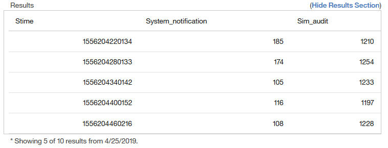
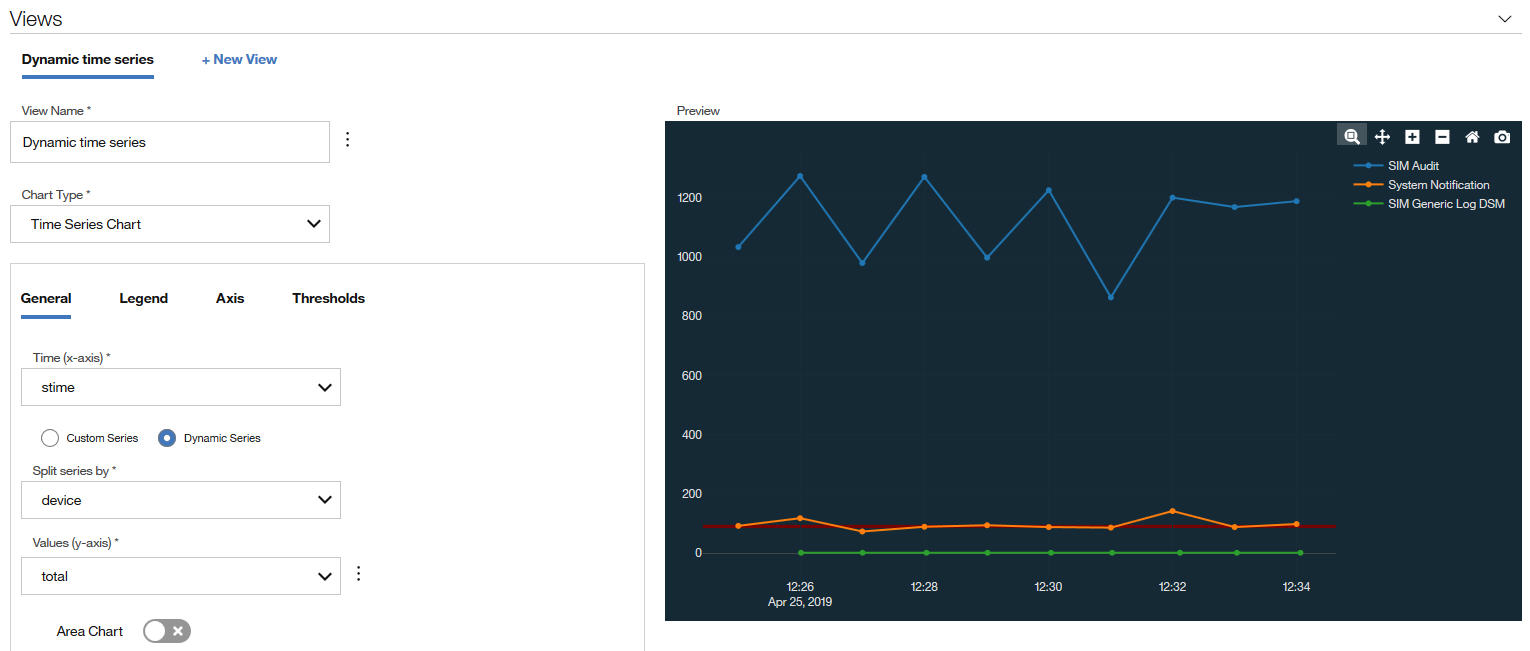
The query takes the row data for both System Notification and SIM Audit devices and pivots them into separate columns that correspond to a series on the chart:
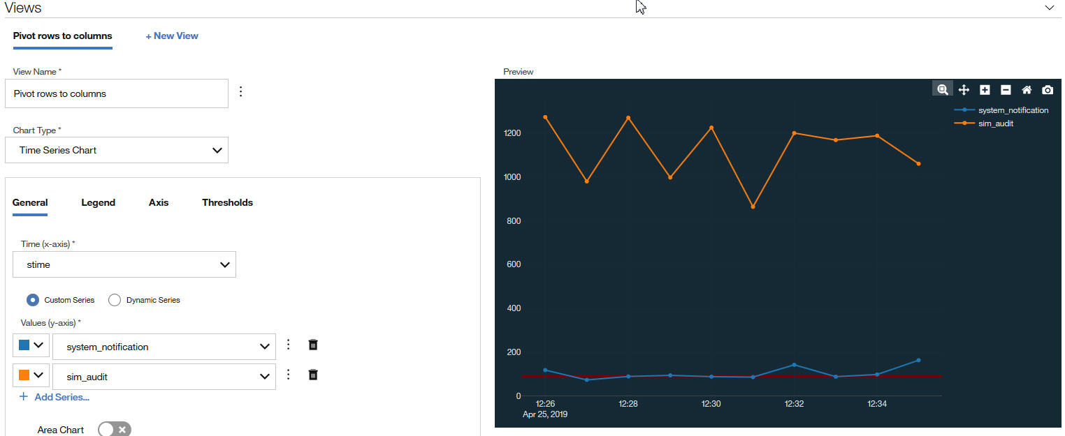
The following image shows the view configuration and chart display for pivoting the rows.
While this method is fairly efficient to transform relational data into time series data, you must know ahead of time what data you're looking for.
Creating a Dynamic Time Series
What if you don't know ahead of time what devices you're looking for, or you want to graph the top five most active devices in the last hour? You can create a dynamic time series in QRadar Pulse V2.1.4. Rather than pivoting rows of data into columns, the second strategy uses a secondary GROUP BY clause (called "device" in the examples) to create a dynamic time series.
SELECT starttime/(1000*60) as 'minute',  MIN(starttime)
as 'stime',  eventcount as 'eventCount', devicetype as 'deviceType',
LOGSOURCETYPENAME(devicetype) as 'device',  count(*) as 'total' FROM
events WHERE deviceType IN (     SELECT deviceType FROM (
SELECT devicetype as 'deviceType',          count(*) as 'total'
      FROM events         GROUP BY deviceType         ORDER BY total
DESC         LIMIT 8 LAST {Time_Span}   ) ) and devicetype not in
(18,105,147,368) GROUP BY minute, device ORDER BY minute asc LAST
{Time_Span}
The returned results for the query look like the following image:
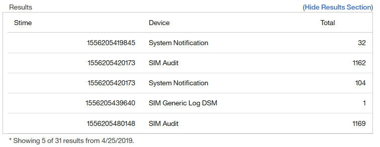
The difference from the previous method is that the data is not pivoted into columns and contains repetitions in the time column that is caused by the secondary GROUP BY clause. By using the dynamic time series option, QRadar Pulse splits the data into a proper time series format. Select the column that contains the time (stime for the x-axis), the column that contains the data (total for the y-axis), and the column that contains the GROUP BY clause (to extract the different series by device).
Although the chart looks the same as the one that was created by the previous method, the underlying AQL query is much more dynamic. If the log sources change over time, the chart automatically updates because the values are no longer hardcoded into the query.
However, you need to be aware of some caveats. Because the data rows don't pivot into columns, the size of the data is much larger and grows proportionately with the number of devices. QRadar Pulse processes the data, so the size of the data might negatively impact the overall responsiveness of the browser. To prevent performance degradation, QRadar Pulse renders the first 20 data series that it detects, and ignores subsequent series. Limit the size of the data by using the WHERE clause to LIMIT and ORDER your data sets for use in a dynamic time series. For example, if the use case is "count the top three most active devices in the last 10 minutes, excluding 'Health Metrics'," create the following query:
SELECT starttime/(1000*60) as 'minute', (minute
* (1000*60)) as 'stime', LOGSOURCETYPENAME(devicetype) as 'device',
count(*) as 'total' FROM events WHERE device IN (     SELECT deviceList
FROM (         SELECT LOGSOURCETYPENAME(devicetype) as deviceList,
count(*) as topDevices         FROM events         WHERE deviceList
<> 'Health Metrics'         GROUP BY deviceList         ORDER BY
topDevices DESC         LIMIT 3         LAST 10 minutes     ) ) GROUP
BY minute, device ORDER BY stime asc LAST 10 minutes
The query is more efficient, and ensures that the three rendered series correspond to the top three active devices in the selected time span.
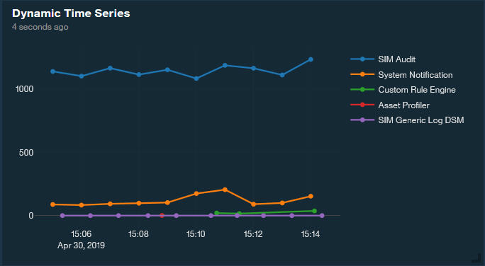
Tracking the Top Five Most Active Devices in the Last Ten Minutes
In this example, you create a dynamic time series chart to track the top five most active devices in your environment in the last ten minutes. In QRadar Pulse V2.1.4 or later, the time series chart has a dynamic series option that is useful when you don't know which devices you want to track, or find it difficult to make time series charts work properly. It automatically detects series and displays them as separate lines on the time series chart.
For more background information, see Time Series Charts in QRadar Pulse.
Click Configure dashboard.
The Configure dashboard screen displays a library of available widgets, with details about each widget.
Click Create new widget.
On the New Dashboard Item page, enter a name and a description for the item.
Select AQL from the data source list in the Query section, and enter the following AQL statement:
SELECT MIN(starttime) as stime, LOGSOURCETYPENAME(devicetype)
as device, devicetype as devices, count(*) as total FROM events WHERE
devices IN (    SELECT devices FROM (        SELECT devicetype as
devices,        count(*) as topDevices        FROM events        where
devicetype <> 368        GROUP BY devices        ORDER BY topDevices
DESC        LIMIT 3        LAST 10 minutes    ) ) GROUP BY starttime/(60*1000),
device ORDER BY stime asc LAST 10 minutes
Keep the refresh time at every minute, and the results set at 1000.
Click Run Query.
In the Views section, call the chart Dynamic time series, and select Time Series Chart as the chart type.
On the General tab, configure the following options:
From the Time (x-axis) list, select stime.
Select the Dynamic Series option.
Split the series by device.
From the Values (y-axis) list, select total.
Set Show Legend to Yes and set the orientation.
Click Save.
The following screen capture is an example of what the chart looks like:
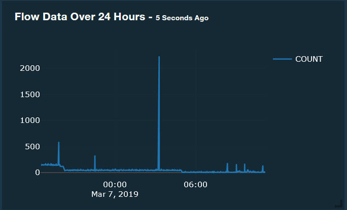
Tracking Flow Data Trends Over 24 Hours
In this example, you learn how to create a time series chart to track all flow data from a specific interface over the last 24 hours.
Click Configure Dashboard.
The Configure dashboard screen displays a library of available widgets, with details about each widget.
Click Create new widget.
On the New Dashboard Item page, enter Flow data over 24 hours as the name and provide a description.
Select AQL as the data source, set the Refresh Time to every 5 minutes, and enter the following AQL query in the AQL Statement field:
select MIN(starttime) as 'Start Time', count(*)
as 'Flow Count' from flows GROUP BY starttime/60000 ORDER BY 'Start
Time' DESC last 24 HOURS
Set the Results Limit to 1000, and click Run Query.
In the Views section of the page, enter Flow Data over 24 hours as the View Name and select Time Series Chart.
Select Start Time for the Time x-axis and choose Custom Series.
Select Flow Count for the y-axis.
Click the More options icon.
Leave the Axis Label as Flow Count.
Select Linear as the Line shape, and Line as the Line mode.
Click Save.
On the Configure dashboard screen, ensure the new widget is selected, and click Save.
The chart might look similar to the following example:
Aggregating Data to Create a Time Series Chart
In this example, you learn how to create a time series chart to show the number of events every minute for the SIM User Authentication category. You use global views to aggregate the data into a format that QRadar Pulse can display.
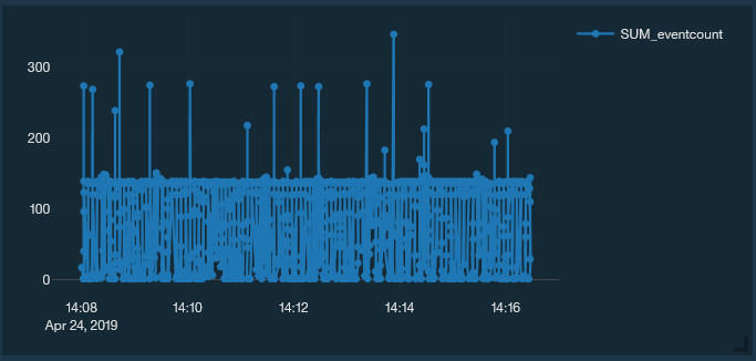
The AQL query to generate the time series graph looks like the following statement:
select categoryname(category) as 'catname',
category as 'All categories',
count(category) as 'catcount',
first(starttime) as 'Time'
from events
where category = 16001
group by category, starttime/60000
order by Time
last 1 hours
The resulting graph displays the number of logins in the past hour. However, if you want to run the query for longer than 24 hours, it might be difficult to get information over a period of days. Aggregated data views, also called global views, can help. A saved search that is grouped by multiple fields generates a global view that has many unique entries. As the volume of data increases, disk usage, processing times, and search performance can be impacted. To prevent increasing the volume of data, only aggregate searches on necessary fields. You can reduce the impact on the accumulator by adding a filter to your search criteria.
- Part 1: Creating an Aggregated Data View in the Log Activity Tab
- Part 2: Verifying the Global View in the Admin Tab
- Part 3: Creating a Query with the Global View in Pulse
Part 1: Creating an Aggregated Data View in the Log Activity Tab
Aggregated data views are accumulated buckets of data that is used to generate reports and dashboards. These global views are based on saved searches that accumulate the data regularly in the background. Use the following procedure to create a time series graph for a SIM User Authentication category.
In QRadar, go to the Log Activity tab and switch to the Advanced Search field.
To make the global view reusable for any category, remove the "where" clause in the previous example, enter the following AQL query, and then click Search.
select categoryname(category) as catname, category, count(category) as catcount, first(starttime) as Time from events group by category, starttime/60000 order by Time last 1 hoursNote:By default, QRadar displays two "Top 10" charts above the results list. You work with these charts to create the Global View. By default, it looks something like the following example:
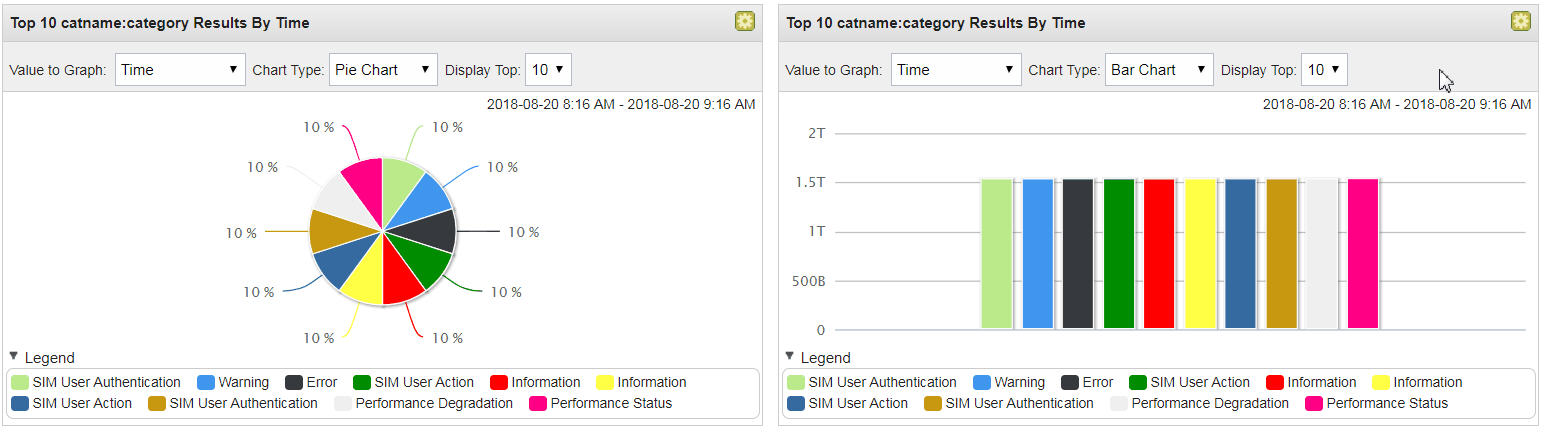
On the pie chart, click Settings to display the configuration settings.
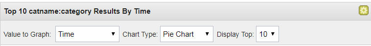
To convert the chart into a time series chart that works with Pulse, select Time in the Value to Graph list, and then change the chart type to Time Series.
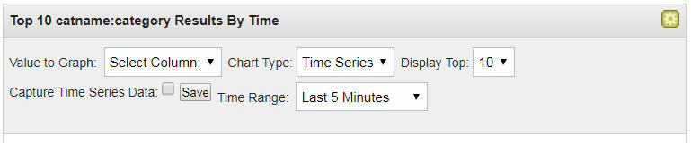
From the Value to Graph list, select COUNT.
Select the Capture Time Series Data check box, and then click Save. The Save Criteria page opens, where you create a saved search and a Global View.
Enter Pulse Category Count in the search name.
Enter values for the following parameters:
Parameter
Description
No aggregation
Select the check box for the group you want to assign this saved search. If you do not select a group, this saved search is assigned to the Other group by default.
Manage Groups
Click Manage Groups to manage search groups.
Timespan options
Choose one of the following options:
Last Interval (auto refresh) Select this option to filter your search results while in auto-refresh mode. The Log Activity and Network Activity tabs refresh at 1-minute intervals to display the most recent information.
Recent Select this option, and from this list box, select the time range that you want to filter for.
Specific Interval- Select this option, and from the calendar, select the date and time range that you want to filter for.
Click OK.
Note:After the criteria is saved, the Global View is now active and ready for you to use in QRadar Pulse.
Part 2: Verifying the Global View in the Admin Tab
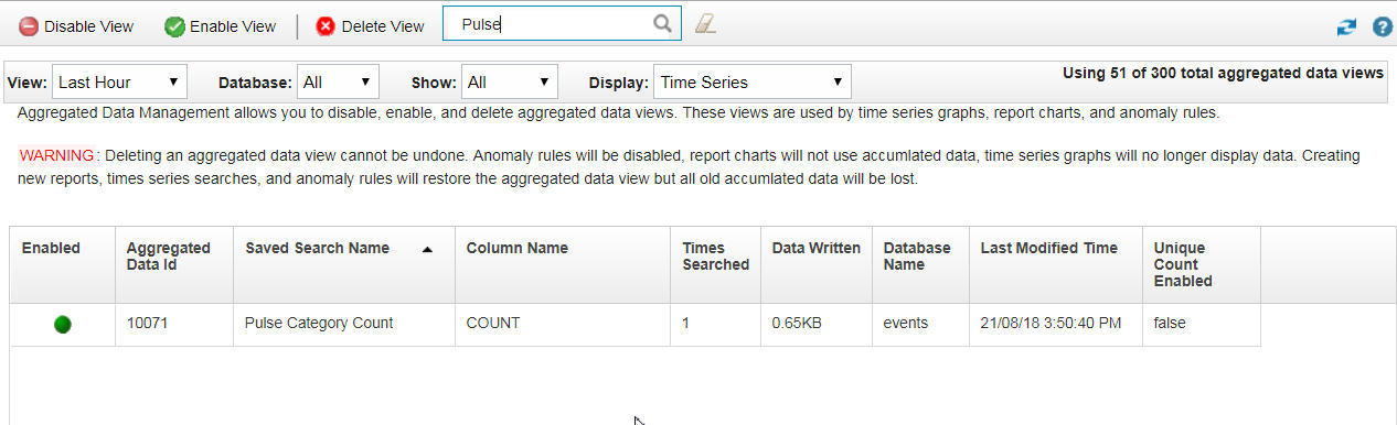
First, verify that the aggregation (Global View) was created properly.
Go to Admin >Aggregated Data Management.
Select Time Series in the Display list.
Tip:You can filter the view to display your new Global View. For example, type Pulse.
Part 3: Creating a Query with the Global View in Pulse
After you verify the Global View, you can switch to QRadar and create a query against this new Global View.
Click Configure dashboard.
The Configure dashboard screen displays a library of available widgets, with details about each widget.
Click Create new widget.
On the New Dashboard Item page, enter a name and a description for the item.
Select AQL from the data source list in the Query section, and enter the following AQL statement to run a query from the new Global View:
SELECT * FROM GLOBALVIEW('Pulse Category Count','NORMAL')
LAST 7 days
Click Run Query.
The query displays the columns in the results field.
Fine-tune the AQL statement:
Add the following columns: COUNT_category, Time, and Category. Add a WHERE Category clause and an ORDER BY clause so that the query runs in the correct time sequence.
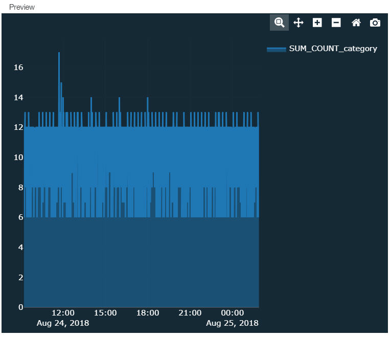
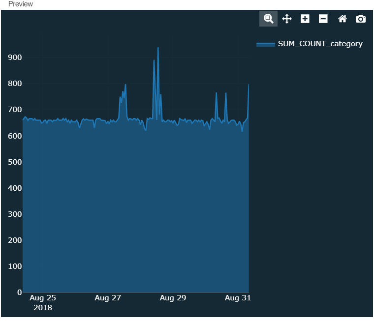
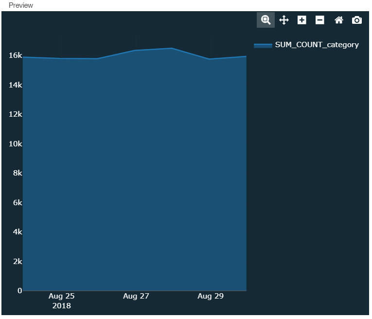
Global Views are accumulated in three time ranges: NORMAL (by minute), HOURLY, and DAILY. Add a GROUP BY clause to allow the flexibility to change the query between the three levels of accumulation. The new query looks like the following example:
SELECT SUM(COUNT_category), Time * 1000 as Time
FROM GLOBALVIEW('Pulse Category Count','NORMAL') WHERE Category =
16001 GROUP BY Time ORDER BY Time LAST 7 days
Note:The HOURLY time range doesn't return any data until the Global View runs for at least 1 hour. Similarly, the DAILY time range doesn't return any data until the Global View runs for at least 1 day.
You can now create your time series chart in Pulse like the following examples with NORMAL (by minute), HOURLY, and DAILY respectively: