Charts
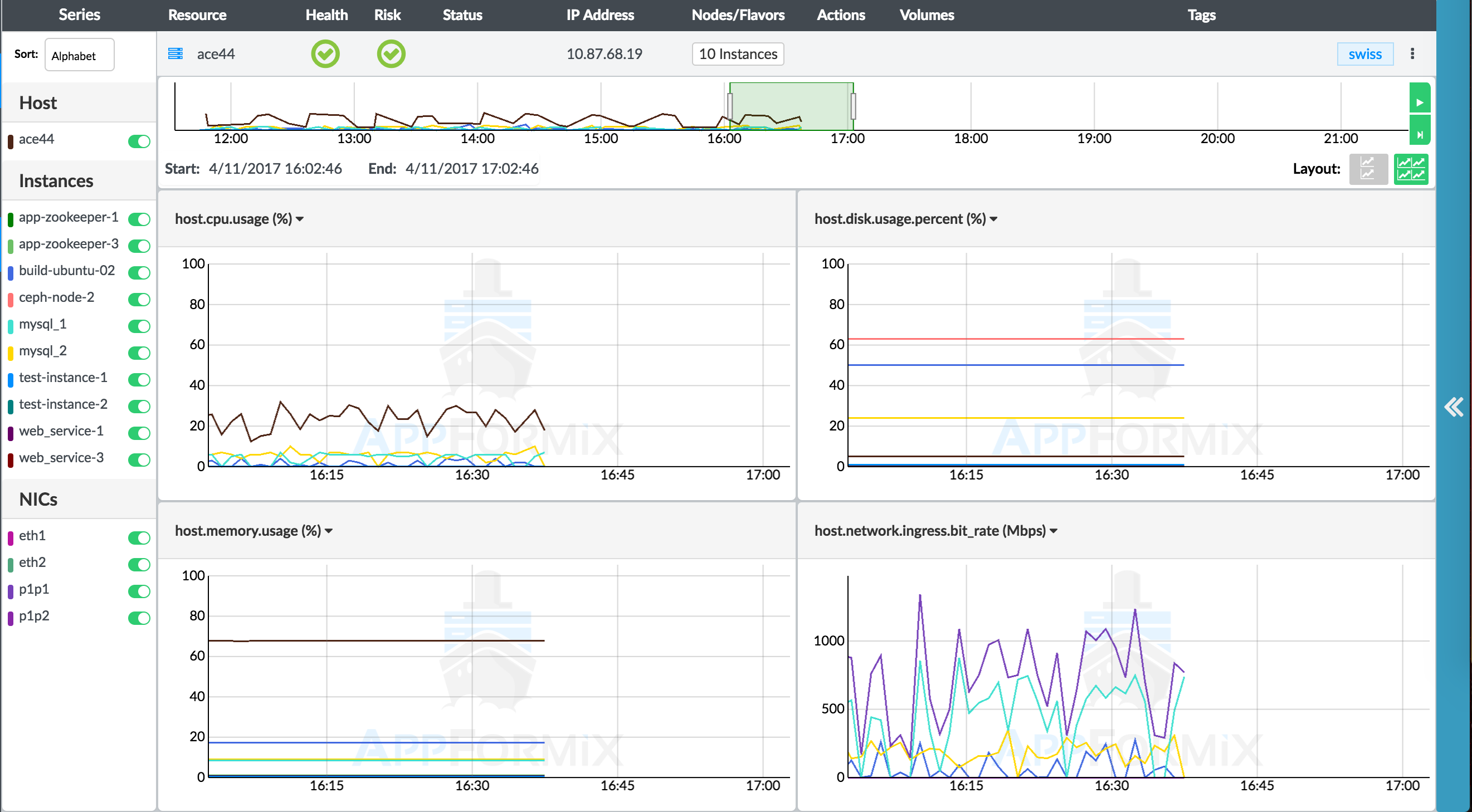
With Contrail Insights Charts, you can view real-time and historical values of all metrics that Contrail Insights monitors. Charts provide you with a way to view metrics for multiple entities across layers and organized by physical host, project, or aggregate. The charts update with the latest data streamed from the Contrail Insights Platform without needing to refresh. You can select which entities to display on the charts, and select the time period that is displayed. When you hover over the charts, a pop-up box shows the actual values for the selected entities at a specific point in time. Figure 1 shows real-time metric values streamed from the Contrail Insights Platform.
Timeline
The Timeline at the top of the page provides navigation to a specific point in time that you want to view. The green rectangle on the Timeline can be dragged left or right, or resized to change the time window displayed in the charts. To the right of the Timeline, the play/pause button (top button) allows you to pause and start the charts from moving. The live button (bottom button) resets the view to the current time. Figure 2 shows navigation using the green rectangle for a timeline from 16:43:43 to 17:34:43.

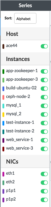
Chart Legend
The chart legend shows which entities are currently being displayed in the charts. You can select a subset of entities to display to improve the clarity of the charts and focus on specific entities. By default, the entities are sorted alphabetically, but they can be sorted by a specific metric as well. Figure 3 shows the chart legend.
When selecting a metric by which to sort, the top 10 entities will be selected, as shown in Figure 4.
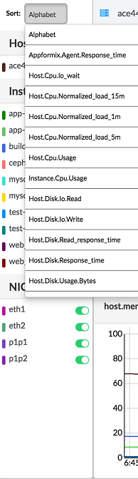
Chart Data Values
At the center of the page, the charts show the latest data for up to four different metrics, updating in real-time from a stream of data from the Contrail Insights Platform. When the cursor is positioned over the charts, a pop-up box shows the data values at that particular time. Charts can be zoomed in or out using the mouse scroll wheel. You can choose to display two or four charts at a time. Figure 5 shows the chart data values pop-up box for a particular time.

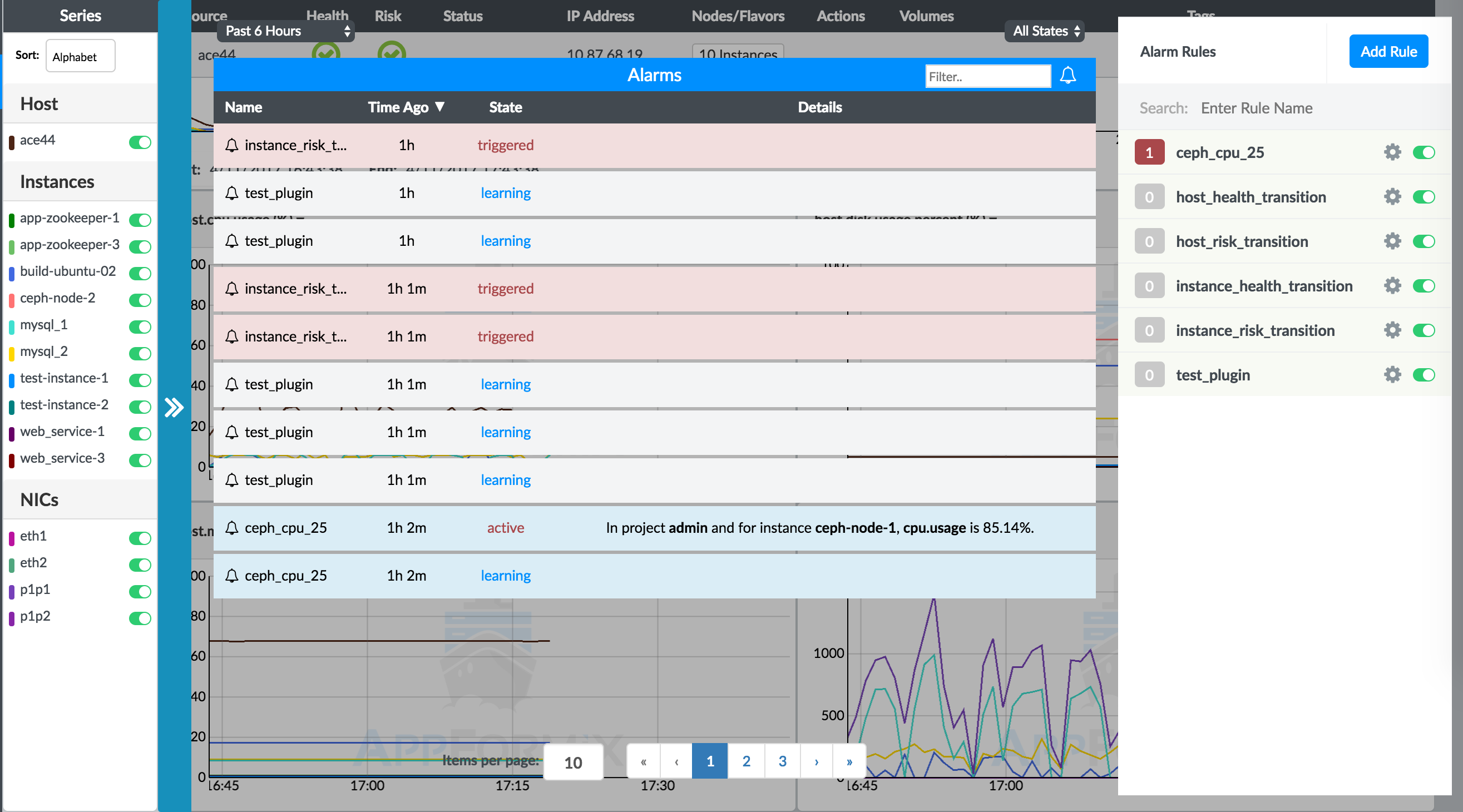
Alarms on Charts
Alarms can be viewed without navigating away from the charts. There is a blue expand button to the right side of the charts that overlays the alarms history and configuration on top of the charts view.
Any alarms that occur while on the page will display as symbols on the chart. A circle appears at the time a new alarm enters learning state. A triangle pointing to the right indicates the time at which an alarm became active. A triangle pointing to the left indicates the time at which an alarm became inactive. If any symbol is clicked, then a pop-up box will display the details about the alarm that fired. Figure 6 shows the alarms history and state from the charts view.