ON THIS PAGE
Dashboard Overview
Juniper Security Director Cloud enables you to monitor your network through customizable and interactive widgets. The new dashboard enables you to select the data displayed on the dashboard. You can switch between general and security data.
The new general and security dashboards provide a comprehensive analysis of your network trends based on the latest logs. These dashboards offer improved visualization and insights compared to previous versions.
General Data
The dashboard provides a customizable view of general network data through interactive widgets. You can view data for the last 14 days and filter information based on device name, device groups, or zones. You can filter the data by zones only after you select a device or device group.
| Widget | GUI View | Description |
|---|---|---|
| Threats Blocked | 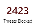 |
Number of threats blocked. |
| Traffic Inspected | 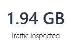 |
Volume of traffic inspected for threats. |
| SRX Devices Managed | 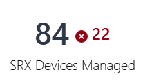 |
Total number of managed devices and the number of devices not
connected to Juniper Security Director Cloud. The device count is based
on the statuses displayed in the Management
Status column on the Devices page. For example, the screenshot indicates that 84 devices are managed by Juniper Security Director Cloud and 22 out of the 84 devices are not connected to Juniper Security Director Cloud. |
| Log Storage Usage | 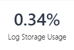 |
Percentage of the system log storage space used. |
| SD Users | 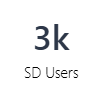 |
Number of users. |
| SD Critical Alerts | 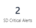 |
Number of alerts created for critical threats. |
| Top Application Visibility by Volume | 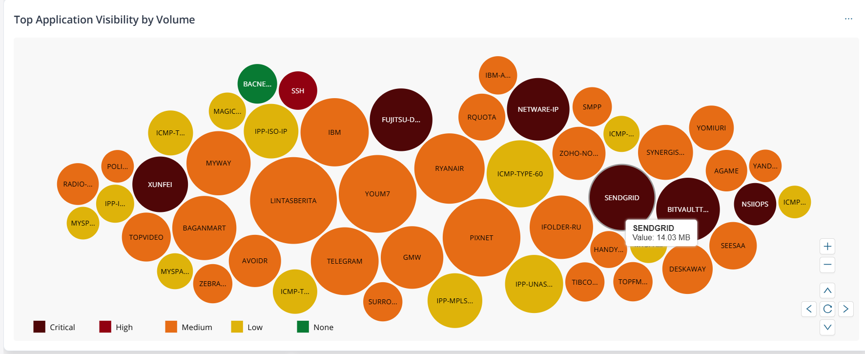 |
Top 50 applications based on volume of traffic inspected. The
bubble color depends on the highest severity threat detected. Hover
over a bubble to view the volume inspected for the
application. The possible values and corresponding color codes are:
When you click a bubble or the widget, you are redirected to the Applications Insights page for the same time period and global filters preselected. You can then interact with the bubble chart or the table to view application-specific information. |
| SRX Device Health Status | 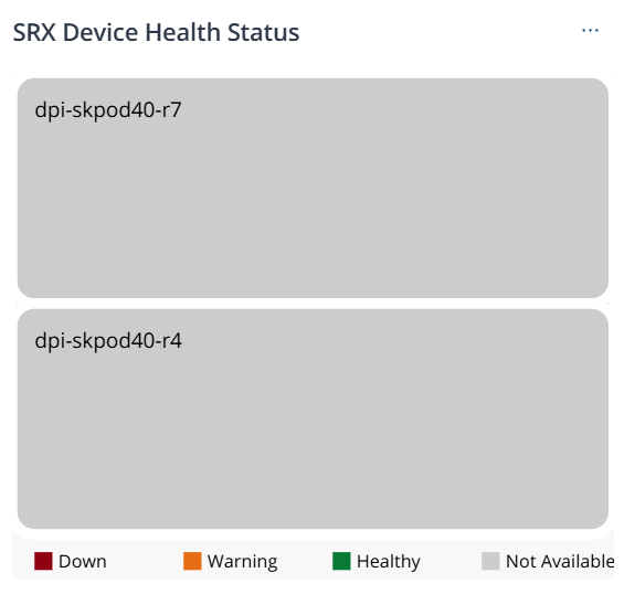 |
Status of the managed devices based on percentage of resources used such as CPU processing power, memory, and storage. The color coding and status is based on the Device Health Status column in the Devices page. The possible values are:
When you click the device name, you are redirected to the device-specific details page. When you click the device count or the legend, you are redirected to the Devices page with the corresponding devices. |
| Threat Summary | 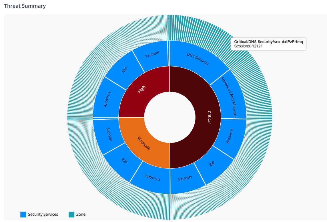 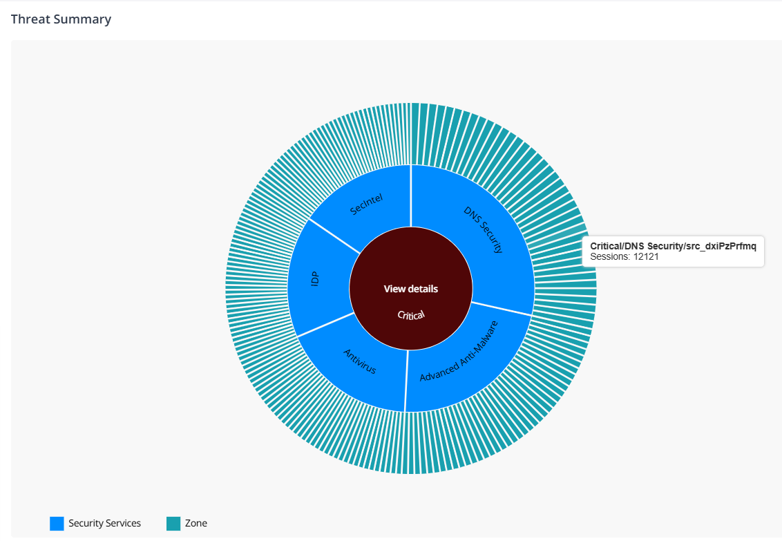 |
Number of critical, high, and medium category threats detected by a security service in a zone. Interact with the chart to drill down or drill up the data. When you click the threat type or security service, a View details link is displayed. The link redirects you to the Threats Insights page with pre-selected filters. But, when you click a zone, you are automatically redirected to the Threats Insights page. For example, the screenshot indicates that critical threats were detected by DNS Security service in, SecIntel, IDP, and Advanced Anti-Malware services. It also indicates the corresponding zones where the threats were detected. |
| Alerts | 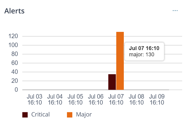 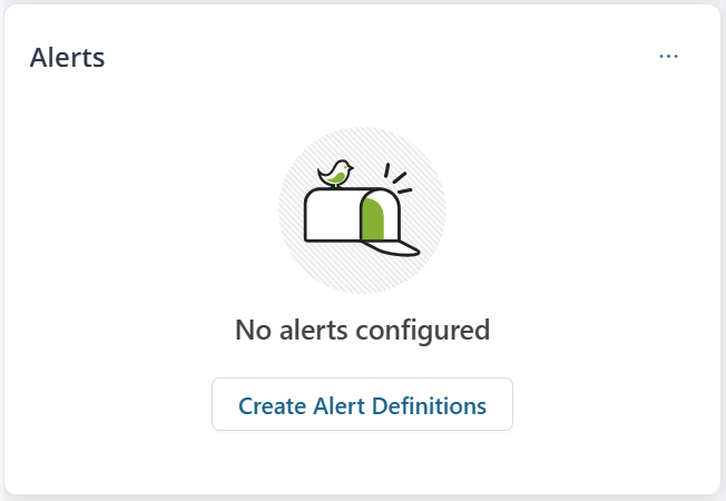 |
Number of critical and major alerts raised across seven equal
intervals within the selected duration. Hover over the bar to view
the number of alerts. For example, when you filter the data to the last 14 days, the graph displays data divided into seven equal intervals of two days each. If alert definitions were not created, no alert information is displayed and you are prompted to create alert definitions. When you click Create Alert Definitions, you are redirected to the Alert Definitions page. See Create and Manage Alert Definitions. |
| User Activity Visibility by Volume | 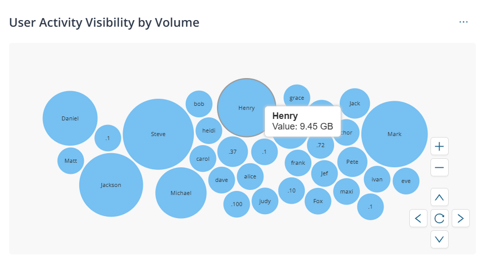 |
Volume of traffic inspected for the top 50 users. Hover over a
bubble to view the traffic volume for the user. When you click a bubble or the widget, you are redirected to the Users Insights page for the same time period and global filters preselected. You can then interact with the bubble chart or the table to view user-specific information. |
| Top 5 URL Activity | 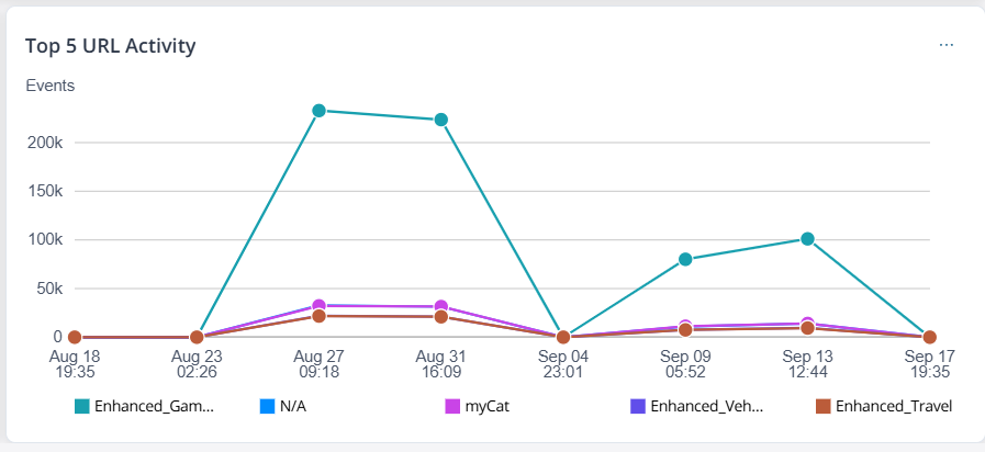 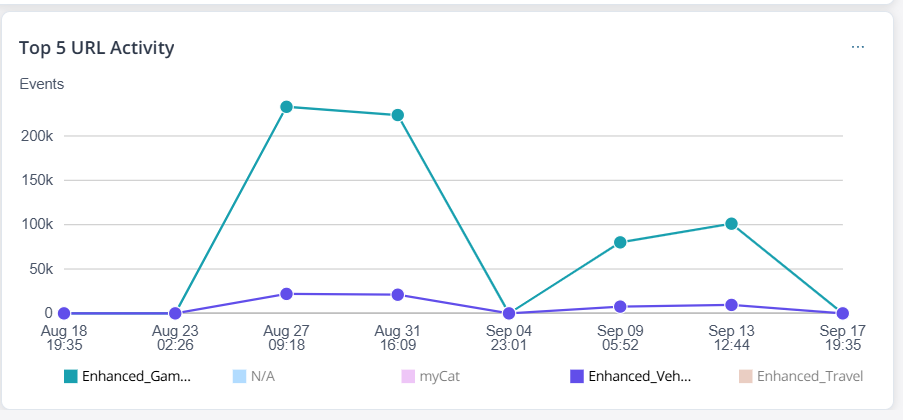 |
Number of events per top 5 URL categories across seven equal
intervals within the selected duration. For example, when you filter the data to the last 14 days, the graph displays data divided into seven equal intervals of two days each. When you click the dots in the graph, the All Security Events page is displayed with pre-selected filters. When you click the widget, you are redirected to the URL Filtering Insights page. You can also interact with the legends to view information for all or specific URL categories. |
Security Data
The dashboard provides a customizable view of your network security data through interactive widgets. You can view data for the last 14 days and filter information based on device name, device groups, or zones. You can filter the data by zones only after you select a device or device group.
| Widget | GUI View | Description |
|---|---|---|
| Firewall Sessions | 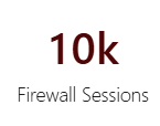 |
Number of sessions inspected for threats. |
| Threats Blocked | 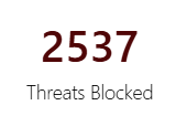 |
Number of threats blocked. |
| Infected Hosts | 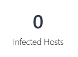 |
Number of hosts infected by critical threats. |
| SRX Devices Managed | |
Total number of managed devices and the number of devices not
connected to Juniper Security Director Cloud. The device count is based
on the statuses displayed in the Management
Status column on the Devices page. For example, the screenshot indicates that 84 devices are managed by Juniper Security Director Cloud and 22 out of the 84 devices are not connected to Juniper Security Director Cloud. |
| Threat View | 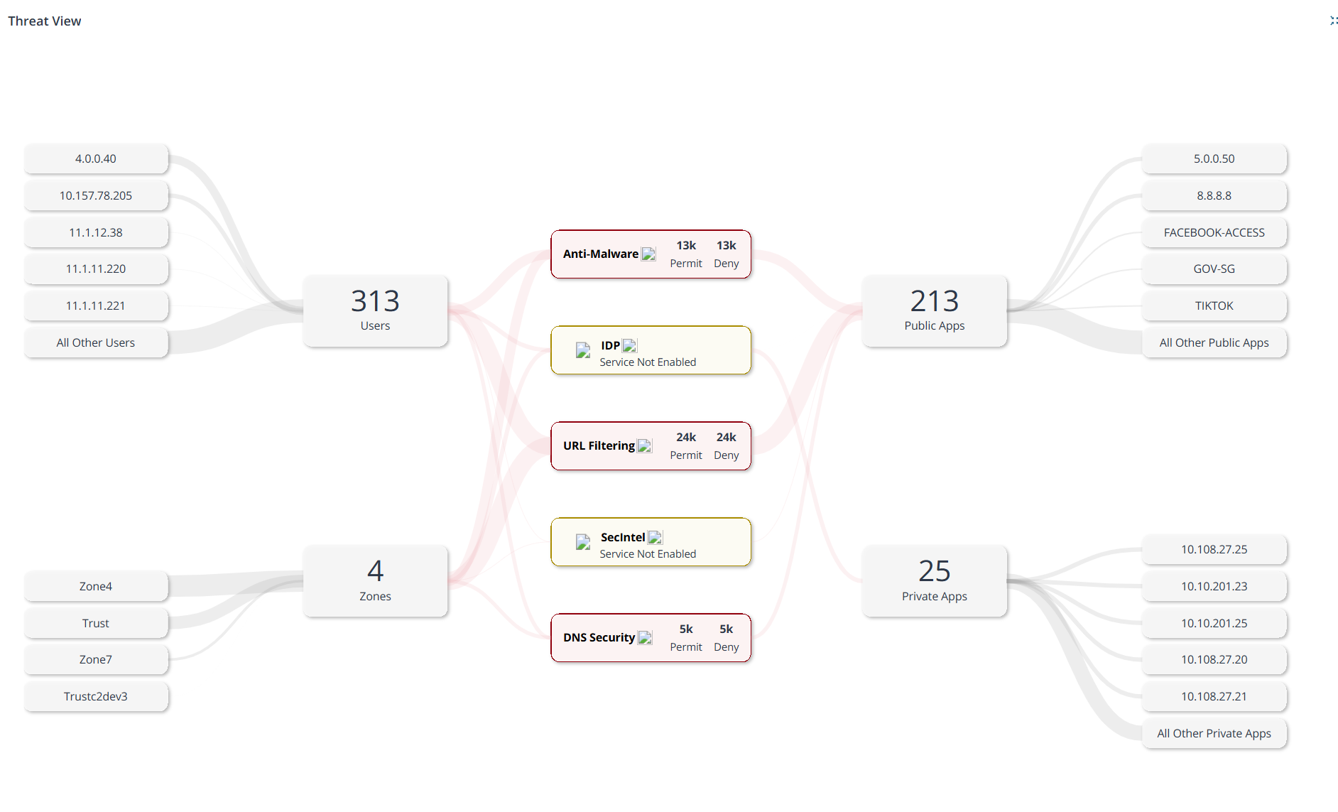 |
|
| Threat Summary | |
Number of critical, high, and medium category threats detected by a security service in a zone. Interact with the chart to drill down or drill up the data. When you click the threat type or security service, a View details link is displayed. The link redirects you to the Threats Insights page with pre-selected filters. But, when you click a zone, you are automatically redirected to the Threats Insights page. For example, the screenshot indicates that critical threats were detected by DNS Security service in, SecIntel, IDP, and Advanced Anti-Malware services. It also indicates the corresponding zones where the threats were detected. |
| Top Security Events | 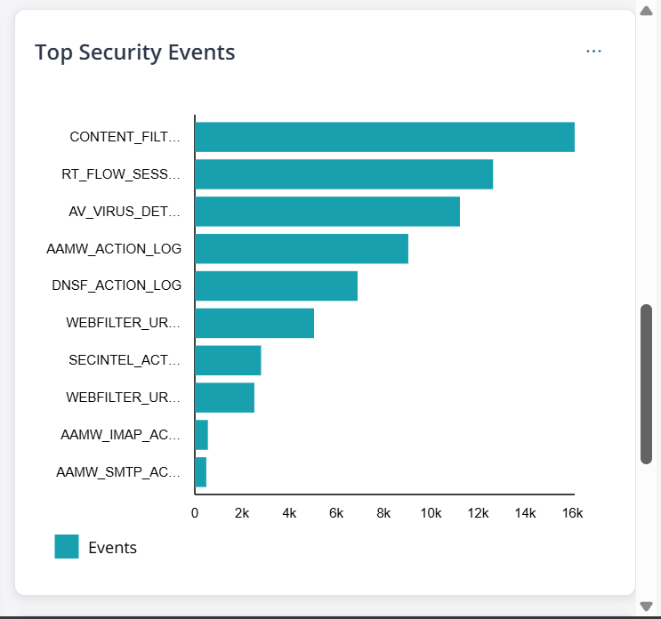 |
Number of top 10 security events by event type. Hover over the bars to view the number of events in a type. |
| Infected Hosts | 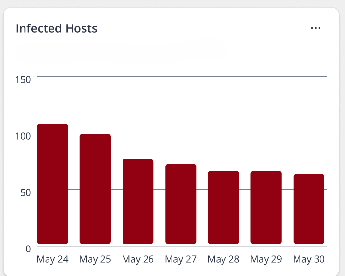 |
Number of hosts detected with critical threats across seven equal
intervals within the selected duration. Hover over the bars to view
the number of hosts. For example, when you filter the data to the last 14 days, the graph displays data divided into seven equal intervals of two days each. |