
Understanding the Site-Level Sustainability Dashboard
Use the Site-Level Sustainability Dashboard to monitor energy insights, identify inefficiencies, and gain visibility into site-level energy consumption. The site-level energy insights are organized into three tabs: Overview, Topology and Energy Savings.
About the Overview Tab
The Overview tab provides aggregated site-level energy metrics, trend visualizations, device energy insights, and potential energy savings to help you analyze the energy profile of your site.
For an overview of the Site-Level Sustainability dashboard, see View Sustainability Insights for a Site.
You can view data for the selected time range. The available time ranges are Today, Yesterday, Last 7 Days, Last 30 Days, and Custom. By default, the widget displays data for Last 30 Days.
The global time range selector applies to all widgets except the Energy Savings widget, the Power Usage metric card, and the Carbon Intensity and Average Power Cost cards. The Energy Savings widget displays projections for future time ranges, the Power Usage metric card shows the real-time power usage of the organization, and Carbon Intensity and Average Power Cost display configured values that do not change with the selected time range.
A page-level scope selector also allows you to select a site. Based on the selected site, data is displayed on the energy dashboard.
- View a Site's Energy Metrics
- View Historical Trend Graphs for a Site
- Monitor Power and Throughput of Devices in a Site
- Monitor a Site's Power and Throughput Trends Over Time
- View Carbon Intensity Configured for a Site
- View the Average Power Cost Configured for a Site
- View the Top Devices in the Site by Selected Energy Metrics
View a Site's Energy Metrics
The site-level metric cards display key aggregated energy metrics for a site. These values are derived from device-level telemetry and aggregated at the site level.
Use the cards to get a high-level overview of the site's energy profile for the selected time range.

For metrics description, see Table 1.
| Metric | Description | Unit | Notes |
|---|---|---|---|
| Power Usage | Real-time power consumption of the site, aggregated from device-level telemetry |
Kilowatts (kW) |
The timestamp indicates when the data was last updated. |
| Energy Consumption | Energy consumed by the site during the selected time range |
Kilowatt-hour (kWh) |
The system aggregates power usage for a rolling one hour interval to calculate energy consumption |
| GHG Emission | Total greenhouse gas emissions generated by the site during the selected time range |
gCO₂e |
GHG emission is calculated based on the carbon intensity you configure at the site or organization level. If not configured, a default value is used to calculate the emission. See, Configure Sustainability Settings for a Site. |
| Cost | Estimated cost of energy consumed by the site during the selected time range | Region‑specific currency | If the Total Cost appears blank, verify that the Average Power Cost is configured at the site or organization level. See, Configure Sustainability Settings for a Site. |
-
The timestamp in the top-right corner reflects the selected time range for Energy Consumption, GHG Emissions, and Cost and the values update based on the selection.
-
The units displayed for Power Usage, Energy Consumption, and GHG Emissions are dynamically scaled based on the magnitude of the value.
View Historical Trend Graphs for a Site
You can view historical trend graphs for Energy Consumption, GHG Emission, and Cost for the selected site.
Click any of the three metric cards to view their trend charts for the selected time range in the right pane. When you select a time range, the trend graph displays data for the rolling interval ending at the most recent available data point.
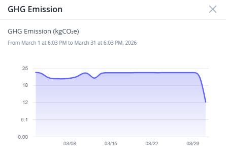
Figure 2 shows the site's emission trend for the last 30 days. You can view similar trend charts for the other two metrics as well.
The x-axis represents the selected time range and y-axis represents the aggregated site-level values of the selected metric for the selected time range. Hover over any point on the graph to see the exact metric value for that timestamp.
These trends help you identify recurring usage patterns, correlate energy usage with cost and emissions, validate the impact of optimization actions, and detect power consumption anomalies that may require further investigation or planning.
Monitor Power and Throughput of Devices in a Site
The Network: Power vs Throughput scatter graph shows the relationship between throughput and power consumption for individual devices in the site during the selected time range.
Use this graph to visually compare how devices in the site differ in terms of the traffic they handle and the power they consume.
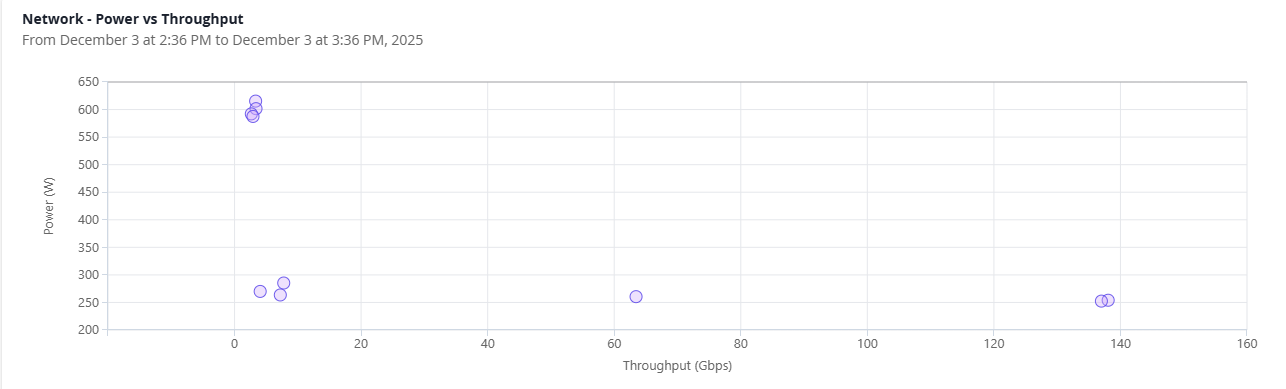
Each circle represents a device within the site.
| Axis | Metric | Description | Unit |
|---|---|---|---|
| x-axis | Throughput |
Traffic handled by the device during the selected time range. Throughput value in the graph is derived from the device's revenue ports (server-facing ports). |
bps |
| y-axis | Power | Power consumed by the device during the selected time range. | Watts (W) |
Understanding the position of each device on the graph helps you easily identify energy efficiency patterns.
-
Bottom-right (high throughput, low power)
These devices are delivering more traffic while consuming relatively less power. These are typically the most efficient devices in the site.
-
Top-left (low throughput, high power)
These devices are consuming more power than the traffic they handle. These devices may be inefficient or underutilized.
-
Upward diagonal trend
These devices are consuming power proportional with throughput, which is typically the expected behavior for devices under traffic load.
-
Clusters
Devices with similar power and throughput patterns.
Use the scatter graph to identify devices with high power usage but low throughput, detect underutilized or overloaded devices compared to their peers, and find opportunities for optimization.
Monitor a Site's Power and Throughput Trends Over Time
The Power vs Throughput line graph shows the aggregated power usage and throughput of all devices in the site during the selected time range.
Use the line graph to locate the site's inefficient time windows, when power consumption is high but throughput is low. You can view site-level trends across the selected time range.

| Axis | Metric | Description | Color | Unit |
|---|---|---|---|---|
| Left y-axis | Power | Shows the aggregated power usage of the site over the selected
time range. Note:
Click the Power legend to view only the power trend line on the graph. Double click the metric to clear the filter. |
Brown | Watts (W) |
| Right y-axis | Throughput | Shows the aggregated traffic handled by the devices in the site
over the selected time range. Traffic may vary significantly based on network activity. Note: Click
the Throughput legend to view only the throughput trend line on
the graph. Double click the metric to clear the filter.
|
Blue | bps |
| x-axis | Time Range | Represents the selected time range. By default, it is set to Last 30 Days. |
— | Hours or Days |
Use the Network: Power vs Throughput scatter graph for device-level comparison and the Power vs Throughput line graph for site-level trend analysis.
Under normal operating conditions, power draw should increase when throughput increases and reduce during low-traffic periods. However, most network devices have a relatively flat power curve due to always-on components such as control planes, PSUs, transceivers, and cooling systems.
Use the chart to:
-
Compare power to traffic proportionality in a site across time windows
-
Identify idle power draw during off-peak hours and plan optimization efforts
For example, in a stock exchange network, throughput spikes during trading hours and drops afterward. However, power usage remains almost constant. You can use the historical trend graphs to identify off-peak hours and schedule port shutdown to avoid unnecessary power consumption.
-
Compare site-level patterns across multiple sites
View Carbon Intensity Configured for a Site
Carbon intensity determines the site's GHG emissions. It represents the grams of CO₂e (carbon dioxide equivalent) emitted per kWh of energy consumed.
CO₂e is a standard unit used to express the global warming impact of all greenhouse gases in terms of their carbon dioxide equivalence.
The system uses carbon intensity as the input for calculating GHG emissions.
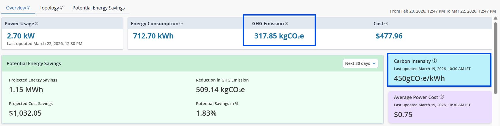
GHG Emission (CO₂e) = Energy Consumption (kWh) × Carbon Intensity (gCO₂e/kWh)
Configure accurate carbon intensity value to ensure that the GHG emission shown on the dashboard reflects your site's actual environmental impact.
To configure carbon intensity for the site, see Configure Sustainability Settings for a Site.
If carbon intensity is not configured, a banner appears prompting you to configure this value. If left unconfigured, the system displays a default value sourced from recognized carbon data providers, which you can override as needed.
The timestamp on the Carbon Intensity card indicates when the data was last updated. The GHG Emissions metric calculated using this value reflects emissions for the selected time range.
View the Average Power Cost Configured for a Site
The Average Power Cost card displays the cost per kWh of electricity used at the site.
This value is used to calculate the total power cost for the site. The average power cost is displayed in USD.
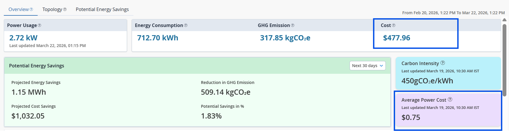
To configure average power cost for the site, see, Configure Sustainability Settings for a Site.
If average power cost is not configured, a banner appears prompting you to configure this value. If left unconfigured, the Power Cost metric on the dashboard appears blank.
The timestamp on the Average Power Cost card indicates when the data was last updated. The Total Cost metric calculated using this value reflects power cost for the selected time range.
View the Top Devices in the Site by Selected Energy Metrics
The Top Devices table lists all devices in the site and ranks them based on a selected energy metric, such as energy consumption, traffic, fan speed, or temperature deviation. The table aggregates device-level telemetry for the selected time range.
By default, the table lists devices in the descending order of energy consumption, allowing you to quickly identify the highest energy consuming devices in the site.
You can also sort the table based on other metrics available in the table. Click the arrow next to any column header to sort the table based on that metric.
For example, when you sort by Temperature Deviation, the table is reordered to display devices with the highest temperature deviation first. The widget header updates accordingly to Top Devices by Temperature Deviation, indicating the active sorting metric.

For field description, see Table 4.
| Field | Description |
|---|---|
| Device Name | Name of the device. Click the device name to navigate to the Device-Level Sustainability Dashboard for detailed insights. |
| Power Usage | The power utilized by the device during the selected time range, measured in Watts (W). |
| Energy Consumption | The total amount of energy consumed by the device during the selected time range, measured in kilowatt-hours (kWh). |
| Max Traffic | The maximum throughput recorded for the device during the selected time range, measured in bps. |
| Min Traffic | The minimum throughput recorded for the device during the selected time range, measured in bps. |
| Average Fan Speed | The average rotational speed of the device’s fans during the selected time range, measured in Revolutions Per Minute (RPM). |
| Temperature Deviation | The variation between the device’s measured temperature and the
optimal temperature range. The icons help you quickly identify whether the device is running normal, warmer, or hotter than expected baseline.
Higher deviations may indicate thermal concerns such as airflow issues or fan failures. |
| Potential Energy Savings | The energy savings the site could have achieved during the selected time range if all available energy optimization recommendations for the selected time range were applied. |
| Achieved Energy Savings | The energy savings achieved by the site during the selected time range as a result of implementing the recommended energy optimization actions. |
Use the device table to:
-
Identify devices that contribute the most to the site’s overall energy consumption
-
Detect unusually high energy consuming devices
-
Compare devices across multiple energy and thermal metrics
-
Prioritize devices for optimization, reconfiguration, or replacement
About the Topology Tab
The Topology tab provides an interactive visualization of the site’s network fabric and uses color-coding to highlight device-level energy insights.
The topology is derived from the Data Center Director blueprint and reflects the layout of devices in the site.
You must adopt Apstra Edge to the organization to view topology and telemetry data of devices in the dashboard. See, Adopt Juniper Apstra Edge.
The topology view shows how devices in the network fabric are interconnected and how they compare in terms of power usage, energy consumption, and thermal behavior.
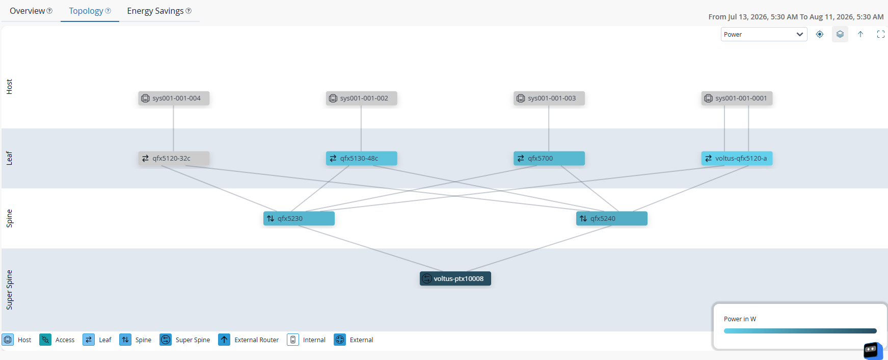
Key Elements in the View
-
Each node represents a network device in the site.
-
Device roles are indicated in the legend at the bottom left corner.
-
Links represent physical or logical connectivity between devices.
-
A color scale in the bottom right corner indicates the intensity range for the selected metric.
Note: The color scale is applicable only to Apstra-managed devices.Use the metric selector on the top-right corner to overlay different metrics on the topology.
The available metrics are:
Table 5: Metric Overlay Options Metric Description Color Gradient Power The device's power consumption. 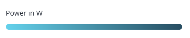
Emissions The device’s estimated greenhouse gas emissions. 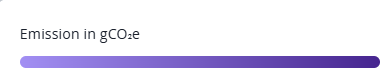
Temperature The operating temperature of the device. 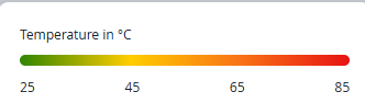
-
Green—Operating within normal temperature range.
-
Yellow—Approaching defined temperature threshold.
-
Red—Exceeded defined temperature threshold.
Note:When a metric overlay is applied, devices are color-coded according to their value for that metric.
Darker or more intense shades indicate higher values, while lighter shades indicate lower values.
Use the color scale to quickly identify devices with higher energy or environmental impact and plan optimization or replacements.
You can use the Juniper's Power Calculator to compare power characteristics across device models.
-
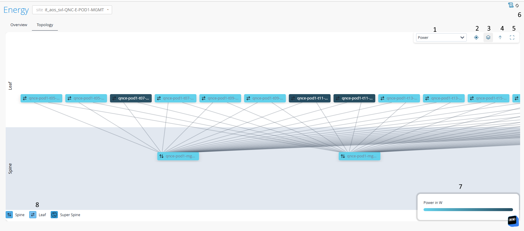
Topology View Task Pane
| Options | Description |
|---|---|
| 1 | Metric Selector—Use the drop-down to
choose a metric to overlay on the topology. The options are:
|
| 2 | Reset—Reset the topology view to its default zoom position. |
| 3 | Layer Control—Switch between different data overlays. |
| 4 | Up a Level—Navigate up a topology hierarchy level. |
| 5 | Enter Fullscreen—Expand the topology view to fullscreen mode. |
| 6 | Refresh—Click to load the latest topology and telemetry data of the site. |
| 7 | Color Scale—Shows the color range for
selected metric. Darker or more intense shades indicate higher values, while lighter shades indicate lower values. |
| 8 | Device Legend—Maps device roles with their associated colors. |
Interactive Actions
-
Hover over a node to view device name, type, and the selected metric's value.
-
Expand the leaf group in the topology view
By default, leaf nodes are grouped to simplify the topology view.
To view individual leaf nodes:
Click the leaf group node to open the search and selection panel.
Figure 10: Search and Selection Panel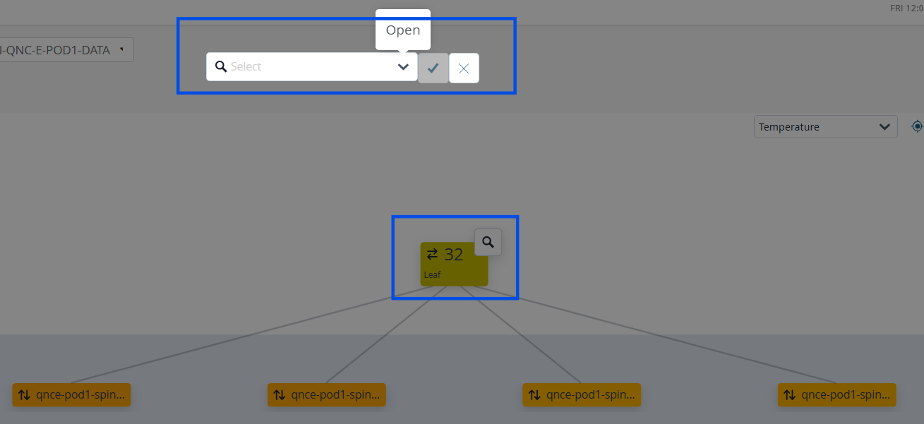
Use the drop-down to select the IP address of the leaf nodes you want to display in the topology view.
Click Select All to display all leaf nodes.
Click the checkmark to apply your selection.
Figure 11: Topology View Navigation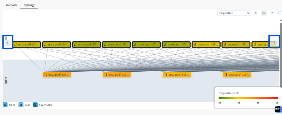
Use the navigation arrows in the topology view to pan across the fabric and explore different sections of the layout.
-
Click a node to open the knowledge card.
The card provides more details on the device, such as traffic details and detected anomalies.
-
Double click a device to highlight only its connections.
Click Reset to reset the view.
Benefits of the Topology View
Use the topology view to:
-
Visualize the layout of the site's network fabric
-
Identify high power consuming or inefficient devices in the context of their fabric role
-
Identify hotspots such as high power consuming or overheated devices.
-
Detect tier-level patterns in energy usage. For example, a single spine device consuming significantly more power than its peers
-
Correlate energy behavior with device roles (leaf, spine, super spine) to identify anomalies such as a single device consuming far more power than other devices in the site
About the Energy Savings Tab
The Energy Savings tab on the Site-Level Sustainability Dashboard displays the potential and achieved energy, emissions, and cost savings associated with energy optimization recommendations for the selected site.
Use the Potential and Achieved views for a selected site to compare estimated savings with the savings achieved after recommendations are applied.
-
Potential displays the estimated energy, emissions, and cost savings that can be achieved if all available energy optimization recommendations are applied.
-
Achieved displays the actual energy, emissions, and cost savings achieved from successfully applied recommendations.
Review Potential Energy Savings
Use projected savings to identify high-impact optimization opportunities and prioritize energy-saving actions for devices in the selected site.
You can view potential savings metrics in the following tabs of the Site-Level Sustainability Dashboard:
-
Overview
-
Energy Savings
Both tabs include the Potential Energy Savings view, which provides projected energy, emissions, and cost savings based on the selected time range. The available time ranges are Today, Tomorrow, Next 7 Days, and Next 30 Days. By default, the view displays projections for Next 30 Days.
Potential Energy Savings View
The Potential Energy Savings view provides a high-level summary of the projected energy savings, emissions reduction, and cost savings that can be achieved if all available energy optimization recommendations for the devices in the site are applied.
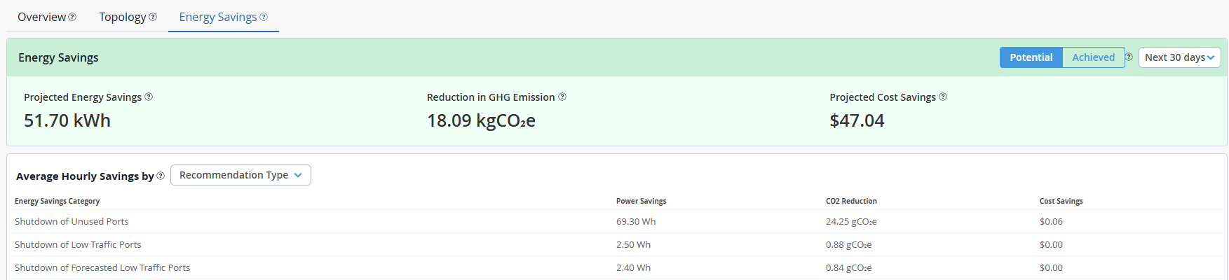
| Metric | Description | Data Availability |
|---|---|---|
| Projected Energy Savings | Estimated reduction in energy consumption that the site can achieve by applying the available energy optimization recommendations. | The projection is displayed for the selected time range. |
| Reduction in GHG Emission | Estimated reduction in greenhouse gas emissions that the site can
achieve by applying the available energy optimization
recommendations. The value is calculated based on the projected energy savings and the carbon intensity configured for the organization. |
The projection is displayed for the selected time range. |
| Projected Cost Savings | Estimated cost savings that the site can achieve by applying the
available energy optimization recommendations. The value is calculated based on the projected energy savings and the average power cost configured for the organization. |
The projection is displayed for the selected time range. |
Use the Potential view on the Energy Savings tab for deeper analysis.
Average Hourly Savings
The Average Hourly Savings table on the Potential view displays the average hourly savings achievable for the selected site.
You can filter the table by recommendation type, device model, or Junos OS version installed on devices at the site and view a detailed breakdown of the potential energy, emissions, and cost savings that contribute to the total potential savings shown in the insights panel.
Use the table to identify which recommendation types, device models, or Junos OS versions offer the highest potential energy savings at the site.
| Field | Description |
|---|---|
| Energy Savings Category | Filter potential energy savings by one of the following categories: Recommendation Type, Device Model, or Device OS. |
| Power Savings | The average hourly power savings achievable for the selected category if all applicable energy optimization recommendations are applied. |
| CO2 Reduction | The average hourly reduction in greenhouse gas emissions for the selected category, assuming all applicable recommendations are applied. |
| Cost Savings | The average hourly cost savings resulting from power reductions for the selected category, assuming all applicable recommendations are applied. |
Review Achieved Energy Savings
The Achieved view helps you measure the impact of applied optimization recommendations at the selected site.
Use this view to monitor achieved energy savings, emissions reduction, cost savings, and the status of recommendation deployment jobs.
Achieved energy savings are updated after available recommendations are successfully applied.
Energy Savings
The Energy Savings insights panel displays the actual energy savings, emissions reduction, and cost savings achieved through recommendation-based optimization at the site.
Savings are calculated using port-level power savings data for ports that have been successfully disabled through applied recommendations.
You can view achieved savings metrics in the following tabs of the Site-Level Sustainability Dashboard:
- Overview
- Energy Savings
Use the time range selector to view the aggregated values of achieved energy savings, emissions reduction, and cost savings for the selected period.
| Metric | Description | Data Availability |
|---|---|---|
| Achieved Energy Savings | Reduction in energy consumption achieved at the site through applied energy optimization recommendations. | The savings is displayed for the selected time range. |
| Reduction in GHG Emission | Reduction in greenhouse gas emissions achieved at the site
through applied energy optimization recommendations. The value is calculated based on the achieved energy savings and the carbon intensity configured for the organization. |
The reduction is displayed for the selected time range. |
| Cost Saved | Cost savings achieved at the site through applied energy
optimization recommendations. The value is calculated based on the achieved energy savings and the average power cost configured for the organization. |
The savings is displayed for the selected time range. |
Recommendation Actions
The Recommendation Actions table displays the deployment history and status of recommendation actions initiated from the Recommendation tab.
The table tracks system-initiated deployment jobs created when recommended actions are applied from the Recommendation tab. During deployment, pre-configured configlets are automatically deployed through Apstra Data Center Director.
User-initiated configlet deployments performed manually through Apstra Data Center Director are not tracked in this table.
Use this table to monitor system-initiated recommendation deployments and review the status of previously executed optimization actions.

Use the Energy Savings insights panel to view aggregated savings data associated with the successfully applied recommendation deployment jobs and measure the impact of energy optimization efforts.
| Field | Description |
|---|---|
| Job ID | Unique identifier assigned to the recommendation deployment job. |
| Recommendation Type | Type of recommendation applied. For example, Empty Port Shutdown. |
| Status | Current deployment status of the recommendation. The states are:
You can filter the table by deployment status. Click All and select the status by which to filter jobs. |
| Completed Time | Date and time when the deployment completed, displayed in the local time zone. |
| Details | Click to view additional information about the recommendation
deployment. You can drill down through the device and port hierarchy to view the deployment status at each level. |
The selected time range applies only to the metrics displayed in the Energy Savings insights panel. The Recommendation Actions table displays recommendation actions initiated through the Recommendation tab during the past 30 days.