Monitoring cloud activity from charts
The Activity Dashboard page from the Monitor tab of the Management Console is the point from which you can view specific types of activity in your enterprise. This activity reflects the results of both real-time and historical data scans.
From the Monitor page, you can view the following dashboards:
-
Application Activities
-
Anomalous Activities
-
Office 365
-
IaaS Monitoring Dashboard
-
Activity Alerts
-
Zero Trust Enterprise Access
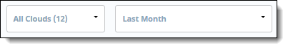
You can display dashboard views in a variety of ways. You can select all cloud applications for higher-level overviews of your cloud data activity, or you can select specific cloud applications or only one cloud for more detailed information. To view activity for a specific time, you can select a time range.
You can go to the following pages by clicking the menu items.
The following sections describe these dashboards.
Application Activities
The Application Activities dashboard provides the following views.
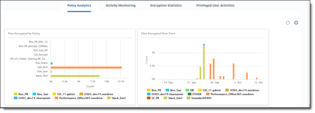
Policy Analytics
Policy Analytics provides perspectives on the type, quantity, and source of policy triggers in your organization. For example, you can see the total number of policy violations over a specific time (such as a month), as well as a breakdown of violations by cloud, by user, or by policy type (such as external collaborator violations).
For descriptions, see Policy Analytics.
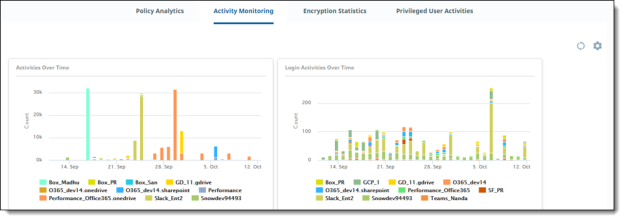
Activity Monitoring
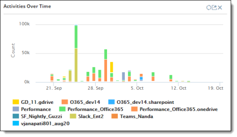
Activity Monitoring shows quantified views of activities in your organization – for example, by activity type (such as logins and downloads), by time, or by user.
For descriptions, see Activity Monitoring.
Encryption Statistics
Encryption Statistics shows how encrypted files are being accessed and used in your organization. For example, you can view the highest number of users who have encrypted or decrypted files, how many encryption and decryption activities have taken place over time, or the types of files that have been encrypted.
For descriptions, see Encryption Statistics.
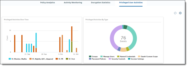
Privileged User Activities
Privileged User Activities shows activities performed by users with higher-level access permissions in an organization. These users are typically administrators and are sometimes referred to as "super users." Users at this level can view the number of accounts created or frozen by an administrator, or how many session settings or password policies were changed. Being aware of privileged user activity is important because these users have permissions under which they can modify settings that could compromise a cloud's security. The information from these dashboards allows the security team to monitor the actions of these users, and act quickly to address threats.
For descriptions, see Privileged User Activities.
Anomalous Activities
The Anomalous Activities detection engine continuously profiles data attributes and user behavior to detect activity that is out of the ordinary for your enterprise. Monitoring includes the locations from where logins take place (geo-logins), source IP addresses, and devices used. User behavior includes activities such as content uploads and downloads, edits, deletes, logins, and logouts.
Anomalies are not actual policy violations but can serve as alerts for possible data security threats and malicious data access. Examples of anomalies might be an abnormally large number of downloads from an individual user, a higher-than-normal number of logins from the same user, or persistent login attempts by an unauthorized user.
The user profile includes sizes of file downloads across cloud applications, as well as the time of the day and day of the weeks that the user is active. When the engine detects a deviation from the observed behavior over this period, it flags the activity as anomalous.
Anomalies are classified into two types: deterministic and statistical.
-
Deterministic detection works in real time and detects anomalies as user activity occurs, with a nominal delay (for example, 10 to 30 seconds). The algorithm profiles entities (such as users, devices, applications, content, user locations, and data destination location), attributes (such as access location, source IP address, device used), and the relation between them.
-
When an unknown or unexpected new relation is encountered, it is evaluated for suspicious activity. The sample of user activities profiled in this approach is relatively small and grows over time. The accuracy of the anomalies detected using this method is high, although the number of rules or the search space is limited.
-
Statistical detection creates a user’s baseline with a larger activity sample, typically spanning over a 30-day period to reduce false positives. User activity is profiled using a three-dimensional model: the metric observed (location, access count, file size), time of the day, and day of the week. The metrics are grouped by time and day. Activities profiled includes:
-
Content downloads
-
Content access -- uploads, edits, deletes
-
Network access -- logins and logouts
When the engine detects a deviation from the observed behavior over this period, based on clustering techniques, it flags the activity as anomalous. It detects anomalies in non-real time with a delay of typically one hour.
The deterministic algorithm is used for geoanomaly detection. The statistical algorithm is used for anomalous downloads and for content and network access.
To view anomalous activities, go to Monitor > Anomalous Activities.
For more details about viewing anomaly reports, see:
Anomalous activities by geolocation
The Anomalous Activities by Geolocation dashboard is a map view showing geographic pointers where anomalous activity has likely taken place. This type of anomaly is called a geoanomaly. If geoanomalies have been detected, the map shows one or more geographic pointers identifying where the activity in question took place.
When you click on a pointer, you can display details about the user's current and previous activities, including their email address, the cloud they accessed, their location, and the activity time. Using the current and previous activity details, you can make comparisons that provide insight into the anomaly. For example, the user might have logged in to two different cloud applications using the same sign-on credentials, from two different locations. The blue pointer represents the location with the current focus. To focus on the other location, click its pointer.
If there are multiple instances of anomalous activity from a geographical area, multiple pointers appear, slightly overlapped. To display information on one of the pointers, hover over the area with the overlapping pointers. In the small box that appears, click the pointer for which you want to view details.
Displaying geoanomaly details from the Activity Audit Logs page
From the Activity Audit Logs page (Monitor > Activity Audit Logs), you can select geoanomaly views by clicking the Binocular icon that appears at the left in the activity list.
Anomalous downloads, content access, and authentication
The following dashboard charts provide information about anomalous activity across cloud applications.
-
The Anomalous Downloads by Size chart shows a summary count of downloads over time by size of downloaded files.
-
Data hijacking in enterprises is often indicated by an abnormally high number of downloads of business-critical data. For example, when an employee leaves an organization, their activity might reveal that they downloaded a large amount of corporate data just before their departure. This chart tells you the number of times an anomalous pattern is found in user downloads, the users who did the downloading, and when the downloads occurred.
-
The Anomalous Content Delete chart shows the number of delete events for anomalous activity.
-
The Anomalous Authentication chart shows the number of times an anomalous pattern is found in a user’s network access events, including logins, failed or brute-force login attempts, and logouts. Repeated unsuccessful logins could indicate a malicious attempt to gain access to the network.
-
The Anomalous Downloads by Count chart shows the number of anomalous downloads for your enterprise.
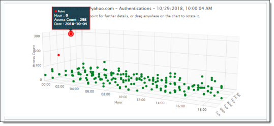
Three-dimensional activity views
You can also view a three–dimensional chart from which you can observe anomalous activity in relation to normal activity. In this view, activities are represented as data points (also called buckets) on three axes:
-
X=hour of day
-
Y=aggregated activity count or aggregated download size
-
Z=day of the week
The chart uses a clustering mechanism to illustrate activity patterns and reveal anomalies. These activity clusters can give you a better idea of what types of events are occurring most frequently at specific days and times. The clusters also enable anomalies to stand out visually.
As activities are tracked hour by hour, data points are added to the chart. Clusters are created when relevant activities total at least 15 data points. Each cluster is represented by a different color for its data points. If a cluster has fewer than three data points (buckets), the events represented by those points are considered anomalous, and they appear in red.
Each data point on the chart represents events that occurred on a specific hour of the day. You can get details about the date, the hour, and event count by clicking on any data point.
In this example, the cluster at the lower right has 15 data points. It shows that several events took place during late afternoon and evening throughout the week. The access count was similar for all activities. On one day, the access count was much higher, and the point is shown in red, indicating an anomaly.
The table below the graph lists the events represented in the graph. The list in this example outlines the date and time of the access, the name of the file accessed, the cloud from which the access took place, and the email address of the user who accessed the content.
Settings for configuring anomaly information
From the System Settings page, you can configure how to track, monitor, and communicate information about anomalous activities. For Box cloud applications, you can suppress (allowlist) connected apps included in the cloud account to prevent geoanomalies.
Adaptive threshold for permitted user activity rates (Preview feature)
The adaptive threshold defines a permitted rate of user activity. The configured threshold can be adjusted based on the user activity rate. Being able to configure a threshold enables you to adjust the rate of user activities as needed. If conditions permit, for example, the threshold can be modified to allow a higher rate of activity.
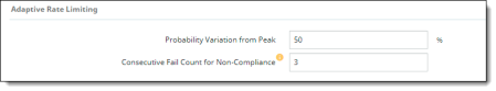
Adaptive threshold configuration evaluates threshold compliance and will allow events up to the defined threshold. CASB also checks the probability of event occurrences after the fixed threshold. If the probability is within the allowed range, the events are allowed. The default value for the variance percentage from peak probability is 50%.
You can also set a consecutive failure count (for example, three failures in a row). When the number of consecutive failures exceeds the specified count, the events are considered non-compliant. The default count is three (3) consecutive failures. It can be adjusted up to 20 or down to 1.
You can choose adaptive threshold as a context type in a policy, where these settings will be applied. This context type is available for inline policies for Upload, Download, and Delete activities. For instructions on using adaptive threshold as a policy context type, see Creating Cloud Access Control (CAC) policies.
Tracking of anomaly information
-
Go to Administration > System Settings > Anomaly Configuration.
-
Select settings as follows:
|
Section/Field |
Description |
|---|---|
|
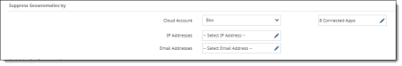
Suppress Geoanomalies by |
|
|
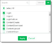
Activities for Geoanomaly |
Search for the activities to track for geoanomalies, select the activities, and click Apply.
Note For anomalies to be triggered for Microsoft 365 and AWS, you must check O365Audit and AWSAudit from the list. |
|
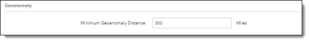
Geoanomaly |
For Minimum Geoanomaly Distance, enter the minimum number of miles for which to track geoanomalies, or accept the default of 300 miles.
|
|
Adaptive Rate Limiting |
Enter or select the following options that will apply to the tenant:
|
|
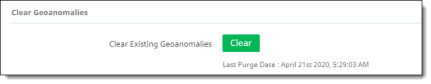
Clear Geoanomalies |
Click Clear to clear previously reported geoanomaly information. After you click Clear, the date and time at which the geoanomalies were last purged appears below the Clear button.
|
-
Click Save.
Settings for anomaly profiles (dynamic anomaly configuration)
Dynamic anomaly configurations include profiles for defining behavior that is considered anomalous. These profiles are based on activity category and activity types. Each profile is either predefined (provided for all tenants; cannot be modified or deleted by administrators) or user defined (can be created, modified, or deleted by administrators).
You can create up to four user-defined anomaly profiles. Each profile defines anomalous behavior for an activity category (for example, authentications or content updates), and activities associated with that category (for example, login, content download, or content delete).
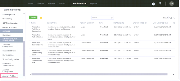
The Anomaly Profiles page shows:
-
The profile Name and Description
-
The Activity Category (for example, ContentUpdate)
-
Type – either Predefined (system-generated, cannot be edited or deleted) or User-Defined (can be created, edited, and deleted by administrators).
-
Created Date – the date on which the profile was created.
-
Last Modified By – the username of the person who last modified the profile (for user-defined profiles) or system (for predefined profiles).
-
Last Modified Time – the date and time on which the profile was last modified.
-
Actions – an Edit icon for displaying profile details and modifying user-defined profiles.
You can filter the column display or download the list of profiles to a CSV file using the icons at the upper right above the list.
|
|
To show or hide columns, click the Column Filter icon, and check or uncheck column headings. |
|
|
To download the listed profiles, click the Download icon and save the CSV file to your computer. |


The following procedures outline the steps for adding, modifying, and deleting user-defined anomaly profiles.
Note
You can have no more than four user-defined profiles. If you currently have four or more user-defined profiles, the New button appears dimmed. You must delete profiles to bring the number down to fewer than four before you can add new profiles.
To add a new user-defined anomaly profile:
-
Go to Administration > System Settings, select Anomaly Profiles, and click New.
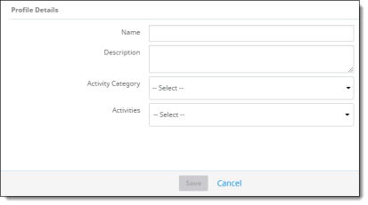
-
For Profile Details, enter the following information:
-
Name (required) and Description (optional).
-
Activity Category – Select a category for defining activities in the profile.
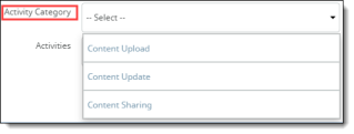
-
Activities – Check one or more activities for the selected category. The activities you see in the list are based on the activity category you selected. The following activity types are available.
|
Activity Category |
Activities |
|---|---|
|
Content Upload |
Content Upload Content Create |
|
Content Update |
Content Edit Content Rename Content Restore Content Move Content Copy |
|
Content Sharing |
Collaboration Add Collaboration Invite Content Share Collaboration Update |
-
Click Save.
To modify a user-defined profile:
-
Select a user-defined profile and click the pencil icon at the right.
-
Make the needed modifications and click Save.
To delete a user-defined profile:
-
Select a user-defined profile and click the Trash Can icon at the upper right above the list.
-
When prompted, confirm the deletion.
Office 365
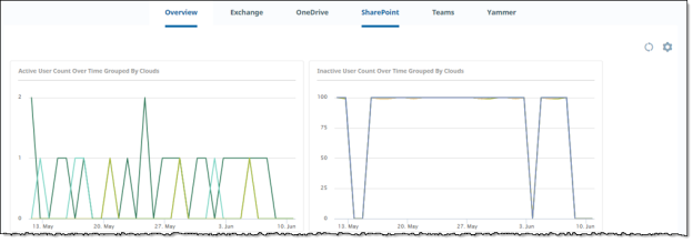
The Office 365 dashboard provides information about activities for the applications in the Microsoft 365 suite. Charts are shown only for the applications you onboarded.
The Overview charts summarize user activity information for your onboarded applications. The application charts show user activity for that application.
For chart details, see Office 365 dashboards.
AWS Monitoring
The AWS Monitoring dashboard provides information about user activity by location, time, and number of users.
For chart details, see AWS Monitoring charts.
Customizing and refreshing a dashboard display
You can move charts around on a dashboard, select which charts appear, and refresh the display for one or all charts.
To move a chart in a dashboard:
-
Hover over the title of the chart you want to move. Click and drag it to the desired position.
To refresh the display for a chart:
-
Hover over the upper right corner of the chart and click the Refresh icon.

To refresh the display for all charts on the page:
-
Click the Refresh icon in the upper right corner of the page.

To select what data appears in a dashboard:
-
In the upper left corner of the page, select the cloud applications and the time range to include.
Exporting data for reporting
You can export the information you need from any chart.
-
Select the tab that has the chart whose data you want to export (for example, Monitor > Activities Dashboard > Policy Analytics).

-
Select the chart whose data you want.
-
To exclude any items from the export (for example, users), click the items in the legend to hide them. (To show them again, click the items once more.)
-
Hover over the top of the chart, click the Export icon in the upper right corner.

Then, select an export format from the list.
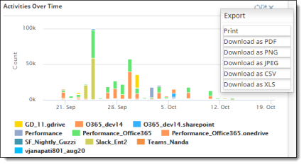
-
Save the file.
Printing a report or chart
-
Click the Export icon in the upper right corner of the chart whose data you want to print, and select Print.
-
Select a printer and print the report.