View WAN Edge Insights for Monitoring
Use the Insights page of the Juniper Mist portal for a detailed monitoring experience of your WAN Edge devices.
The Insights page of the Juniper Mist portal is a powerful tool you can use for in depth analysis and detailed monitoring of your WAN Edge devices. It provides a single-pane-of-glass view for gaining a deep understanding of the health of the network. For general information, see Insights Overview.
Navigate to WAN Edge Insights
- WAN Edge Insights
- Applications
- Application Path Insights (BETA)
- WAN Edge Device Charts
- WAN Edge Ports Charts
WAN Edge Insights
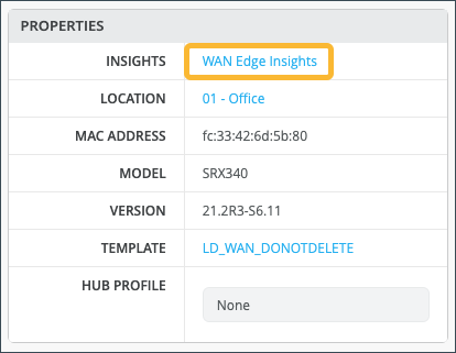
From the left menu of the Juniper Mist portal, select WAN Edges > WAN Edges, then select your WAN Edge device.
In the Properties pane, select WAN Edge Insights for the next level of information about your WAN Edge device.
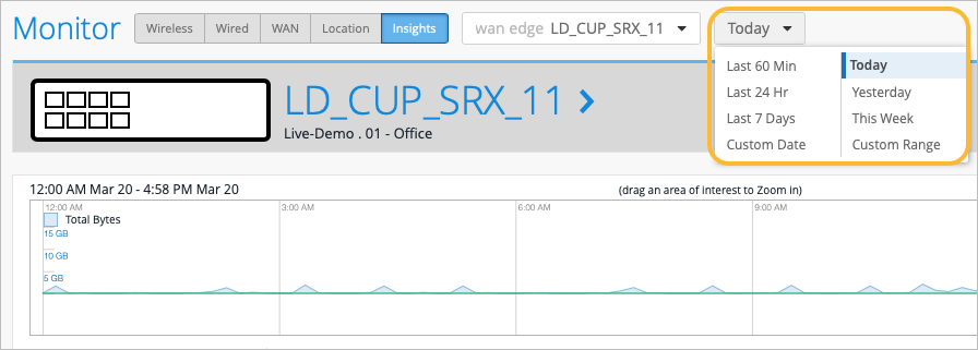
Next to the selected WAN Edge on the Insights page, you can select the time frame for which you want to view the information. The default view is Today, but this can be set to a customized date, or range of dates. Below this, you find (when the site location information is configured) where this WAN Edge is configured via a street map.
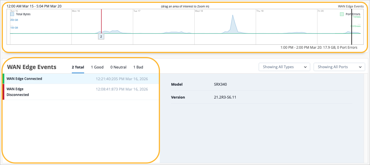
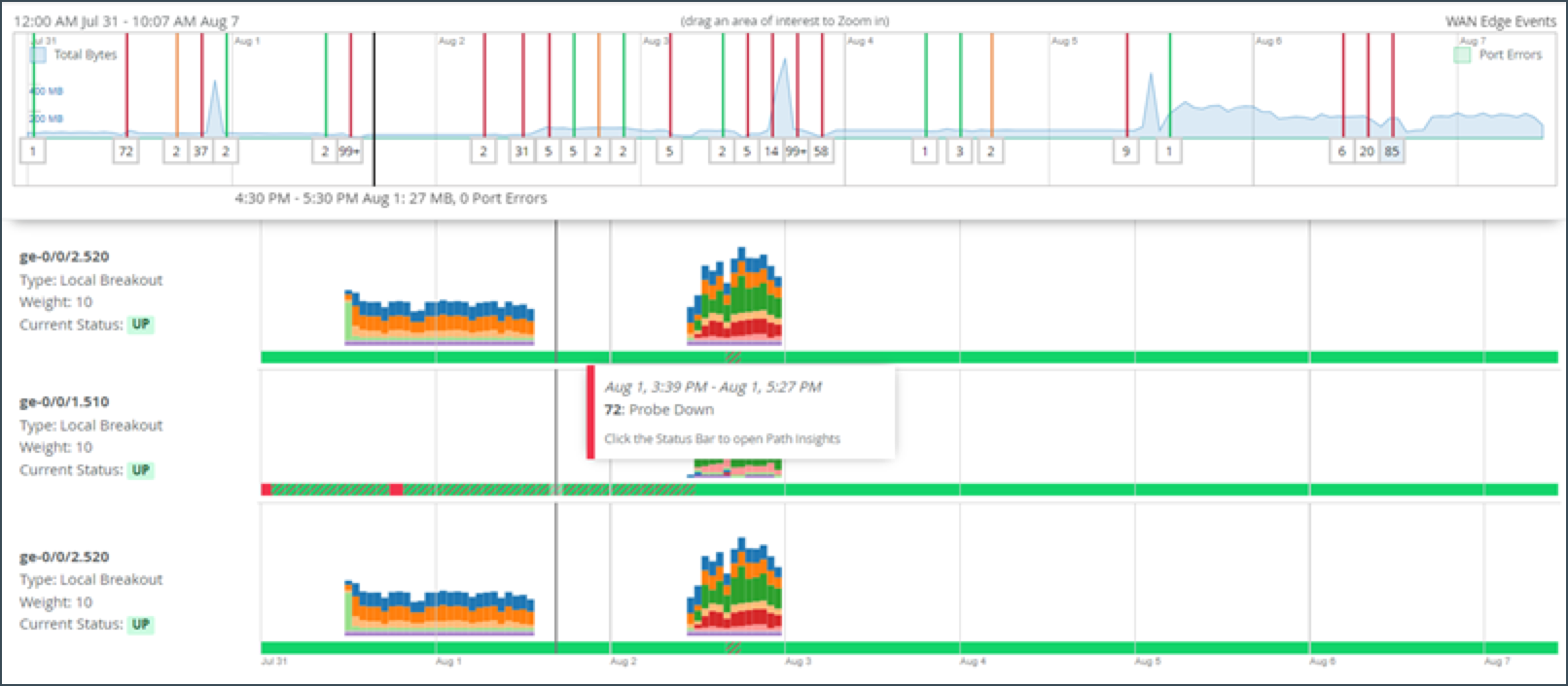
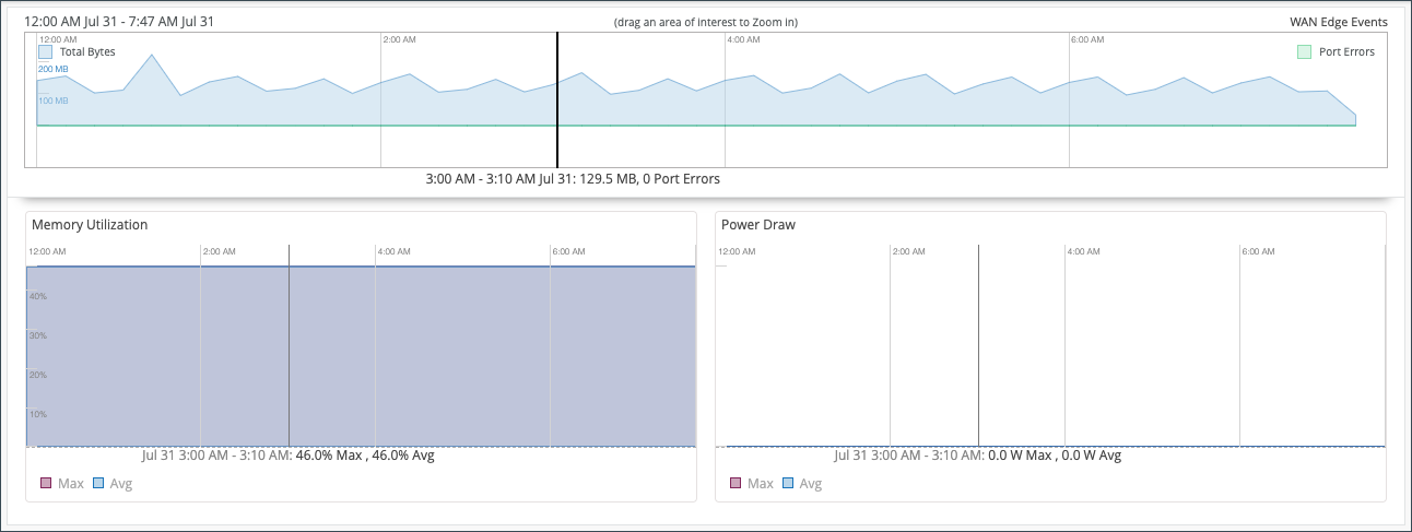
WAN Edge Events
With your time frame selected, WAN Edge Events displays a time line of the traffic through the WAN Edge during your specified time, and provides a list of events.
Select a specific event in the listed WAN Edge Events for greater detail of the Total, Good, Neutral, and Bad events. Detailed information about the event displays on the right based on what you selected.
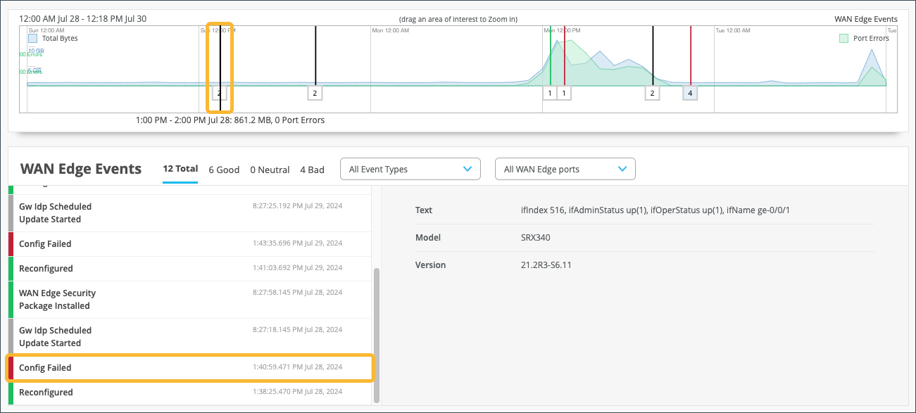
To drill down to a detailed portion of time, select a window of time with your mouse cursor. By doing this, you’re able to adjust the window of events and isolate specific Good, Neutral, and Bad occurrences that happened on your network. With a smaller section, you’ll get a more detailed view of that period.
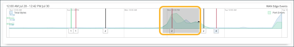
Scroll down on the WAN Edge Events page for deeper insights within your selected period.
In the WAN Edge Events section, you can narrow down the type of event by selecting a modifier from the drop-down menu. You can also filter your search by limiting the event types to a specific port.

Table Capacity
The Table Capacity section provides you with quick access to the Forwarding Information base (FIB) tables and Session tables for each node of your device:
-
FIB Entries: Displays the current number of FIB entries and the percentage of utilization; essentially showing how much of the available FIB space is currently being used.
-
Session Flows: Displays the current number of active sessions and the percentage of session flow utilization based on the device's capacity.
In the case of a high availability cluster, Table Capacity indicators are displayed for each node.
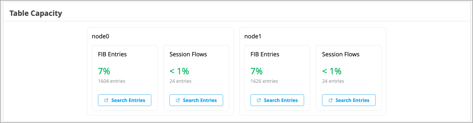
Click the Search Entries button under each metric to open a shell view in a new window. In this view, users can search for entries after specifying filters.
Applications
The Applications section of the Insights page lets you view reports on applications. It is divided into four tabs (Categories, Apps, Applications, and Clients). This section allows you to:
- Use categorized applications to monitor and troubleshoot specific application behavior.
- View a client's use of a particular application by clicking the Clients tab.
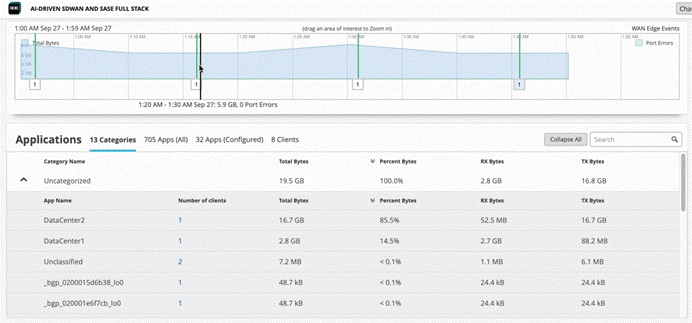
On the Categories tab, you can see the following details about applications usage:
| Column | Description |
|---|---|
| Category Name | The category of the applications. Expand the categories to view individual applications details. |
| Number of Clients | Click on the number to see more information about the clients using the application. |
| Total Bytes | The traffic volume that each application or website receives and transmits. |
| Percent Bytes | Percentages of traffic volume that each application or website receives and transmits. |
| RX Bytes | Traffic that applications or websites receive. |
| TX Bytes | Traffic that applications or websites transmit. |
Ensure you’ve had a few hours for these metrics to be populated following initial deployment.
On the Categories tab, in the Number of Clients column, you can click on the number to see more information about the clients using the application.
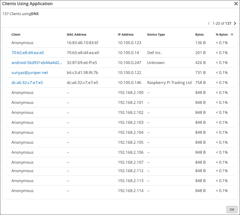
For WAN Edge devices running a DHCP server, clients using that application will display a HostName in the Client column if available. Otherwise, the MAC address will be displayed. Device Type and MAC Address columns will be populated as well.
In the Apps tab, hover over the App Name to see more details about the services.
Use the Applications tab to monitor and troubleshoot specific application behavior.
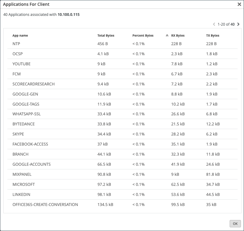
Click the Clients tab to see how much bandwidth a particular client is using, as well as a client's usage of a particular application. You can click the number in the Number of applications column to see more information regarding the client's application use.
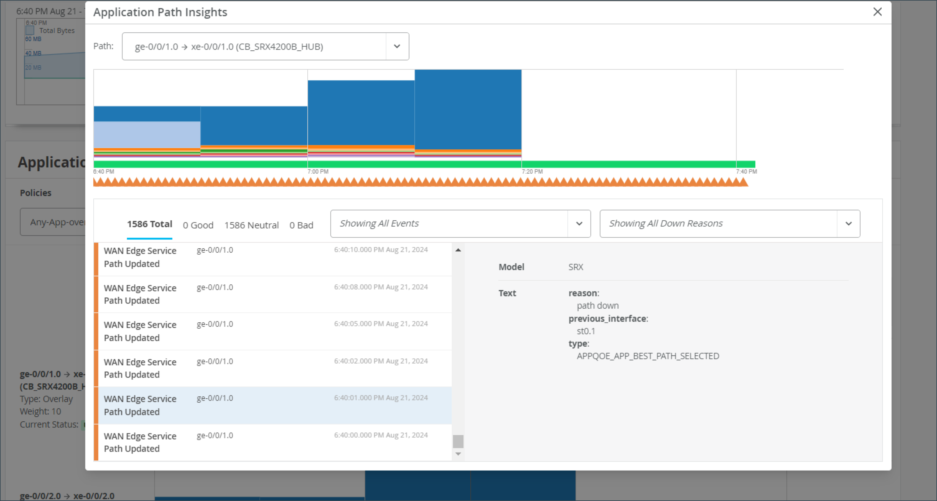
Application Path Insights (BETA)
The Application Path Insights (BETA) section displays which applications are using the most bandwidth according to the selected Application Policy and Network. It displays the effective application flow over the path for the selected Application Policy.
You can also change the Data Type to Sessions to see the number of sessions occurring per application. Hover over a section of the graph to view the bandwidth or sessions per application as well as jitter, loss, and latency.
The Application Path Insights visualization data is available only if the configuration is managed by Juniper Mist.
Have you ever been on an important Zoom or Teams call and experienced jitter or latency? This is a bad experience for anyone, but if you're the network operator, it's even worse. You don't want the CEO yelling at you because their shareholder meeting went bad. With Juniper's WAN Assurance Application Insights dashboard, you could do something about it.
This dashboard shows you which applications are using bandwidth at any given time. Given those insights, you can easily set policies to remediate issues, such as prioritizing some applications, blocking others, or working with your ISP to gain more bandwidth. Application Insights dashboard also lets you verify that your policies were configured correctly, and you can easily see the top 10 applications by bandwidth utilized, quickly adding and removing applications from this list.
And that's the power of WAN Assurance App Insights in 60 seconds.
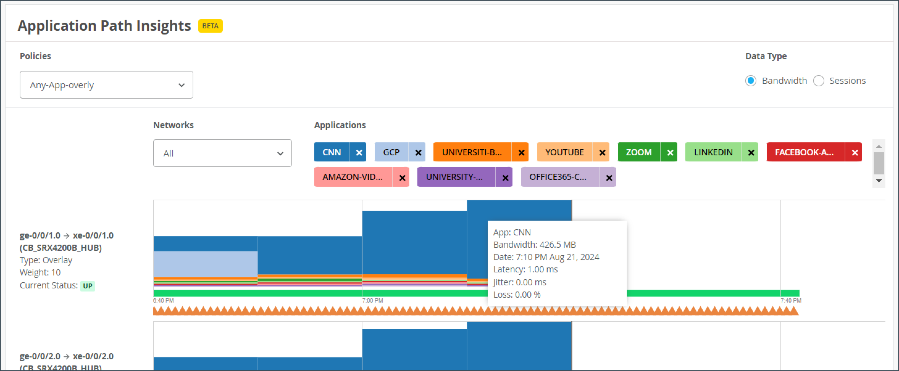
The path state bar shows path state information over a time line, and path state events are indicated by segments highlighted in different colors. For example, Path Up events are shown in green, and Path Down events are shown in red.
You can filter this section in the following ways:
- Policies: You can filter by policy type.
- Data Type: Toggle between Bandwidth and Sessions to analyze traffic volume or session count.
- Networks: Filter by specific networks.
A list of applications is shown with color-coded tags.
You can hover over the highlighted portions of the path state bar to view a summary of path state events.
If you click on the bar, a pop-up window displays containing detailed information about the path state events. The list of events displays on the left and when you select an event, the reason for the event displays on the right.
| Path State Events |
|
| Path State Reasons |
|
| Path State Events |
|
| Path Down Reasons |
|
WAN Edge Device Charts
The WAN Edge Device Charts include Control Plane CPU, Data Plane CPU, Memory Utilization, and Power Draw (SRX Only).
The Control Plane CPU and Data Plane CPU charts show you the percentage of CPU utilization for both max and average. On the Control Plane CPU, you can click the View Live Process Detail link to see more in depth information about the processes that are running on the control plane.
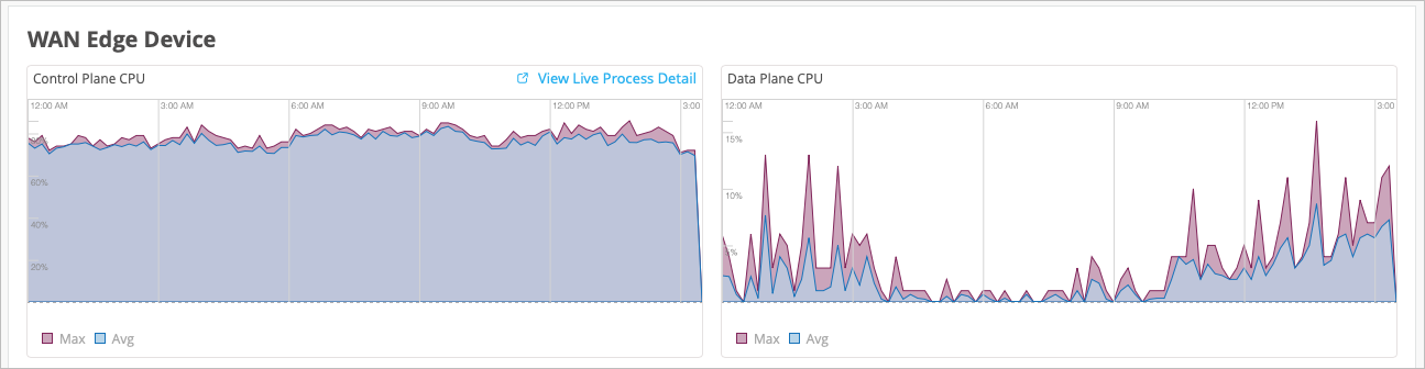
The Memory Utilization and Power Draw (SRX Only) charts show you the percentage for both max and average.
WAN Edge Ports Charts
The WAN Edge Ports charts include Bandwidth, Max Bandwidth, Applications TX + RX Bytes, Port Errors, and IPsec Traffic (SRX Only). From the drop-down list at the top, you can select All ports to see utilization metrics for all interfaces, or you can select an interface to see the metrics for that particular interface.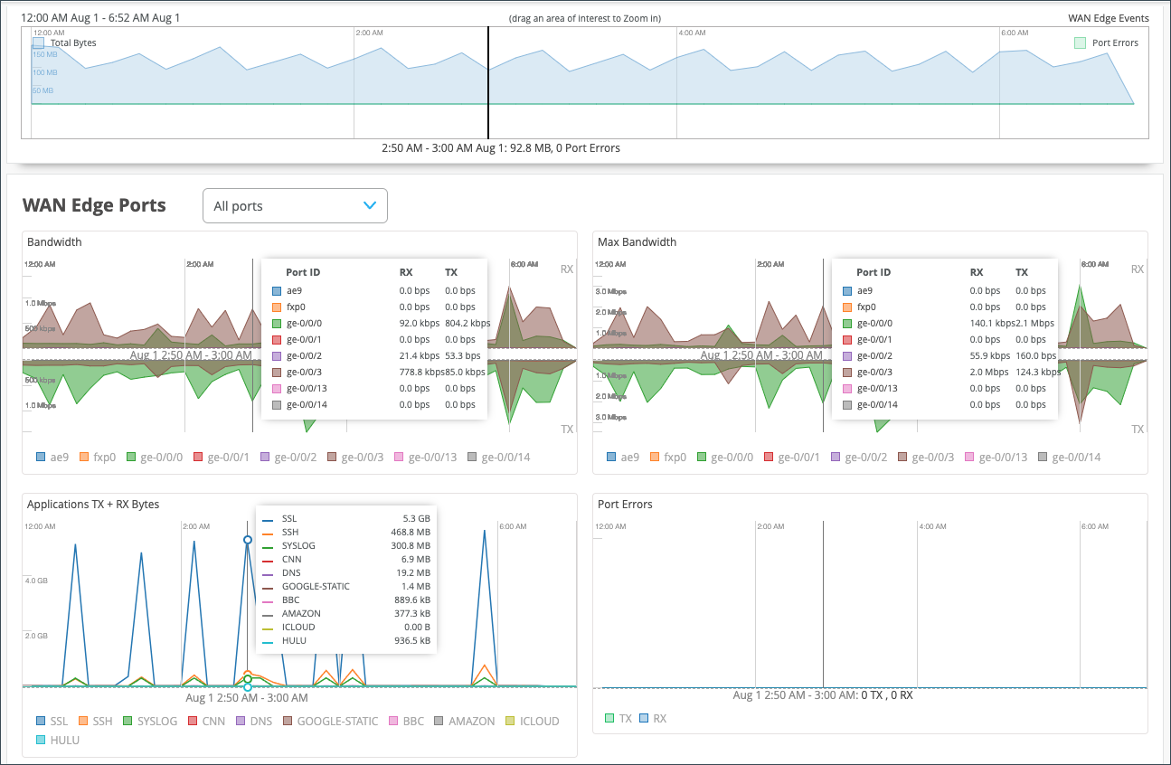
- In the Bandwidth chart, the bandwidth utilization metrics in megabits per second (Mbps) for that particular interface display.
- The Max Bandwidth chart displays insights into the highest point of link utilization recorded for received power signal (RX) and transmitted power signal (TX) packets on each port during the day in Mbps.
The last three WAN Edge Ports charts are Applications TX + RX Bytes, Port Errors, and IPsec Traffic. Hover over the charts to find out more information.
- The Applications TX + RX Bytes chart outlines transmit and receive data information, which can be isolated at an application level by clicking on the application name at the bottom to see Client, MAC address, IP address, device type, bytes, and % bytes for bandwidth utilization.
-
The Port Errors graph displays port errors detected on the WAN Edge device over a period of time. Port errors are Ethernet data link error counts that include all possible Ethernet errors reported by the port device driver. Exact types of errors vary by device driver, and the total may include but is not limited to CRC errors, collisions, and so on. Errors are counted in both the transmit (TX) and receive (RX) direction. The graph displays the total for all ports, or for a particular port based on the WAN Edge Ports selection.
- The IPsec Traffic chart displays IPsec traffic for transmit and receive packets during the day in kilobytes or megabytes.
View Probe Stats
This section provides insights into the health of WAN peer and overlay paths. In Juniper Mist WAN Assurance, WAN Edge devices use probes to monitor the performance of WAN paths between edge devices. These insights include live graphs of jitter, latency, loss, and mean opinion score (MOS).
Probe Stats with SRX Series Firewalls: The SRX Series Firewalls used as WAN Edge devices in Juniper Mist™ WAN Assurance provide underlay path insights. Real-time performance monitoring (RPM) probes are configured in the underlay path to generate performance metrics such as latency, jitter, and loss. These probes send periodic ICMP echo requests to target addresses at set intervals and measure response times to calculate latency, jitter, and packet loss.
Probe Stats with SSR Series Routers: The Session Smart WAN Edge devices deployed in Juniper Mist™ WAN Assurance provide liveness and overlay-path quality insights using Secure Vector Routing (SVR). SSR Series Routers use Bidirectional Forwarding Detection (BFD) on port 1280 to check liveness with downstream SSR Series Routers and to monitor jitter, latency, loss, and Mean opinion score (MOS). This insight is applicable only for SSR Series Routers. SSR Series Routers also use ICMP probes to monitor these metrics on the underlay paths.
This section consists of the following tabs:
-
WAN Probes
This tab shows live graphs of the following network performance metrics from configured real-time ICMP probes:
-
Latency chart displays round-trip time (RTT) values in milliseconds (ms) with the timestamps. It also shows the average WAN probe value. The chart highlights overall latency stability (for example, sudden spikes) on the WAN path.
-
Loss chart displays the overall packet loss as a percentage.
-
Jitter chart displays the difference between the maximum and minimum round-trip times (RTT) measured over the course of time.
Figure 17: WAN Probes Statistics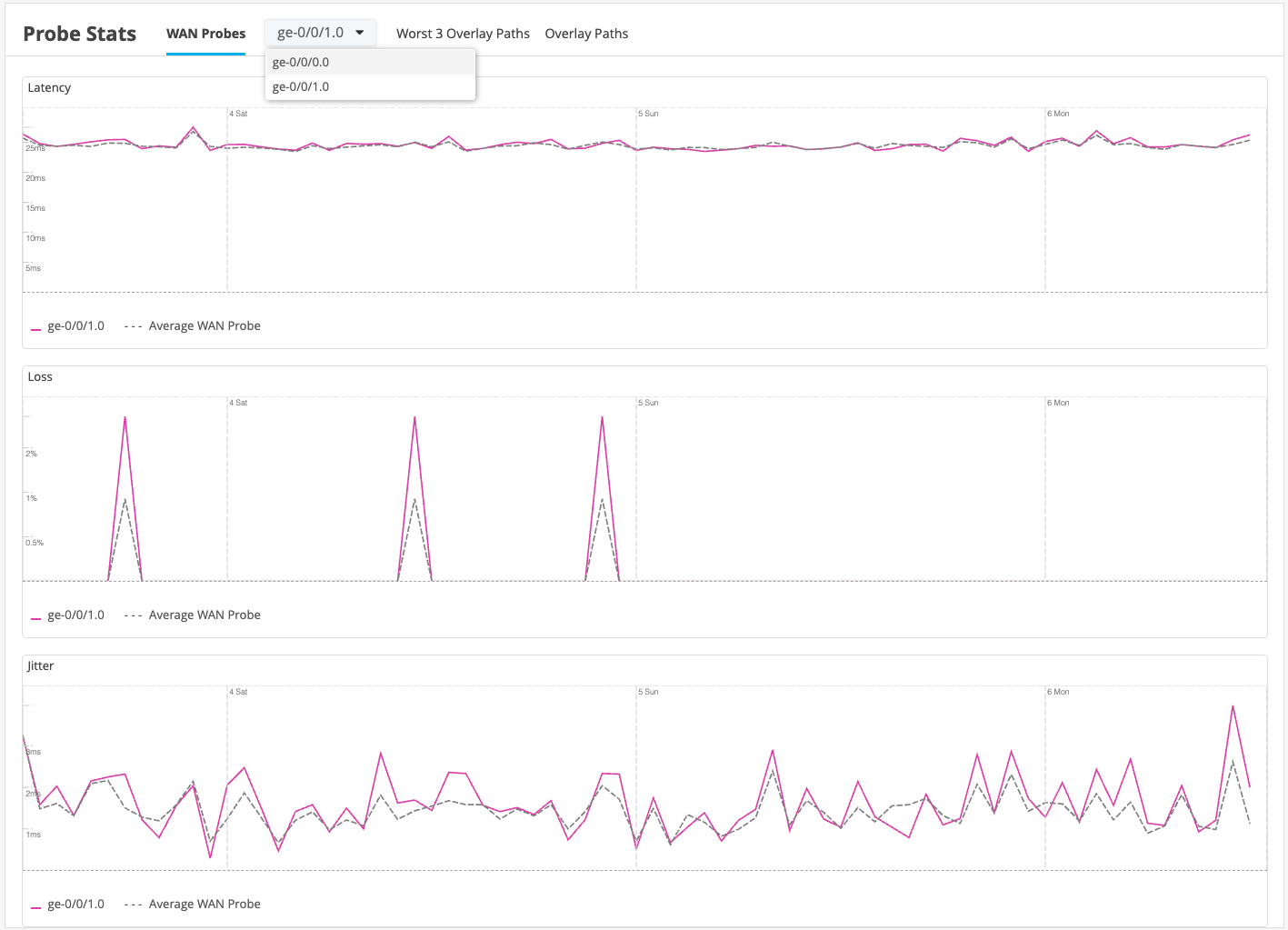
-
-
Worst 3 Overlay Paths
This tab shows the three worst peer connections with the least metric values. The following network performance metrics are shown as live graphs:
-
Latency chart displays round-trip time (RTT) values in milliseconds (ms) with the timestamps. It also shows the average WAN probe value. The chart highlights overall latency stability (for example, sudden spikes) on the WAN path.
-
Loss chart displays the overall packet loss as a percentage.
-
Jitter chart displays the difference between the maximum and minimum round-trip times (RTT) measured over the course of time.
-
MOS chart displays the quality of the paths on a rating scale from 1 to 4. Higher rating indicates better path quality.
Note: If a Secure Edge Connector is configured and the probe IP and source addresses are added, the above-mentioned live graphs display data related to the Secure Edge connector.
-
-
Overlay Paths
This tab shows the performance of the selected overlay path between the WAN Edge devices. The following network performance metrics are shown as live graphs:
-
Latency chart displays round-trip time (RTT) values in milliseconds (ms) with the timestamps. It also shows the average WAN probe value. The chart highlights overall latency stability (for example, sudden spikes) on the WAN path.
-
Loss chart displays the overall packet loss as a percentage.
-
Jitter chart displays the difference between the maximum and minimum round-trip times (RTT) measured over the course of time.
-
MOS chart displays the quality of the paths on a rating scale from 1 to 4. Higher rating indicates better path quality.
Note: If a Secure Edge Connector is configured and the probe IP and source addresses are added, the above-mentioned live graphs show data related to the Secure Edge connector.Figure 18: Overlay Paths Statistics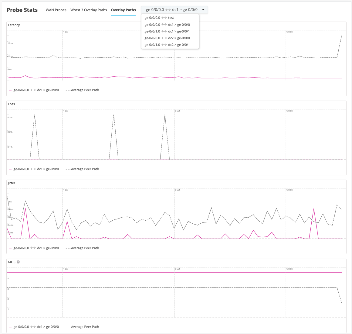
-
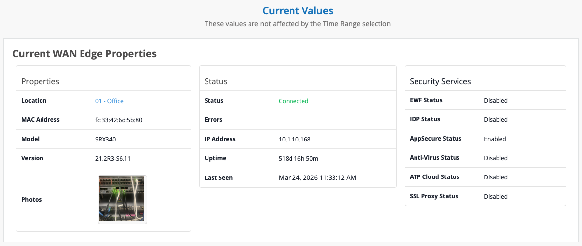
WAN Edge Properties is the final section of the WAN Edge Insights page. Time range selections do not impact information in this section.