Service-Level Expectations (SLE)
Get familiar with the Service-Level Expectations (SLEs) and the SLE dashboard.
What Are Service-Level Expectations (SLEs)?
The following video gives you a quick, high-level introduction to SLEs.
Hello again, I'm Mike, and this is Marvis. Last episode, you showed us how easy it can be to operate an SD-WAN. Nice job.
Speaking of which, Marvis, how's the WAN currently doing? As you can see, Marvis has three Service Level Experience Numbers, or SLEs, that measure and explain WAN user experiences. All WAN edge devices are running smoothly. Marvis, what about the WAN Link Health SLE? We're only at 76%? That's okay, but not great.
Looks like we've got an LTE signal issue. Talk to me, Marvis. Who's being impacted? How widespread is the issue? I see. Let's have someone check where we place the device. We might be able to move it so it can get a stronger signal. Next, let's check the Application Health SLE. Marvis, do we have any applications with high latency? Bingo. It's one of our internal apps. Better tell the SRE team to check in.
I love these insights and solutions for issues on the WAN. Thanks for all your help, Marvis. I always learn so much from our conversations.
Juniper Mist™ captures, analyzes, correlates, and classifies event and performance data from your network and devices. It then provides you with an assessment of users' experiences on your network.
Many factors contribute to positive or negative user experiences. Juniper Mist organizes these factors into SLEs. You can set the SLE thresholds to define exactly what "success" means for SLEs such as throughput, capacity, AP health, switch health, and more (as relevant to your network).
When user experiences fail to meet your SLE success thresholds, Juniper Mist identifies the root cause of each poor experience and provides complete details so that you can address the issues.
By skimming the SLE dashboard, you can see at a glance which service levels are low and what types of issues are occurring.
Finding the SLE Dashboard
To open the SLE dashboard, select Monitor > Service Levels from the left menu.
Selecting a Technology
Use the buttons at the top of the page to select the SLE dashboard that you want to view (such as Wireless, Wired, WAN, Location, and Insights). Your subscriptions determine which buttons are available.
Selecting the Context and Time Period
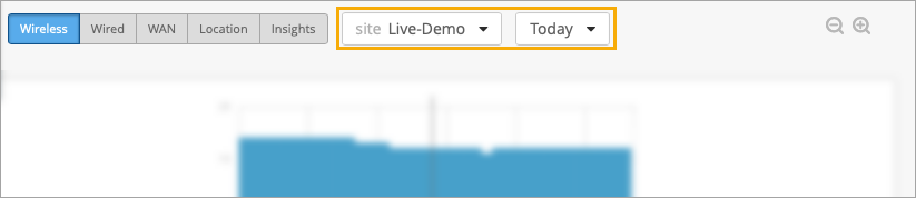
At the top of the Monitor page, select the context, which can be an entire organization, an AP, or a client. In addition, select a time period.
The Monitor page displays data as recent as the past 60 minutes or as far back as the last 7 days. If you purchase a Premium Analytics subscription, you can access up to 3 years' worth of wireless network insights and other data. To access the information available through your Premium Analytics subscription, select Analytics > Premium Analytics from the left menu of the portal.
Context Example: Organization
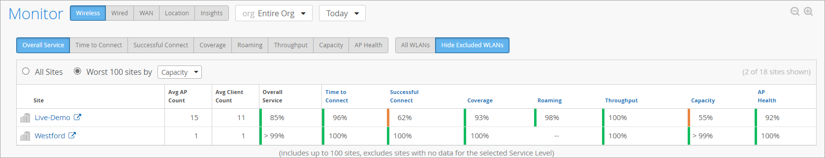
To compare the performance of all sites in your organization, select Entire Org as the context.
Use the filter buttons above the table to change the view:
-
Overall Service—This is the default view when you select Entire Org as the context. You can compare the overall user experience at each site.
-
SLE filter buttons—Zoom in on a single SLE by using the SLE buttons above the table. The button options vary, depending on which page you're on (Wireless, WAN, and so on).
You also have the option to view All Sites or the Worst 100 Sites. For the Worst 100 option, also use the drop-down list to select the SLE that you're concerned about. For example, if you're troubleshooting an issue with capacity, you'd select that option from the drop-down list to see which sites are having the most issues with this SLE.
The available SLEs for the filter buttons and the Worst 100 drop-down list vary, depending on whether you're looking at Wireless, Wired, or WAN SLEs.
Context Example: Site
To compare all SLEs for one site, select the site as the context.
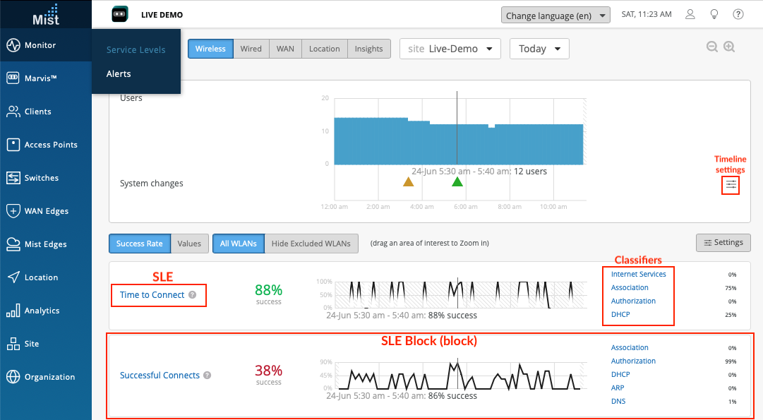
This image shows a Wireless example, but the SLE blocks are set up the same way for Wired, WAN, and so on.
Using the System Changes Timeline
When investigating issues, your first question might be, "Did anything change on the network?" With this timeline, you can see at a glance if any system changes occurred and how many users or clients were active at the time.
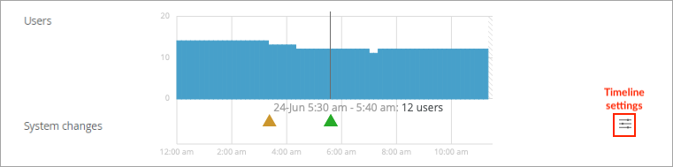
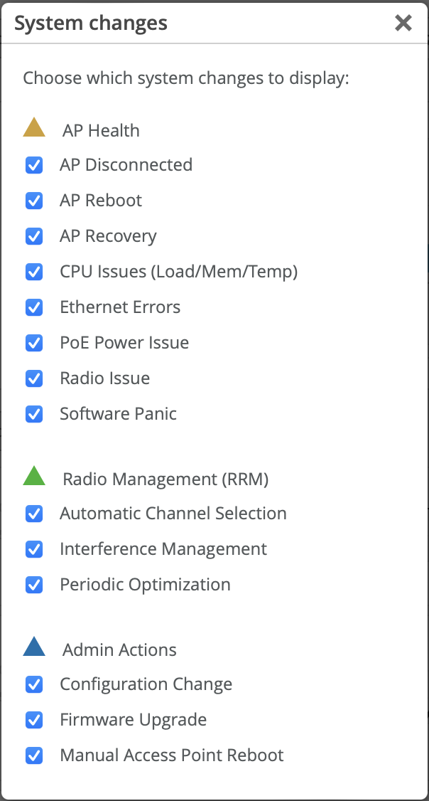
The triangles below the timeline represent various types of system changes:
-
Yellow triangle—AP Health
-
Green triangle—Radio Management (RRM)
-
Blue triangle—Admin Actions
You can adjust the timeline settings to specify the types of changes to include. To
get started, click the timeline settings button: ![]()
In the System Changes window, select or clear the check boxes the events to include or exclude.
Setting the SLE Thresholds
Each SLE has a success threshold. For the Time to Connect SLE, for example, you might set a threshold of 2 seconds. This means that you consider your network successful when users can send and receive data over the Internet within 2 seconds of attempting to associate with an AP.
To view or modify the SLE thresholds, you can click the Settings button on the right side of the SLE dashboard.
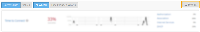
In the Customize Service Levels window, you can modify the thresholds as needed to ensure that the SLE settings meet your goals for your network.
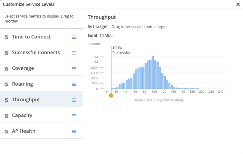
This example shows the wireless SLEs. Depending on the dashboard that you're viewing, you'll see different SLEs in this window.
Understanding the SLE Blocks
Each SLE appears in a separate block (sub-section) on the dashboard.
In each block, you'll see:
-
Overall Service Level. On the left side of each SLE block, you'll see the overall service level for the selected site and time period.
-
Click Success Rate to see the percentage of user experiences that met the SLE success threshold.
-
Click Values to see the number of user experiences that met the SLE success threshold.
-
-
Timeline. In the middle of each SLE block, you can explore the timeline. As your mouse moves across the timeline, information appears under it.
-
Click Success Rate to see the percentage of successful user experiences at the selected point in time.
-
Click Values to see the number of successful user experiences at the selected point in time.
-
-
Classifiers. On the right side of each SLE block, you see the classifiers for the user experiences that didn't meet the SLE success threshold. Juniper Mist attributes each unsuccessful user experience to one classifier. Together, the classifiers give you a high-level root cause analysis of the unsuccessful user experiences.
-
Click Success Rate to see the percentage of unsuccessful user experiences associated with each classifier.
Note:Together, these individual percentages total 100 percent of the unsuccessful user experiences.
-
Click Values to see the number of unsuccessful user experiences that were caused by each classifier.
Note:Together, these individual values represent the total number of unsuccessful user experiences.
-
Sample SLE Block
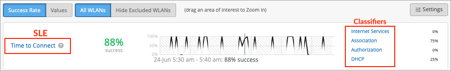
In this example, the Success Rate button is selected, so you see percentages instead of values.
-
On the left, you see that the overall success rate for the selected site and time period was 88 percent.
-
In the middle, the timeline caption shows that the mouse is hovering over 24-Jun 5:30 am - 5:40 am. At that point, the success rate was 88 percent.
On the right, you see that 75 percent of the SLE-lowering issues occurred in the Association process and 25 percent occurred in the DHCP process. Together, these classifiers account for 100 percent of the user experiences that failed to meet the threshold. The other classifiers show 0 percent, meaning that they had no impact on this SLE.
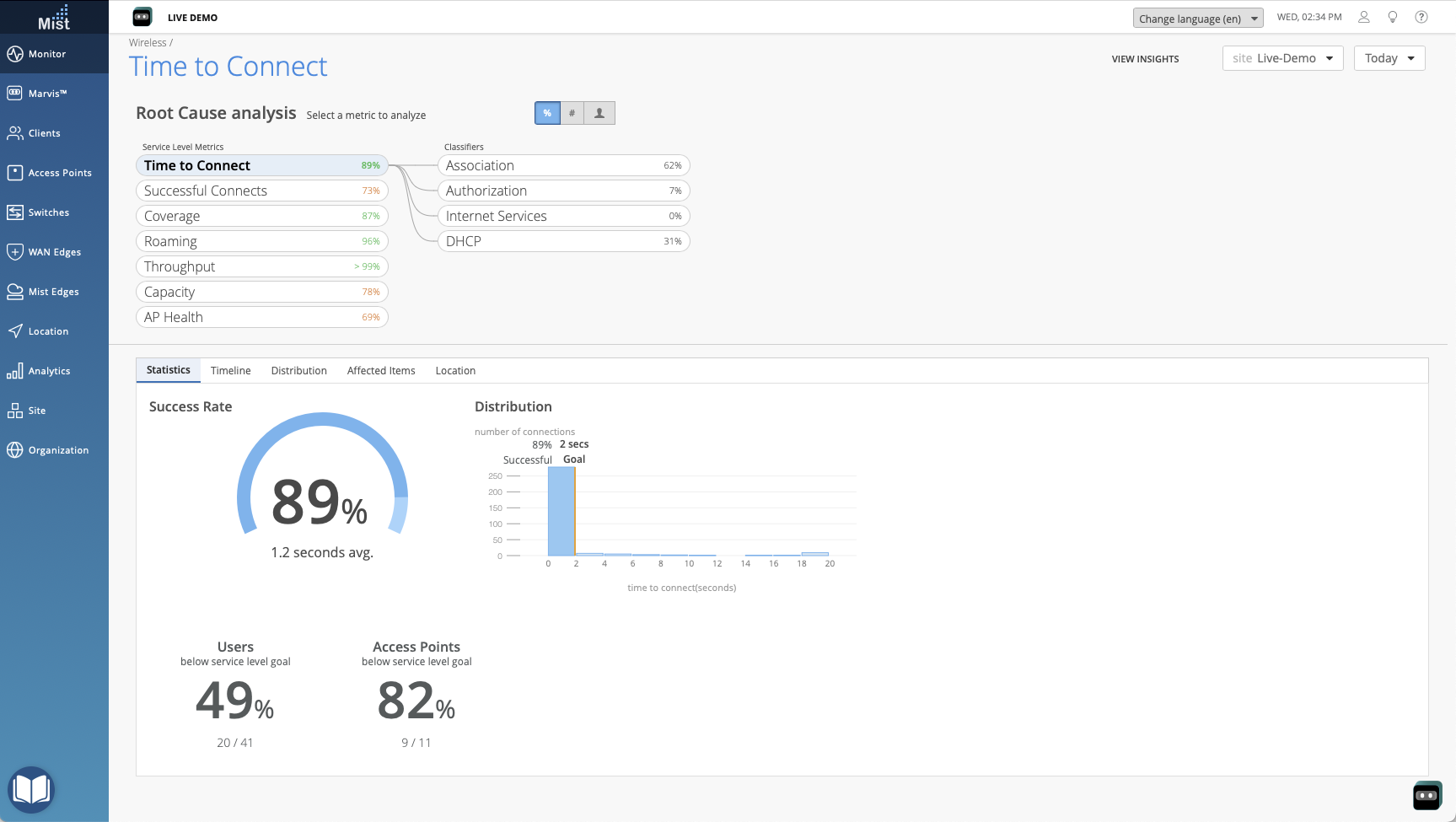
Viewing the Root Cause Analysis Page
From the dashboard, you can click any SLE or classifier to go to the Root Cause Analysis page.
This example shows the Root Cause Analysis page for the wireless Time to Connect SLE.
Tips:
-
At the top of the page, you see the data for all classifiers and their sub-classifiers (if applicable).
-
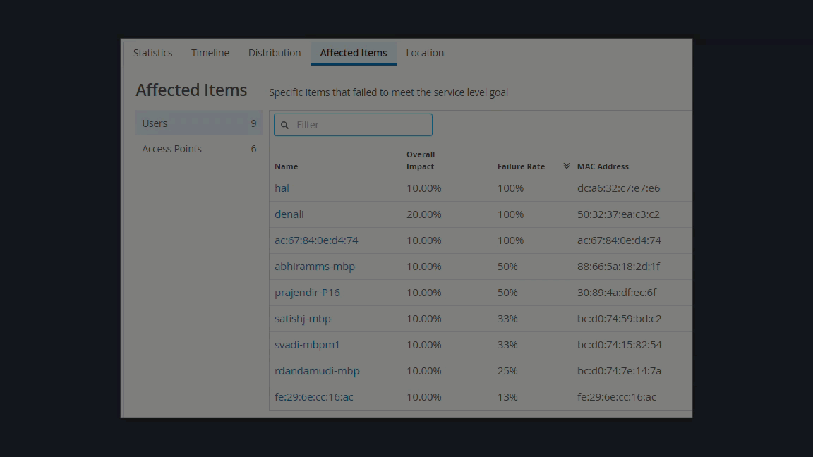
In the lower part of the page, you see additional details about the selected item. Depending on the classifier, you might see signal strength information, a list of affected devices and clients, or other information. These details help you to understand the scope of the issues.
-
On the Affected Items page, you can use the Filter box to search for an item. As shown in the animation below, simply start typing in the box, and matching items will appear in a drop-down list. Then click the item that you want to view.