Understanding GUI Controls
The following sections describe the various controls that can appear on the Junos Space UI:
Check Box
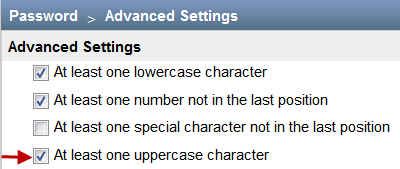
You can use check boxes to select or deselect an option. For example, to ensure that there is at least one uppercase character when a user creates or modifies a password, an administrator can select the At least one uppercase character check box (as shown in Figure 1) on the Administration > Applications > Network Management Platform > Modify Application Settings (from the Actions menu) > Password > Advanced Settings page. On a page, you can select one or more check boxes.
Selecting All Objects on a Single Page
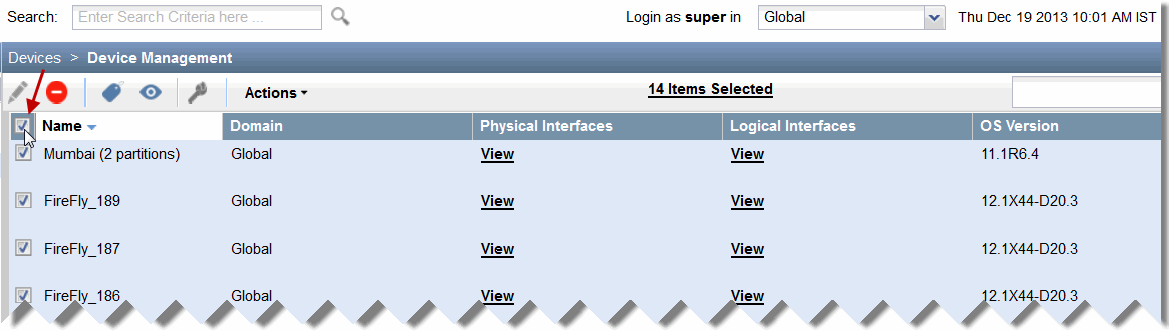
With Junos Space, you can select all objects on an inventory landing page by selecting the check box that is displayed adjacent to the first column header. For example, you can select the check box (see Figure 2) adjacent to the Name column on the Device Management inventory landing page to select all devices displayed on this page.
Selecting All Objects Across Multiple Pages
For certain tasks, you can select an appropriate check box in the Junos Space UI to select all objects spread across multiple pages. With this feature, you do not need to select each object individually on multiple pages.
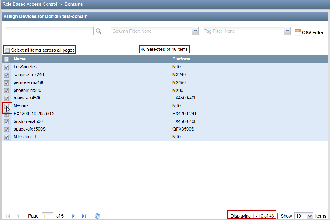
For example, when you want to assign all devices to a domain, you can select the Select all items across all pages check box on the Domains page at the time of domain creation, which selects all devices (indicated by the check mark next to the devices as shown in Figure 3). However, after all the devices are selected, you can deselect one or more devices, if needed.
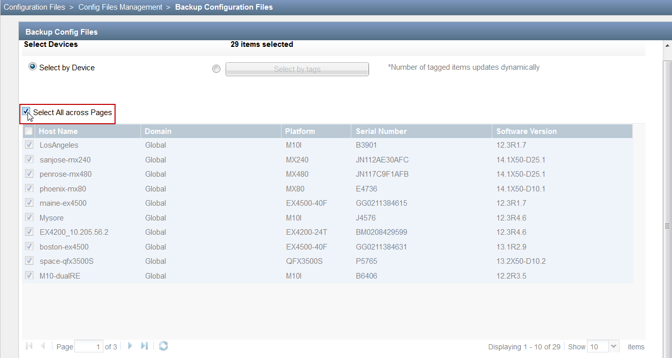
Though some pages support selection of all objects across multiple pages, you may not be able to deselect any of these objects after the selection. For example, when you select the Select All across Pages check box when backing up the configuration files (on the Configuration Files > Config Files Management > Backup Configuration Files page), you cannot deselect any of the selected devices (see Figure 4). The configuration of all devices are backed up.
Only certain pages in the Junos Space UI support the selection of objects across multiple pages.
Date Picker
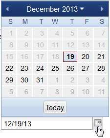
Using a date picker, you can select a date by either typing it into a text box or by using a drop-down Calendar control.
In Figure 5, you can specify a date by typing the date in the text box or from the Calendar control by clicking the icon next to the text box. To select today’s date, click Today on the Calendar control.
Drop-down List
With a drop-down list, you can select from a list of values (see Figure 6). Clicking the arrow next to the list box opens the list. Junos Space also provides an editable drop-down list, which is a combination of a drop-down list and an editable text box (see Figure 7). You can enter the first few letters in the text box to narrow down the list of values.
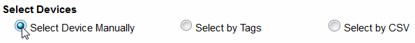
Option Button
Using an option button, you can make a single choice among a set of mutually exclusive, related options. Only one button at a time can be selected from the available options. The default option is selected (see Figure 8).
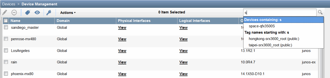
Search Field
Use the Search text field on the right of the inventory page banner to look for specific objects to display on the inventory landing page. To find objects (within columns) on this page, enter the search criteria in the Search field (see Figure 9). This field supports the same search syntax as the global search field (see Using Global Search). For example, enter “os:junos AND down” to find devices that are down on the Device Management inventory landing page. This feature is more powerful than the column filter because it allows you to use Boolean expressions.
Clicking the magnifying glass at the right of the search field displays a list of objects matching the search criteria. If you press the down arrow after entering the search criteria in the search field , a list of search options is displayed. When you select a search option from the list, only those inventory items that are specific to that search option are displayed on the page.
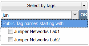
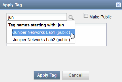
You can create tags to categorize objects. For more information about tagging objects to select similar objects, see Tagging an Object (in the Junos Space Network Management Platform Workspaces User Guide).
To display all the inventory objects on the page again, clear the contents of the Search field and press Enter.
You must append "*" if you want to search using partial keywords. Otherwise, the search might return zero matches.
To search for specific objects across the entire Junos Space Network Management Platform, use the Search field on the banner at the top of the inventory page (see Figure 10). For more information about global search, see Using Global Search.

Spin Box
A spin box is a text box with up and down arrows that you can click to change the value incrementally (see Figure 11). You can also type a valid value in the box.

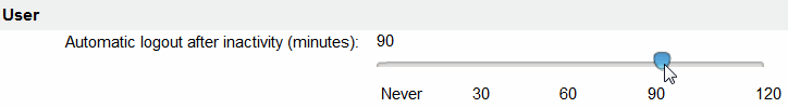
Slider
Using a slider, you can select a value from a continuos range of values by sliding the indicator along a bar. The indicator shows the current value.
In Figure 12, the automatic logout of a user due to inactivity is set to 90 minutes by using the slider control.
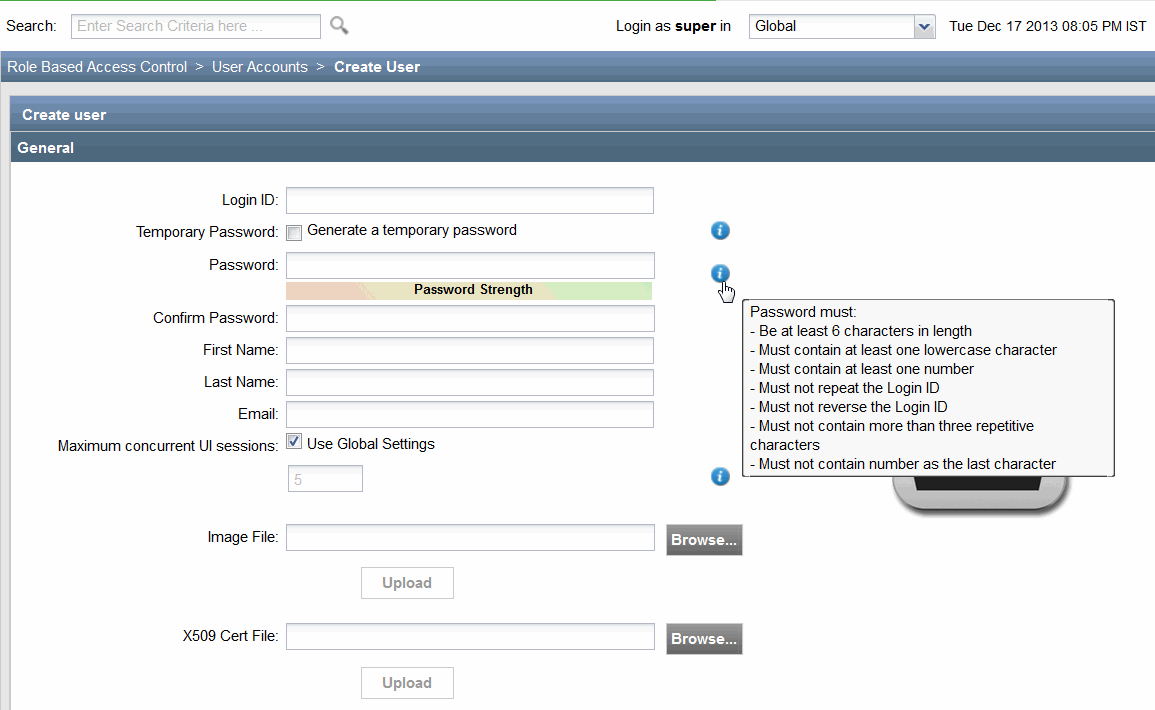
Text Box
A text box enables you to:
Enter or edit text (for example, the Login ID or Password fields in Figure 13).
Upload files from your computer to the Junos Space server, such as the Image File or X509 Cert File fields in Figure 13.
Choose a value from a drop-down list of values when you enter the first few letters in the text box (see Figure 14).
Use the label associated with a text box to identify the purpose
of a text box. You can gain additional information about some of the
text boxes from the information icons that are associated with the
text boxes ( ). For example, the Temporary Password and Password text boxes have
information icons associated with them as shown in Figure 13. You must mouse over the information
icon for Junos Space to display information about the text box with
which the information icon is associated. For example, when you mouse
over the information icon associated with the Password text
box, the conditions that must be met when you enter a password are
displayed.
). For example, the Temporary Password and Password text boxes have
information icons associated with them as shown in Figure 13. You must mouse over the information
icon for Junos Space to display information about the text box with
which the information icon is associated. For example, when you mouse
over the information icon associated with the Password text
box, the conditions that must be met when you enter a password are
displayed.
Not all text boxes in Junos Space have information icons associated with them.
Identifying the Range of Values
Usually, if there is a default value associated with a text box, then it is displayed by default on the text box. However, to determine the range of values that is accepted in a text box, perform the following steps:
To determine the minimum value, enter a negative value (for example, –1) in the text box. An error icon appears next to the text box. Mouse over this icon to see the minimum value that is accepted in this text box (see Figure 15).
Figure 15: Minimum Value in a Text Box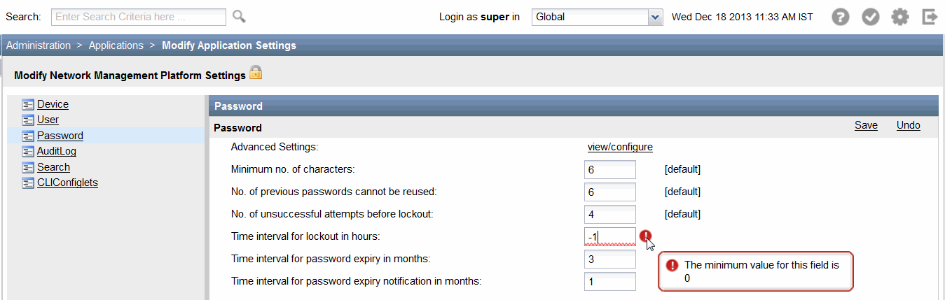
To determine the maximum value, enter a very high value in the text box. An error icon appears next to the text box. Mouse over this icon to see the maximum value that is accepted in this text box (see Figure 16).
Figure 16: Maximum Value in a Text Box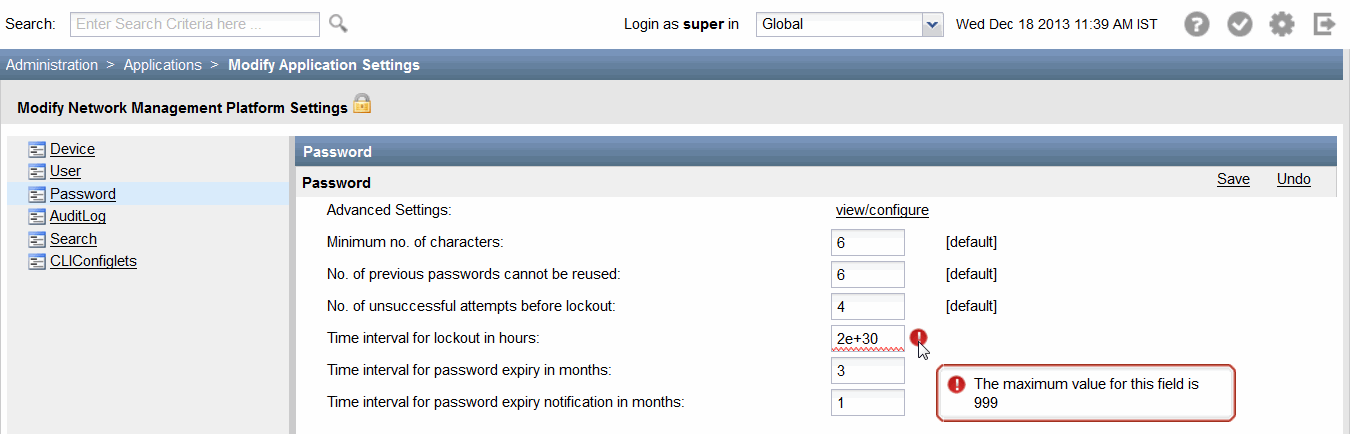
Tree View
Using the tree view, you can view and interact with a collection of Junos Space objects that are arranged hierarchically. You can select only one object from the objects that are displayed in tree view. You can expand and collapse an object by clicking the plus and minus expander buttons respectively (see Figure 17).
Scrolling Controls
Junos Space Network Management Platform provides horizontal and vertical scroll bars on inventory landing pages, which you can use to scroll the contents of the page by clicking one of the scroll arrows, clicking an area in the scroll bar, or dragging the scroll bar. For example, to view data that is at the bottom of the Junos Space page, you can drag the vertical scroll bar toward the bottom of the page. Figure 18 shows the horizontal scroll bar that enables you to scroll horizontally through the Junos Space page allowing you to view data that is on the left or right.

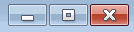
Sizing Controls
You can use the minimize, maximize, and close buttons of your browser window to hide the Junos Space application window, enlarge the window to fill the whole screen, and close the window, respectively.
Minimize the window when you want the Junos Space application window to be temporarily out of the way instead of closing it.
Close the window when you have finished working on it and there is no need for you to return.
To resize a window (make it smaller or bigger), point to any of the window's borders or corners. When the mouse pointer changes to a double-headed arrow, drag the border or corner to shrink or enlarge the window. You cannot resize a window that is already maximized.
Figure 19 displays the minimize, maximize, and close buttons.