About the Dashboard Page
The HPE Mist Networking Data Center Assurance dashboard provides operational insights about the performance of the data center network and the hosted services. These insights enable network administrators to quickly respond to network issues that impact end user experience.
To access this page, click Dashboard from the main menu. The dashboard provides information in the three tabs: Overview, Geographic View and Topology.
Overview Tab
The Overview tab provides three views of the data center network: individual site, site group, and for all the sites in the organization that you have access to based on your user role. The site-level view provides information about the devices in the site, their role, anomalies in the devices, impact analysis information, and so on, displayed in a set of predefined widgets. The information in these widgets gets updated on the basis of the information available for the selected site.
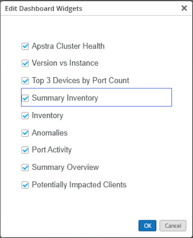
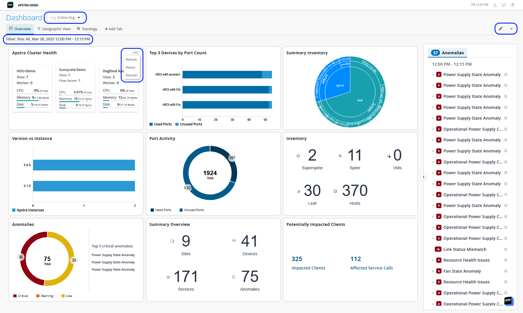
You can select the widgets that you want and customize how they are displayed in the Overview tab. Click the Edit (pencil) icon at the top right of the page to show or hide widgets from the Overview tab. Also, you can resize or reorder the widget according to your layout preferences. Click the ellipsis (...) at the top right of any widget to refresh the displayed information, resize, or to reorder the layout of the widget as shown in Figure 1.
You can also create a custom dashboard to monitor specific insights according to your network's requirements, by clicking Add Tab. You can then add the required widgets.
Widgets Displayed for Site Groups and All Sites
In the Overview tab, you can also view information for a site group or for all the sites in the organization that you have access to based on your user role. Use the filter at the top of the page to select a site group or All Sites. When a site group or All Sites is selected, the widgets display information about Apstra Controllers, version of Apstra installed, and so on. Figure 1 displays how the Overview tab looks when a site group or All Sites is selected.
|
Widget Name |
Description |
|---|---|
|
Apstra Cluster Health |
Displays the total number of controllers within an Apstra cluster in the entire organization or a site group. It also provides a summary of the CPU, memory, and disk utilization, site count, worker count, and remote server count for each controller. Select an individual controller to expand the view and see details of its worker nodes and flow servers. You can also select a worker node or a flow server to view its historical data. |
|
Version Vs Instance |
Number of Apstra instances running and their versions. |
|
Top 3 Devices by Port Count |
Displays a graph listing the top three devices by number of ports. |
|
Summary Inventory |
Displays hierarchical information about the superspines, spines, leaf, and host devices in the organization or site group. |
|
Inventory |
Displays the total count of devices in the data center and their roles. |
|
Anomalies |
Displays the total count of anomalies categorized by their severity levels, such as critical, warning, and low. The tile also lists the top three critical anomalies that need immediate attention. |
|
Port Activity |
Displays the total number of ports in the organization or site group along with a graph of used and unused ports. |
|
Summary Overview |
Provides information about the total number of sites, devices, services, and the total number of anomalies generated. |
|
Potentially Impacted Clients |
Provides the total number of clients that are impacted because of an anomaly and the total number of services affected. |
Widgets Displayed for a Single Site
You can select a single site to view site-level information in the Overview tab. The widgets on the page provide information specific to the site you selected. Figure 2 shows the widgets displayed on the Overview tab for a single site.
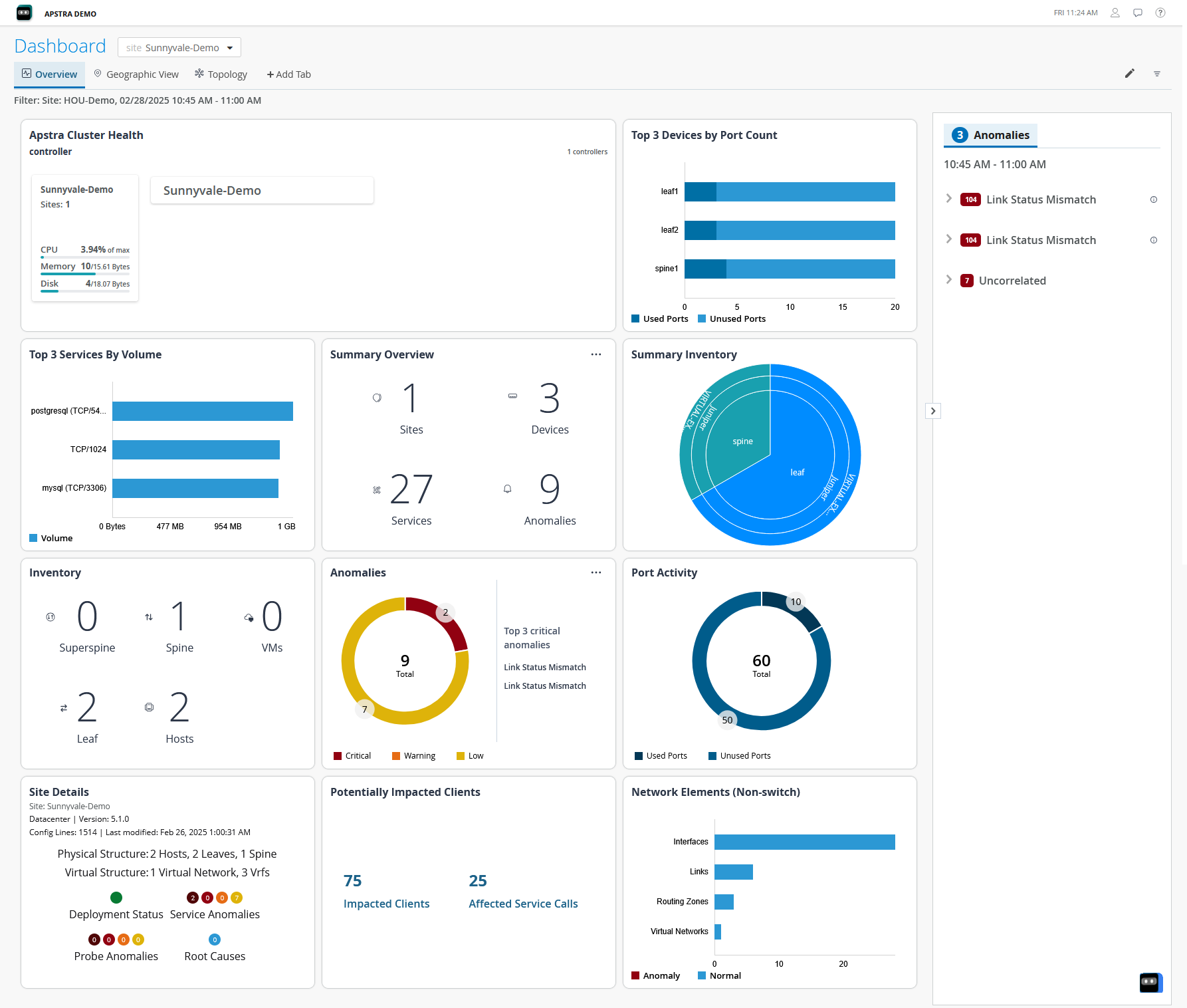
In Figure 2, the Key Anomalies widget and the Anomalies tab in the right pane do not show any data because no anomalies are reported in the site you selected. The widgets get updated depending on the information available for the selected site. Table 2 describes the widgets displayed for a single site.
|
Widget Name |
Description |
|---|---|
|
Apstra Cluster Health |
Displays the controllers within an Apstra cluster for the selected site with all worker nodes and remote servers associated with it. It also provides a summary of the CPU, memory, and disk utilization, site count, and worker count for the controller and each worker node and flow server. You can select a worker node or a flow server to view its historical data. |
|
Top 3 Devices by Port Count |
Displays a graph listing the top three devices by number of ports. |
|
Top 3 Services By Volume |
Displays a graph listing the top three services by volume of data. |
|
Summary Overview |
Displays the number of devices and active services in the site and the count of anomalies generated. |
|
Summary Inventory |
Displays hierarchical information about the superspines, spines, leaf, and host devices in the site. |
|
Inventory |
Displays the total number of devices in the data center and their roles. |
|
Anomalies |
Displays the top three key anomalies along with the total count of anomalies generated in the site. |
|
Port Activity |
Displays the total number of ports in the site along with a graph of used and unused ports. |
|
Site Details |
Displays the Apstra version, number of physical and logical systems, and the anomalies reported. |
|
Potentially Impacted Clients |
Displays the total number of clients and services impacted. |
|
Network Elements (Non-switch) |
Displays the number of different non-switch elements in the network. Also shows the number of elements with anomalies and those operating normally in each element type. |
Anomalies
The Anomalies tab in the right pane displays the anomalies that have occurred and also indicate how the anomalies are related to a key anomaly. An anomaly might trigger multiple related events. Expand the key anomaly to view the detailed list of anomalies related to the key anomaly. Often, the related events that are generated get resolved automatically when the event that triggered these anomalies is resolved. Such an event or anomaly is termed a key anomaly. Identifying and flagging key anomalies help administrators resolve issues faster. Identifying and flagging key anomalies also help reduce alert fatigue, which is a condition that administrators might face due to overwhelming number of anomalies of different levels of severity. Alert fatigue might lead to delayed response to anomalies or sometimes ignoring critical anomalies.
Geographic View Tab
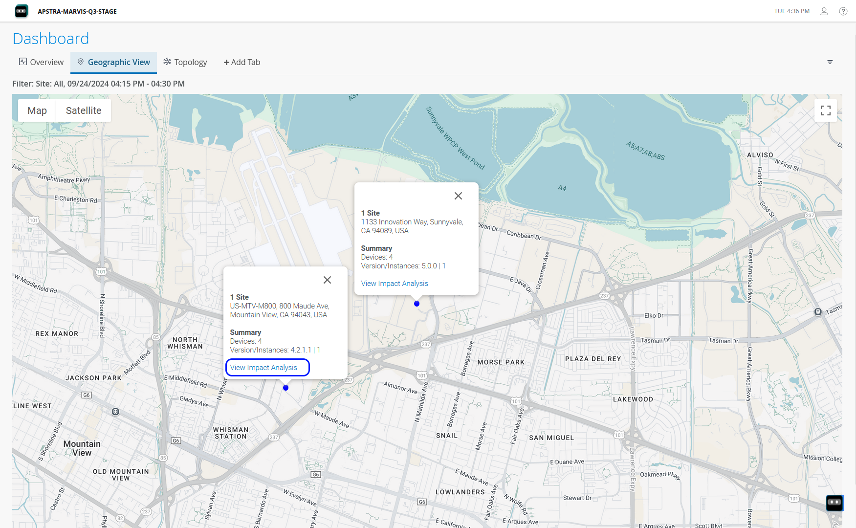
The Geographic View tab helps view the location of the sites on the map, number of devices, and the anomalies if any in the devices. The site icon on the map appears in blue if the site is operating normally. The icon appears as red if anomalies are reported in the site as shown in Figure 3. Hover over the icon to view the site details. In the pop-up that appears, you can view site information, such as the number of devices in the site, the version of Apstra installed in the site, and number of Apstra instances.
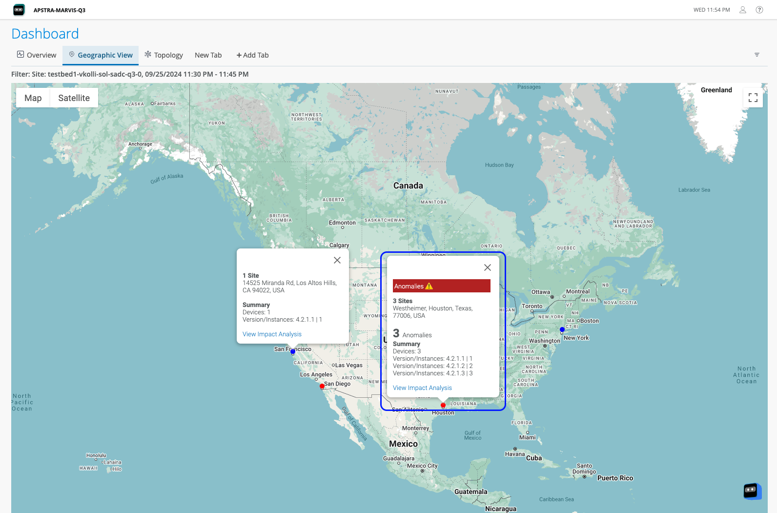
Click the icon to zoom in to the exact location of the site on the city map. Click View Impact Analysis as shown in Figure 4. You are prompted to select the site. After you select the site, you are redirected to the Impact Analysis page.
Topology Tab
The Topology View tab provides a graphical representation of the physical topology of the data center fabric, providing information about how devices are connected to one another, their roles, and the count of anomalies, if any, generated in the devices. The topology view displays the data center network in three layers - host, leaf, and spine. You can also view the VM connections in the topology by enabling the Show VM layer toggle button.
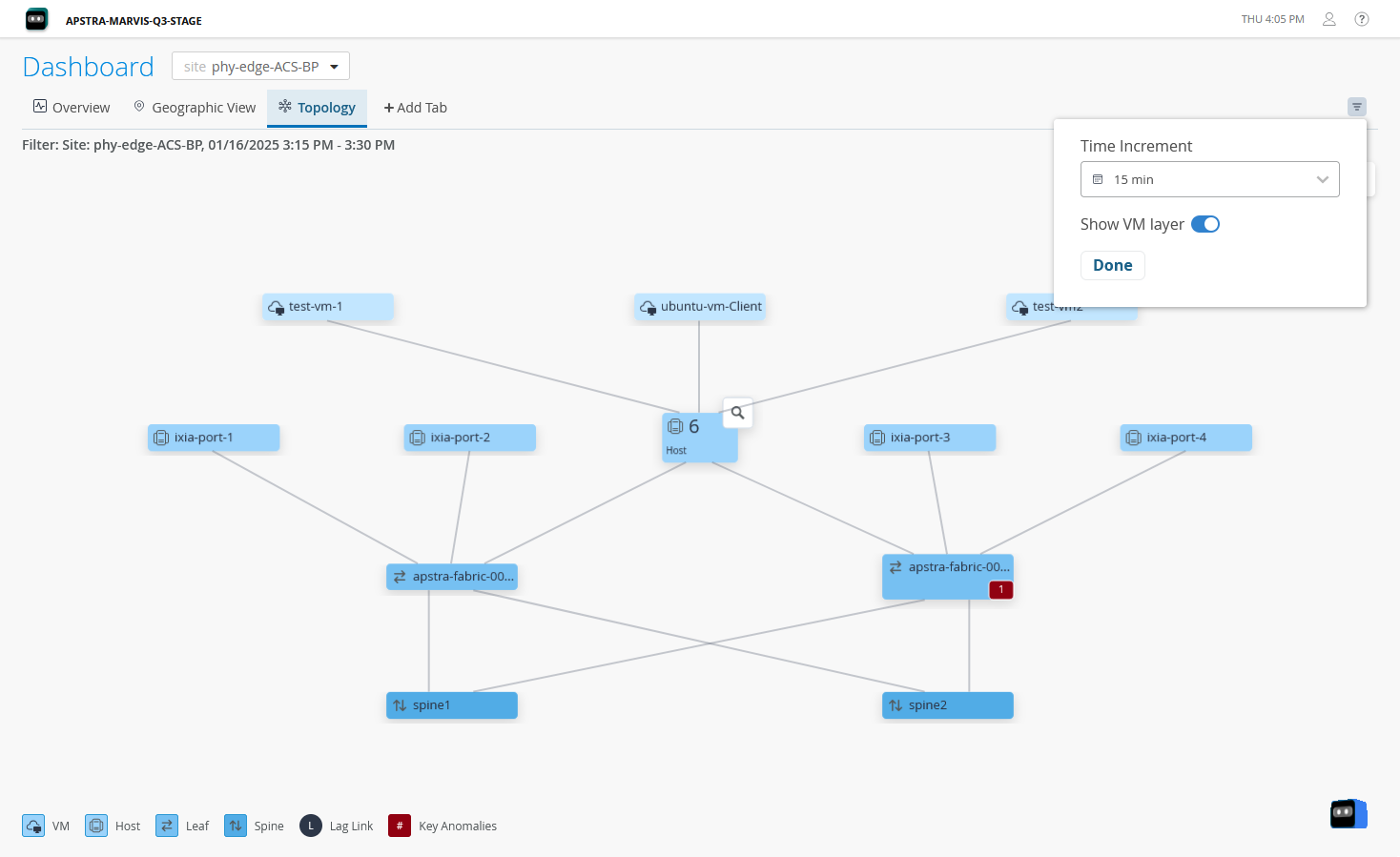
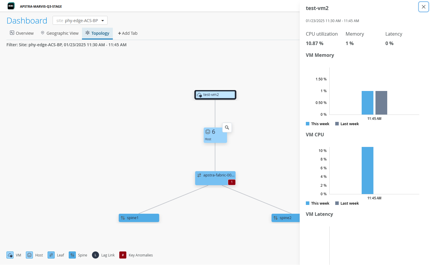
In addition to this, you can view details of specific nodes in the topology. Click a node to view device information such as CPU and memory utilization in the right pane as shown in Figure 6.
Accessibility on the Dashboard
The Data Center Assurance dashboard is compliant with the Web Content Accessibility Guidelines 2.1 (WCAG) from the World Wide Web Consortium (W3C).
W3C is an organization that helps develop Web standards and guidelines to accommodate the growing diversity of people, hardware, and software. WCAG is a set of guidelines developed with a goal of providing a single shared standard for web content accessibility that meets the needs of individuals, organizations, and governments internationally. These guidelines explain how to make web content more accessible to a wide range of audiences, including users viewing with assistive tools.
The dashboard is accessible to users who employ screen readers such as Non-Visual Desktop Access (NVDA) for devices running Windows or VoiceOver that is built into Apple devices. You can navigate and interact with dashboard elements using a screen reader in combination with the keyboard shortcuts listed in Table 3.
|
Action |
Shortcut Key |
|---|---|
|
Forward Navigation |
Tab |
|
Backward Navigation |
Shift + Tab |
|
Select, Deselect, Open |
Enter / Space |
|
Navigate between options |
ArrowUp / ArrowDown |
|
Close |
Esc |
On using the keyboard navigation, the selected element is highlighted as shown in Figure 7.