Understanding the Organization-Level Sustainability Dashboard
Use the Organization-Level Sustainability Dashboard to monitor energy insights, potential energy savings, and top sites energy usage across the organization. The dashboard is organized into the two tabs: Overview and Potential Energy Savings.
Overview
The Overview tab provides a high-level summary of the organization's energy profile and highlights potential energy savings achievable through optimization actions across the organization.
You can view data for the selected time range. The available time ranges are Today, Yesterday, Last 7 Days, Last 30 Days, and Custom. By default, the widget displays data for Last 30 Days.
The global time range selector applies to all widgets except the Potential Energy Savings widget, the Power Usage metric card, and the Carbon Intensity and Average Power Cost cards. The Potential Energy Savings widget displays projections for future time ranges, the Power Usage metric card shows the real-time power usage of the organization, and Carbon Intensity and Average Power Cost display configured values that do not change with the selected time range.
- View Energy Metrics for the Organization
- View Energy Savings For the Organization
- Review Potential Energy Savings
- Review Achieved Energy Savings
- View Carbon Intensity and Average Power Cost Configured for the Organization
- View Top Sites in the Organization By Energy Metrics
- View Top Sites on the Map
View Energy Metrics for the Organization
The organization-level metric cards display key aggregated energy metrics for the organization.
Use these summary cards to get a high-level overview of the organization's energy profile for the selected time range.

For energy metric description, see Table 1.
| Metric | Description | Unit | Notes |
|---|---|---|---|
| Power Usage | Real-time power consumption of the organization, aggregated from site-level telemetry |
Kilowatts (kW) |
The timestamp indicates when the data was last updated. |
| Energy Consumption | Energy consumed by the organization during the selected time range |
Kilowatt-hour (kWh) |
The system aggregates power usage for the selected time interval to calculate energy consumption |
| GHG Emission | Total greenhouse gas emissions generated by the organization during the selected time range |
gCO₂e |
GHG emission is calculated based on the carbon intensity you configure at the organization level. If not configured, a default value is used to calculate the emission. See, Configure Sustainability Settings for the Organization. |
| Cost | Estimated cost of energy consumed by the site during the selected time range | Region‑specific currency | If the Total Cost appears blank, verify that the Average Power Cost is configured for the organization. See, Configure Sustainability Settings for the Organization. |
-
The timestamp in the top-right corner reflects the selected time range, and the values displayed for Energy Consumption, GHG Emissions, and Cost update based on this selection.
-
The units displayed for Power Usage, Energy Consumption, and GHG Emissions are dynamically scaled based on the magnitude of the value.
View Historical Trend Graphs for the Organization
The Historical Trend Chart allows you to analyze energy trends for the organization over time.
You can view historical trends for the following metrics: Energy Consumption, GHG Emission, and Cost.
Click any of the three metric cards to view their trend charts for the selected time range in the right pane. When you select a time range, the trend graph displays data for the rolling interval ending at the most recent available data point.
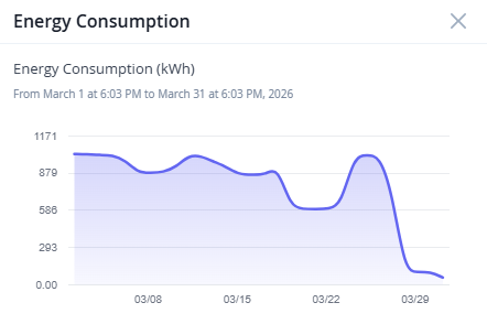
Figure 2 shows the organization's energy consumption trend during the last 30 days. You can view similar trend charts for the other two metrics as well.
The x-axis represents the selected time range and y-axis represents the aggregated organization-level values of the selected metric for the selected time range. Hover over any point on the graph to see the exact metric value for that timestamp.
View Energy Savings For the Organization
The Energy Savings tab on the Organization-Level Sustainability Dashboard displays the potential and achieved energy, emissions, and cost savings associated with available energy optimization recommendations.
Energy optimization recommendations are currently generated and applied only at the device level. Organization-level and site-level dashboards provide aggregated views of potential and achieved savings across devices.
Use the Potential and Achieved views to compare estimated savings with the savings achieved after recommendations are applied.
- Potential view displays the estimated energy, emissions, and cost savings that can be achieved if all available energy optimization recommendations are applied. See, Review Potential Energy Savings.
- Achieved view displays the actual energy, emissions, and cost savings achieved from successfully applied recommendations. See, Review Achieved Energy Savings.
Review Potential Energy Savings
Use projected savings to identify high-impact optimization opportunities and prioritize energy-saving actions across the organization.
You can view potential savings metrics in the following tabs of the Organization-Level Sustainability Dashboard:
-
Overview
-
Energy Savings
Both tabs include the Potential Energy Savings view, which provides projected energy, emissions, and cost savings based on the selected time range. The available time ranges are Today, Tomorrow, Next 7 Days, and Next 30 Days. By default, the view displays projections for Next 30 Days.
Potential Energy Savings View
The Potential Energy Savings view provides a high-level summary of the projected energy savings, emissions reduction, and cost savings that can be achieved if all available energy optimization recommendations are applied.

For field description, see Table 2.
| Metric | Description | Data Availability |
|---|---|---|
| Projected Energy Savings | Estimated reduction in energy consumption that your organization can achieve by applying the available energy optimization recommendations. | The projection is displayed for the selected time range. |
| Reduction in GHG Emission | Estimated reduction in greenhouse gas emissions your organization
can achieve by applying the available energy optimization
recommendations. The value is calculated based on the projected energy savings and the carbon intensity configured for the organization. |
The projection is displayed for the selected time range. |
| Projected Cost Savings | Estimated cost savings that your organization can achieve by
applying the available energy optimization recommendations. The value is calculated based on the projected energy savings and the average power cost configured for the organization. |
The projection is displayed for the selected time range. |
Use the Potential view on the Energy Savings tab for deeper analysis.
Average Hourly Savings
The Average Hourly Savings table on the Potential view displays the average hourly savings achievable by the organization.
You can filter the table by recommendation type, device model, or Junos OS version installed on the device and get detailed breakdown of potential energy, emissions, and cost savings that contribute to the total potential savings shown on the insights panel.
Use the table to identify which recommendations, device types, or Junos OS version offers the highest potential energy savings.
| Field | Description |
|---|---|
| Energy Savings Category | Filter potential energy savings by one of the following
categories:
|
| Power Savings | The average hourly power savings achievable for the selected category if all the energy optimization recommendations are applied. |
| CO2 Reduction | The average hourly reduction in greenhouse gas emissions for the selected category, assuming all applicable recommendations are applied. |
| Cost Savings | The average hourly cost savings resulting from power reductions for the selected category, assuming all applicable recommendations are applied. |
Review Achieved Energy Savings
The Achieved view helps you measure the impact of applied optimization recommendations.
Use this view to monitor achieved energy savings, emissions reduction, cost savings, and the status of recommendation deployment jobs.
Achieved energy savings are updated after available recommendations are successfully applied.
Energy Savings
The Energy Savings insights panel displays the actual energy savings, emissions reduction, and cost savings achieved through recommendation-based optimization.
Savings are calculated using port-level power savings data for ports that have been successfully disabled through applied recommendations.
You can view the achieved savings metrics in the following tabs of the Organization-Level Sustainability Dashboard :
-
Overview
-
Energy Savings
Use the time range selector to view the aggregated values of achieved energy savings, emissions reduction, and cost savings for the selected period.

For field description, see Table 4.
| Metric | Description | Data Availability |
|---|---|---|
| Achieved Energy Savings | Reduction in energy consumption achieved by your organization through applied energy optimization recommendations. | The savings is displayed for the selected time range. |
| Reduction in GHG Emission | Reduction in greenhouse gas emissions achieved by your
organization through applied energy optimization
recommendations. The value is calculated based on the achieved energy savings and the carbon intensity configured for the organization. |
The reduction is displayed for the selected time range. |
| Cost Saved | Cost saved by your organization through applied energy
optimization recommendations. The value is calculated based on the achieved energy savings and the average power cost configured for the organization. |
The savings is displayed for the selected time range. |
Recommendation Actions
The Recommendation Actions table displays the deployment history and status of energy optimization actions initiated from the Recommendation tab.
The Recommendation Actions table tracks system-initiated deployment jobs created when you apply a recommended action from the Recommendation tab. During deployment, preconfigured configlets are automatically deployed on the device through Apstra Data Center Director.
User-initiated configlet deployments performed manually through Apstra Data Center Director are not tracked in this table.

Use this table to monitor system-initiated recommendation deployment jobs and review the status of previously executed optimization actions. For field description, see Table 5.
Use the Energy Savings insights panel to view aggregated savings data associated with the successfully applied recommendation deployment jobs and measure the impact of energy optimization efforts.
| Field | Description |
|---|---|
| Job ID | Unique identifier assigned to the recommendation deployment job. |
| Recommendation Type | Type of recommendation applied. For example, Empty Port Shutdown recommendation. |
| Status | Current deployment status of the recommendation. The states
are:
You can filter the table by deployment status. Click All and select the status by which to filter jobs. |
| Completed Time | Date and time when the deployment completed, displayed in the local time zone. |
| Details | Click to view additional information about the recommendation
deployment. You can drill down through the site, device, and port hierarchy to view the deployment status at each level. |
The time range selector applies only to the metrics on the Energy Savings insights panel.
The Recommendation Actions table displays recommendation actions initiated through the Recommendations tab in the past 30 days.
View Carbon Intensity and Average Power Cost Configured for the Organization
The Carbon Intensity and Average Power Cost configured at the organization level are used to calculate GHG Emission and Cost displayed on the Organization-level Sustainability Dashboard.
The dashboard displays a banner prompting you to configure these values if they are not set.
You can configure these values on the Organization Settings page (Organization > Organization Settings > Sustainability). See, Configure Sustainability Settings for the Organization.
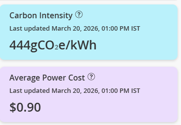
Carbon Intensity—Represents the amount of greenhouse gas emissions produced per unit of energy consumed. It is measured in grams of CO₂e per kWh (gCO₂e/kWh).
This value is used to calculate GHG emissions displayed on the dashboard.
GHG Emissions (CO₂e) = Energy Consumption (kWh) × Carbon Intensity (gCO₂e/kWh)
Configure an accurate carbon intensity value to ensure that the GHG emissions displayed on the dashboard reflect your organization’s actual environmental impact.
Average Power Cost—Represents the cost per unit of electricity used at the organization-level.
This value is used to calculate the Cost displayed on the dashboard.
Configure this value to ensure accurate cost calculations across the dashboard.
-
If carbon intensity is not configured, the default value of 443 will be used. You can override this value as needed.
-
If average power cost is not configured, cost-related metrics, such as Total Cost and Projected Cost Savings, appear blank.
-
The timestamps on the corresponding cards indicate when the values were last updated.
View Top Sites in the Organization By Energy Metrics
The Top Sites by Energy Consumption section provides a list of high energy consuming sites sorted in the decreasing order of energy consumption.

Click the arrow next to any column header to sort the table based on that metric. The widget header updates accordingly to indicate the active sorting metric.
You can further drill down into a site to view detailed energy insights and identify devices contributing to higher energy consumption, cost, and GHG emissions.
Alternatively, you can use the scope selector at the top of the page to view sustainability insights for a specific site or a device.
View Top Sites on the Map
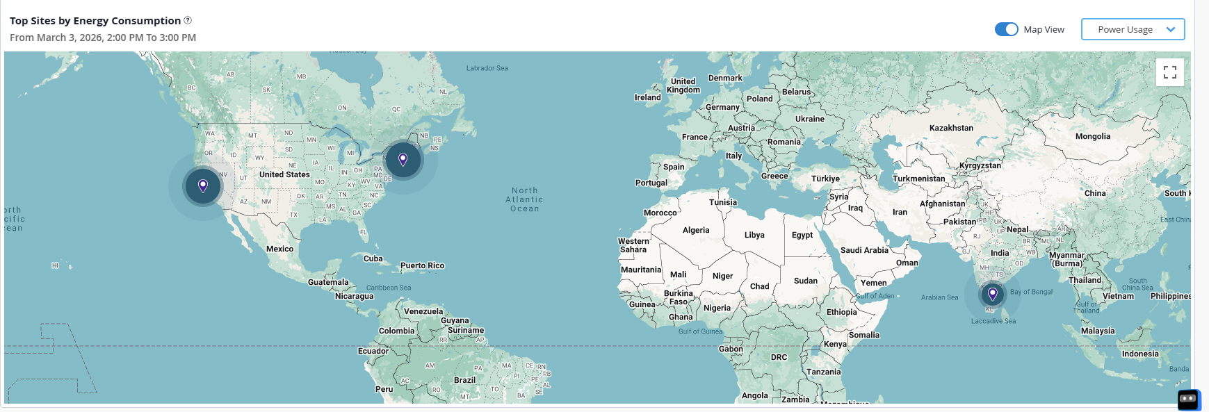
Toggle Map View on the Top Sites widget to view the geographical distribution of the sites on a map. The visualization on the map helps you quickly identify sites that have higher power consumption, cost, and GHG emissions.
Select a metric from the drop-down to update the map and compare sites. The size of the circle indicates how high or low the metric is at each site. Hover over a site to view detailed energy data for the past hour. You can also view the map in full screen mode and use pan or zoom to explore specific regions.