无线 SLE
使用无线服务级别体验 (SLE) 评估影响用户的因素,例如吞吐量、信号强度、漫游等。
概述
无线 SLE 视频概述
观看此短视频,快速了解无线 SLE。
So let's dive into it. Our core functionality for the network management platform is around user service level expectations. So every user, every minute we collect the data to answer the simple question, are users able to connect and are they having a good experience? So what you see here is the site level, this is our global headquarters here in Sunnyvale, the entire site's wireless experience.
So we could take this one level up and essentially show you where all the sites around the world from their service level expectations are doing. And you could take this one step further on understanding the successful connect experience and see which sites are having certain issues. You can understand coverage, roaming.
We've introduced some really cool roaming metrics this year around signal quality and stability of roams, all this kind of stuff. This is on the wireless side. This is the org level service level expectation view that we talk about.
Now, the next core function for our platform is around understanding the experience and taking it down and saying, who all are impacted? And once you know which devices are impacted, being able to go into an individual device. Here, I've zoomed in to a specific device and that specific device, we're showing you now service levels for that individual device. Every device, every minute, we have the data and being able to zoom in to a certain time and say,why was that device not having a good experience? Aha, it's DNS failure.
The device wasn't having good roaming experience. Aha, it's signal quality. Every user, every minute, service levels.
Then you can go in and say, okay, I want to understand this particular device and go into that individual device's experience and see what are the specific signals? What are the specific failures we see for this device? And there's lots and lots of DNS failure for this particular device. Being able to get to that kind of level and specificity of detail with just a couple of clicks, that's the power of the MIST dashboard at a operations level, at a configuration level as well.
查找无线 SLE
从左侧菜单中选择 “监控 > 服务级别 ”,然后单击 “无线” 按钮。无线 SLE 显示在“用户和系统更改”时间轴下方。
-
您的订阅决定了显示哪些按钮。
-
在页面顶部,使用下拉菜单设置时间段和上下文(组织、站点或设备)。
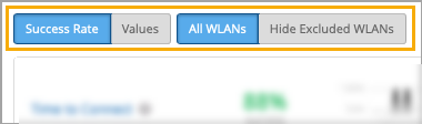
SLE 过滤器按钮
筛选器按钮显示在 SLE 块上方。
-
使用左侧的按钮显示 成功率 或 值。
使用右侧的按钮显示 所有 WLAN 或 隐藏排除的 WLAN。“排除的”WLAN 是您在 WLAN 配置中使用 Wi-Fi SLE 选项排除的 WLAN。
成功阈值设置
您可以调整决定成功或失败的阈值。为此,请单击“无线 SLE”部分右上角的 “设置 ”按钮。在设置窗口中,按照屏幕上的说明设置阈值。
无线 SLE 视频深度探讨
观看此 37 分钟视频,深入了解无线 SLE。
So everyone does client health now, as far as the marketing literature is concerned, but service level expectations are about user experience, not just client health. So we measure 150 different states about wireless clients every couple of seconds, and we translate this into seven different service levels, which are user experiences rather than base RSSI levels. We build baselines and thresholds by understanding what is normal on each individual access point at each individual site, and we do this through a whole complex set of machine learning and AI.
Customers get to define the expectations, rather than having to manually set thresholds, the AI does the rest. The setup time for all of this is a few seconds, so let's have a quick look at Mist in comparison with the competition. So here we can see on the right hand side the Mist cloud, and it is a fairly complicated environment, but this is all managed as a service by Mist.
So the customer's view is a simple web GUI that takes around five minutes to get up and running, to get access points connected, a basic configuration put on, and clients starting to use the system. From the moment the first client and the first access point connect to the system, it begins its learning process to understand the normalities of this site. And more importantly, once it's understood those normalities, to be able to spot any deviation from that normality and report that to the rest of the system.
So let's look at these 150 things that we claim we collect every couple of seconds. So these are broken into two main groups. I'm not going to read all of them out, but you can see them there on the screen, and this is available through the GUI as well.
So from an access point of view, we break it down into positive, neutral, and negative events. So positive events are things people connecting, things being configured, and things being claimed and upgraded and all those sort of things. Neutral events are basically things that are getting information.
So they're not a good or bad, they're just reporting information. And then the negative events are things going wrong. So DFS events, DHCP failure events, man-in-the-middle attacks, reflection, network traffic reflection, great for picking up spanning tree loops.
So these are the sort of information we're gathering from an access points perspective. On the right hand side, we can see on the client perspective, we gather even more information. So here we can actually understand any roaming issues.
We can see, again, we've got positive, neutral, and negative events. So a client associating or roaming successfully is a positive event. Whereas a client actually being deauthenticated or roaming away from the network, it's not positive, it's not negative, it's just one of those things that happens.
And then we have the negative events, such as authorization failures, key failures, DNS failures, DHCP failures. And this is just some of the data that we gather about the system. And this is the data you can turn on and off.
There's a whole section of data underneath this on signal strengths and other such things that are gathered regardless. So we don't gather all of these events every two seconds, of course. We gather the relevant piece of information from each client every two seconds.
So what does this lead to? Rather than having all of this information shown about 150 or as many clients as you have on the network, say you had 10,000 clients, each with 150 different states, that would be a very difficult thing to display in a useful way. So these get translated into the service level expectations. We'll go into these in a lot more detail in a moment, but just to give you a really high level of what these are about.
So time to connect. So this is the end user's experience of saying, I want to connect to the wireless LAN and then hitting the internet, i.e. hitting the default gateway. So a number of things happen between those two points in time.
But what this metric is all about is understanding the delta between those two points in time, because that will give a very good indication of that end user's experience. Now, if that's a DHCP issue or a DNS issue or an authorisational authentication issue, that's to some extent less important. It's more about understanding how that's impacted the end user's experience.
Because if a DHCP server fails to provide an address a couple of times, but it still manages to do that in a very short period of time, then that's not an issue for the end user. The end user wouldn't notice that because they still connected within the time. If we look at throughput, trying to understand throughput on a network is almost impossible because it's entirely dependent on the mix of clients.
Each client has a different set of capabilities and each client may be a different distance from the access point. And as the distance increases, the data rate reduces. So the throughput of an access point or of an entire wireless network is very difficult to measure.
And what we're doing here is measuring that every minute. And this isn't measuring the actual throughput. This is measuring the theoretical throughput.
So this is an important differentiation. It's very easy to measure how much data has gone through a network. What this is measuring is how much data could have gone through that network based on the number of clients connected to the access point.
So we'll cover that in more detail in a moment. Roaming performance. Obviously, moving from one access point to another has been the bane of our lives as far as getting wireless networks to perform for voice and video. We're now in a position where 82.11r is pretty awesome. It can do the roaming in single digit milliseconds. So we can then set a different target for roaming than we would for an initial connection.
And typically, we set this at 0.2 of a second or 200 milliseconds. The system will then show us exactly how many devices are hitting that target and how many devices are missing. And more importantly, it will do root cause analysis on those failures.
So you can see here, we failed 4% of the time because we had a 96% success rate. And 100% of those failures were based on standard roams. A standard roam typically will take half a second at least.
So anything doing a non-enhanced roam will always fail this particular metric. But those are devices you want to update and get rid of as far as the performance is concerned. Successful connects measures the devices that didn't get onto the network at all.
So in the timed connect metric that we covered a moment ago, everybody got onto the network, just some of them took longer than the threshold that was defined. In the successful connects metric, these are clients that failed to get on. So you can see the classifiers on the right-hand side, DHCP authorization and association.
So if a client never gets a DHCP address, if it just fails and eventually times out, the end user will be told by the client, I failed to connect to the wireless network. Won't mention the fact that it was a DHCP issue. But of course, we track this.
Now, this is absolutely essential for IoT devices. If a device doesn't connect that has a human on the other end of it, the human is going to complain. If the device that is failing to connect is an IoT device, no one may ever know. That's why it's really important we track these. Coverage validation on every packet. Every time we receive a packet from a client, we measure its received signal strength.
We'll go into that in more detail in a moment. Capacity is understanding how much of the RF spectrum is available to you as far as the network is concerned. So this is looking at Wi-Fi interference, how many clients are trying to use the air at the same time, and also non-Wi-Fi interference.
And then the last one is AP uptime. This is really looking at how long the APs have been connected, if they've had reboots, if they've just been disconnected from the cloud, but still maintained connections themselves. And you'll see that there is some logic and intelligence built in here.
For example, if 20 APs all failed at exactly the same moment and they were all connected to the same switch because we understand the LLDP source, then we're not going to say 20 APs rebooted. We're going to say a switch went down. So equally, if 500 APs disappear off the network at exactly the same moment and they're all the APs on a particular site, the system will work out.
And rather than sending you 500 emails about APs going down, you'll get an email saying the site went down. So this is the high level of the service level expectations. But if we just scoot back for a moment onto that coverage one, this is a really important metric because we do a site survey when we install a system. Of course we do. That's exactly the right thing to do. The trouble is the system will then be live for five to seven years and the environment will change.
The client base will change. The number of clients will massively change. So that coverage model that was accurate for that 20 minute segment, day one of the network being installed, needs to be updated.
And of course, we can't suggest that you do a site survey every week. So the system is effectively doing that for you. Now, in other segments of this training, you'll understand more and more about allocation services.
But for this part of the training, let's assume we can locate clients pretty accurately. So if we take that coverage metric and we understand every client and the signal strength of every client as it transmits a packet back to the network, we can plot that on the map of the site. And each one of these dots on the site are actually showing an average and maximum RSSI.
So you can see very clearly where the blue spots on the network are. In this case, this is our office in the US and you can see the blue parts are very much the car park. We can drill down to a huge level of detail on this to understand the received signal strength from the client back to the network on a square by square basis around this building.
So if someone's having a problem in a particular area, you'll rapidly see that area start to go blue. Now, this is measuring the signal strength of the client as heard by the network, which is very different to what is done in a site survey. In a site survey, you're measuring the power of the access point as heard by the client.
So this is very much the worst way of measuring things because it's always going to have a lower reading, but it's a much more honest way. If an end user is not receiving a telephone call correctly on their mobile device because they keep it in their pocket with their keys all the time, that mobile device is going to be sending a very weak signal back to the network and this system will actually pick that up. That's not ideal.
Everyone should have their mobile phones held out in front of them as per a site survey laptop at all times, but we know that's not the reality. So understanding the end user's experience as far as signal strength is concerned gives us a much better indication of overall user performance. Right, enough of the slideware.
Let's move over and have a look at a live system view. We have a limited amount of data to play with because everyone's away from the offices. So we're going to have to just work with the data that we have.
Here we can see the service levels of our office in the US and here we can see the service levels of the demo system that you might have access to. So we'll start on this one. If we look at the top here, we can see the number of users connecting to the network over the last seven days.
So you can choose how long you want to look at this data for. And it's interesting to see this number of users because this can immediately show a big issue if there's a large drop in users. Typically this happened between 5 and 6pm so probably everyone went home.
The green triangles you see here are radio changes on the network. So again, you can see if a radio change had an impact because this line moves all the way down the network. The blue ones are the configuration changes.
So here someone changed the threshold to four seconds for the SLE of time to connect. So we can see that change was made there and we can see that that had an impact on the time to connect service level here. So if we look at the time to connect service level beforehand, we can see that information and we can choose any time frame that we want or we can just simply go for the last seven days.
We can also choose what information we get to see here. So we can actually choose which one of these pieces of information we actually show on these triangles. The settings part of the service levels allows us to define the individual service levels and where the thresholds are set.
So time to connect is currently set at four seconds as we can see here. What does that mean? So that means that if the whole process of association, authentication, DHCP requests, DNS lookup and arping the default gateway, if that whole process happens within this four second timescale, we just mark it as a pass and move on. So all of this traffic that's happened here, we don't care about it, but it doesn't matter because it's met the service level that the customer has specified.
Anything that's taken longer than that, i.e. everything to the right hand side of this slider, will have root cause analysis run on that automatically to understand why those clients took longer. So let's have a look at the rest of the SLEs while we're in here. So throughput.
This is specifying a target throughput for every client on the network. So we're saying that we want every client to be able to, in theory, achieve 80 megabits per second. So if that client is an 11G client that is only ever going to connect at 54 megabits per second, for example, it would always fail this metric.
But if this client, the client is an 11AC client or an 11AX client, then it would potentially always pass this metric. However, if that client is in the coffee shop down the road, hanging onto the signal at the very low signal rate, then it may drop down to even low as six meg and therefore would fail the metric. So this is the problem.
This is the complexity we're trying to deal with. Understanding what is a good connection as far as both the distance from the AP and the client capability. Looking at roaming, you can see here we've got a target set of 0.2 of a second and this is running at 94% success and the failures are out here at one to two seconds and those will be the traditional non-enhanced roaming, what's called the standard roams, the older clients.
Successful connects, we don't allow you to set a threshold for successful connects, mainly because we assume you want 100%. We don't generally build in a level of failure of clients not connecting to the network. Coverage allows us to set the signal strength of the received signal strength from the client's perspective.
Now, of course, these are negative numbers, so it's all a bit round the wrong way, but effectively, these clients are the successes and these clients are the failures, even though the numbers high, it's a negative. So I'm sure you all remember that from your basic RF. Looking at capacity, this is defining how much of the band should be available at any one time, at any part of a user minute.
So here we can see, typically, there's between 30% and 70% of the band available. So the blue information behind is the last seven days that's been seen. So we've got a target set of 20% of the band should be available at any time.
And we're failing that 1% of the time in this case. AP uptime is looking at AP uptime. And again, we don't allow you to specify a target on this, we assume that you want all of the APs up all of the time.
And we can see that a couple of APs have gone down over the last week. And this is our office testing network, so they're always being rebooted. So once you set your service levels, then the system starts calculating.
And as we saw in this configuration line here, the threshold was changed at this point. So if we look at the information from that point onwards, you'll see that the successful connects figure is changing all the time because it's based on the information that has been gathered for that time slot. Let's go back to seven days.
So there's some important information to know at this point. What you're seeing here is part of the standard wireless LAN subscription. So the standard management wireless LAN subscription will get you what the information you see here.
What you can see also is that we can look at this information from an access point perspective. So we can pick on an individual AP and see the data and the connection successes from an individual AP's perspective. We can also look at an entire organization’s perspective.
And we'll look at this in more detail later. A key point though, is we can drill all the way down to a client level perspective. So we can pick on any one of these clients and see the service levels as experienced by that client.
Now, the client level information is a huge amount of data. And this is covered by the MARVIS license. So if you don't have the MARVIS license for your APs, you won't have access to this client level information. That's just an important point to note. Obviously, the system we're demonstrating on is fully licensed. So I don't want you to be confused about that.
So there is that issue on the licensing. What you can also see here is because of our very small number of clients that are connecting to the network, we've generated some anomalies here. So these areas that you can see here are successful connect anomalies when a number of clients are failing to connect to the network.
Primarily for authorization, we've got a load of clients with the wrong pre-shared key on so we can demonstrate this stuff. This anomaly detection where the system is actually saying this is a big enough change to warrant investigation is actually part of the MARVIS license as well. So there are other things that MARVIS does and we'll cover that in another section.
But we just wanted to make sure that you were aware of what you got as part of the standard wireless license and what you need to add to get for MARVIS to enable. So just wanted to cover those off. One thing you can see at the top here, we've got success rate versus values.
So here we can see 50% success rate. We can go to values and it will show as our time to connect average is six seconds because we've got a lot of clients that are very poor performing. Average throughput is 181.
Average roaming is less than a second. And we can see on average, we're failing to connect. 13 connection attempts are failing.
Coverage is minus 56 dBm and capacity is 52%. So this is interesting, but it doesn't really tell you the whole story. Looking at the success rate is a much better indication of actually what's happening.
And these are very, very unusual figures just because all of the number of people in the office is significant. Well, there's no one in the office. These are just devices that are left in the office for us to play with.
So let's have a look at time to connect in a bit more detail. Here we can see time to connect and we've got these various classifiers. So the classifiers are the things that contribute to the overall time to connect figure.
And here we can see there's been no authorization issues in the last seven days, mainly because there's been no one in the office. There's been no internet services issues. So this is basically, is there enough internet pipe for us to actually do what we need to do? Are we hitting that default gateway? There have been some association issues and there have been some DHCP issues.
So let's have a look at the statistics tab here. And we can see that we have the percentage and also the average. So here we're looking at percentages. We can go to the average metric here and we can see 126 attempts, 96 attempts. We can also then look at the number of users. And here we can see that we bring in a bit more detail now.
So here we can see that eight out of 36 users failed on association. On DHCP, we have to click a bit more detail to understand the different types of DHCP failure. And we can see 29 of the users are failing with unresponsive DHCP and no one's getting nacked or stuck on that DHCP server.
So these three buttons really give you different views of the data because 43% is 43% of all connection attempts. Okay, but what we can see here is that's actually impacting 29 of 36 users. So it just gives you a different way of viewing the various pieces of information.
So let's look at DHCP and let's look at the timeline. So here we can see exactly when the DHCP failures are happening. And on a live system where there's a lot more people connected to the network you would normally see these happen at the beginning of each day.
So if we look at an association problems, for example here we can see, again, when these association issues are happening. We can look at the distribution of these. So here we can now start to see which operating systems are having the issue or which device types are having the issue. And the key part over here is the anomaly detection. So this is looking at what is normal. And normal is based on the last two months of data based on time of day and day of week.
So if today was Monday morning at 10 o'clock then it would look at the performance it's expecting to see on Monday mornings between 10 o'clock and 11 o'clock and predicting that performance and then seeing how that is matched to this anomaly. So when you're coming into a system without knowing the full history of the system this is vital. Because if you see here which devices are actually having the most impact.
So in this case, it's the Sierra devices. And we can see they're actually slightly worse. 1.4 is slightly worse. So 1.0 is exactly the same as it's always been for the last two months. 1.4 is slightly worse than it normally is. 0.8 is slightly better than it normally is.
And we can drill into the individual wireless LANs that are having the problem. So again, you can see if it's only guest devices as your guest wireless LAN that's having the majority of the issues that may cause less alarm bells to ring than if it's the corporate network, for example. And we can then drill down to individual access points and wireless bands that are having the issue.
We can now look at the individual affected items and actually decide which device is having the most problems. So here we can see the Mist AP 12 is actually failing 86% of the time but it's only 4% of the problems. You can see here the Everest device is failing 77% of the time but it's 31% of the problems.
And this device, 50% of the problems. So we can click on any of these to actually see which ones are failing the most and which one's having the most overall impact. So let's pick on a middle one.
Let's go on Everest and see what's happening. So the system will now immediately give us a summary of what's actually happening. So it was slow to connect on 75% of times primarily due to slow association.
It's a client specific issue with mostly happening on this particular wireless LAN and on the five gigahertz band. That's a pretty good first line help desk summary. So we can now look at the insights.
So we can now look at an individual client to actually see what that client's been doing. And here we can see authorization failures. So we're having problems with authorization.
And here we can see PSK failure. Probably it's an incorrectly entered pre-shared key. And the system has already identified that for us but there's a packet capture here that's already been created by the system in order to download that information and actually see exactly what the problem was.
So we can see all the way through this system when there is an issue here, there's a DHCP problem and the client was asking for IP address 000 which clients do. We can see the signal strength. So there's no problem with the signal but the DHCP server kept responding kept refusing a DHCP address because the device kept asking for 000.
And then eventually here we can see it requested an open DHCP address and it got a response and got provided with a DHCP address from this particular DHCP server. So you can see here that the initial DHCP request happened at this point. So 7 minutes and 28 seconds.
And it was 7 minutes and 31 seconds by the time the device actually got a valid IP address. So that's been reported as a slow response from the DHCP server because the DHCP server denied the request so many times in between. So this is the details for a single client.
And a lot of systems will give you some details about a single client. The key point here is we didn't start looking at a client. We started looking at a service level and saw that there was some DHCP issues and drilled into those DHCP issues and found clients that were having those problems.
So we can now drill in here and actually look on these unresponsive DHCP requests who's actually having those problems. And we can see that everyone at some point is having or a large proportion of users at some point are having a problem with DHCP responses. So there is an issue potentially with our DHCP server.
Most of them, it's only a 3% or 4% impact but it is failing a number of times. So immediately we can now say, actually this wireless problem that we're hunting probably isn't a wireless problem. It's a DHCP issue.
Meantime to innocence is one of those things that we like to talk about. And this is a great way of understanding exactly where that problem actually is. So let's move on to one of the other parameters. So let's pick on successful connects because that's kind of related. So here we're going to look at the clients that gave up that they didn't manage to get on. In the previous metric, everybody got on.
It's just some of them took longer than the two or four seconds parameters that was defined. In this case, these clients failed to connect and gave up on that SSID. So here we can now see again, the distribution of this.
We can look at the access points where they're failing. We can look at the device operating systems and we can look at the device types exactly the same way. Now, of course, what you're interested in at this point is the affected items.
And here we can see it's actually only two devices that are having the problem. And we can see immediately, they're failing 100% of the time. And these two devices, I think we can probably guess they've got the wrong pre-shared key.
But we can see here that they're having widespread problems from a DHCP issue. And if we go into the insights page, we can see that they're getting DHCP times out. Okay, so they're not getting an IP address.
So they actually are associating correctly. So it wasn't actually a pre-shared key failure in this case, but the DHCP server is never responding to them. And therefore, they're timing out and giving up on the network.
Again, we could download the packet capture and see those failures. So the great thing is being able to drill into the detail behind these things, you can actually get to the root cause very, very quickly, even if you guess and get it wrong like that. So let's go back into successful connects.
So we can look for anomalies here as well and see if there's any significant anomalies, which there aren't. I mean, there's only those two devices having issues. And we can look at areas where the problems are actually occurring.
So most of the failures are happening here. So we can then isolate where those clients with those particular issues are actually located in the environment. So pretty powerful tool to be able to drill in to understand which clients are failing and why those clients are failing.
So next we'll look at throughput as one of the classifiers. So you can actually jump to any of the service levels from this screen as well. So once we're in, we're looking at this particular site for the last seven days and we can jump around these classifiers inside here.
We don't have to go back to the other screen. Let's look at throughput next. Here we can see that 83% of the time, we didn't hit that 80 megabit per second throughput target that we defined, which is a pretty hefty target due to capacity.
There was simply too many devices trying to access the network. Here we can see coverage was 10% of the issues. So the device was too far away to be able to achieve that 80 megabits per second throughput target that we defined.
And here we have device capability issues. In this case, there was zero of those. So there were no devices that couldn't hit that target, at least in theory. So no 11G devices, for example. And here we have network issues where there wasn't enough internet bandwidth for us in order to be able to achieve that particular throughput requirement. So down here, we can actually see these user minutes.
And the user minutes are actually defining how long, on a permanent basis, we were outside of that threshold target. So each one of these sections you can see here, we break it down. In this case, these are hour-long sections just because we're looking at a whole seven days of information.
We can drill into this in more detail. But between 7 a.m. and 8 a.m., 19 user minutes were lost or didn't meet the threshold, didn't meet the target because of network issues. So a user minute is effectively one minute per device per connection.
So if you have 10 devices connected for one minute, that would be 10 user minutes. If you had 10 devices connected for three minutes, that would be 30 user minutes. One device connected for 20 minutes would be 20 user minutes.
It's just a way of normalizing the user minutes or the user's connections based on the number of devices and how long they're connected. So this gives you an understanding of which one of these individual classifiers is the biggest issue. And we can click on any one of these classifiers and look at that information in more detail.
So coverage, capacity, et cetera. So here we can look at, so coverage, for example, we can see exactly when these coverage issues are happening. We can then drill onto the affected items in exactly the same way.
And we can see which devices are not hitting those targets due to poor coverage. And we can see 41% of the time, this device is dropping below. I mean, an 80 meg target is a pretty high target. So this device wouldn't necessarily have to drop very low before it would actually drop to a lower data rate. Okay, so that's throughput. Let's look on another one and go to capacity.
So capacity is looking at external interference, basically. And we can see in this case, we only have Wi-Fi interference as an issue. And non-Wi-Fi interference would typically be things that are external to the environment, such as radar hits or point-to-point bridge links, video monitors, those sort of things.
So here we can just drill into that, again, the number of minutes that were lost due to Wi-Fi interference. And again, we can see which devices were impacted by that Wi-Fi interference. So again, it's a fairly low figure. We've only got 2% of the time. If you recall, the capacity was set as 20% available. So only 2% of the time was the capacity not above 20%. And we break that, and 100% of that time, it was related to Wi-Fi interference. So we can drill into this and you can see these are tiny percentages. So that's capacity.
Let's look at APUptime while we're down here. So APUptime is really just looking at effectively how many incidents there were of APs either rebooting or becoming unavailable. And we can see we've got three of our 11 access points at some point have had an issue.
We can go into the timeline and we can see here that there was a switch down for a significant part of the week. And we can see here the switch was down here again. So basically they turned the switch off.
And here we've got an AP unreachable for some time as well. So we actually haven't had an access point issue at this point. What we've had is a switch failure. So although the access points connected to the switch obviously would have failed as well, and we can look at the affected items here and see those access points. The main issue that we're actually tracking here is a switch failure, not an access point failure. Roaming is a really critical one.
This is one of the most used troubleshooting tools across the platform. So roaming is understanding as a client moves from one access point to the next access point. This is, as I say, one of the biggest areas of problems in Wi-Fi today.
Sticky clients. There's been lots of terms for it. But effectively, some clients don't like moving from one access point to another. And the quicker you can identify those clients and understand what's going on with them, the better. So in this network, because it's a pretty static environment, because everyone's working from home at the moment, we can see there's only been a few standard roams that have failed the 0.2 second target. We can drill down into that and we can see it's these pies, which are Raspberry Pis.
They're just little tiny clients and they're not brilliant at roaming and they don't do any enhanced roaming. And therefore, each roam that they've done, they failed to hit that target of 0.2 of a second because it takes them around a second to do roaming. Again, we can look at the distribution.
They're all sitting around John's desk. They're all on this wireless LAN. They've all on the five gigahertz band and they're all Raspberry Pis. So all pretty straightforward and we can see when the problem happens. So they obviously did a roam here and they all took too long. It's not a very exciting screen.
I apologize for that. But because we could drill in and see exactly which devices were actually having that problem, we can then go and look at those devices and see if we can improve their roaming capabilities. So the last one really is coverage. And this is really, again, a very important one. We're now in a world where an asynchronous connection is not a good connection. We don't want ADSL anymore.
We want DSL. We want the same upstream as downstream link. And what we're trying to do here is measure not only the signal strength of the client, but also effectively by looking at the data rates of the up and downstream, whether or not there is symmetry in that signal.
So here we can see asymmetric uplink. We can see these two devices have an asymmetric uplink. Therefore, their uplink performance is different to their downlink performance.
But the majority of devices that are having a problem are weak signal. Again, we're looking at a 5% issue here. The average coverage was minus 55.6 dBm. That's a good site coverage. But you will always see this in these sort of networks. People go home and they take their devices with them.
And as they leave the office, their signal degrades. So you always get some weak signal issues. But again, this is what is actually happening to the user. So it's important to measure what is actually happening to the user. Again, we can look at the distribution. We can look at the wireless LANs that are having the issue.
We can have a look at the access points. So exactly the same way. And we can see that 25 out of 42 users are actually having a weak signal at some point, but it's only 5% of all of the user minutes that are actually having this particular issue.
And again, as we looked at before, we can drill into these and see exactly the averages and the number of devices or the percentages. So these are important figures to actually understand what the differences are around that coverage model. So these anomalies here.
So go to successful connects and you can drill into those anomalies and we can see these deviations. Now, this is a tiny amount of data. So if we look at the statistics here, it's only 20 odd users.
So the anomalies are genuine because it's got 100% failure. But it's such a small amount of data and compared to the norm over the last two months, where there'd be 100 odd people in this environment. That's why these anomalies are generating because they're seeing a big difference from the norm.
But each one of these anomalies can actually be seen and tracked. And with a Marvis subscription, MIST will get informed of these anomalies. So we'll actually know these anomalies are happening.
The last bit I wanted to look at is if you have a large organization with multiple sites, then you can view these service levels across all of their sites and you can sort them by the worst ones of each type, etc. So you can see which sites are having the worst problem. And then at an MSP view, you can see each organization and their average service levels across all sites.
So this is just different tiers of information building up on how the actual system is seeing that data. It allows you to drill down at a very granular level to understand from MSP down to organization, down to site, down to access point, down to client. You can see all of that data in a huge amount of detail.
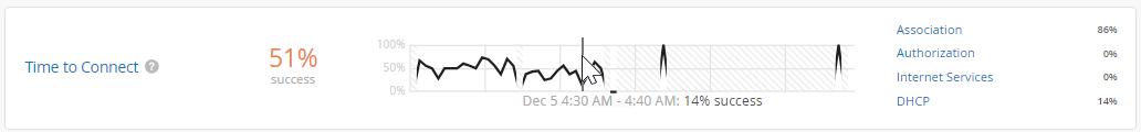
无线 SLE 块
如以下示例所示,每个 SLE 块都提供了有价值的信息。
-
在左侧,您可以看到此 SLE 的成功率为 51%。如果选择“值筛选器”按钮,您将看到一个数字。
时间线在中心显示时间段内的变化。您可以将鼠标指针悬停在任何点上以查看确切的时间和 SLE 结果。
右侧的分类器显示归因于每个根本原因的问题的百分比。在此示例中,86% 的问题归因于关联,14% 归因于 DHCP。
-
如果单击分类器,您将在根本原因分析页面上看到详细信息。大多数分类器都有子分类器,以便更好地了解确切原因。根本原因分析页面还提供了有关问题范围和影响的其他详细信息。
如果选择“整个组织”(位于页面顶部中央)以外的上下文,您将看到 SLE 块。选择“整个组织”后,您会看到所有站点和所有 SLE 的高级摘要信息。
有关无线 SLE 和分类器的详细信息,请参阅下表。
| SLE | SLE 说明 | 分类器 | 分类器说明 |
|---|---|---|---|
| 连接时间 | 连接时间 (Time to Connect) 是从客户端发送关联数据包到客户端可以成功移动数据之间经过的秒数。 您可以单击“ 设置 ”按钮以设置要用作此 SLE 阈值的秒数。 |
授权 | 通过身份验证状态所需的时间明显长于平均时间的连接尝试。 |
| 协会 | 通过关联状态所需的时间明显长于平均值的连接尝试。 | ||
| 互联网服务 | 访问互联网资源所需的时间明显长于平均水平的连接尝试次数。 | ||
| DHCP | 受 DHCP 超时影响的连接尝试。 子分类器:
|
||
| 成功连接 | 瞻博网络 Mist 会跟踪所有连接尝试的成功或失败,包括最初连接到网络、从一个接入点漫游到另一个接入点,以及持续连接。 此 SLE 的阈值不可配置。假设您希望连接 100% 成功。 |
协会 | 关联过程中失败的连接。 |
| 授权 | 授权过程中失败的连接。 | ||
| DHCP | DHCP 进程期间失败的连接(DHCP 超时)。 子分类器:
|
||
| ARP | 由于以下问题之一而导致的连接失败:
|
||
| DNS | 在连接过程中或之后由于 DNS 故障而导致的连接失败。 | ||
| 覆盖范围 | 瞻博网络Mist跟踪活动客户端的接收信号强度指示器 (RSSI),由接入点测量。 使用此SLE确定您的接入点是否足够。 您可以单击“ 设置 ”按钮将 RSSI 设置为此 SLE 的阈值。 |
信号弱 | 由于信号强度低而导致 RSSI 弱。 |
| 非对称下行链路 | 用户分钟数,此时接入点的信号弱于客户端的信号。 | ||
| 非对称上行链路 | 客户端信号弱于接入点时的用户分钟数。 | ||
| 漫游 | 瞻博网络 Mist 会跟踪接入点之间的成功漫游百分比,并给出从 1 到 5 分的质量评分。1 分表示漫游质量好,5 分表示漫游质量不佳。 您无需设置此阈值。假设您想要非常好到优秀的漫游,因此此阈值设置为 2 且无法更改。 |
延迟 | 由于延迟导致漫游时间过长。 子分类器:
|
| 稳定性 | 受快速漫游不稳定性影响的用户分钟数 (802.11r)。当客户端和SSID都能够快速漫游,但客户端漫游速度慢超过2秒时,此分类器适用。此分类器包含一个子分类器: 快速漫游失败。 | ||
| 信号质量 | 受弱信号强度影响的漫游事件 子分类器:
|
||
| 吞吐量 | 瞻博网络 Mist 会基于每个客户端计算整个站点的预估吞吐量。此计算每分钟对每个客户端进行一次。估计器考虑接入点带宽、负载、干扰事件、无线设备类型、信号强度和有线带宽等影响,以得出概率吞吐量。 您可以单击“ 设置 ”按钮以设置要用作此 SLE 成功阈值的 Mbps 数。 |
网络问题 | 有线网络容量大导致吞吐量低 |
| 覆盖范围 | 信号强度弱导致吞吐量低 |
||
| 设备功能 | 由于设备功能问题导致吞吐量低。例如,如果设备仅支持 20 MHz 宽信道、一个空间流或更低版本的 Wi-Fi (802.11 g/802.11 n),则可能会出现吞吐量问题。 | ||
| 容量 | 由于接入点负载过大或信道受到干扰,导致吞吐量低。 子分类器:
|
||
| 容量 | 瞻博网络 Mist 监控可供客户端使用的 RF 信道总容量的百分比。 您可以单击“ 设置 ”按钮来设置客户端必须随时可用的 RF 信道容量(带宽)的百分比。 |
非 Wi-Fi 干扰 | 非 Wi-Fi 源干扰导致容量低 |
| 客户端使用 | 客户端负载过高导致容量低 | ||
| Wi-Fi 干扰 | 由于无线干扰导致容量低 | ||
| 客户端计数 | 连接的客户端数量过多导致容量低 | ||
| 接入点运行状况 | 瞻博网络 Mist 跟踪接入点在未重新启动或断开云连接的情况下运行的时间百分比。 |
低功耗 | 从 PoE 连接接收的电量不足 |
| 接入点断开 | 由于以下问题之一而断开连接:
|
||
| 以太网 | 由于以下问题之一而导致的以太网连接问题:
|
||
| 网络 | 由于往返时间、数据包丢失和 Mist Edge 隧道无法访问而导致的网络相关问题。 子分类器:
|